A Texas twist on tradition, told through brand design
A dynamic expression of brand identity, this animated mark brings Dry Rub’s floral motif to life, layering beauty and boldness in a memorable moment of restaurant branding.
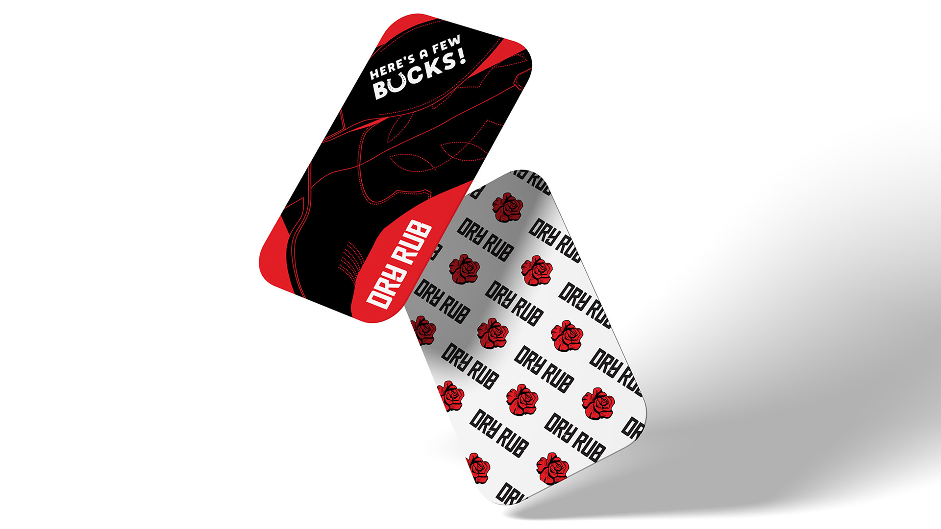
Playful and brand forward, these custom gift cards extend Dry Rub’s bold restaurant branding in a way that balances Texas attitude with hospitality charm.
When this incubator restaurant concept launched in a competitive Plano food hall, the challenge was clear: the public needed to instantly grasp that this was Tex-Mex BBQ. Our Dallas team developed a bold restaurant branding system that blends Texas grit with modern elegance, bringing clarity and character to a fast-paced, high-traffic setting.
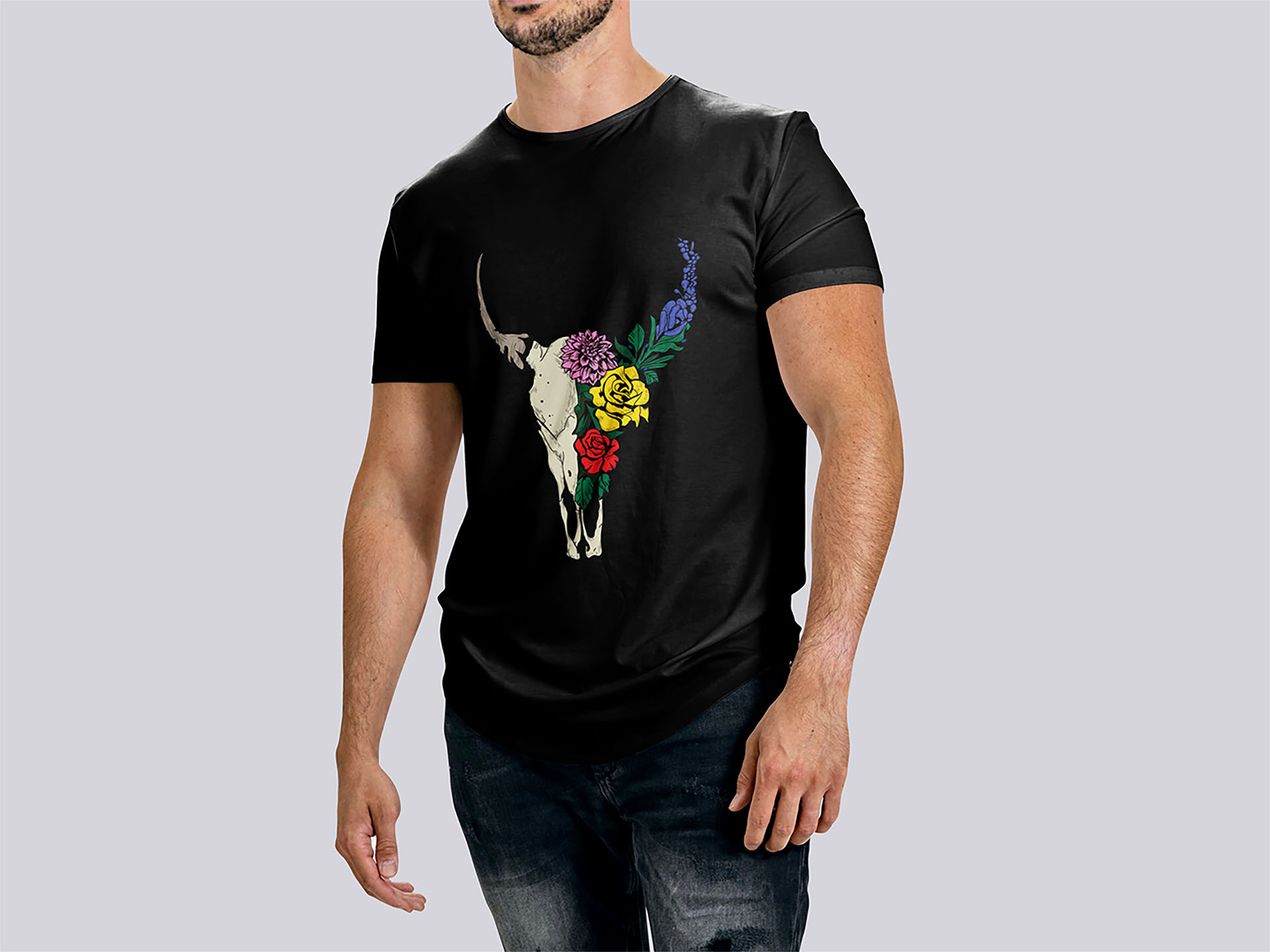
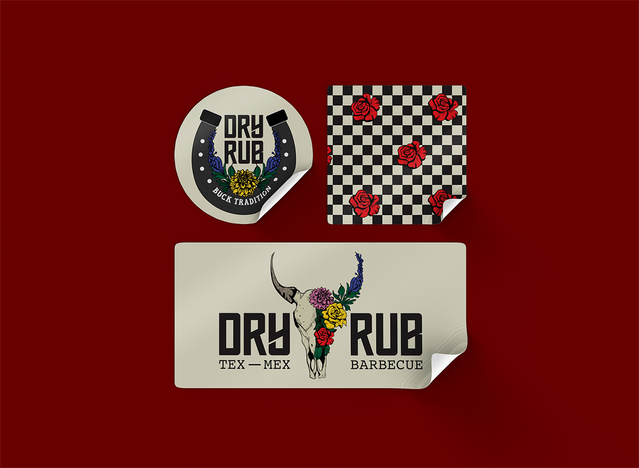
We designed a brand identity centered on a half-skull, half-bouquet mark that’s striking, provocative, and layered with meaning. It tells a story where heritage meets hospitality, rebellion meets refinement. Paired with vibrant graphic design elements and expressive typography, the visual system captures both the ruggedness of BBQ and the warmth of Southern hospitality.
This animated brand mark captures the heart of Dry Rub’s visual identity, blending delicate florals with a defiant edge to express the brand’s unique personality across digital touchpoints.
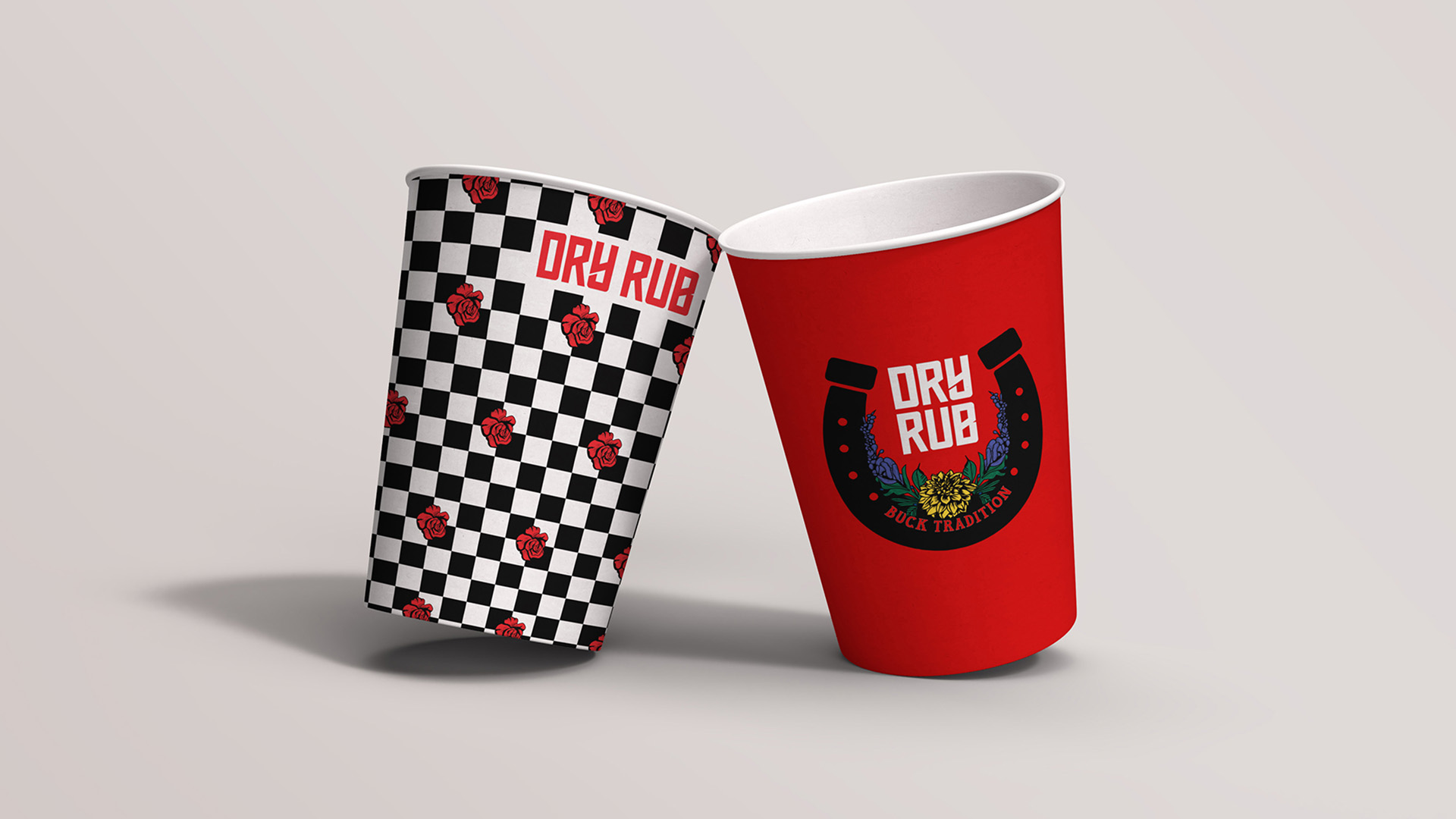
Drawing on regional brand storytelling, we infused floral iconography; bluebonnets, dahlias, and roses to balance masculinity with a welcoming femininity. A bold, contemporary color palette adds the outlaw edge. The result? A branding system that feels authentic, accessible, and instantly memorable, setting guest expectations before they’ve even tasted the brisket.
The comprehensive branding services included signage design, graphic assets, and an adaptable visual toolkit that supports both physical activation and digital storytelling. The identity brings cohesion to a rapidly growing concept while enhancing visibility within a crowded hospitality design landscape.
From food hall design to scalable restaurant branding, Harrison’s role as a trusted branding agency ensured Dry Rub’s brand identity was both functional and magnetic; an experience that surprises, connects, and lingers long after the meal.
As a Brit, diving into the worlds of BBQ and Tex-Mex was both a design challenge and a delicious education. These are two food cultures with deep roots, bold personalities, and strong emotional ties. Capturing that fusion in a brand was incredibly rewarding. Dry Rub gave us the chance to play with contrast: tradition and rebellion, grit and elegance, heat and hospitality. It was a joy to shape a visual identity that feels as layered and flavorful as the food itself.
A playful salute to Texas swagger, this animated digital asset adds movement and meaning the visual system, blending hospitality storytelling with bold personality.
Short, sharp, and full of swagger, this animated brand asset reinforces the personality driven identity system, designed to work across digital and social platforms.
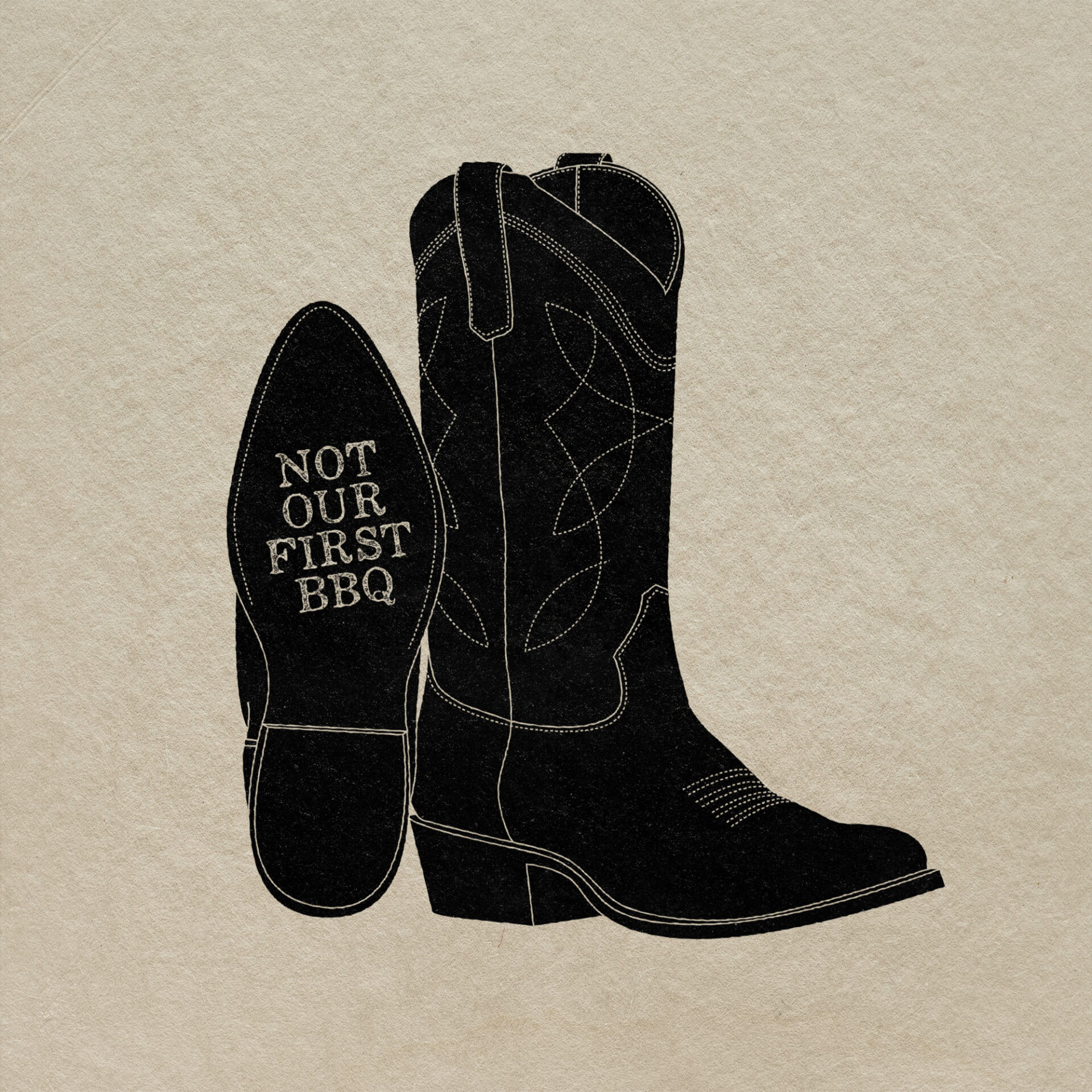
This rocking icon says it all. Dry Rub’s brand system mixes attitude and artistry, turning regional flavor into a visually distinctive language fit for food halls and fast-casual concepts alike.
Related projects
Let’s create something unforgettable
Fuelled by knowledge and imagination, we are driven by our ambition to evolve hospitality brands.
