Bob & Berts
Strategic Positioning
Reviewing and refining a solid, strategic position is such a crucial process in order to truly understand the elements that really make a great concept tick. To credibly scale an independent operation into a national chain there has to be a deep awareness of what makes a fledgling brand memorable, innovative, and special to its customers in the first place. What are the strengths that will get people believing in you, spreading the word, and acting as your advocates once you scale up operations?
Following extensive research and in-depth workshop sessions with key stakeholders it soon became clear that the heart of Colin and David’s concept that had charmed customers was the positive dedication to doing things the right way; thinking local, prioritising people before profit, and taking pride in the quality and delivery of their food and drink – in essence, putting proper coffee in guests’ cups and great grub on their plate, and sharing the success that they created with the community along for the way.
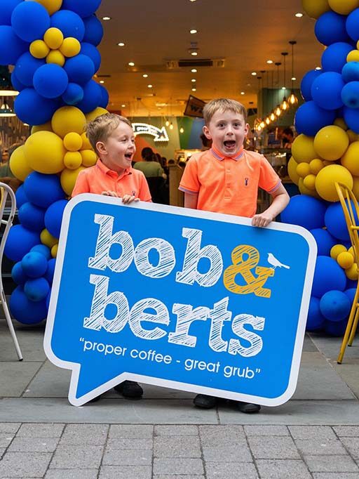
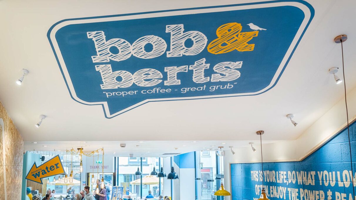
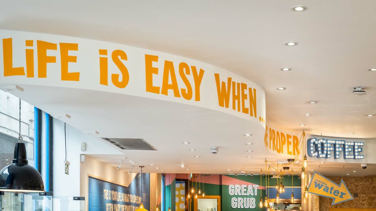
It was this disarming sense of honesty, warmth and positivity that formed the heart of our brand communications. Our communications strategy revolves around the development of ‘chat blocks’ a visual approach which utilises speech bubbles and a conversational tone of voice to reinforce the personal/local aspect of the brand. The brand also defined a commitment to ‘act local’ – supporting local communities and causes, and sourcing ingredients and suppliers from as near as possible to operations.
Once this strategic vision was in place, the challenge was to personify the positive emotional connection that guests had with the brand – feeling uplifted, welcomed, appreciated, rewarded, inspired – into an accessible and versatile range of retail environments.
Interior Design
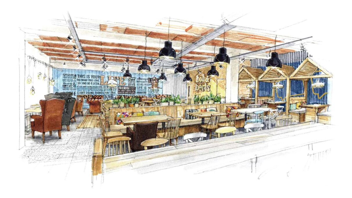
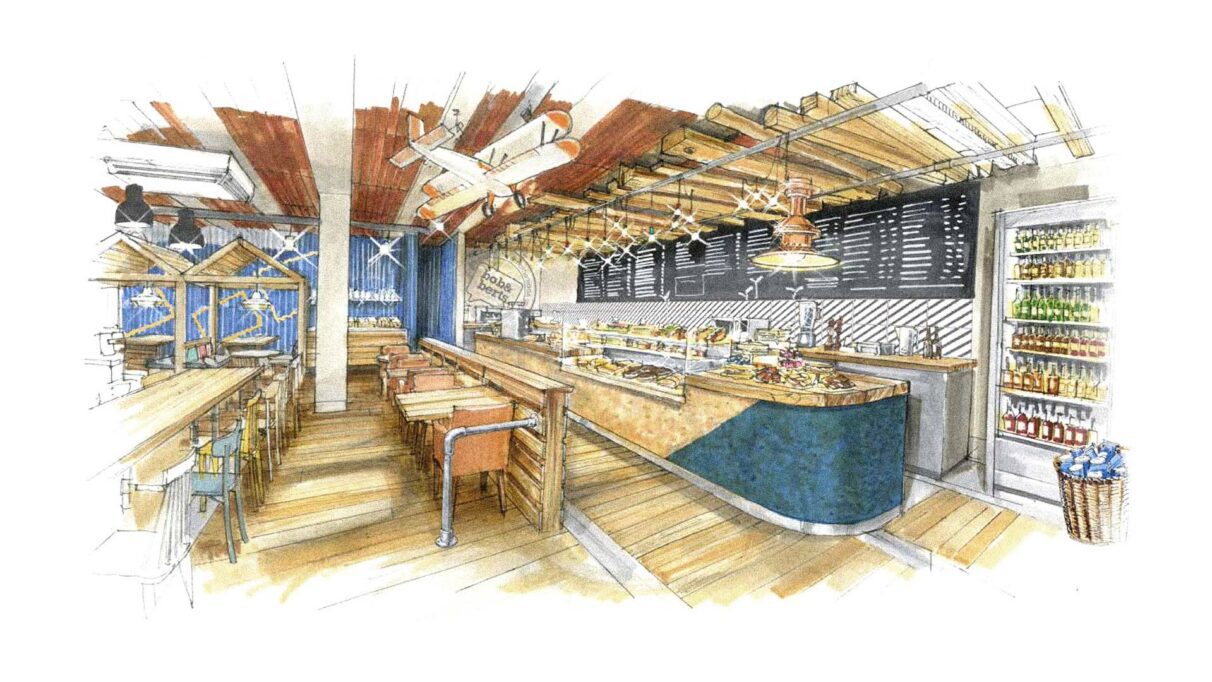
Harrison is a brand-led, full-service agency, so this strategic brand vision formed the backbone of all design decisions across the interior environment.
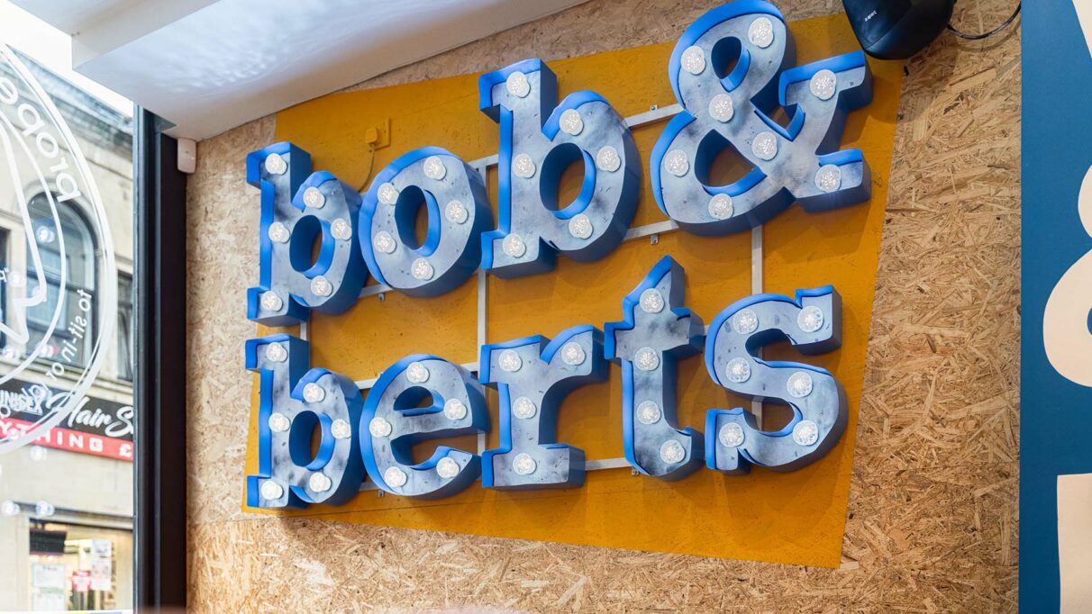
The materials palette is designed to deliver an unpretentious and accessible experience whilst still being underpinned by strong sustainability credentials – utilising recycled timbers and other sustainable materials wherever possible. These natural materials contrast the bold, strikingly positive colour and graphic palette which is designed to deliver instant stand-out in a predictable market sector – meaning high levels of recognition and instantly signifying the difference in the Bob & Berts experience and approach to doing F&B.
Conversational, hand drawn graphic styling on walls and across point-of-sale communications reinforces the chatty aspect of a personal brand that has a close relationship with regular guests.
Implementation
Following approval of Harrison’s prototype store design, the brand is expanding at a rapid pace, with 21 cafés already open across Northern Ireland, Scotland and northern England, and that number set to rise within the next 2 years.
In keeping with its original goals and the strategic vision, the brand has worked hard to promote the concept of #supportlocal. Coffee beans are roasted down the road from their original café, extensive sponsorship of school sports teams near their cafés, and a profit share commitment with many local charities – really giving the sense of a national business that does things differently and practices what it preaches.