Marugame Udon
Strategic Positioning
The secret to a successful full service delivery begins well before the creativity starts in earnest. We worked with all key Toridoll stakeholders in Japan and the UK on a full strategic review and communications roadmap. The goal – to create a brand platform that informed all subsequent creative decision-making in order to achieve a fully integrated brand experience.
Marugame. Delight in the everyday…
For Marugame, this platform was underpinned by the essence of ‘everyday nourishment’ – an ethos combining the sense of a meal that, in Japan, is a daily ritual, with the benefits of it being a healthier, more rewarding, more uplifting guest experience – one which leaves guests feeling re-energised in mind, body and spirit. This ethos was designed to permeate every part of the company’s operations, nourishing staff and the communities in which it operates just as importantly as satisfying guests.
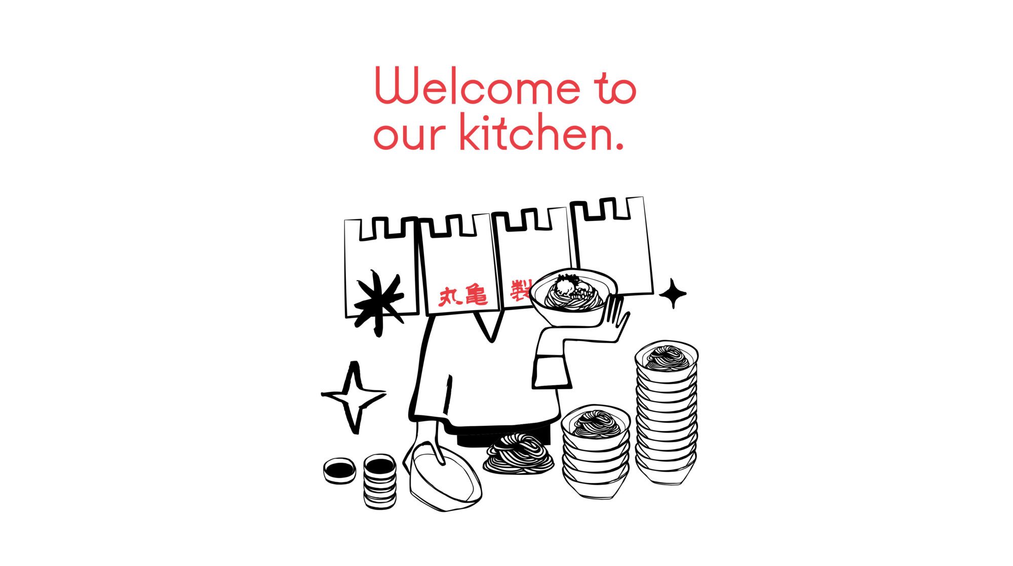
The Marugame Way…
Sharing the simple pleasure of eating this authentic everyday ritual outside Japan became our mission. Visiting udon kitchens is a way of life in Japan and we wanted to recreate the authentic sense of discovery of stumbling into a kitchen in udon’s spiritual home of Kagawa, by inviting guests into the heart of Marugame’s lively kitchen to share this uplifting everyday ritual.
The affordable price point was a springboard to create a brand that was a great leveller – the experience in Japan is a common ground for rich or poor, young or old – the trip to Marugame reminding us all to stop for a moment and focus on the blessings hiding in everyday life.
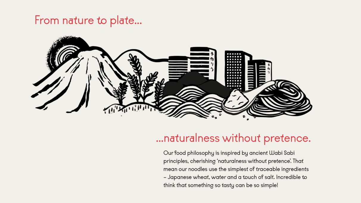
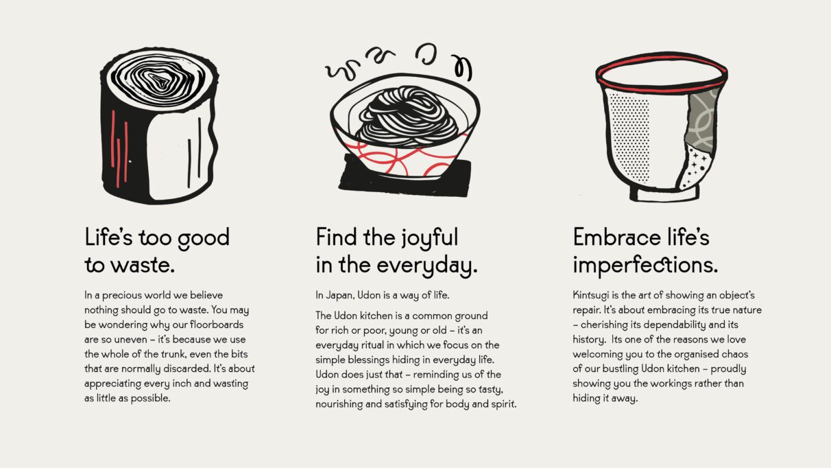
The menu is also guided by finding delight in the everyday, a concept inspired by Shizen, an element of Wabi Sabi philosophy – meaning ‘naturalness without pretence’. It’s driven by a belief in keeping everything simple, honest and good for all. In other words – in life, the simple things can be the most rewarding.
“Working with an international brand where different cultural sensibilities are at play can be a real challenge. The whole Marugame team were incredibly impressed with the level of strategic depth that the Harrison team covered – which meant not only did they truly understood how best to bring the brand to life in Europe – but did so whilst staying true the company’s foundations and taking the founding stakeholders on the journey with them.”
— Keith Bird, CEO, Marugame Europe
Brand Development
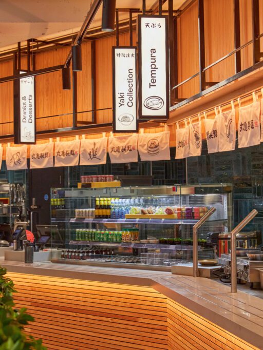
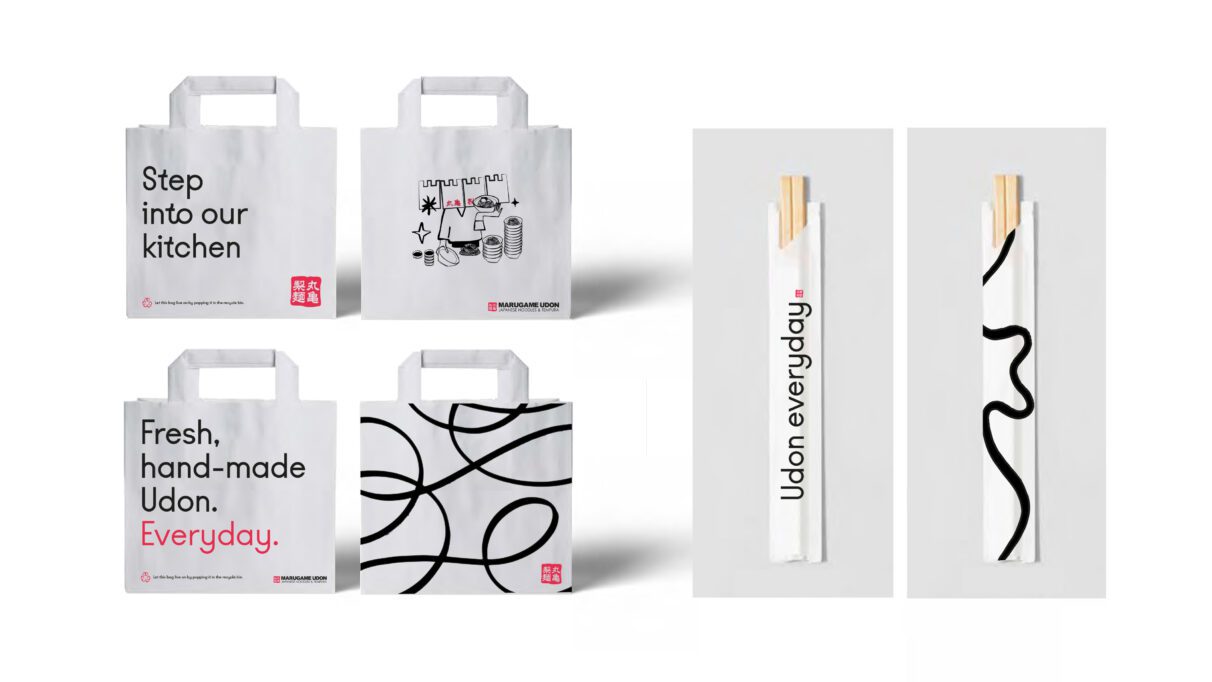
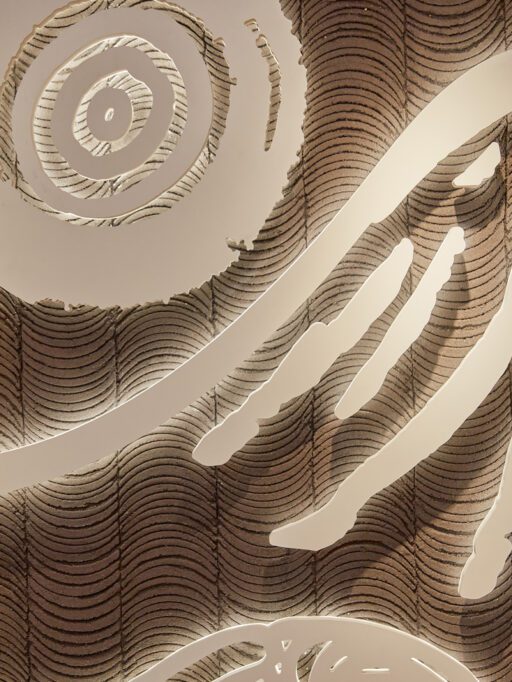
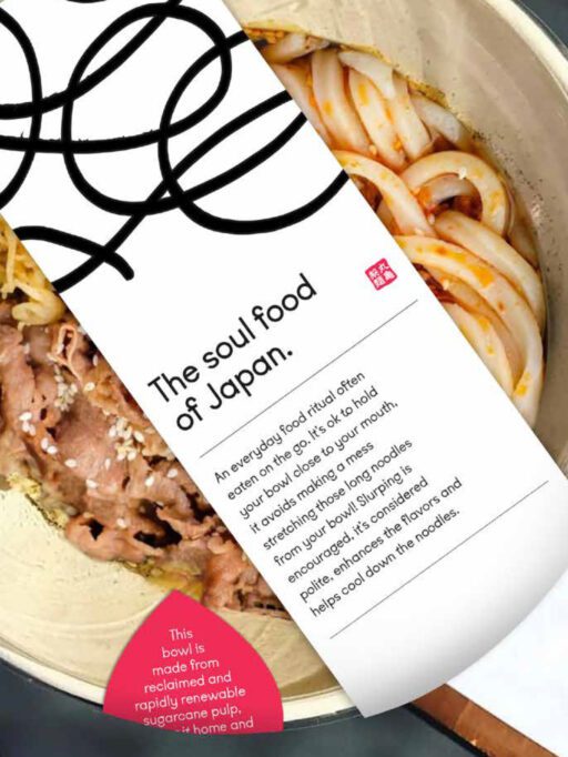
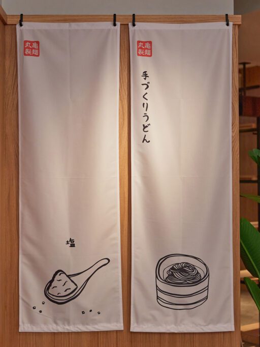
As part of a full review, we assessed existing brand assets against this refocused European brand philosophy, and it became clear that there were opportunities to achieve much greater standout in a market burgeoning with undifferentiated Asian options. This meant creating a new palette of assets that better communicated Marugame’s unique approach, and led to a full refresh of all elements – from colour usage and typography, through to physical implementation in signage and packaging. During this process we developed a full series of illustrations reinforcing the sense of an ‘authentic everyday ritual for all’ and the food philosophy of ‘naturalness without pretence’ and brought to life the brand’s philosophy through storytelling that could be subtly introduced during the customer journey – from tray designs to customer feedback postcards.
Interior Design
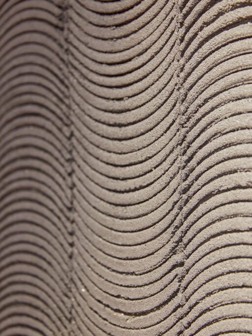
Development of the environment was bound into elements of the traditional ‘Wabi Sabi’ philosophy mentioned earlier. It’s a different way of seeing the world that values honesty, truth and simplicity – where joy is found in an everyday object’s true nature. It’s about embracing, even highlighting a tea cup’s cracks and repairs, cherishing its age, its dependability, its heritage. An example is the use of unevenly shaped timber for flooring, which uses the discarded offcuts from the timber industry – reminding guests of the tree’s true, imperfect form rather than the machined precision of the common floorboard.
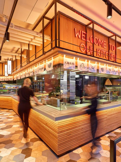
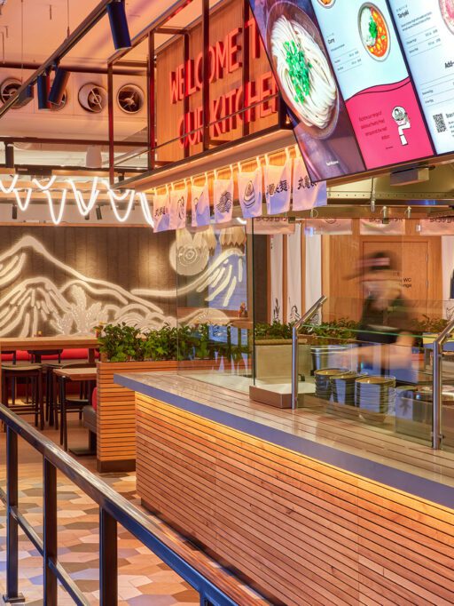
That sense of honesty is also why Marugame’s bustling kitchen is centre stage. Wabi Sabi embraces revealing the workings of an object, and the beauty in its imperfection. We wanted to share the skill, the hard work the craft in the freshly cut noodles amidst the steam and the bubbling pots. Just like in Japan – you will be greeted by the sound, sights, smell – the organised chaos of busy noodle making!
We further reinforced the Wabi Sabi philosophy with a number of design principles to bring the brand to life in our prototype store:-
Hardworking – Kitchen is the focus and the first point of contact with the guest. Craftsmanship in detailing.
Down to earth – Simple and intuitive customer journey. Natural material palette and focus on sustainability.
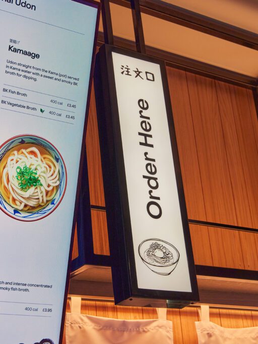
Inclusive – Clear and simple wayfinding. Flexible seating arrangement and sharing tables.
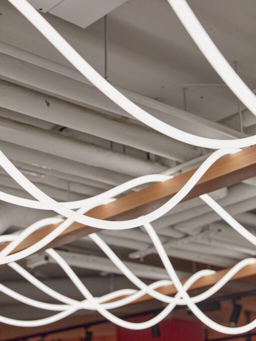
Lively – Quirky, dynamic feature lighting. Clear view to whole ‘theatre’ cookline. Embracing ‘organised chaos’
Humble – Details inspired by local joinery techniques. Simple and uncluttered. Displaying authentic, everyday ingredients.
Genuine – Original Japanese-sourced product displays. Details inspired by Japanese architecture and artistry.
We translated this into a more European focused, modern environment which was welcoming, authentic providing a solution that offered choice and intrigue.
“Harrison really understand how to bring genuine personality to a brand. I’m impressed with the way they weave coherent strategic narrative and storytelling through every element of the creative design process. Their work with the Marugame brand has created a really strong, coherent platform from which to launch the brand across the continent.
— Hilary Ansell, Head of Marketing, Marugame Europe
Implementation
The queues that have famously become a signifier of the excitement around the Marugame brand globally, arrived in the UK capital in August 2021, with the opening of the inaugural European outlet in Middlesex Street, London. The glowing reviews, including one from fearsome UK critic, Grace Dent, show that the brand philosophy is winning over minds and palates. The corner site makes the most of its extended frontage utilising screens with specially commissioned digital art from some of the Japanese diaspora’s emerging creative talents. Noodle shaped neon lighting, which references the drying fresh noodle dough, hangs from the ceiling, and the kitchen is truly centre stage – with fresh noodle preparation and bubbling pots adding to the theatre – a performance which is then relayed to digital screens outside the store to build the excitement in the queue.
Hot on its heals, the site is to be followed by three additional outlets by the end of the year, and initial results are excellent, with sales and loyalty scheme membership far outstripping initial forecasts. The brand plans a number of new openings in the months to come.