Skip to content
Pho 24
AUS
Pho24

A new chapter for Pho24 — humble origins, bold future

ClientViet Thai International
Studio team Melbourne, AUS
SizeVaries
Pho24 is more than just a quick bowl of noodles, it’s a symbol of Vietnamese culture, comfort, and connection.
pho 24 Branding.

A snapshot of Pho24’s comprehensive design manual, showcasing visual identity elements, brand colour palettes, materials, signage, and custom furniture specifications—designed to guide consistent global rollout.

When Viet Thai International acquired the brand with ambitions for global franchise growth, they turned to Harrison to reimagine what Pho24 could look and feel like on the world stage.

Our challenge was to preserve the soul of Pho while evolving the brand into something fresh, modern, and globally relevant. We saw Pho not just as a dish, but as a cultural touchpoint. Vietnam’s equivalent of sushi in Japan. Humble, beloved, and deeply rooted.

With that in mind, we crafted a design language that honoured its simplicity while expressing a contemporary Vietnam. Vibrant, confident, and ever-evolving. The result? A space that feels both familiar and elevated. It welcomes newcomers while staying true to its origins. It’s where the past meets the future one bowl at a time.

Key Features

Pho24’s illuminated blade sign features its signature steaming bowl icon, reinforcing brand recognition through a simple, modern graphic visible day and night in urban settings.
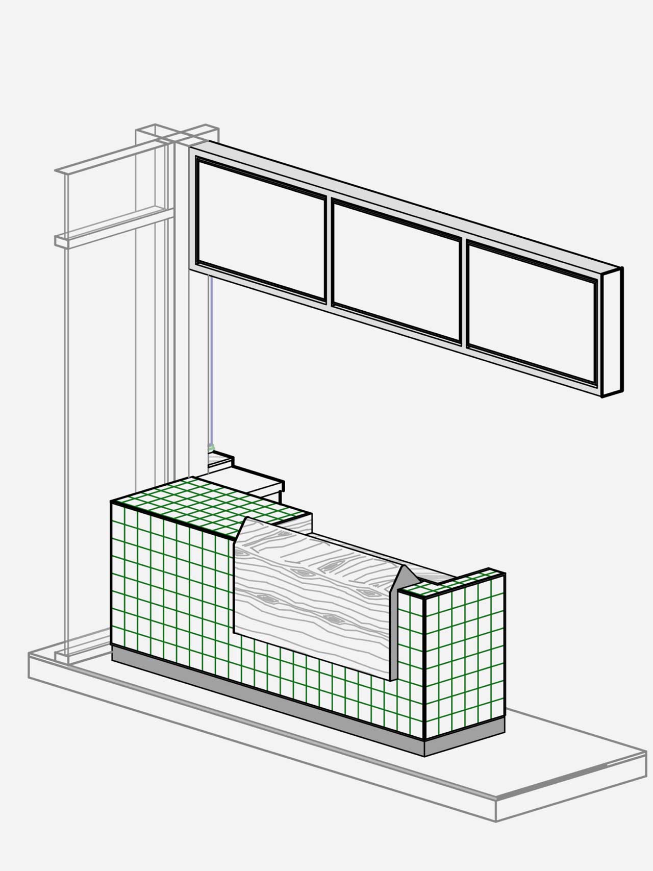
Illustrated counter design concept for Pho24, showing signature material combinations of green tile and timber grain. A key modular feature in the brand’s scalable store formats.
New Pho24 logo design showcasing bold Vietnamese-inspired typography and a flame icon. Reinforces brand personality, quick service, and authentic pho culture.
Pho24 logo icon featuring a flame and bowl motif in a green circle. Represents fast, flavourful Vietnamese pho with a clean, modern identity.
Alternate Pho24 logo icon with lime green graphic on dark green background. Highlights the Vietnamese noodle chain’s fresh, vibrant, and modern branding.
Pho24 visual identity pattern featuring herbs, spices, and produce in textured overlays with lime, sprout, and basil tones. A bold, sensory brand expression rooted in Vietnamese flavour.
Exterior of Pho24 restaurant in Vietnam showcasing the refreshed brand identity with vivid green signage, branded umbrellas, and street-side appeal. A standout look for Vietnam’s beloved phở chain.
interior of Pho24 restaurant showcasing a clean, contemporary design with warm textures, greenery, and Vietnamese branding. Designed to elevate the fast-casual dining experience in Vietnam.
pho 24 Branding.
pho 24 Branding.
pho 24 Branding.
pho 24 Branding.
pho 24 Branding.
pho 24 Branding.
pho 24 Branding.

Pho24 is a space that feels globally fresh, while retaining the warmth and soul of tradition serving up authentic flavours of Vietnam to the world.

Simon Reeves Snr Designer at Harrison
pho 24 Branding.

Pho24 restaurant interior corridor with arched passageway, minimalist WC signage, terrazzo-style floors, and a serene palette of cream, green, and timber. A modern pho dining brand rooted in Vietnamese simplicity.

pho 24 Branding.

Interior shot of Pho24 restaurant showing framed green-toned botanical prints, light timber wainscoting, and minimalist tables and stools. A warm, modern pho dining space inspired by nature and Vietnamese simplicity.

pho 24 Branding.

Let’s create something unforgettable

Fuelled by knowledge and imagination, we are driven by our ambition to evolve hospitality brands. 
Close

Questions, Projects, Ideas? Let’s Talk.