

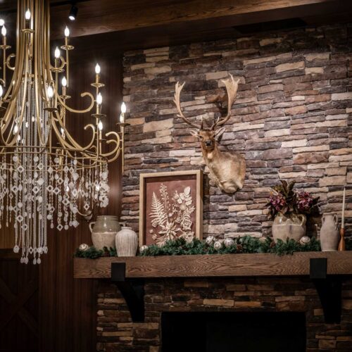
A new destination takes shape
Built to inspire, designed to evolve
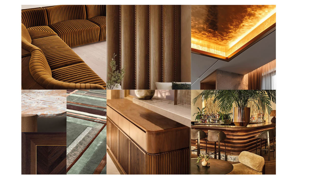
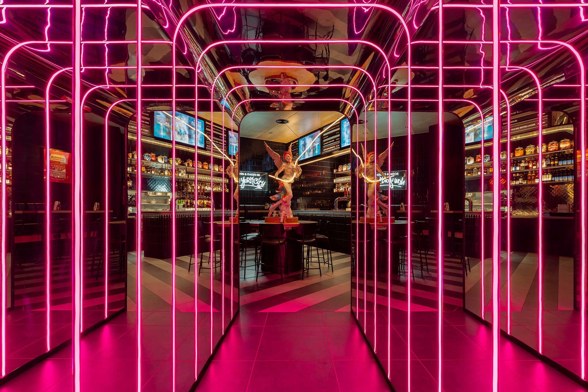
Glowing with refinement immersing you in time and space.
Clarity from complexity
With multiple stakeholders and a fluid offer, we stepped in as guides and visionaries—workshopping and managing the process, uniting teams, aligning ambition, and shaping a singular brand vision. Our process combined creative imagination with commercial rigour. Every decision was intentional. Every element, considered. Because shaping great design isn’t just about making things look good—it’s about making them work hard, move people, and stand the test of time.
Strategy meets storytelling
With brand and offer defined, we brought our creative ambition to life. Every zone was planned with performance and purpose. The designs weren’t just functional—they were transformative. Our team challenged convention at every stage, delivering beyond expected norms to craft a hospitality experience that felt seamless and extraordinary.

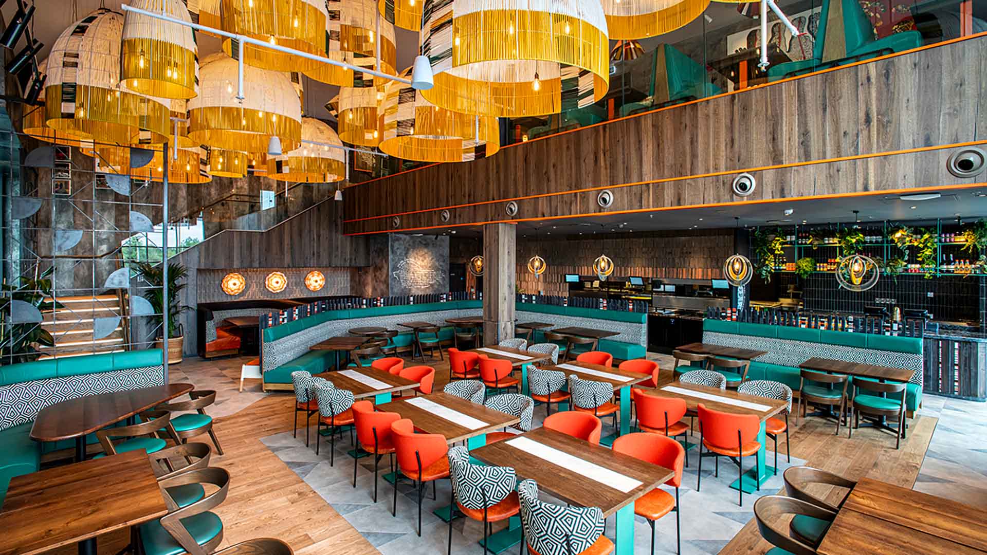
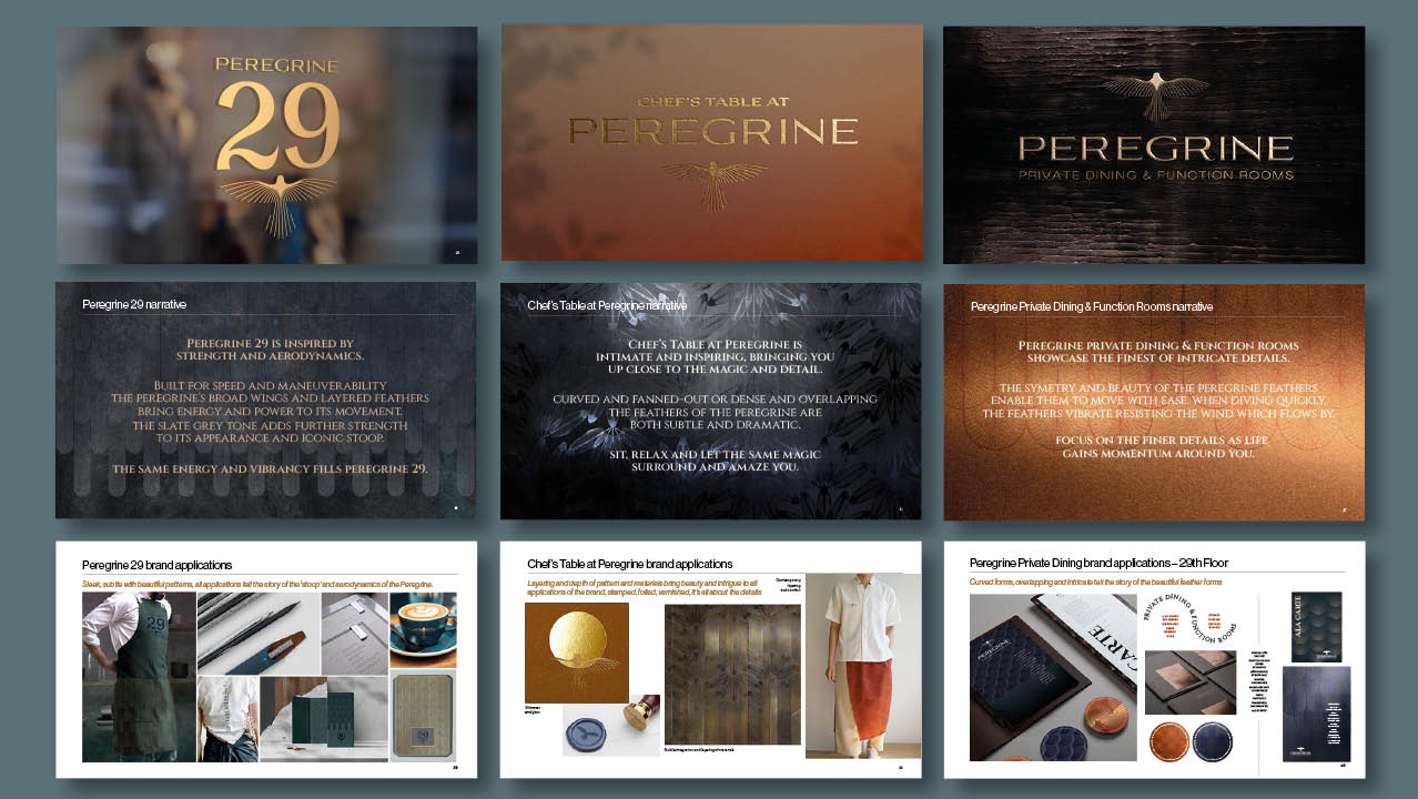
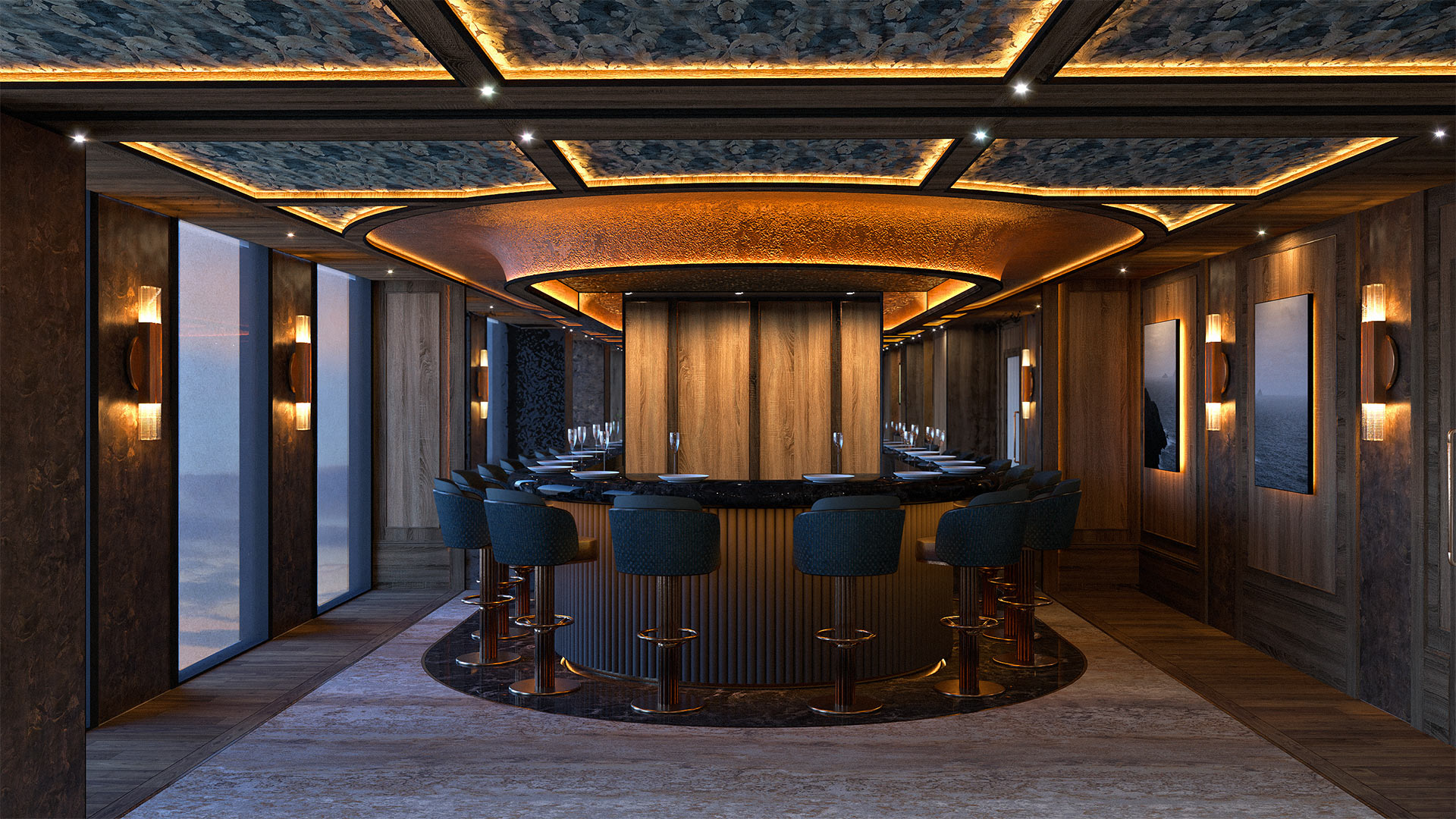
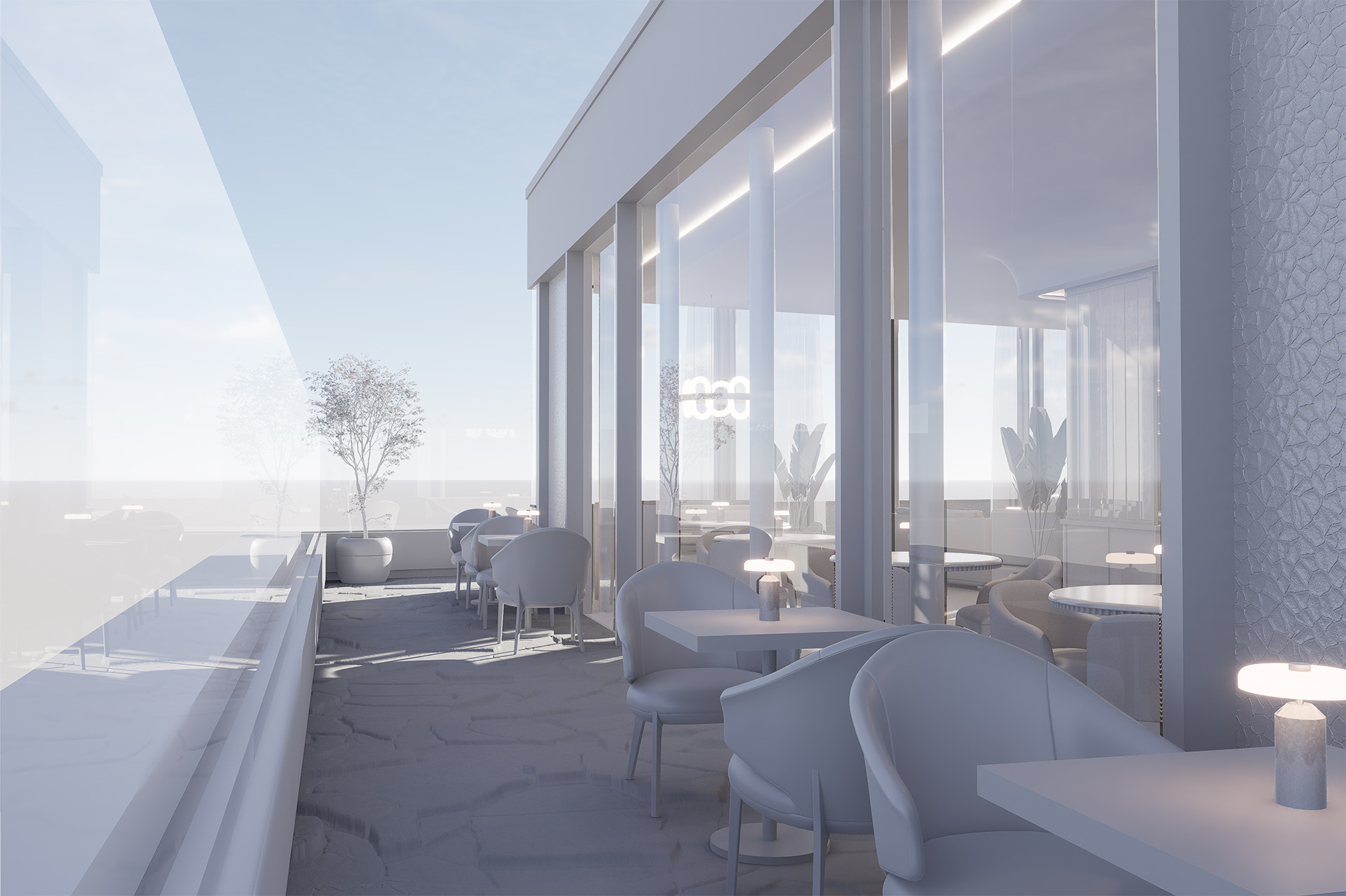
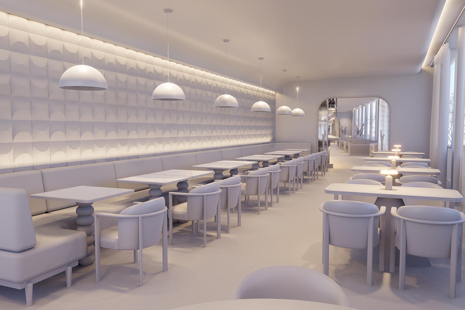
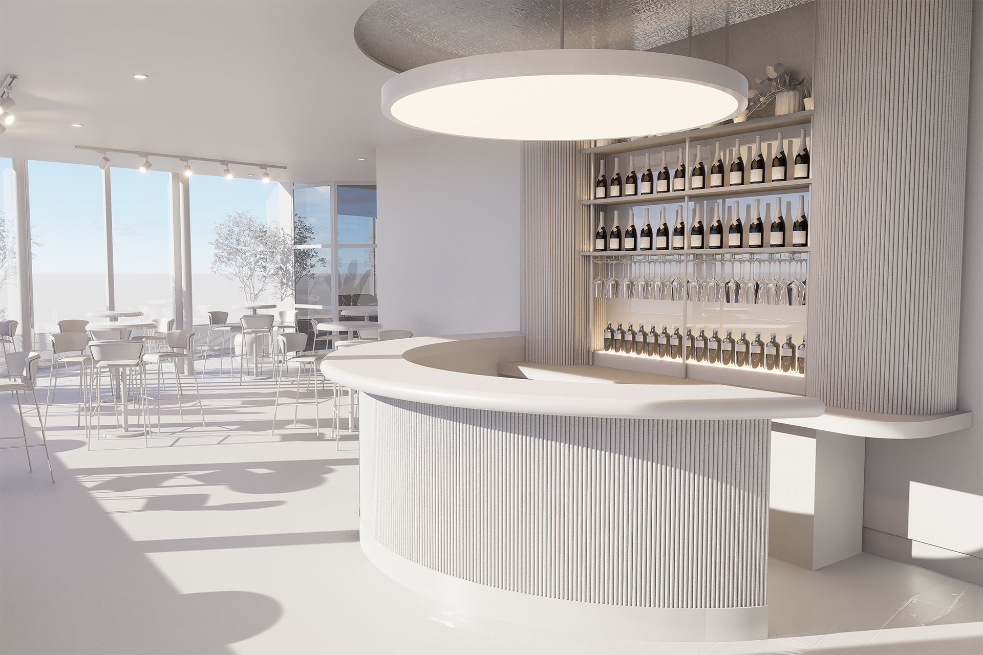
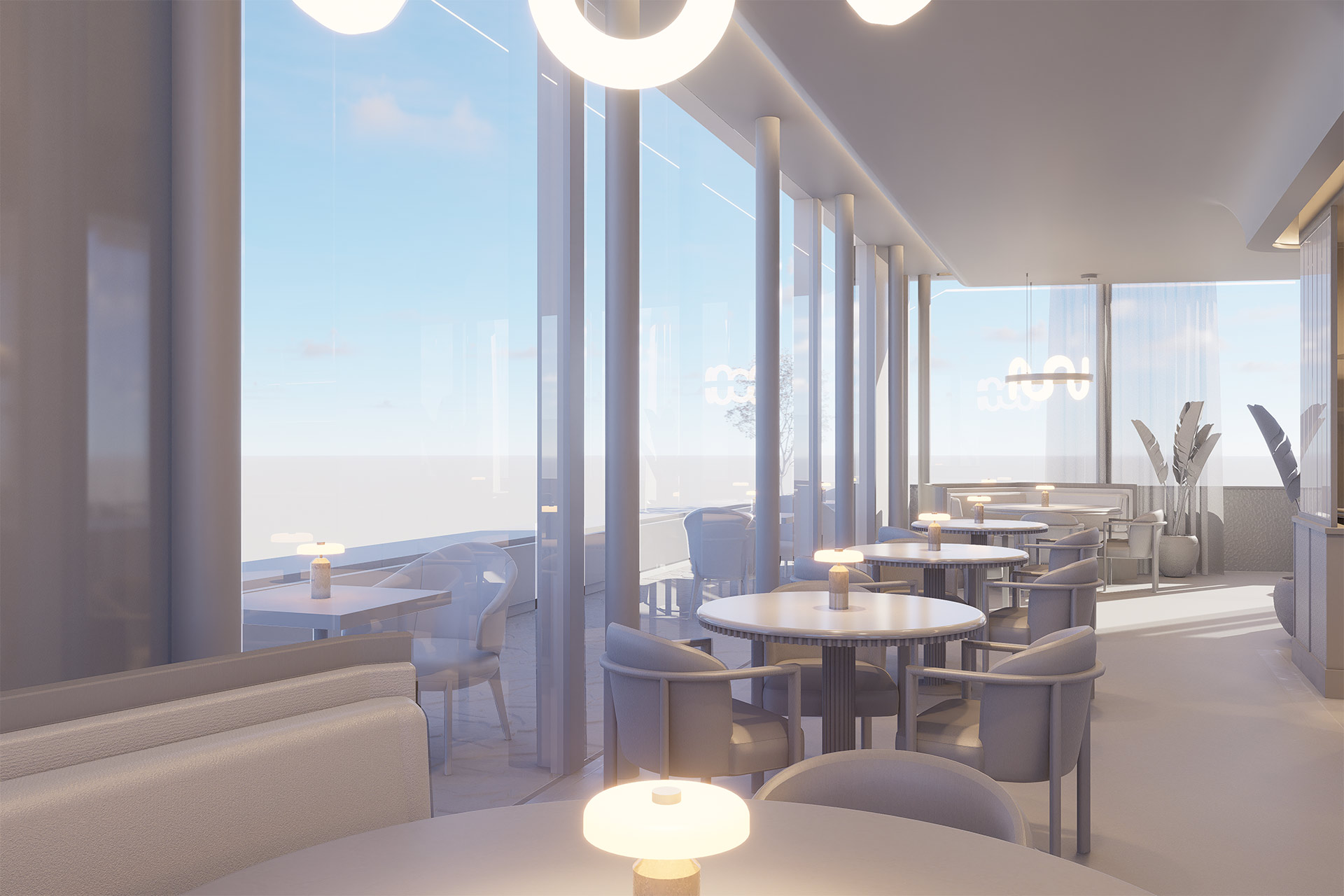
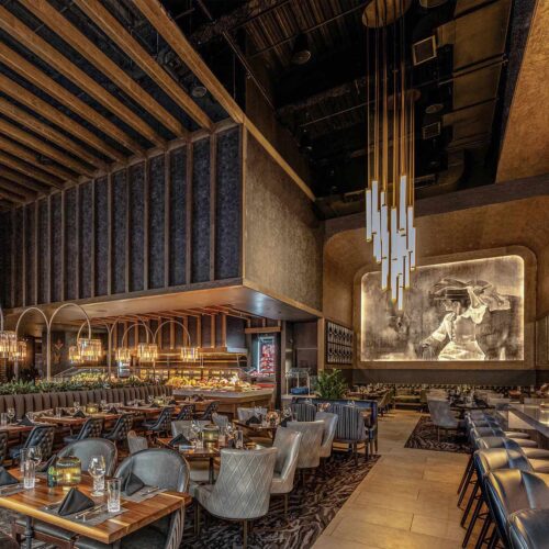
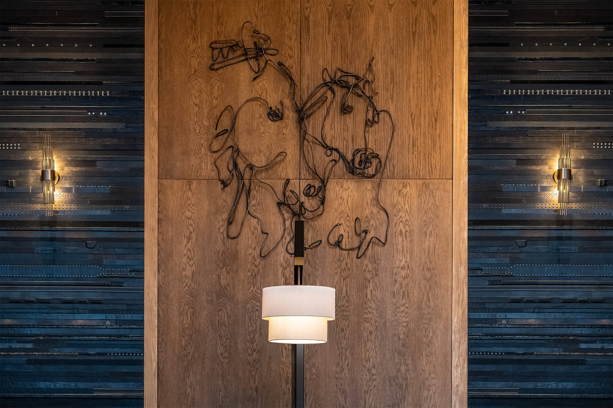
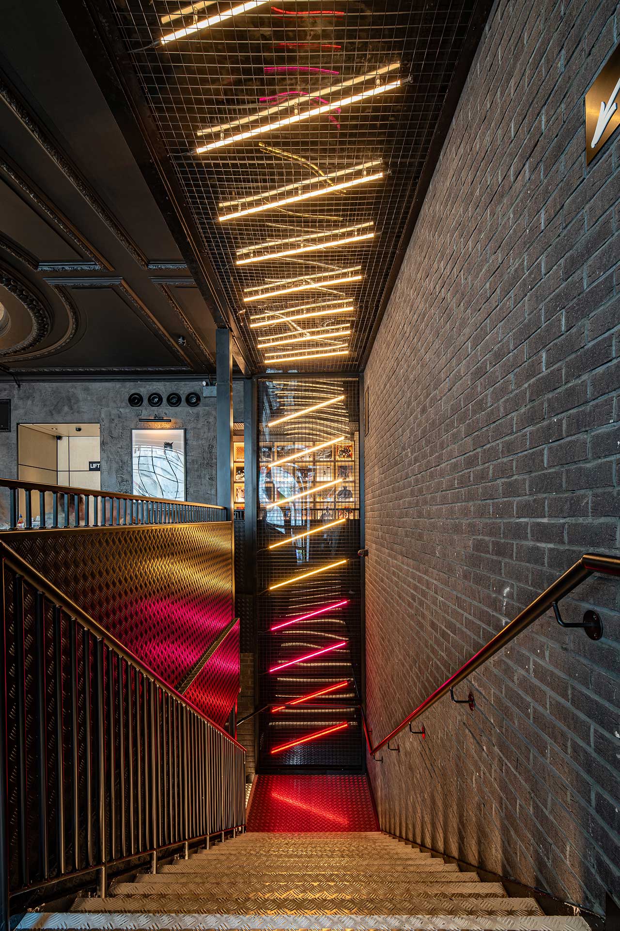
Peregrine takes flight
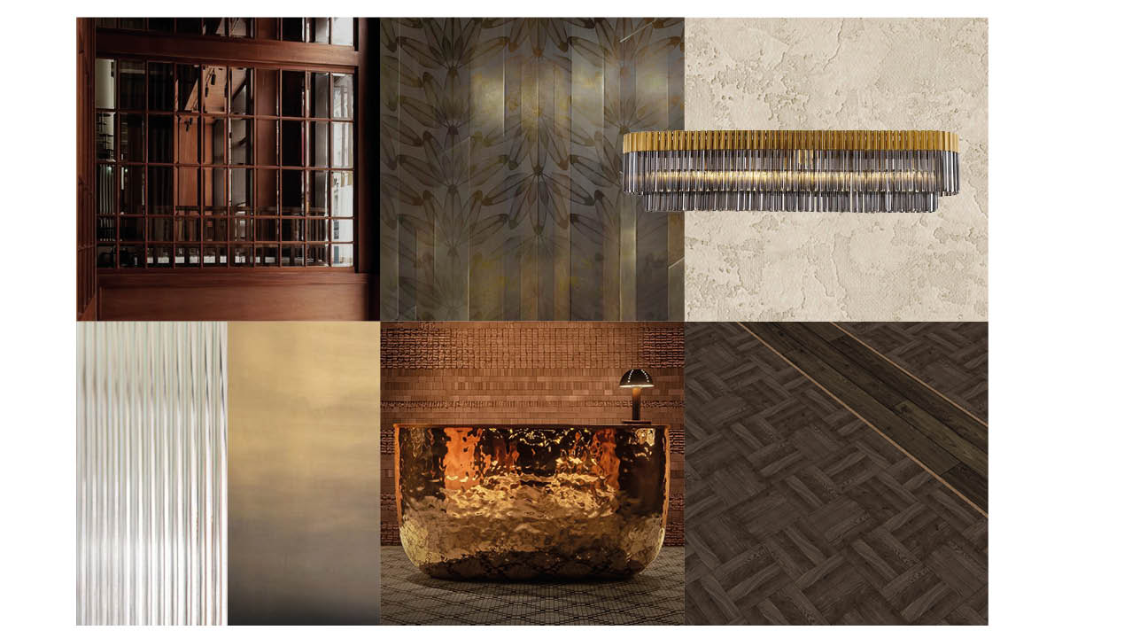
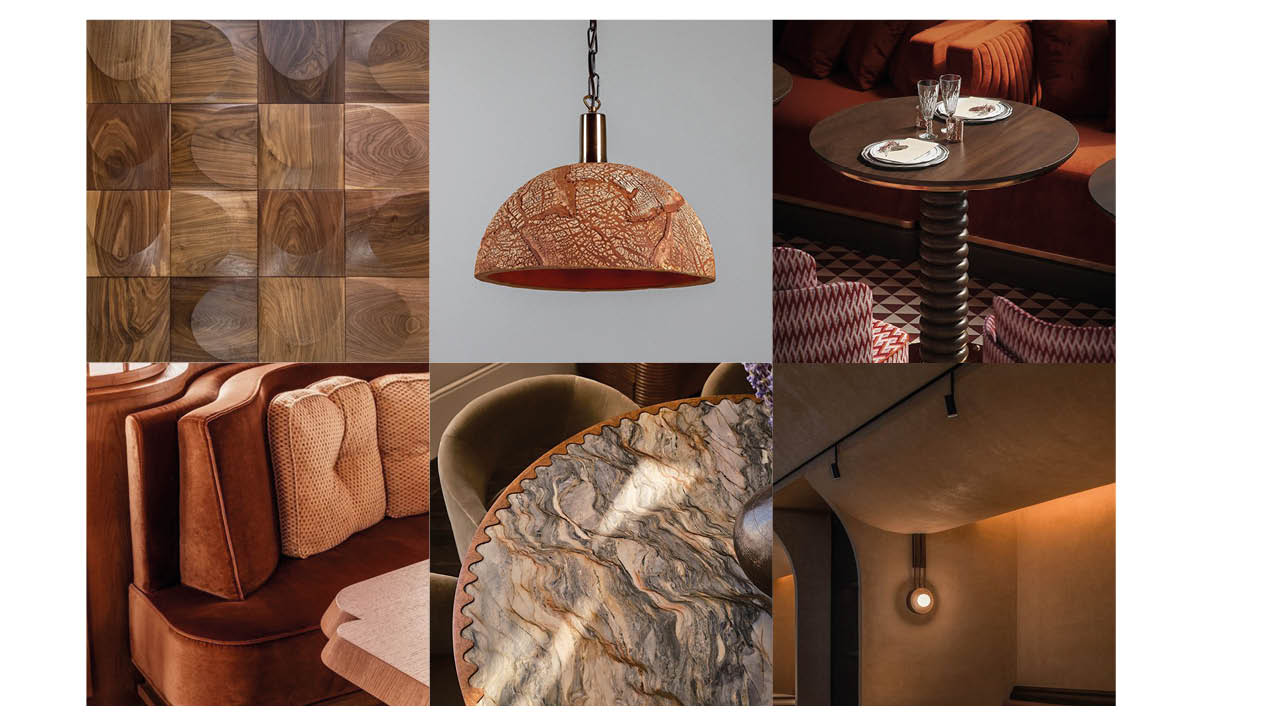
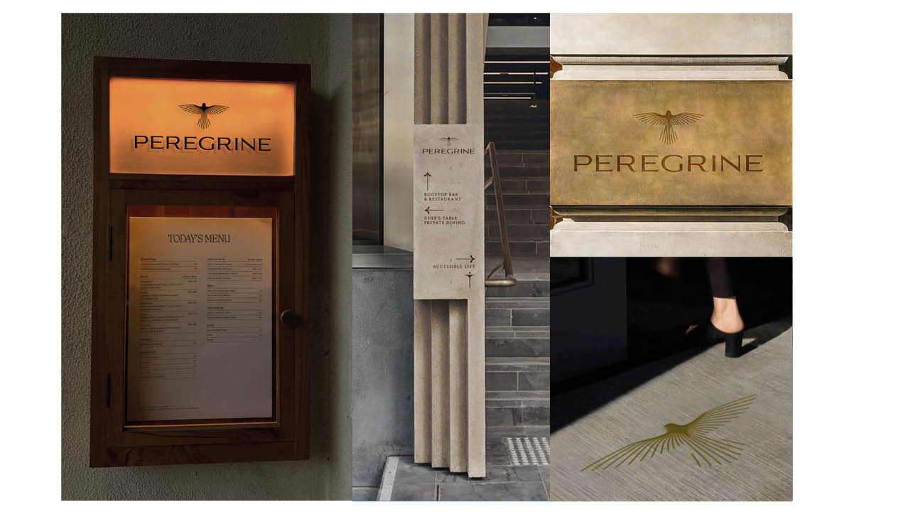
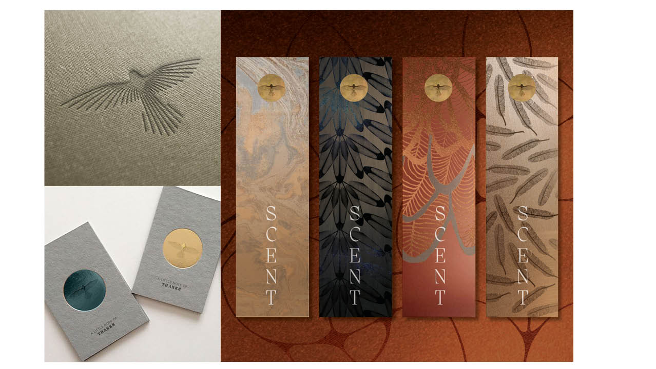
We named the brand Peregrine, inspired by the world’s fastest bird—an enduring symbol of power, elegance and mystique. The brand narrative of the peregrine guided every design detail, from soaring spatial gestures to intricate material layers. We embedded the brand’s spirit into every moment, turning architecture, wayfinding and ambience into storytelling in motion.
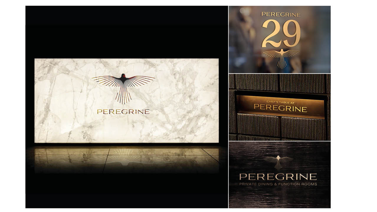
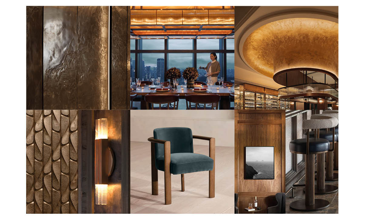
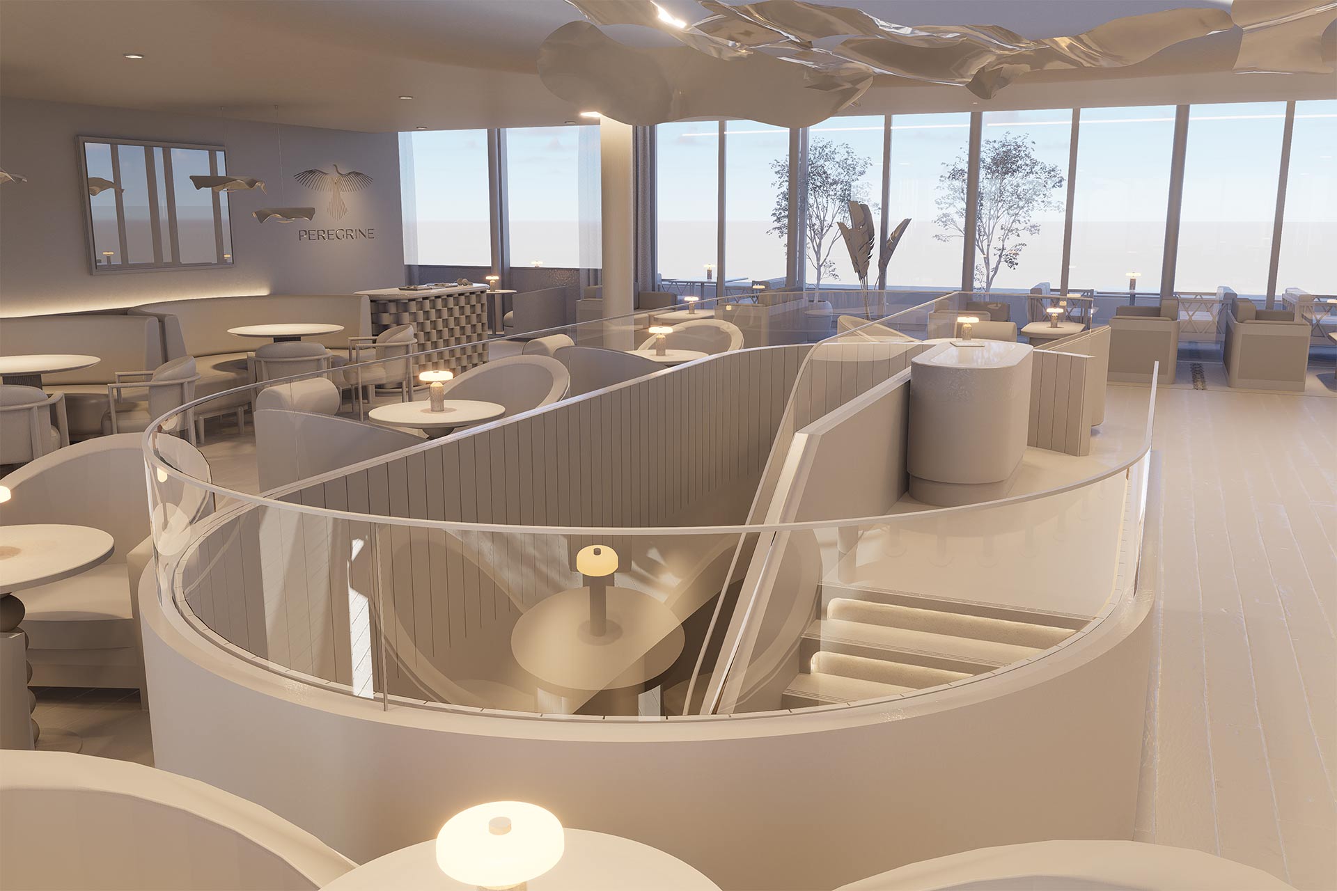
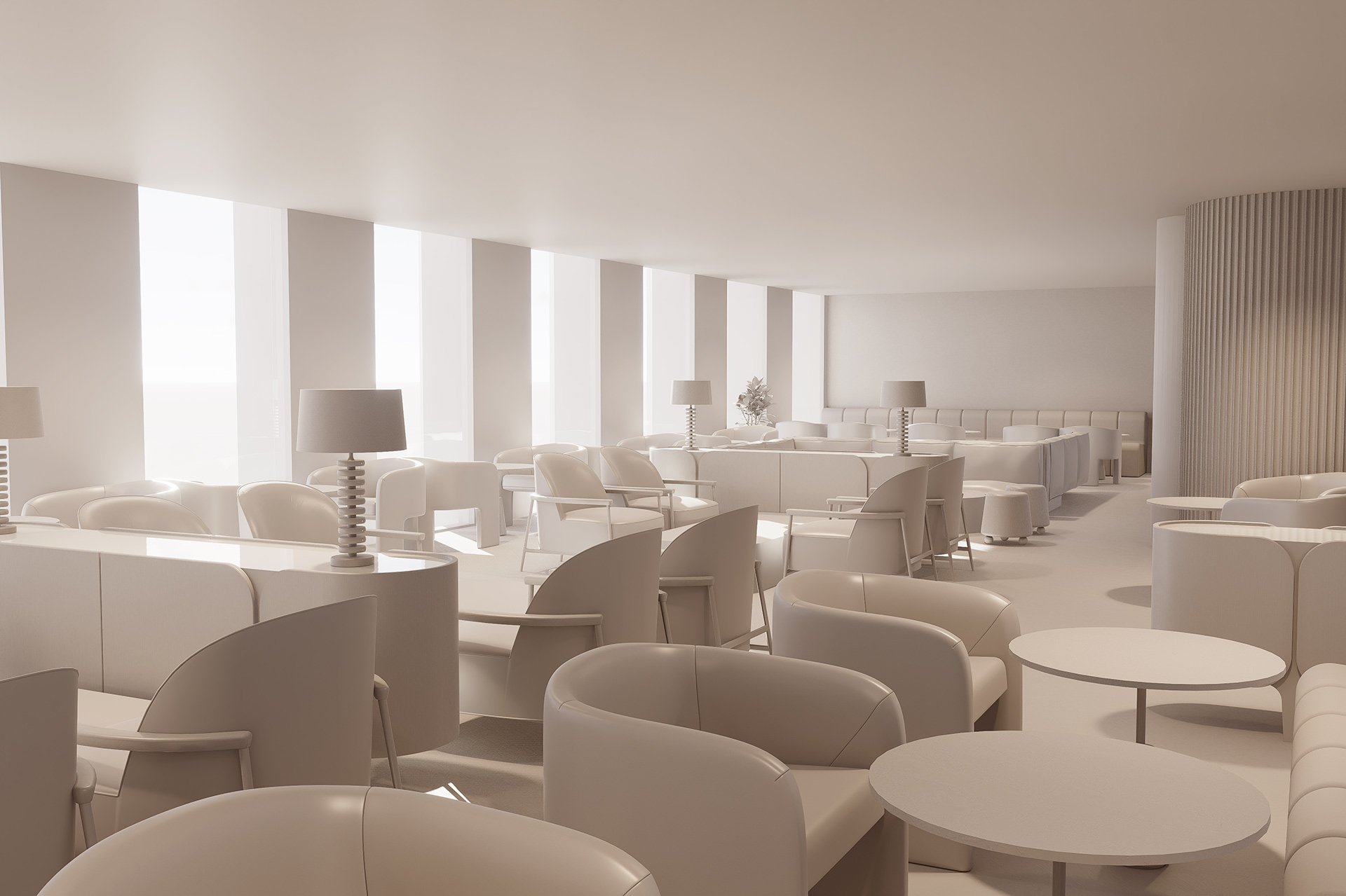
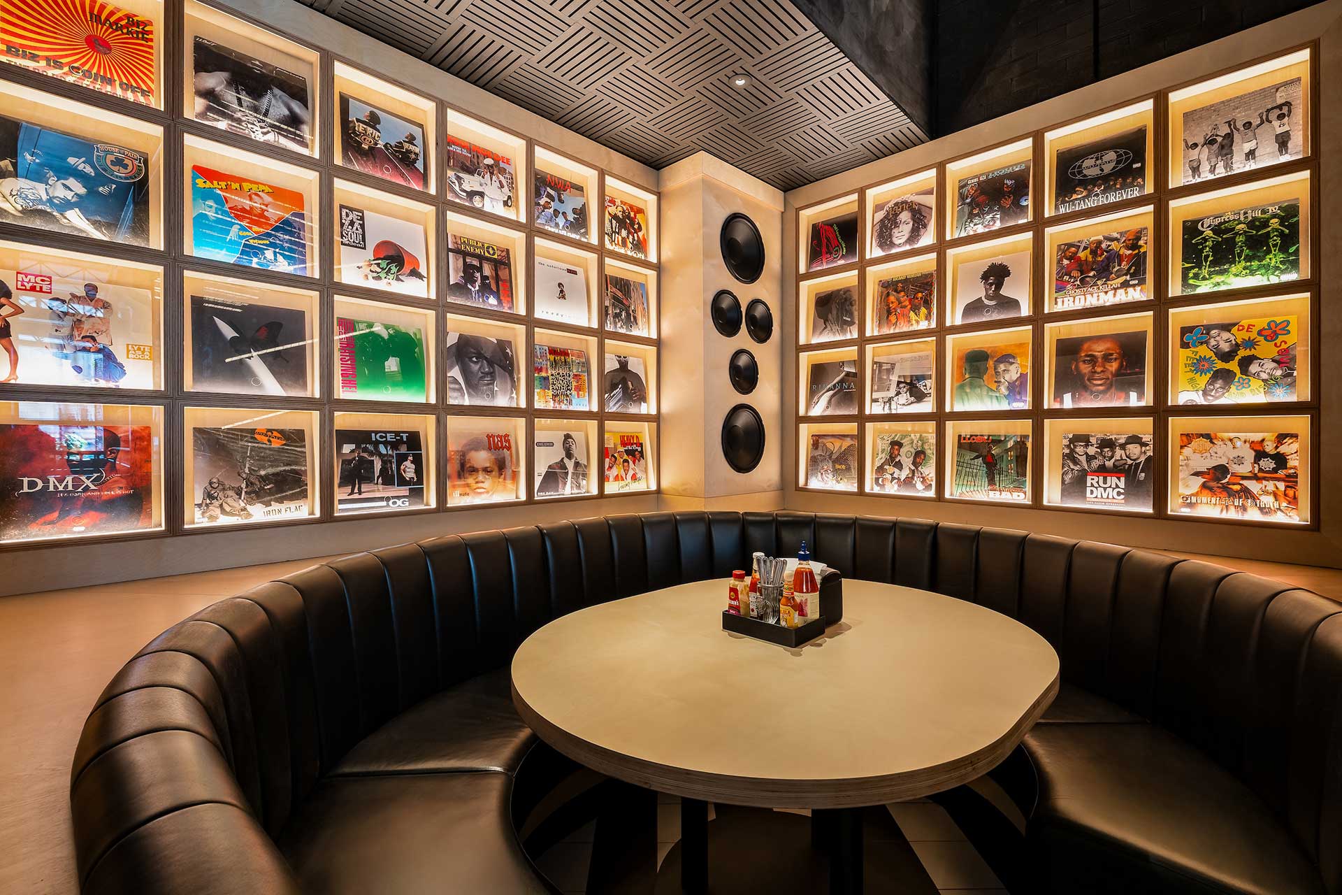
A living, breathing brand
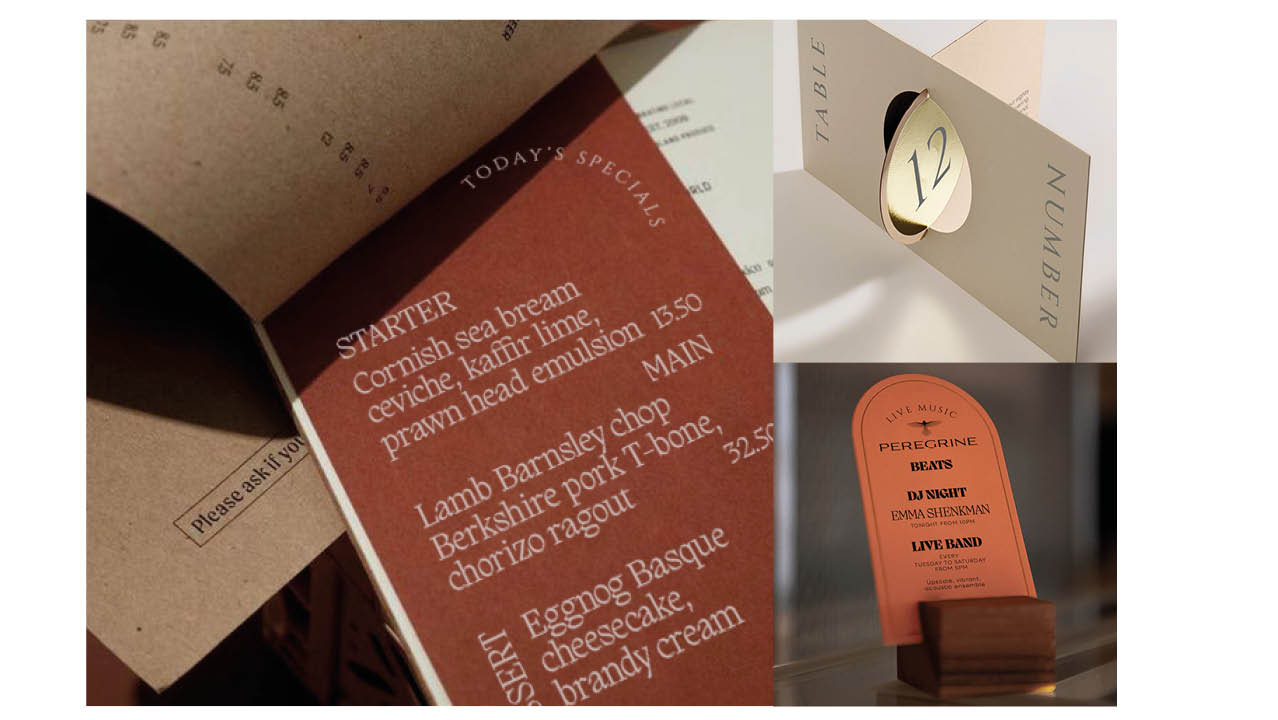
From internal pathways to external identity, every element of Peregrine speaks in one voice. Our design decisions carry purpose: uniforms echo movement, signage reflects nesting and feather forms, and materials change with light—mirroring the bird’s grace in flight. Sometimes bold, sometimes subtle, always intentional.
The brand became the space. The space became the experience. And the guest, always at the centre, feels the magic in every interaction—whether pausing for reflection, sharing a meal, or celebrating on the rooftop, high above the city.
Shaping a new classic
From ground-floor café to skyline dining, Peregrine is designed to surprise, inspire, and perform—at every level. For us, it’s a masterclass in hospitality strategy: weaving narrative into place, and place into memory. A timeless experience, grounded in purpose and elevated by imagination.
With a project of this scale and so many stakeholders, we naturally embraced our role as creators, advisors, and designers. From the refined identity to the imaginative, detail-rich spaces, we’re incredibly proud of what we achieved with Peregrine. It’s a standout example of how Harrison blends strategic thinking with bold, empathetic hospitality design. The result is a layered, theatrical experience driven by passion, creativity, and purpose.
Iconic, timeless and memorable interior design at every turn.

Project snapshot
Related projects

Let’s create something unforgettable
Fuelled by knowledge and imagination, we are driven by our ambition to evolve hospitality brands.
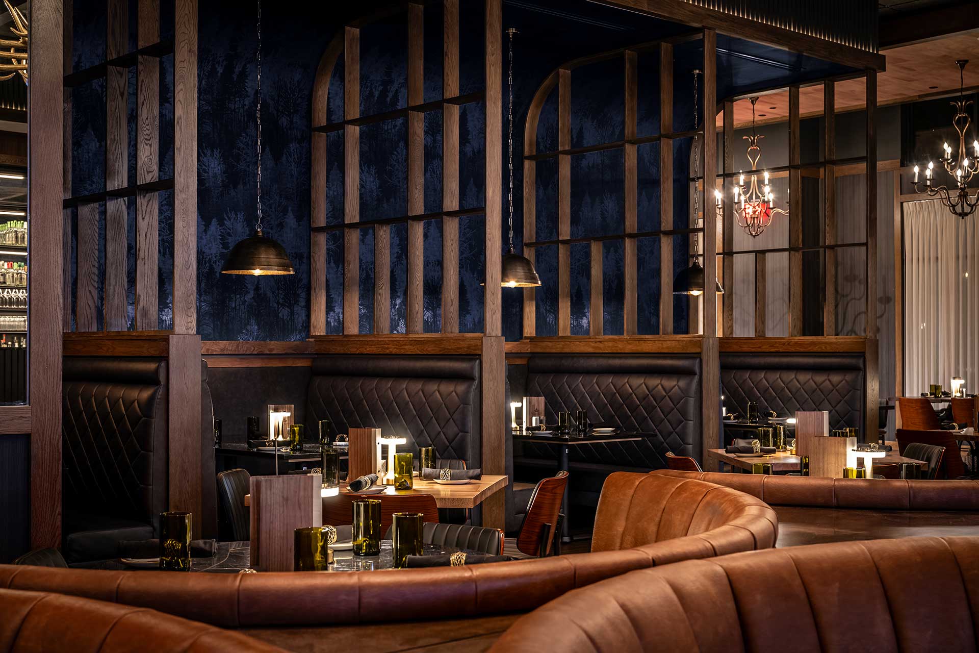
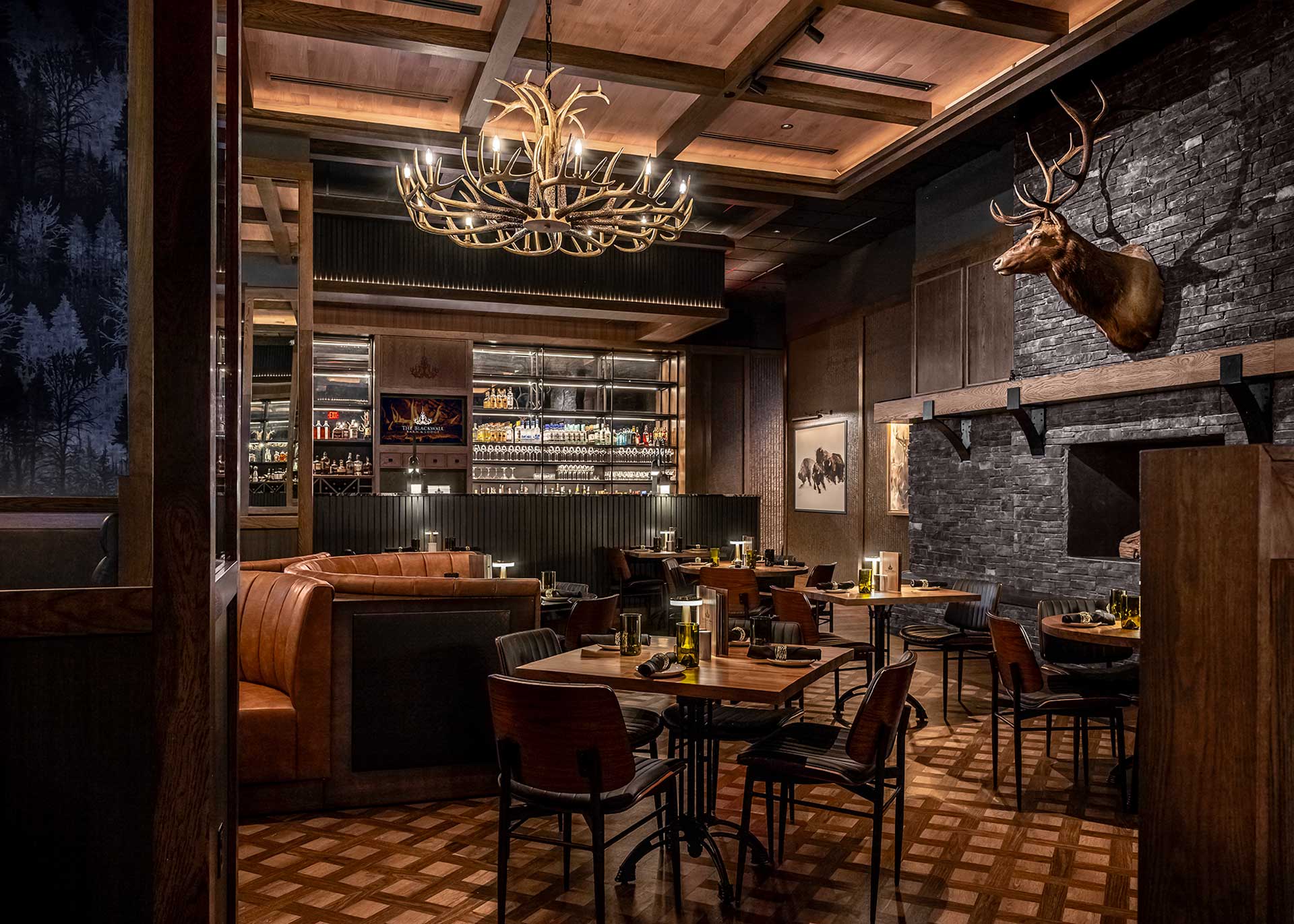
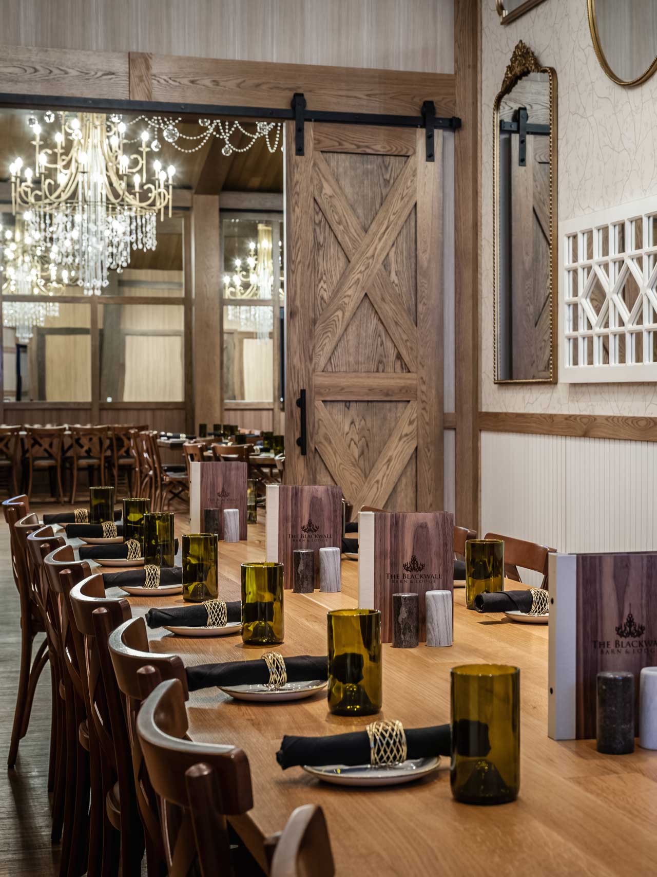
Once a static corner, the façade design now glows with life, transformed by a sculpted canopy, a custom screen inspired by gaucho craftsmanship, and a clear view into the warmly lit interior design. Gas lanterns flicker at the entry, greenery softens the edges, and new patio canopies extend a quiet invitation: come in, linger, and be transported by thoughtful restaurant design.
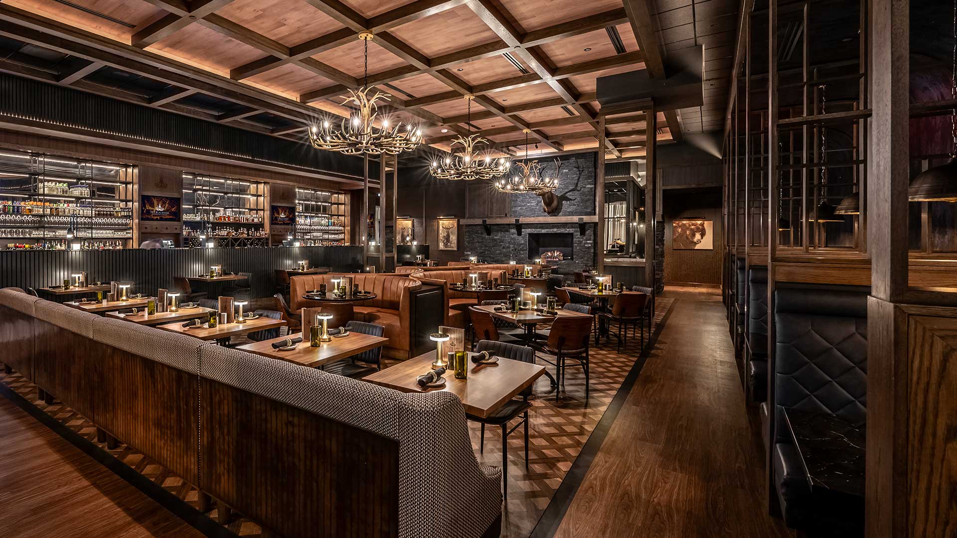
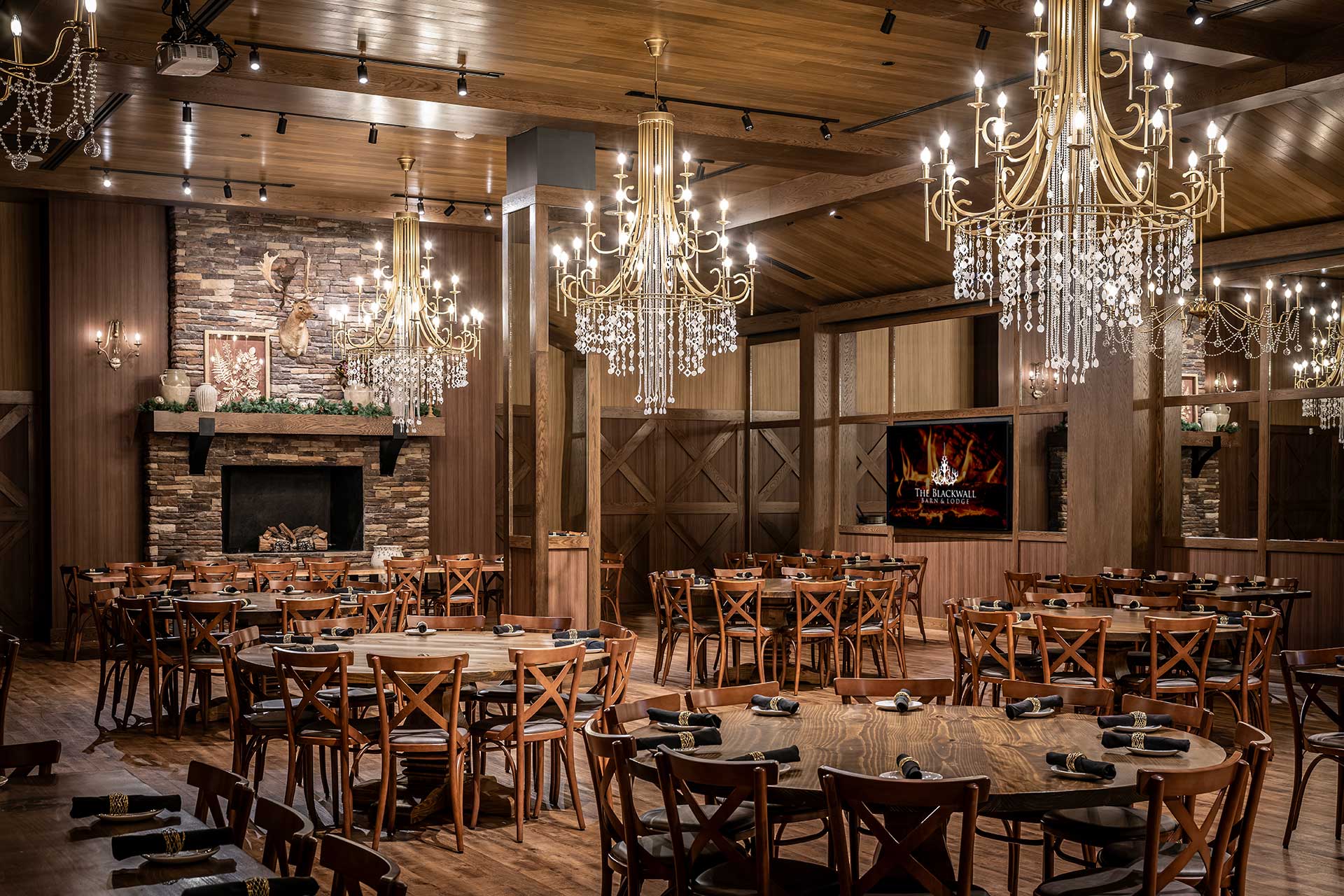
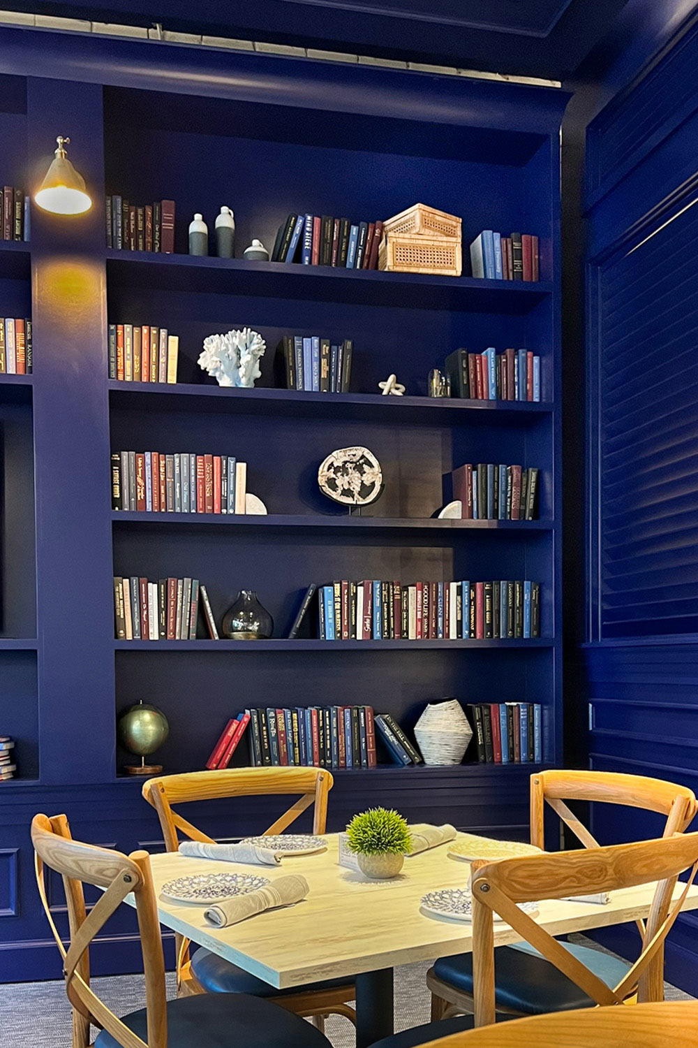
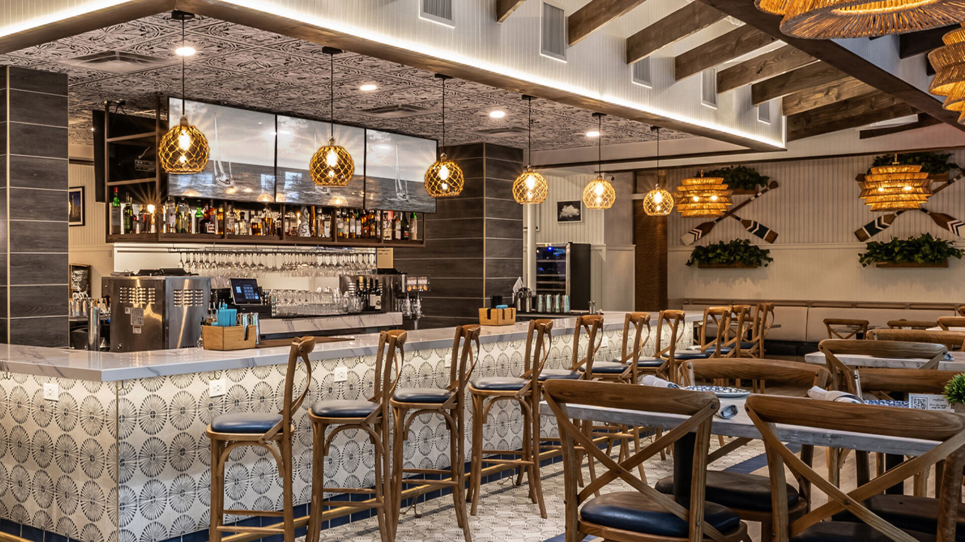
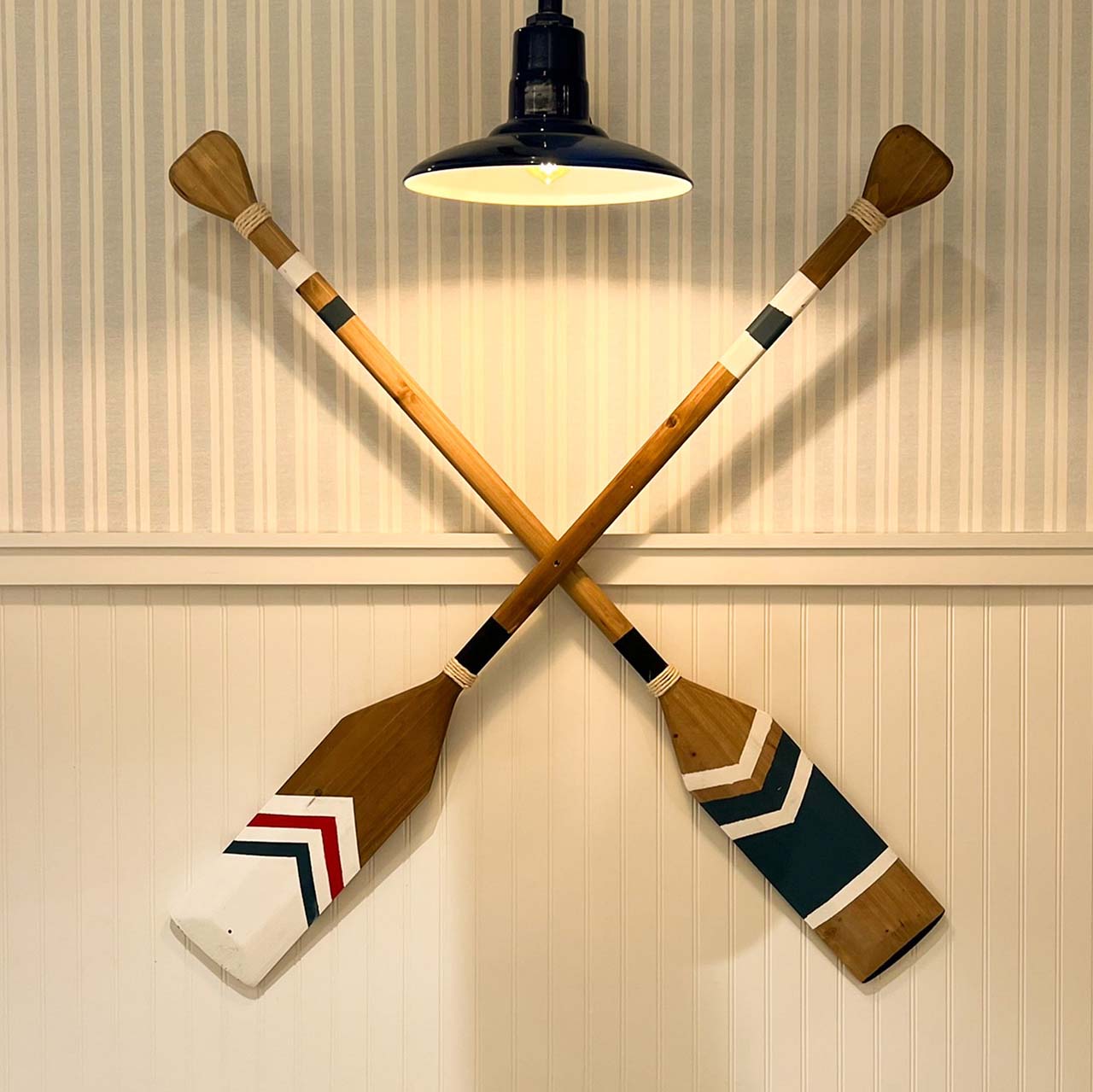
Located within Wilmington’s Avenue North mixed-use development, Blackwall Barn & Lodge was envisioned as more than a restaurant. It was designed as a gathering place where everyday dining and life’s celebrations coexist naturally.
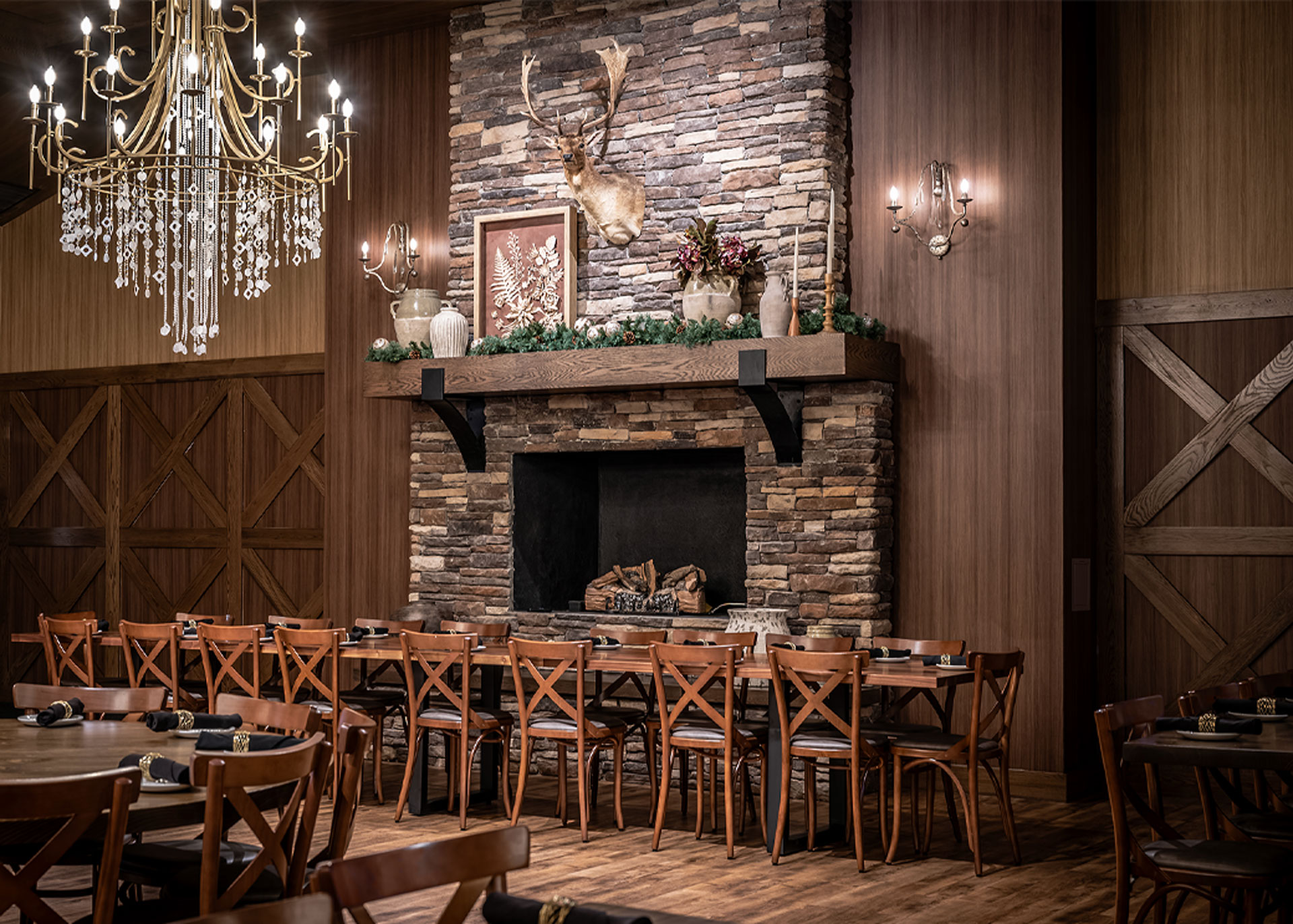
The design balances rustic elegance with a refined, contemporary sensibility. From the moment guests arrive, the environment feels familiar yet elevated, welcoming without pretense. A variety of room types and scales allow the space to adapt effortlessly, supporting everything from casual brunches and colleague dinners to weddings, private dining, and large-scale celebrations within a flexible event space environment.
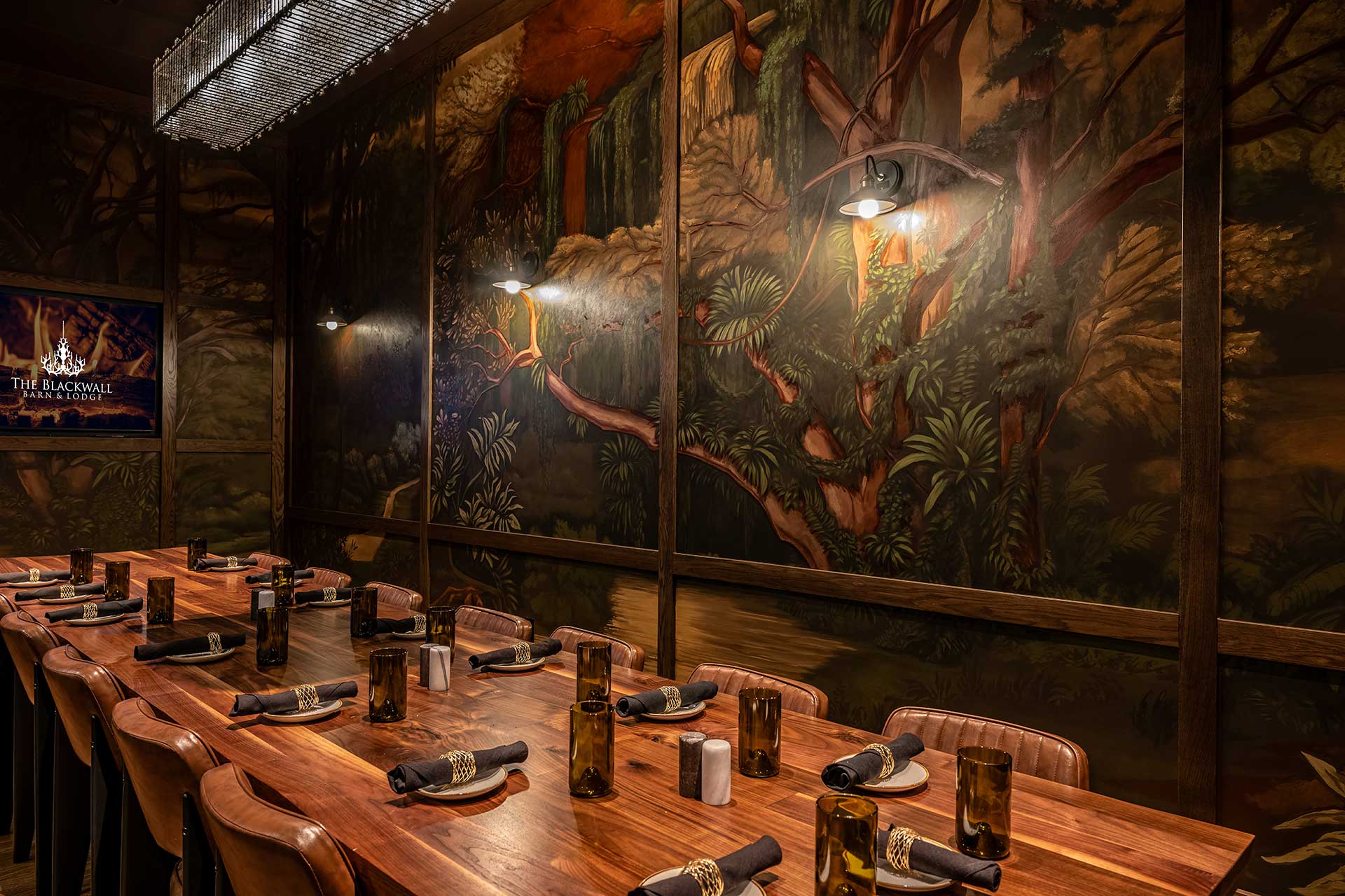
Throughout the restaurant, honest materials and layered textures create a sense of crafted warmth rather than themed décor. Wood, stone, tailored detailing, and soft lighting work together to establish a cohesive restaurant interior designthat feels collected over time making the space approachable, tactile, and enduring. Distinct private dining rooms offer their own personalities while remaining unified within the larger brand experience.
At the heart of the project is experience-driven design within the built environment. Clear sightlines, intuitive circulation, and flexible seating layouts support attentive, people-first service, reinforcing the culture behind the brand as much as the aesthetic. The result is a space that feels established yet alive, intentional yet easy, and naturally personal.
Blackwall Barn & Lodge Wilmington stands as a destination not because of any single design feature, but because the entire environment quietly supports how guests gather, celebrate, and return time after time. Titan Hospitality demonstrates how thoughtful hospitality design can drive connection, loyalty, and long-term success through Blackwall Barn & Lodge.

Working with Titan Hospitality is a reminder of what happens when a client truly understands their guest. Blackwall Barn & Lodge is designed as a place for people to gather, celebrate, and create memories, whether for ten or tenfold. Every space is intentional, warm, and welcoming, creating an experience guests return to again and again. Grateful for a client who leads with hospitality and trust.
The Cottage private dining room is designed to function independently or open fully to the adjacent event space, maximizing flexibility without sacrificing atmosphere. This strategic space planning enhances the guest experience by supporting celebrations, meetings, and group dining with ease.
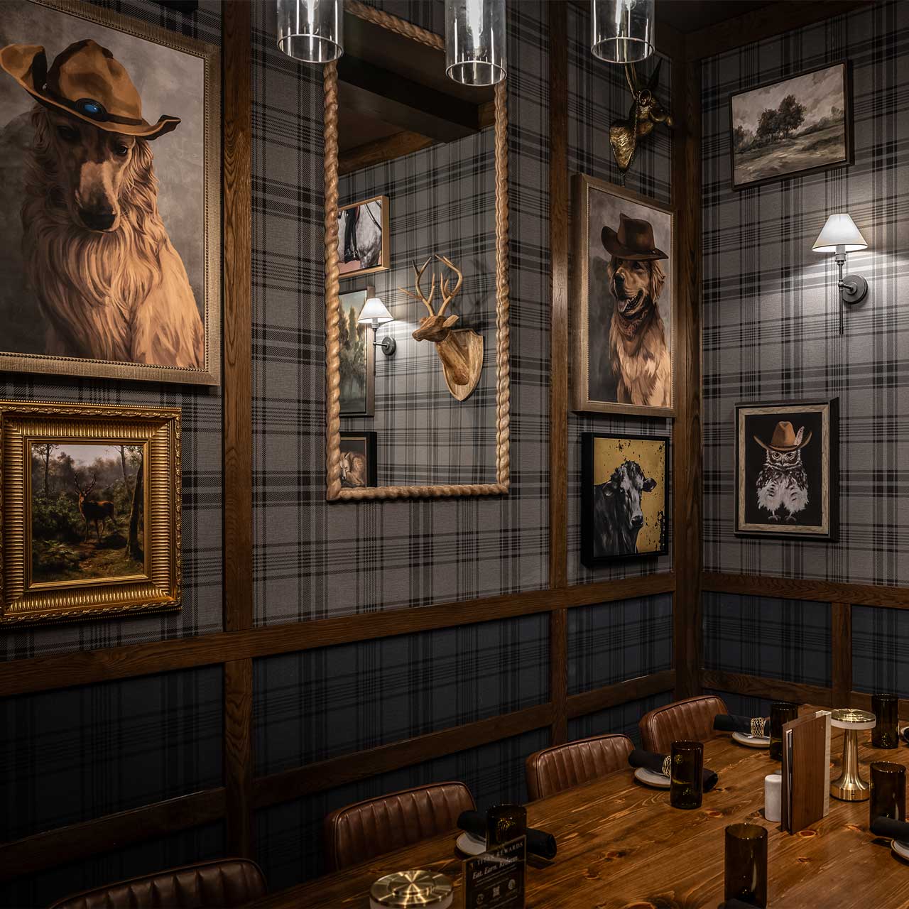
The Game Room, a character-rich private dining room, adds personality and flexibility to the overall experience, enhancing the private dining program within a cohesive restaurant design strategy.
Project snapshot
Related projects

Let’s create something unforgettable
Fuelled by knowledge and imagination, we are driven by our ambition to evolve hospitality brands.
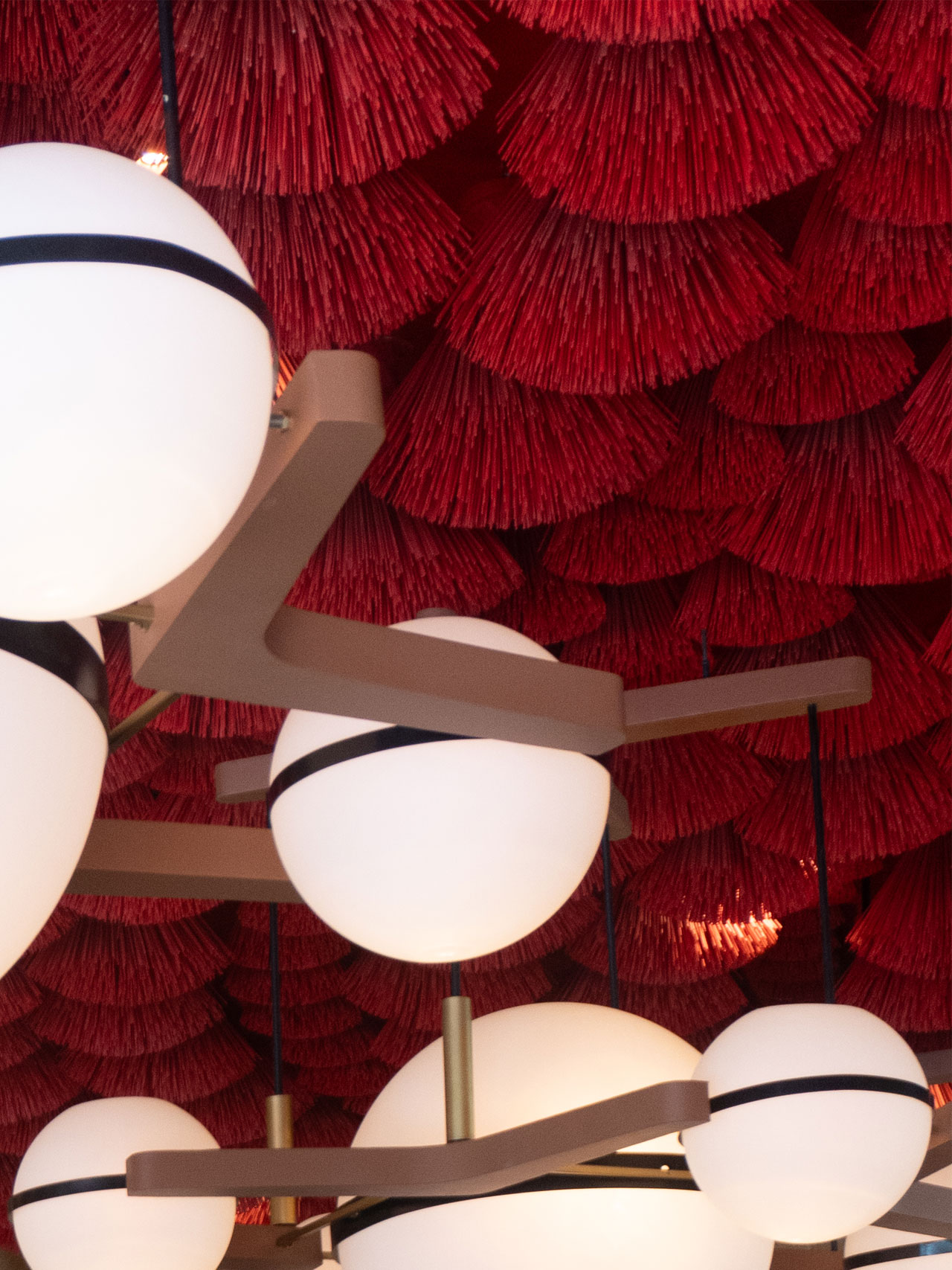
A dramatic pairing of material and light. The red brush ceiling and spherical pendants elevate the mood, making even everyday coffee moments feel cinematic.

A bold red canopy made from handcrafted ceiling elements brings energy and theatre to the lounge zone — a nod to Vietnam’s craft culture and Highlands’ evolving sense of hospitality drama.
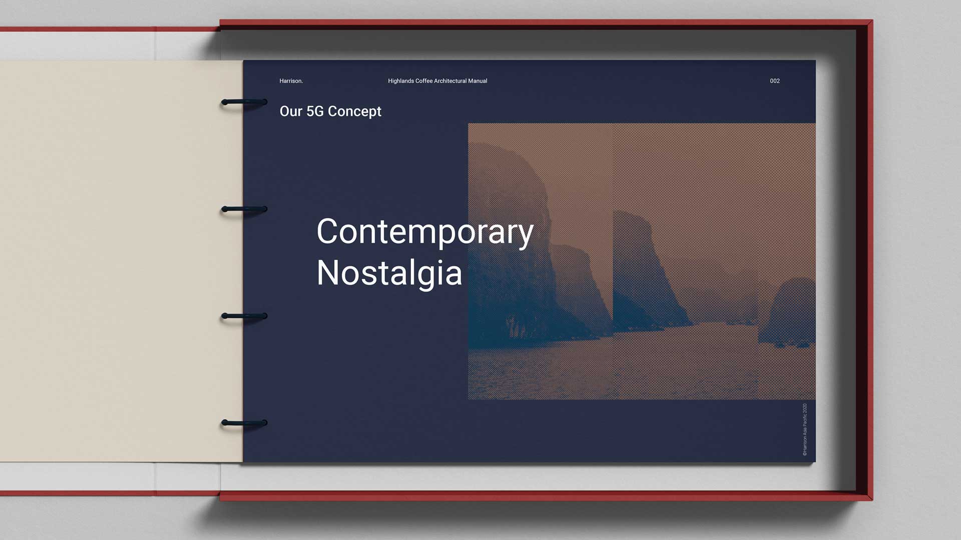
Our journey with Highlands Coffee started with a brief to develop the brand’s next-generation “5G” concept, a forward-thinking evolution of their store design and guest experience. But what began as a single project soon grew into something more lasting and collaborative.
As we filled gaps in design capability, we also built trust. By 2023, Harrison’s APAC team had become fully embedded within the VTI Group’s senior leadership, acting as Design Directors across the region. This closer partnership allowed us to work hand-in-hand with Marketing, Development, and Executive teams, shaping not just stores, but strategy.
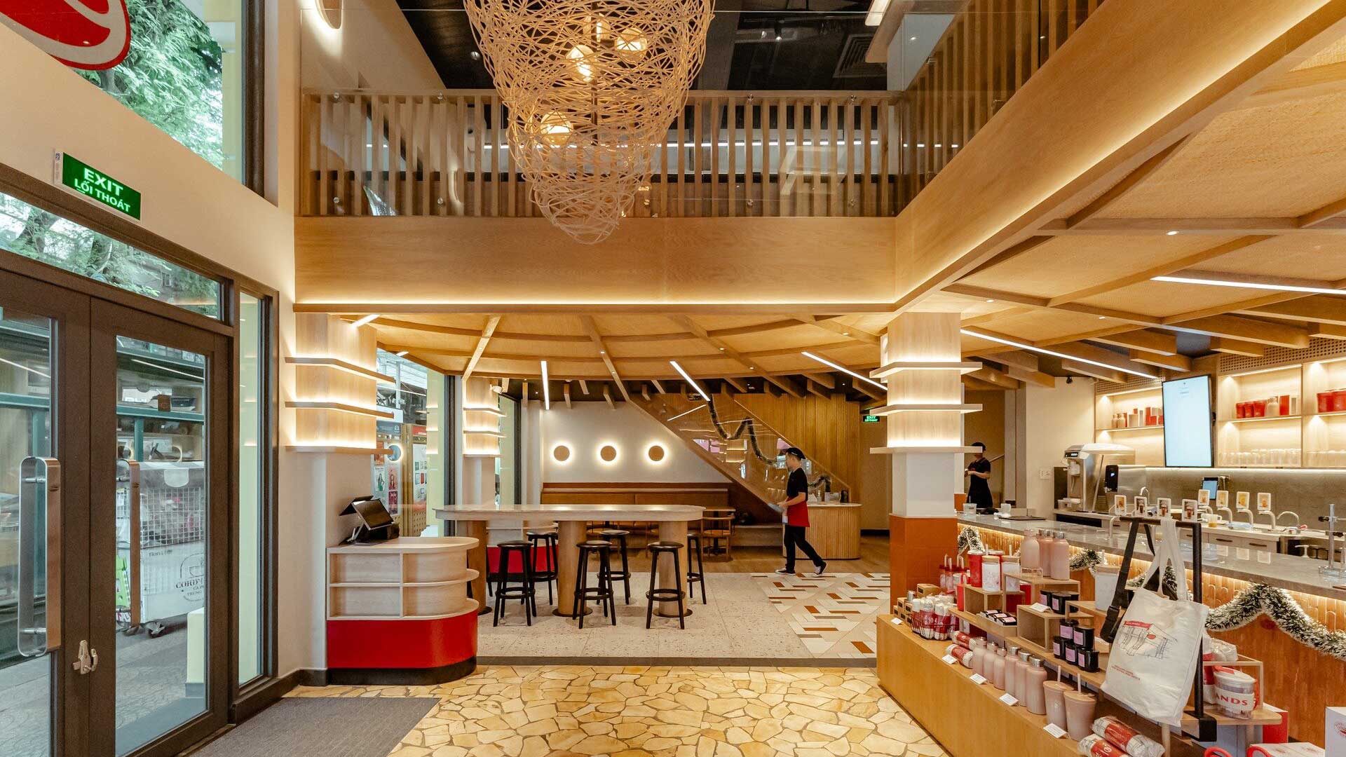
Natural timber structures and soft ambient lighting shape a welcoming entry — balancing contemporary calm with quiet references to traditional Vietnamese craftsmanship.
Our role evolved from delivering individual design solutions to driving long-term brand growth. With more time to test, learn, and refine, we’ve been able to push the brand forward aligning creative, commercial, and operational goals into one cohesive direction.
Alongside this, we’ve launched a mentorship program to upskill the in-house design team ensuring Highlands Coffee can carry the vision forward independently, with confidence and clarity. Because strong design shouldn’t just deliver results, it should leave a legacy.
When you’re close to a brand’s growth, you see more than the milestones, you see the mindset shift. That’s what makes it exciting.


Related projects


Let’s create something unforgettable
Fuelled by knowledge and imagination, we are driven by our ambition to evolve hospitality brands.
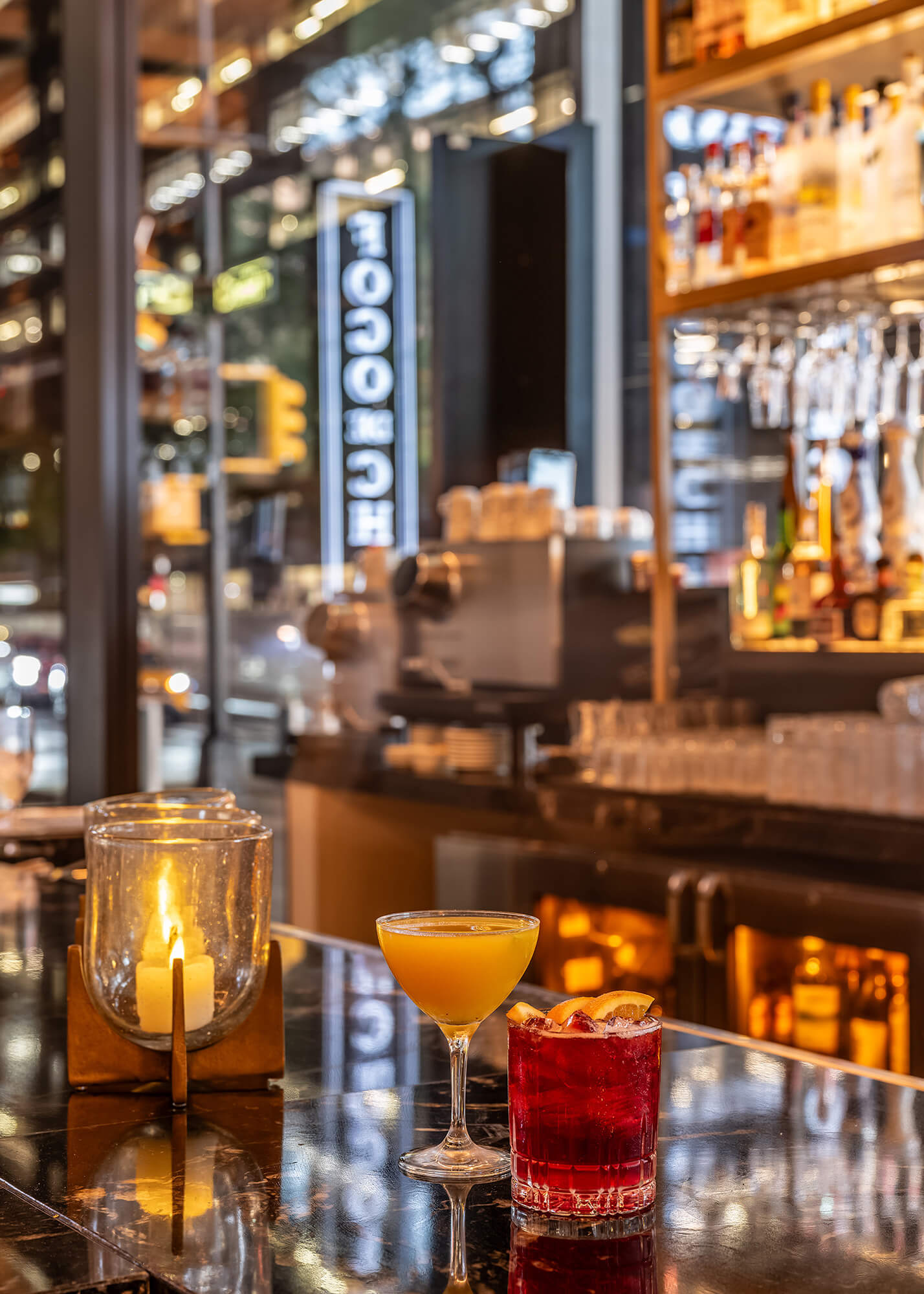
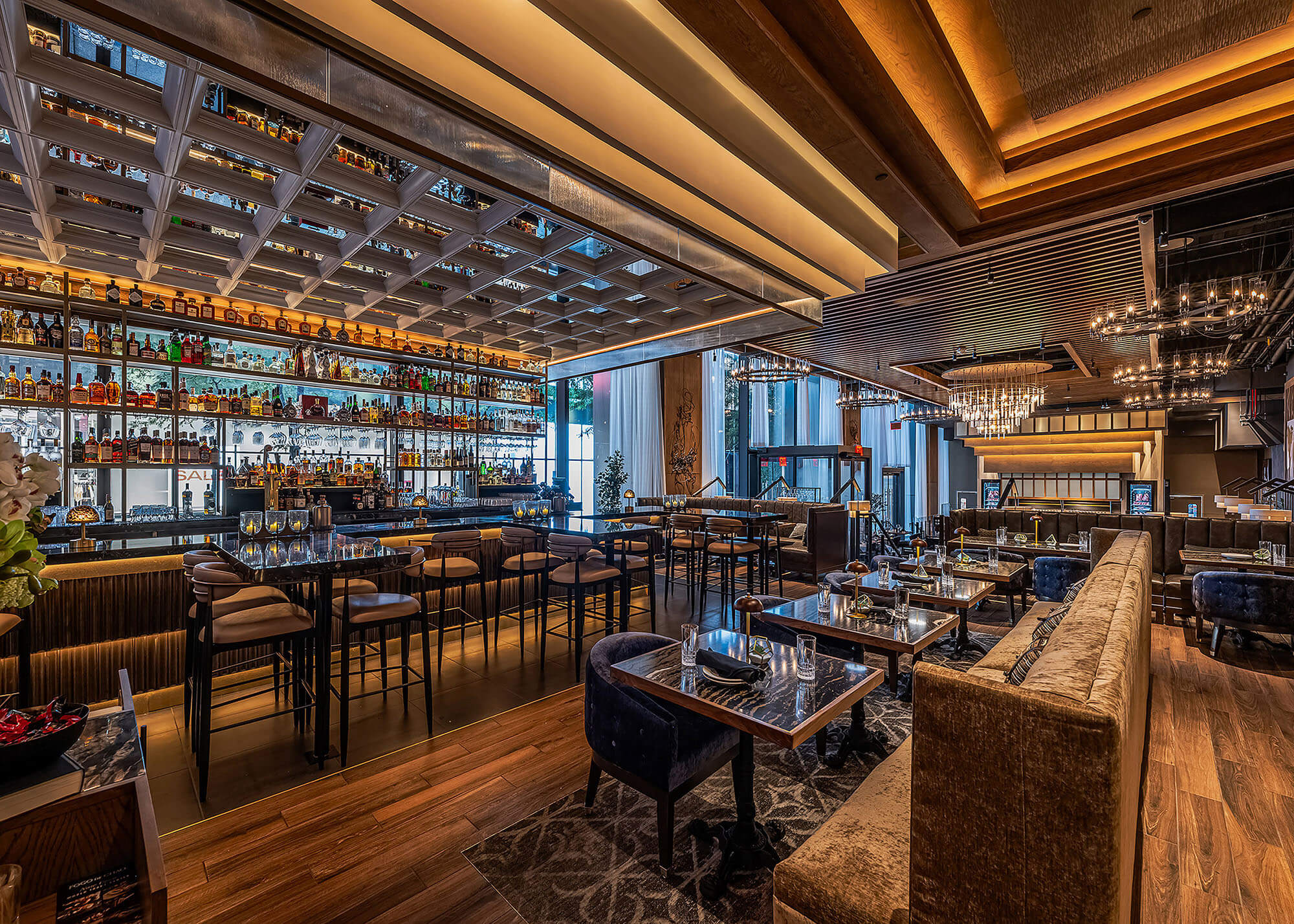
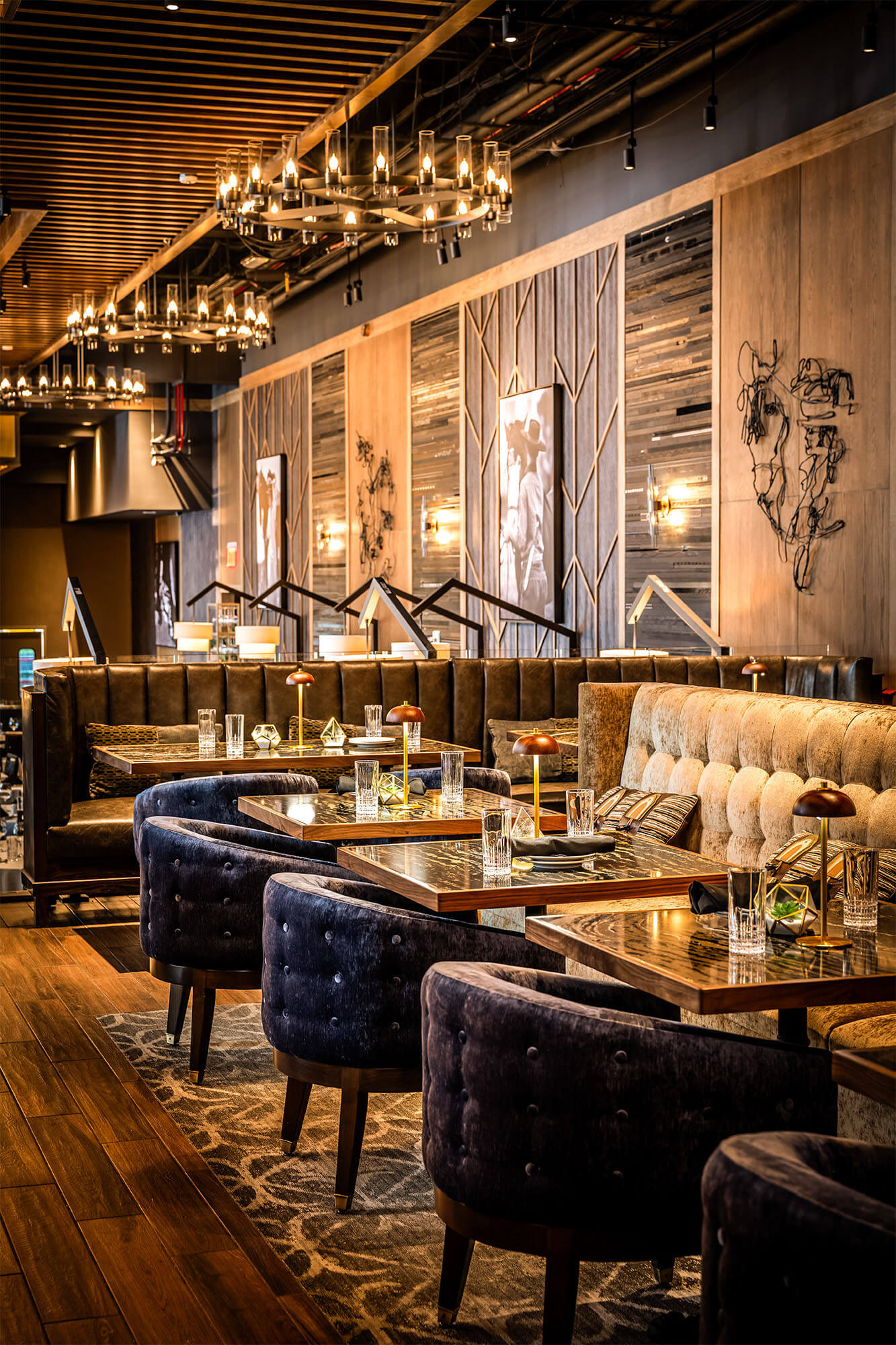
A modern bar design that blends ambiance with allure; where craft cocktails and warm hospitality take center stage in the heart of NYC.
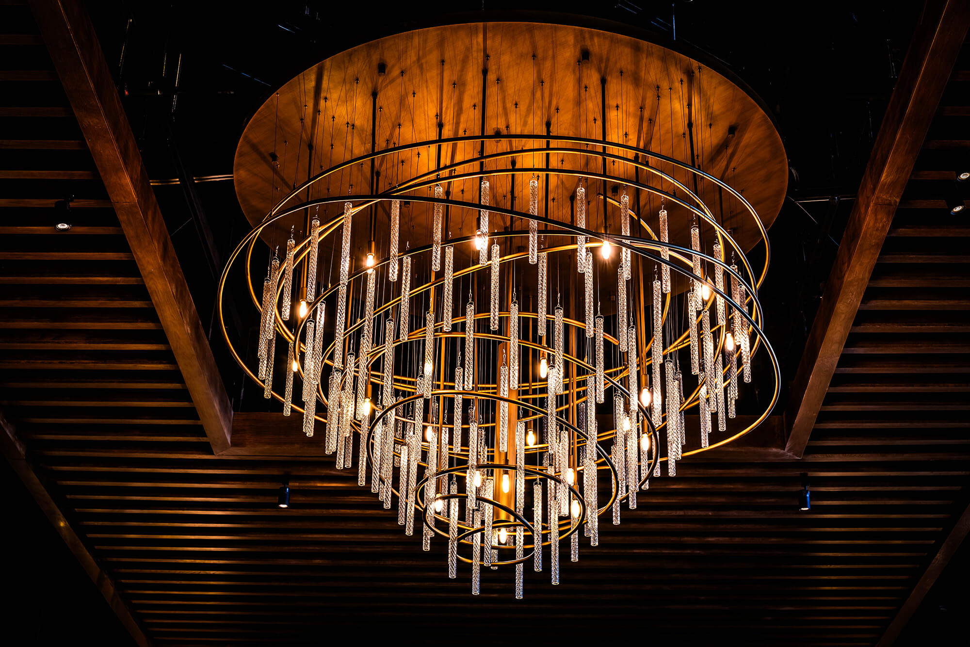
A modern centerpiece with old-world soul, this custom chandelier balances drama and restraint, elevating the guest experience through immersive restaurant lighting design.
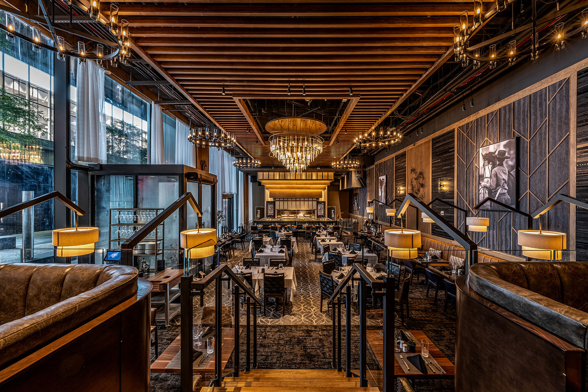
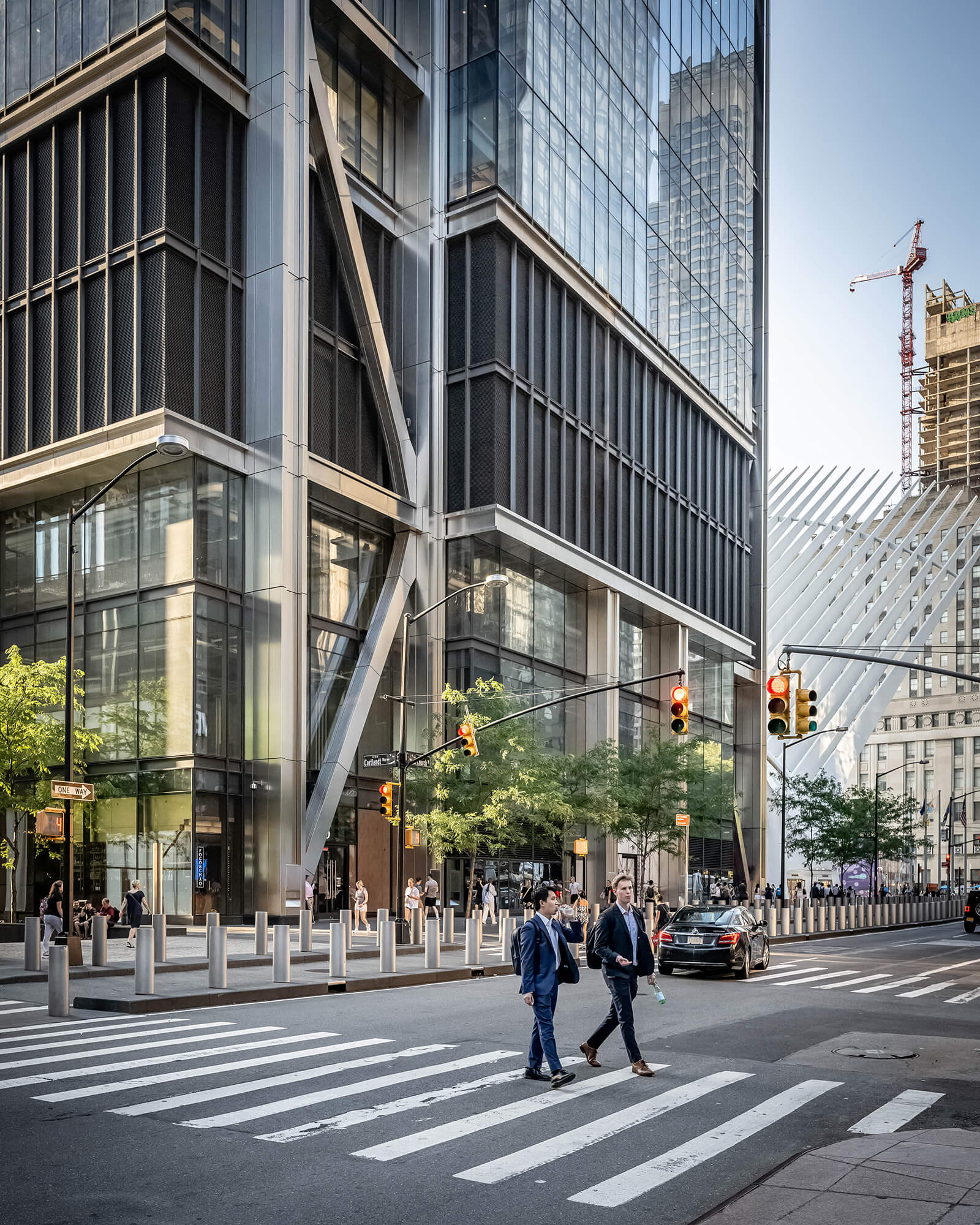
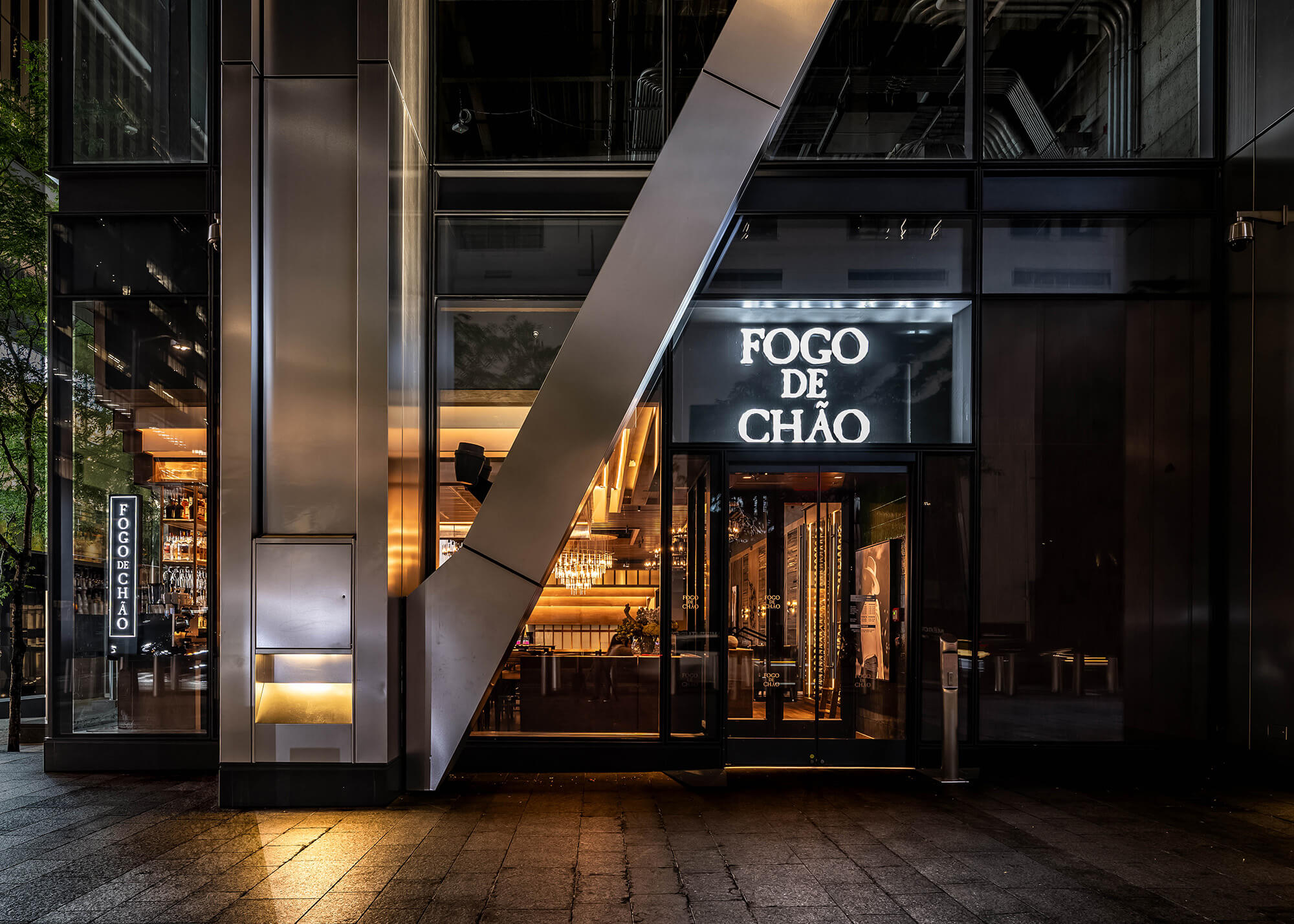
Set within the World Trade Center Oculus complex, this high-profile restaurant architecture project demanded both bold vision and precise execution. Our Dallas office served as Architect of Record and interior designer, overseeing the transformation of an open-volume shell into a refined yet inviting full-service dining experience.
The space planning required clever zoning and rigorous coordination with Port Authority and local officials. The team delivered a seamless restaurant design that respects the transparency of the space while introducing layered intimacy, inviting guests into a story that unfolds from street level to mezzanine.
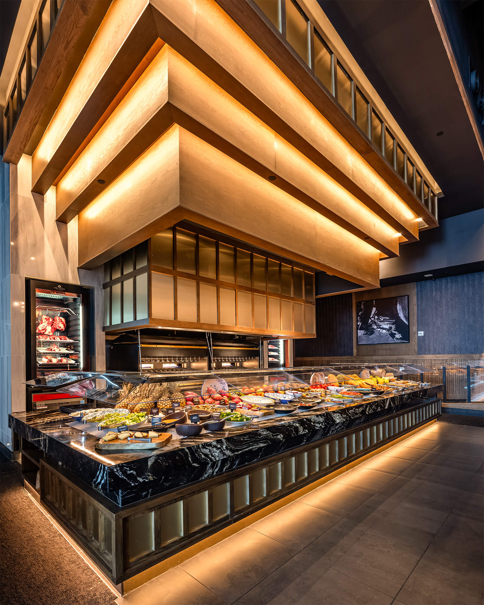
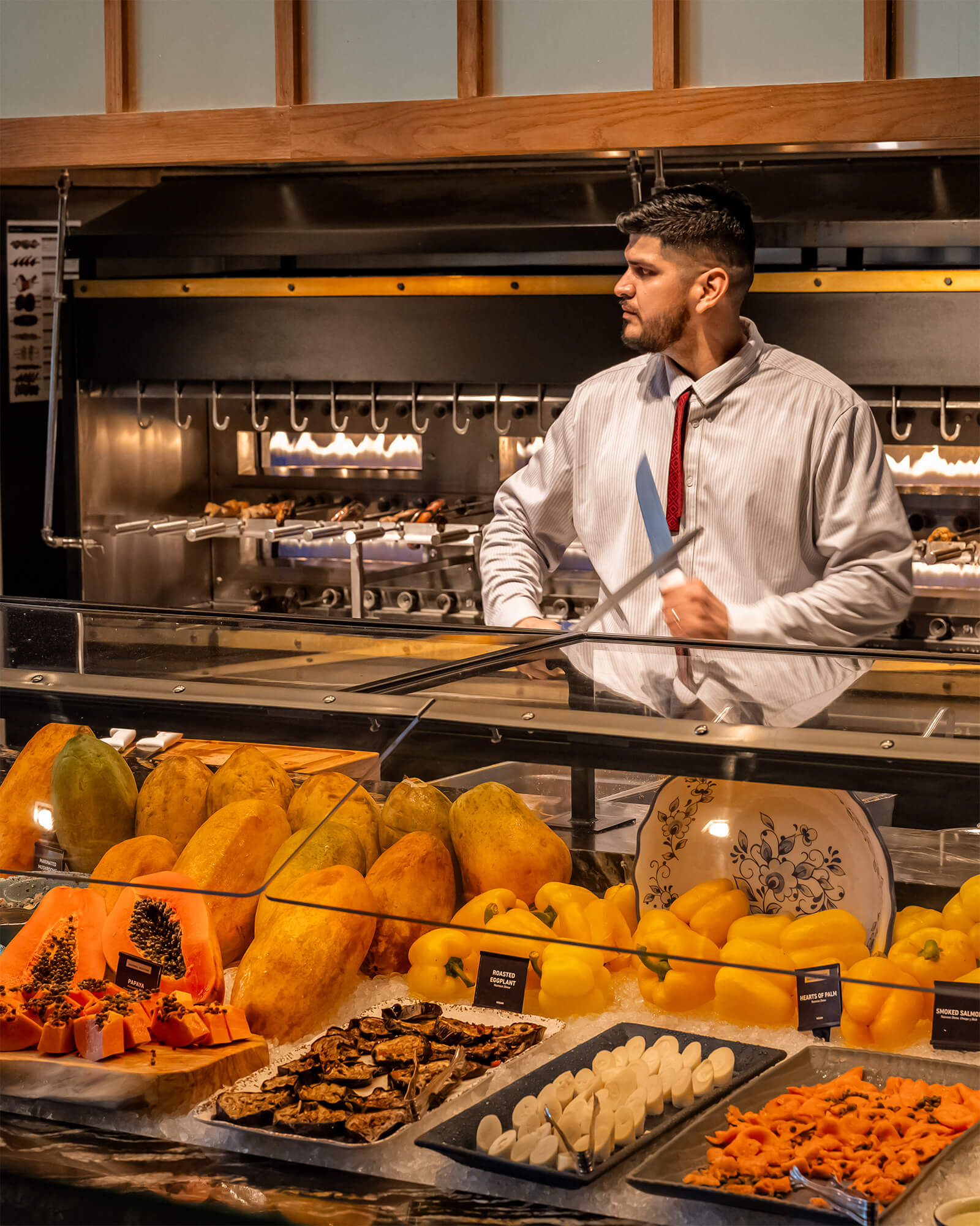
At the heart of the design is Fogo’s iconic Market Table, spotlighted as a visual anchor to reinforce the brand’s experiential dining roots. Above, sculptural lighting draws the eye upward, while sweeping views of the surrounding WTC campus connect guests to the city’s rhythm below.
Natural materials, custom wine walls, and signature art moments ground the interior design in Brazilian heritage, while premium finishes and thoughtful acoustics elevate the urban dining experience. Designed to accommodate over 250 guests, the space includes a dynamic bar design, private dining, and lounge areas all optimized for flexibility and flow.
Whether serving tourists or local professionals, this restaurant design invites people to linger, connect, and experience the soul of Southern Brazilian hospitality brought to life through brand storytelling, structure, and the spirit of place.
There’s something deeply fulfilling about connecting history to spaces that people can truly experience. Seeing those ideas take shape in the real world brings a unique sense of joy and purpose. We are grateful to contribute to the community in this way creating places that not only meet our clients’ needs but also speak to the everyday person. It’s an honor to help bring stories to life through design.
A bold first impression at the base of 3 World Trade invites guests into a refined space where tradition meets modern hospitality.
Project Snapshot
Related projects
Let’s create something unforgettable
Fuelled by knowledge and imagination, we are driven by our ambition to evolve hospitality brands.
The reception feature wall tells the stories of and celebrates the different specialisms which can be studied at the university.
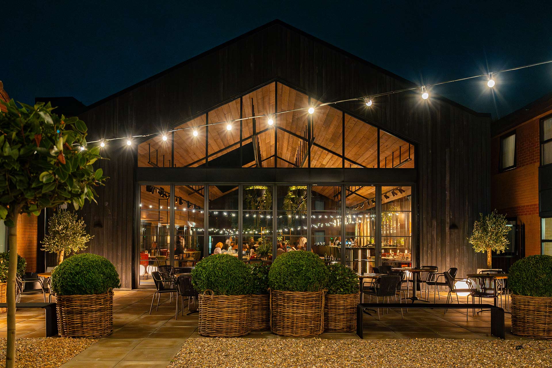
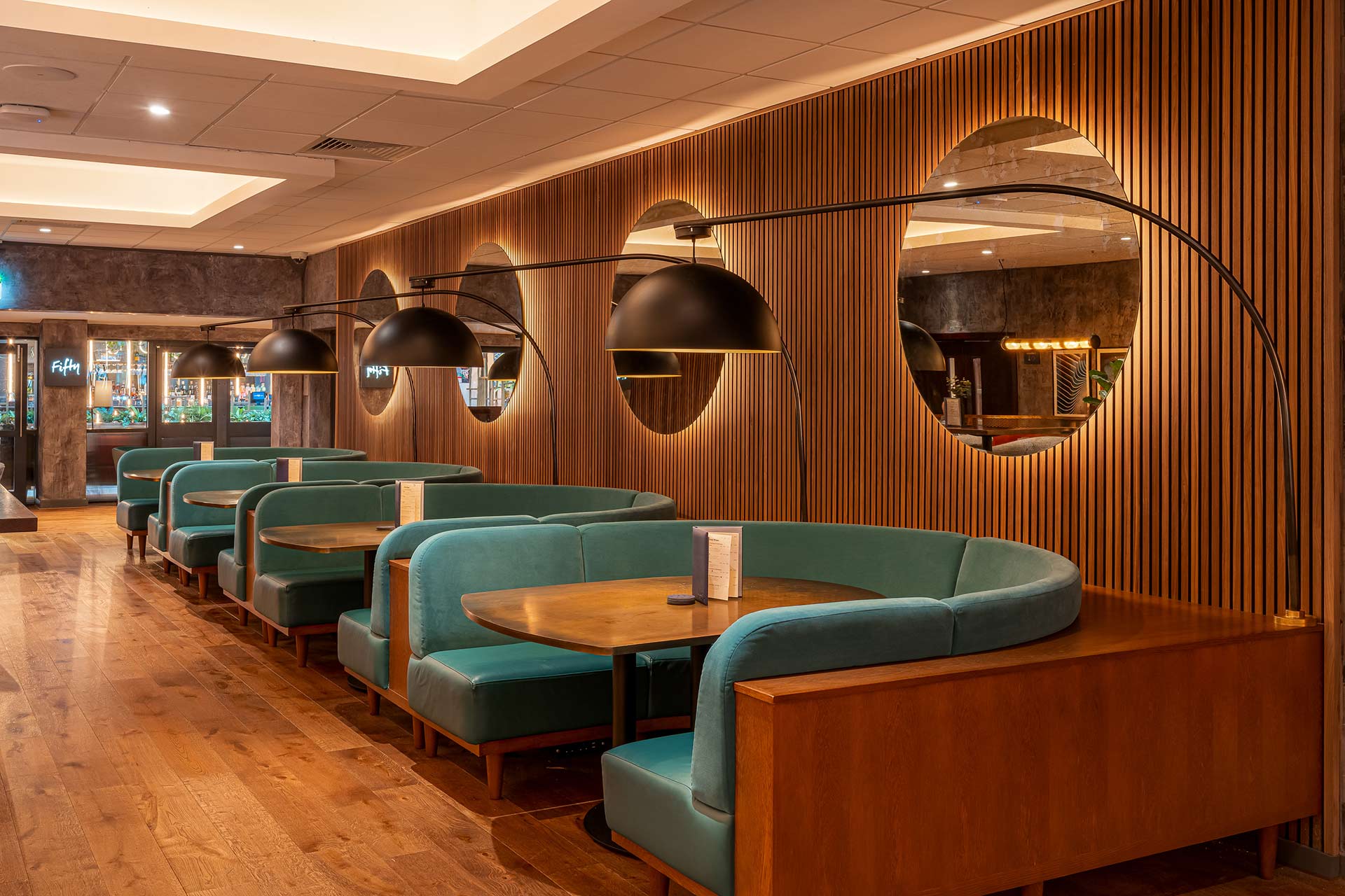
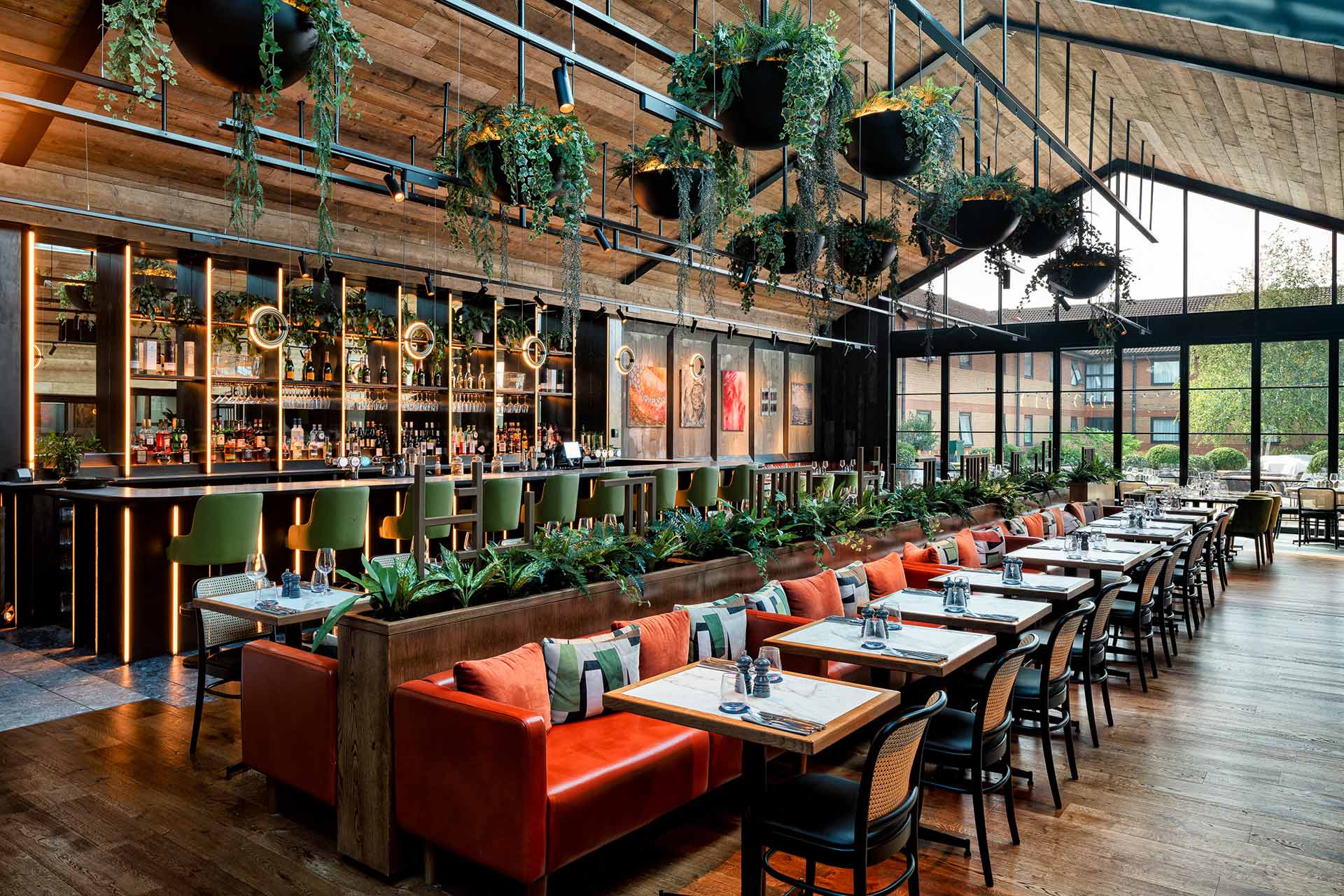
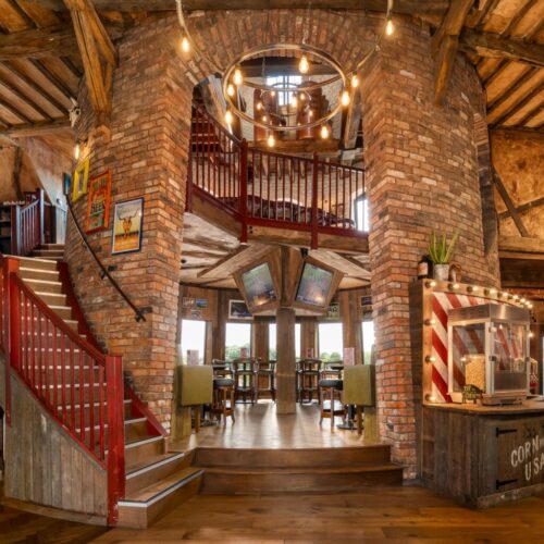
A spectacular new restaurant extension, Fifty The Street, has created a truly iconic destination that appeals throughout the whole day.
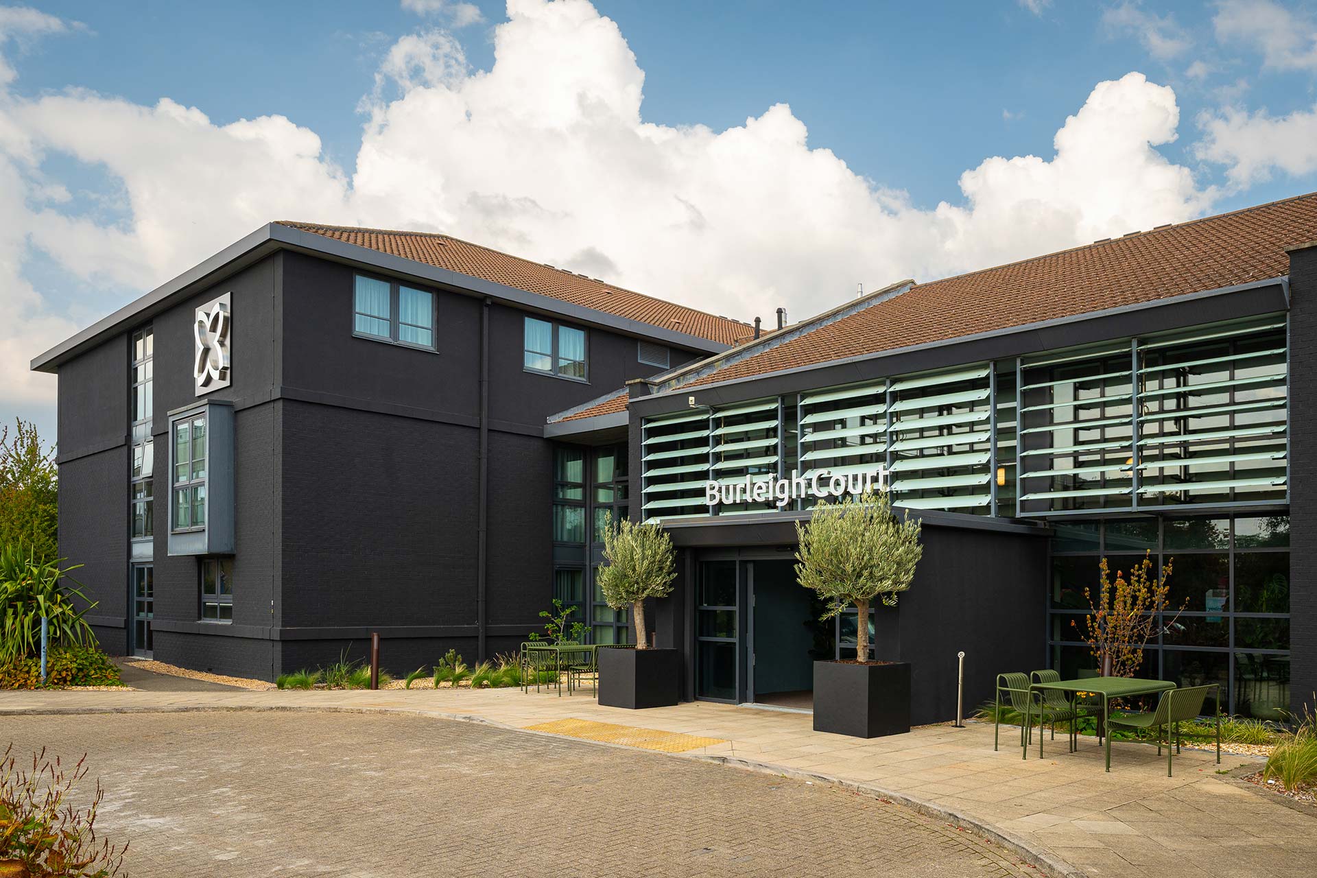
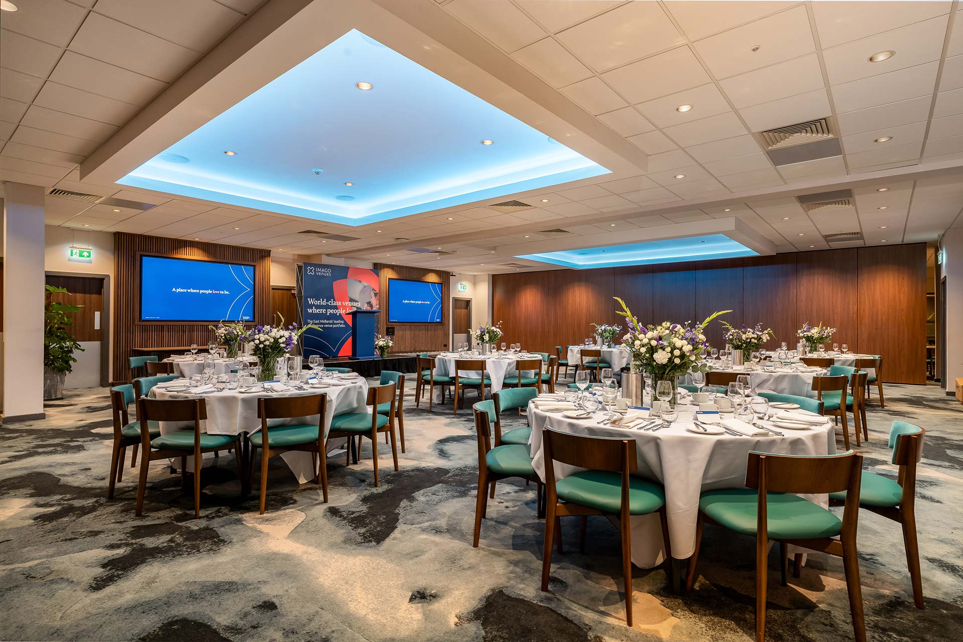
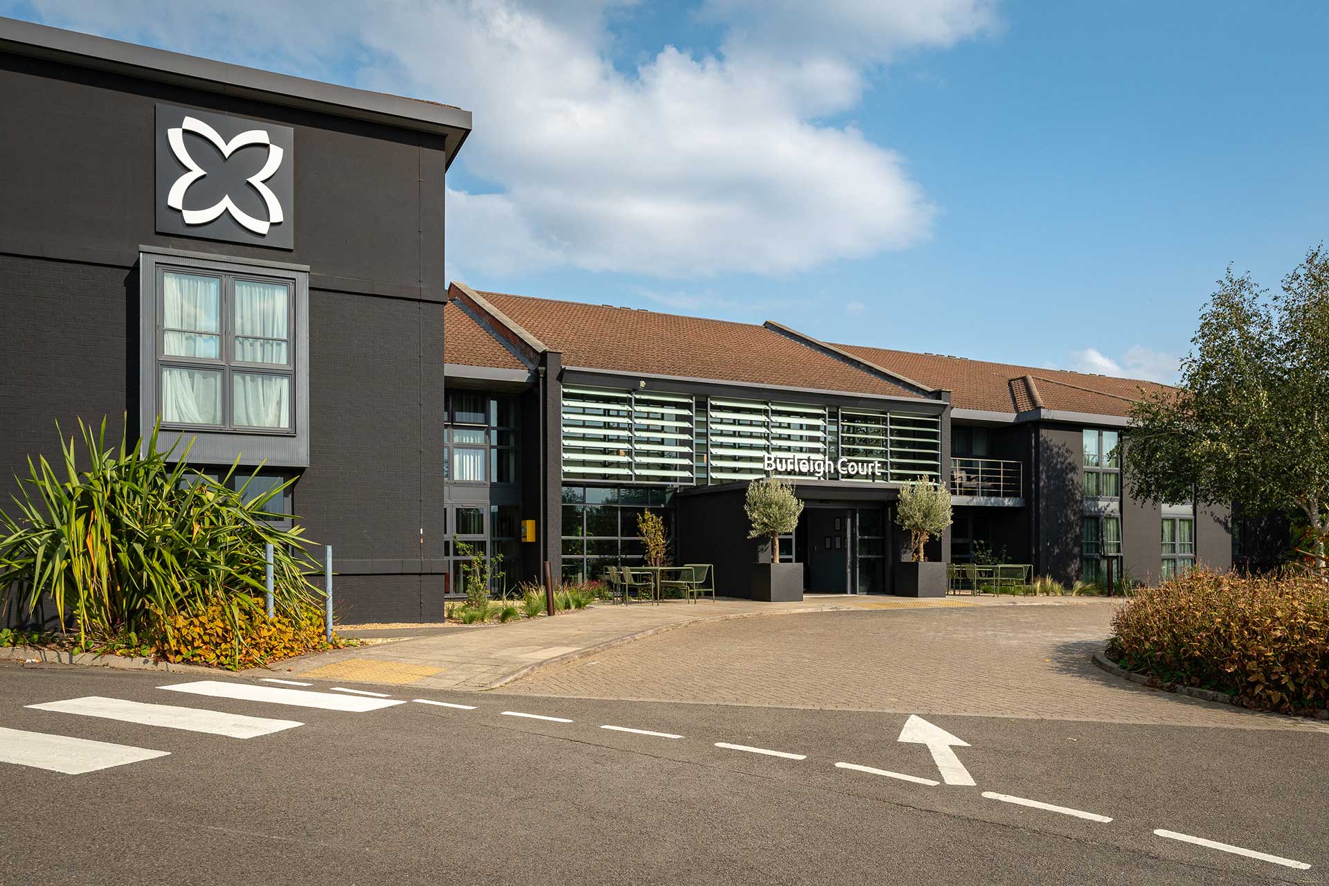
Transforming Loughborough’s Premier Hospitality Destination into a genuine centre of excellence
Working in close collaboration with Imago Venues, we completely reimagined Burleigh Court as a living expression of the university’s spirit rooted in heritage, shaped by innovation, and designed around experience. The ambition was simple but exacting: to transform into a guest journey that feels intuitive, engaging, and quietly memorable.
Five Distinct Spaces, One Cohesive Narrative
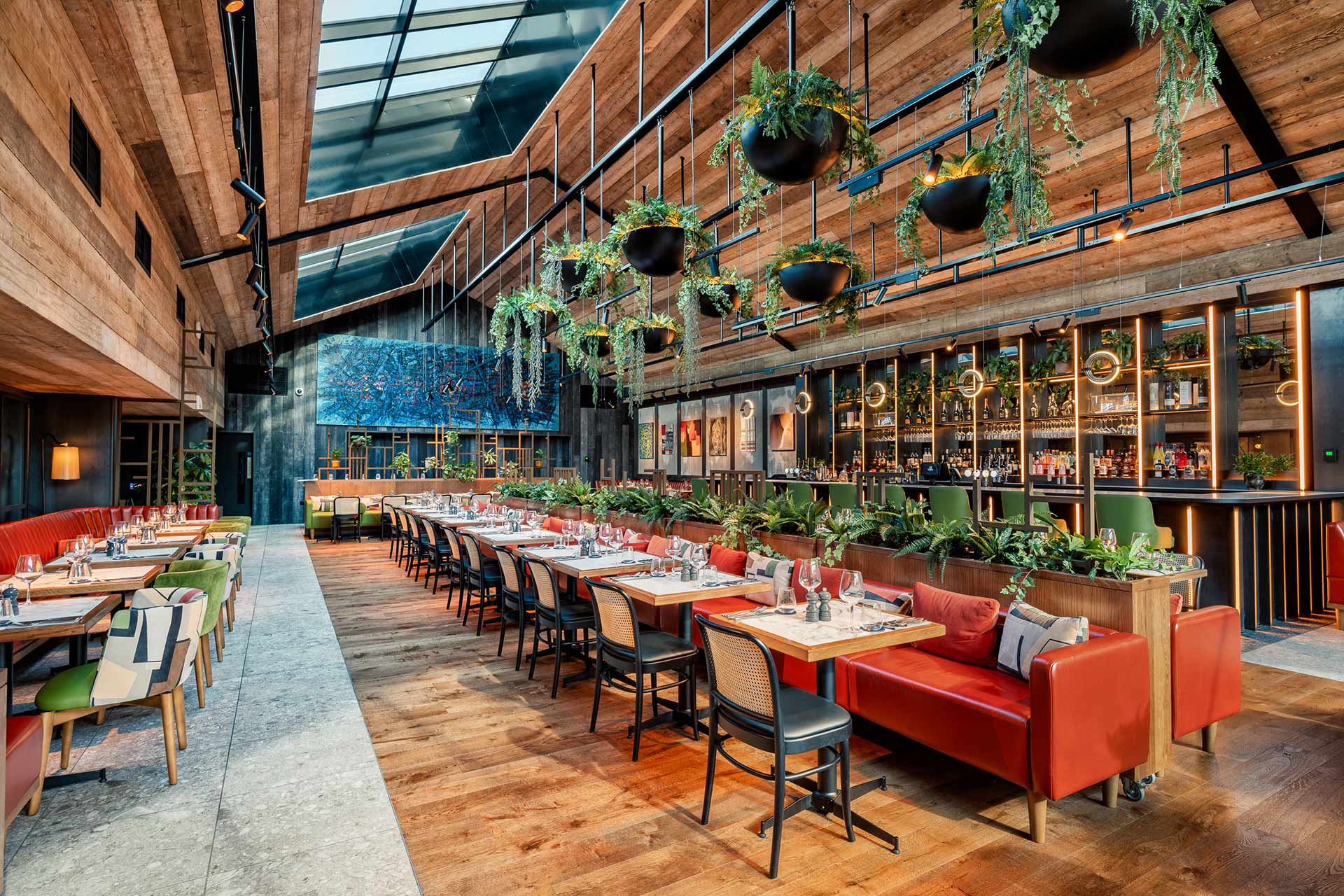
Inspired by Loughborough’s twin academic strengths of engineering and fine art the design unfolds across five distinct spaces, where each space builds a multilayered story. The newly created restaurant, Fifty the Street, sits at the centre. With a sustainable design ethos, it reflects a modern approach to guest dining that is thoughtful, progressive, and grounded in purpose
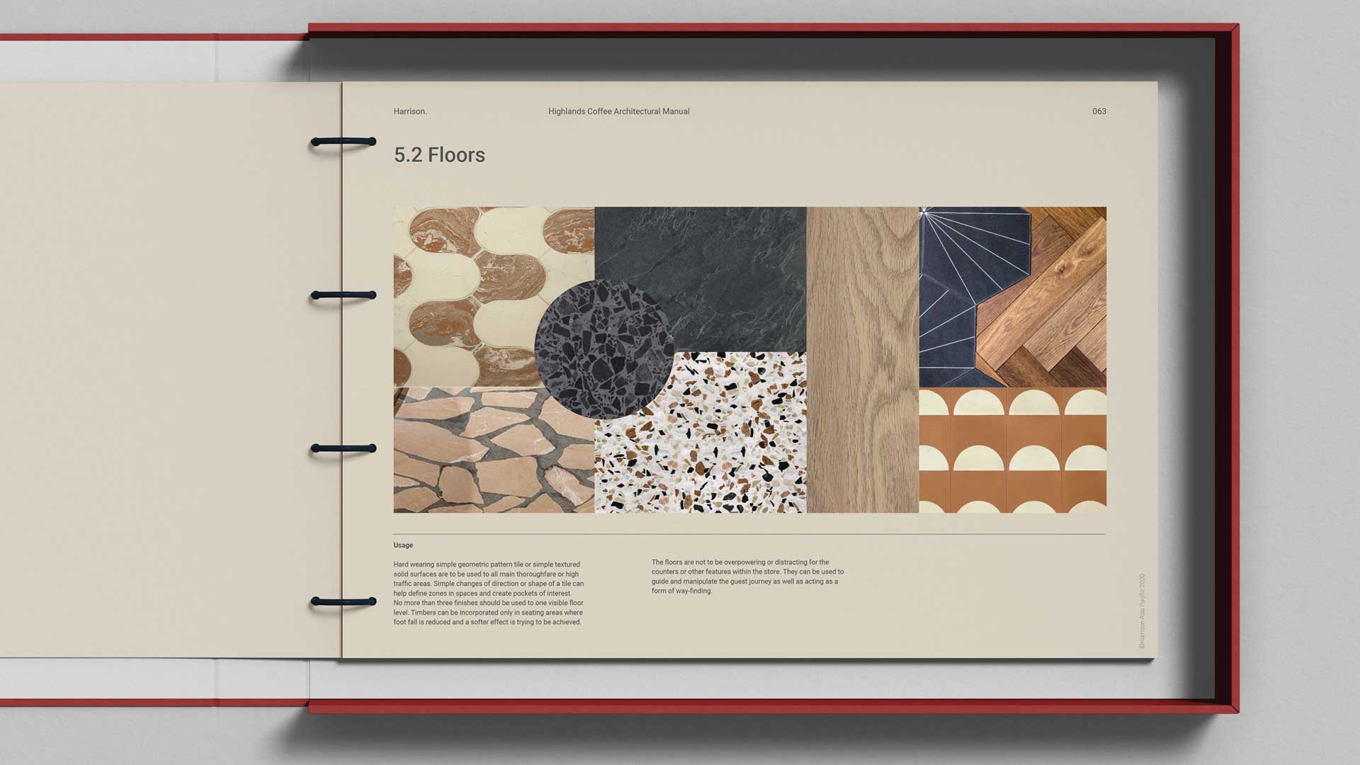
A sympathetic architectural evolution of the fascia and entrance has uplifted and heightened the sense of arrival.
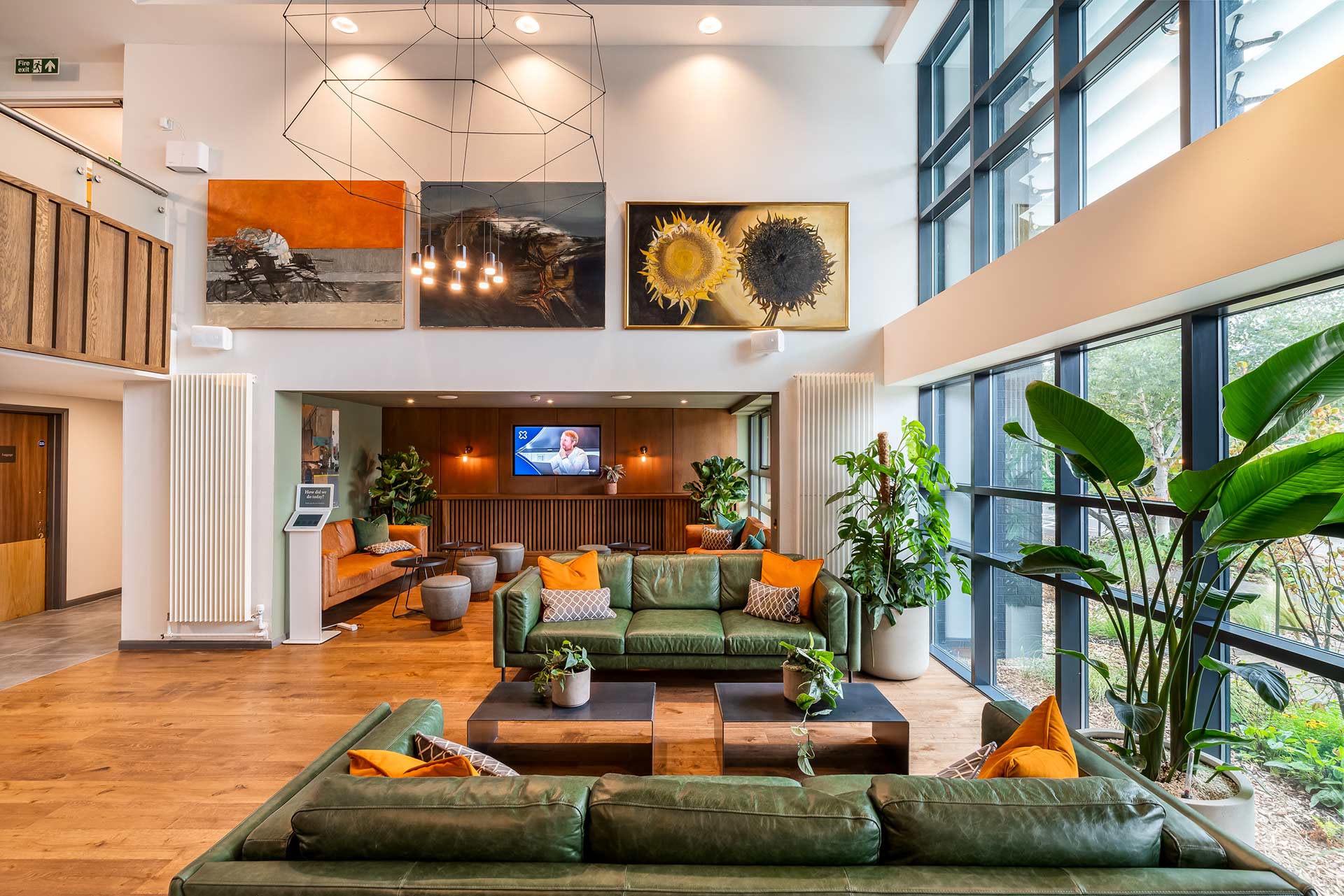
Seemless and Welcoming Guest Arrival
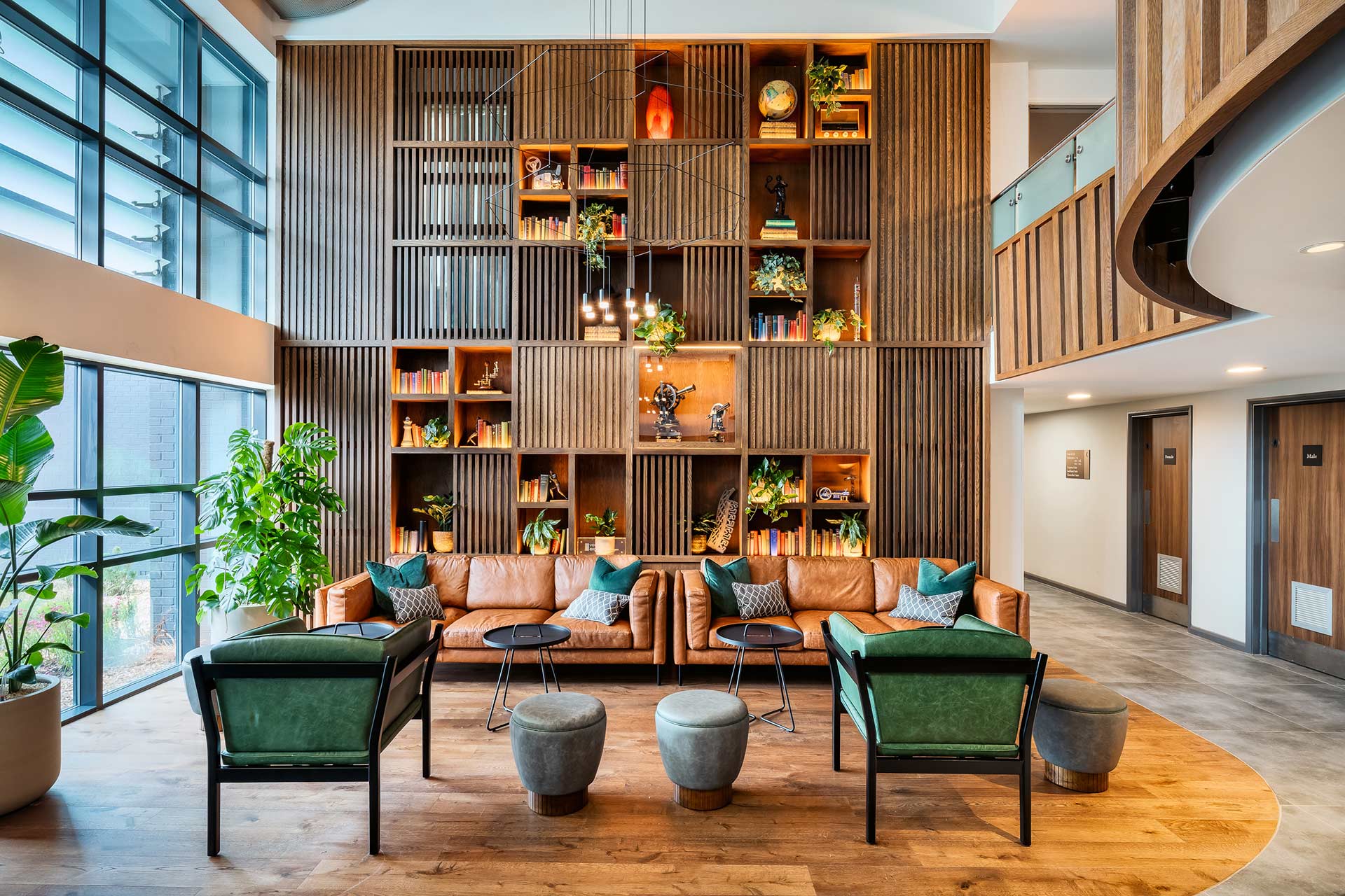
The Reception has been reimagined as a seamless, intuitive welcome. Self-check-in technology is wrapped in warmth and underpinned by an environment that feels both intelligent and human. Throughout, refreshed signage and wayfinding do more than direct; they quietly guide, empowering guests with clarity and confidence.
Designed for Engagement and Ease
Functionality and a quality guest experience are carefully balanced. The reception has been completely redesigned to feel open and welcoming, with self-check-in technology seamlessly integrated into a warm, welcoming and homely space. Wayfinding, lighting, and signage work together to guide guests effortlessly, creating a journey that feels natural rather than directed.
When approaching the brief for Burleigh Court, we wanted to seamlessly blend together the academic heritage of the university and bring contemporary design to the forefront.
Harrison have truly been a great partner and I’m fortunate to have worked with them throughout the process. They have helped me and the business make the right decisions. This is entirely due to their professionalism, the people, and the quality of the job they delivered.
Related projects
Let’s create something unforgettable
Fuelled by knowledge and imagination, we are driven by our ambition to evolve hospitality brands.
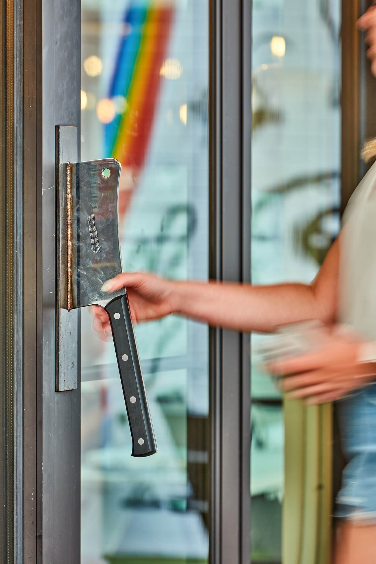
A clever branding moment in the customer journey, the custom door handle sets the tone before guests even step inside.
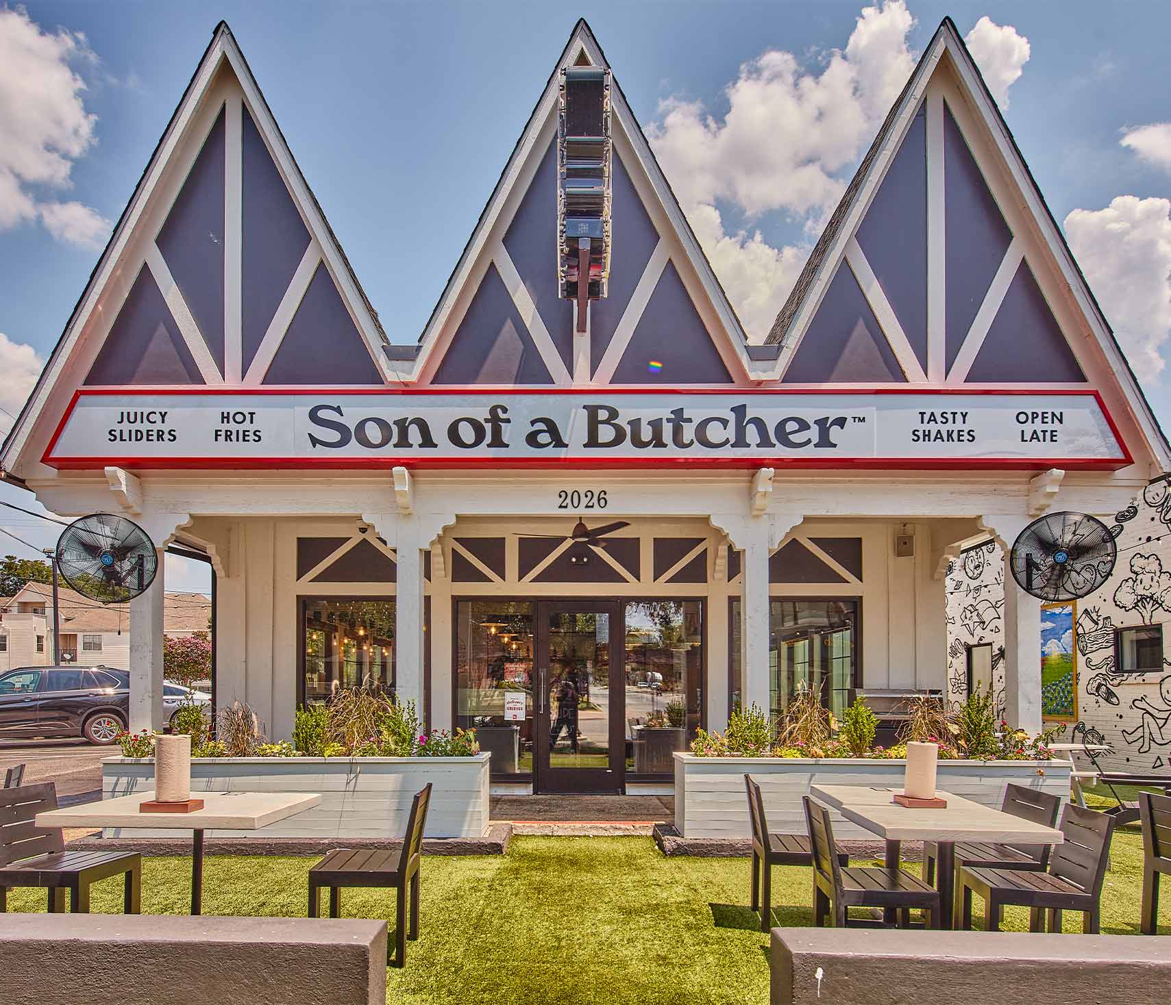
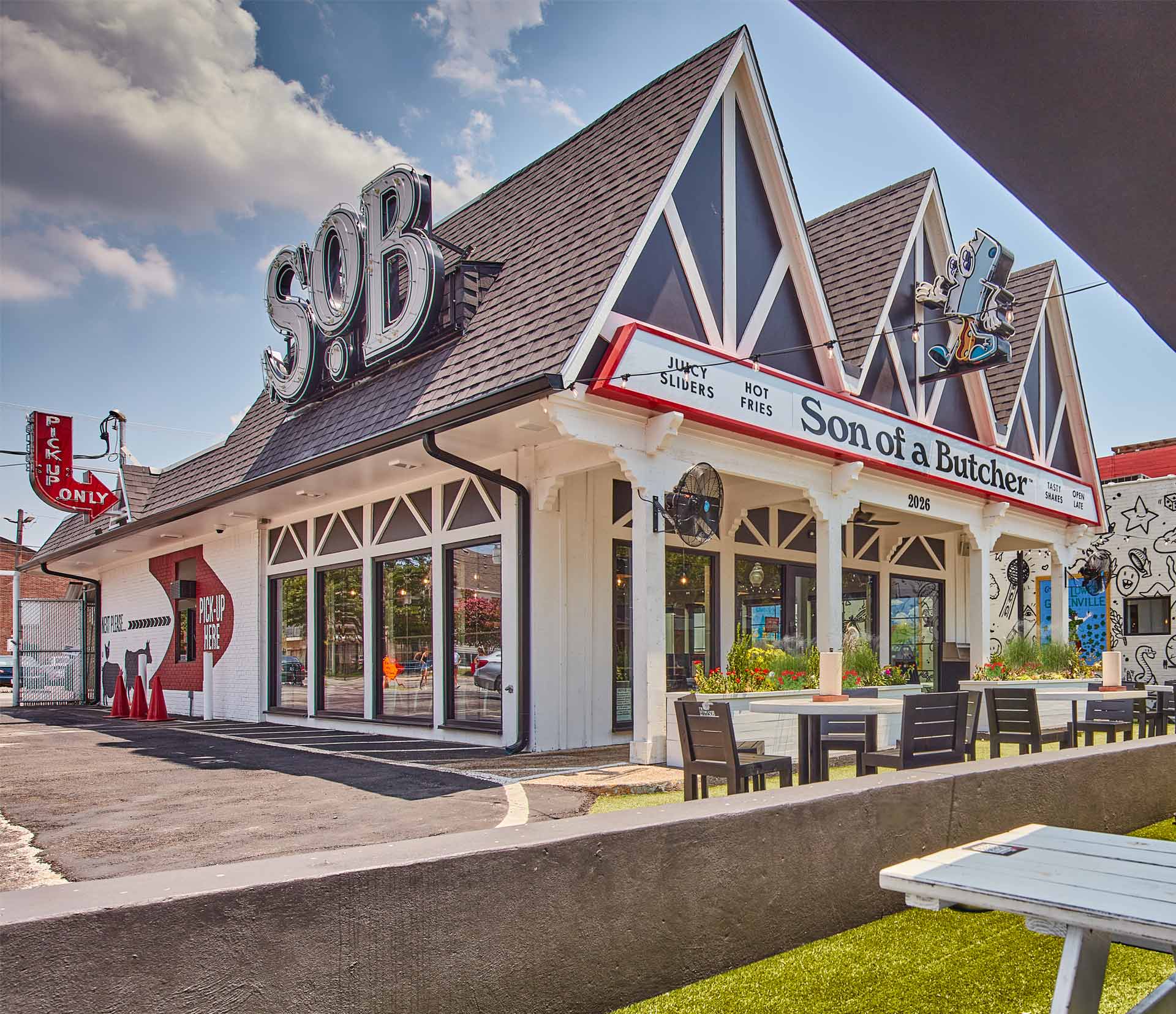
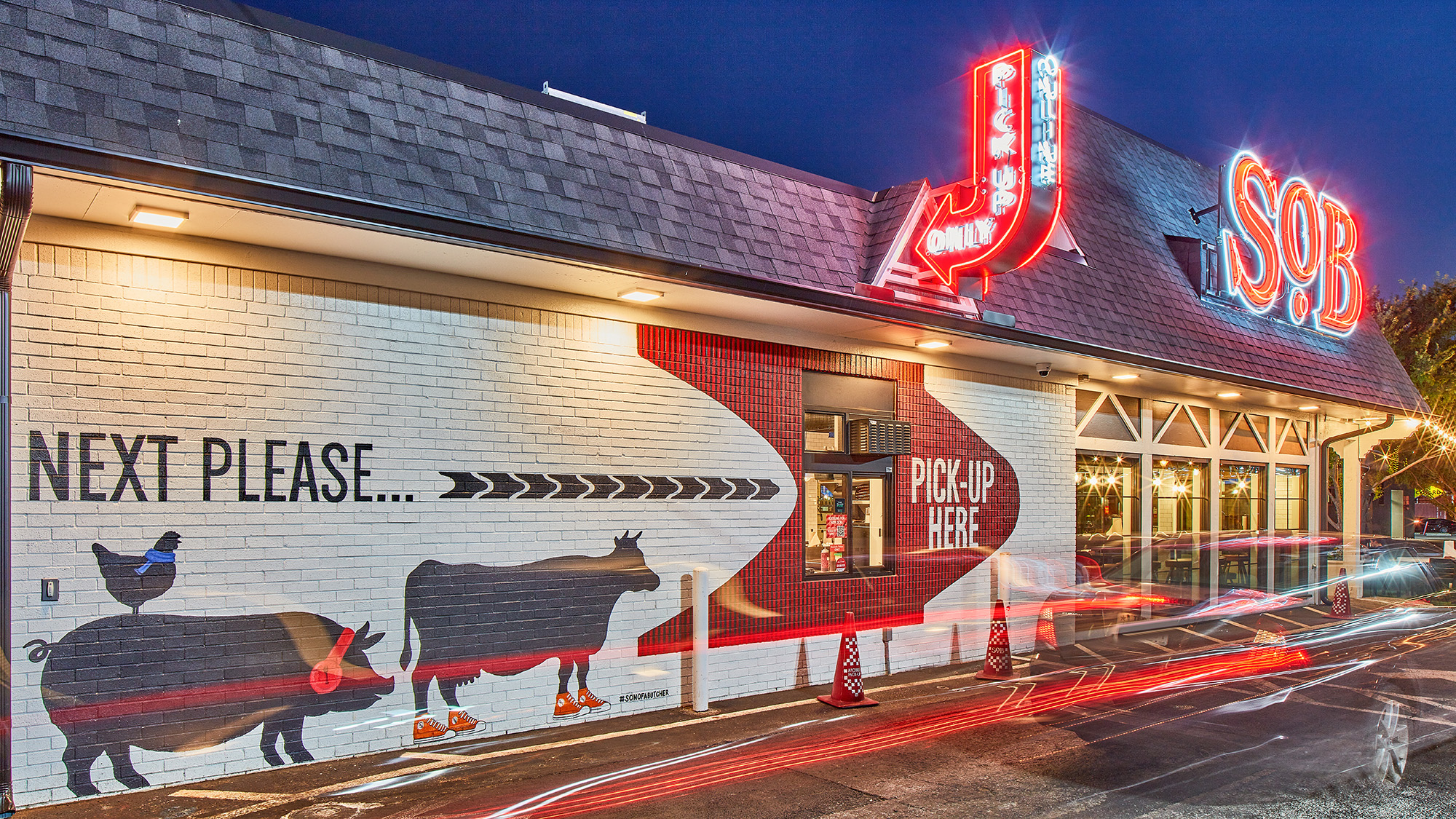
The iconic three-peak architectural design anchors the brand to a neighborhood icon.
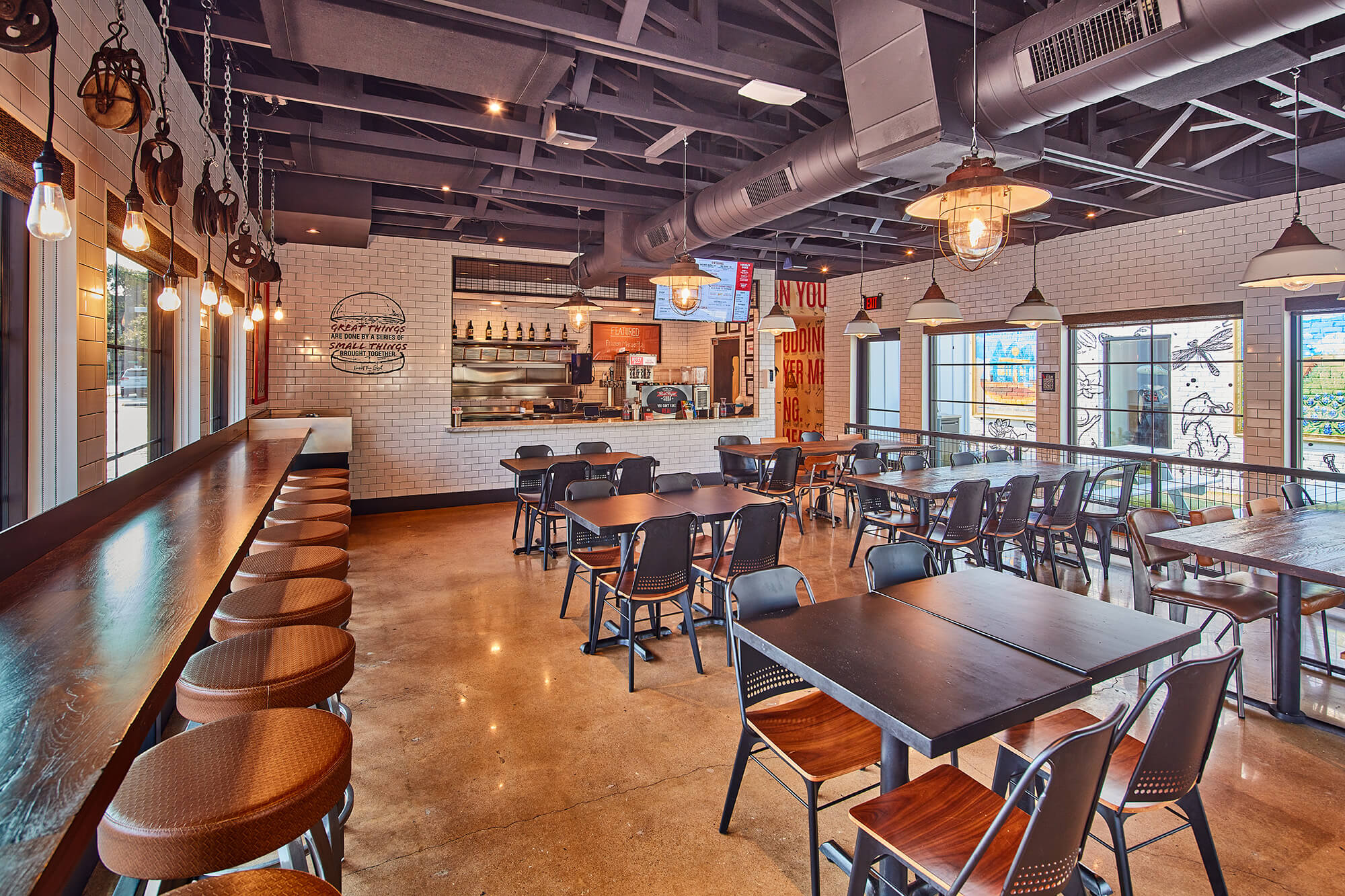
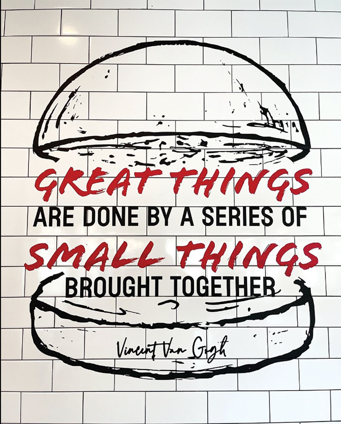
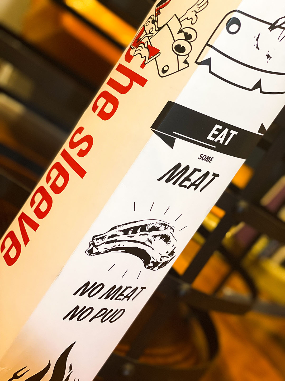
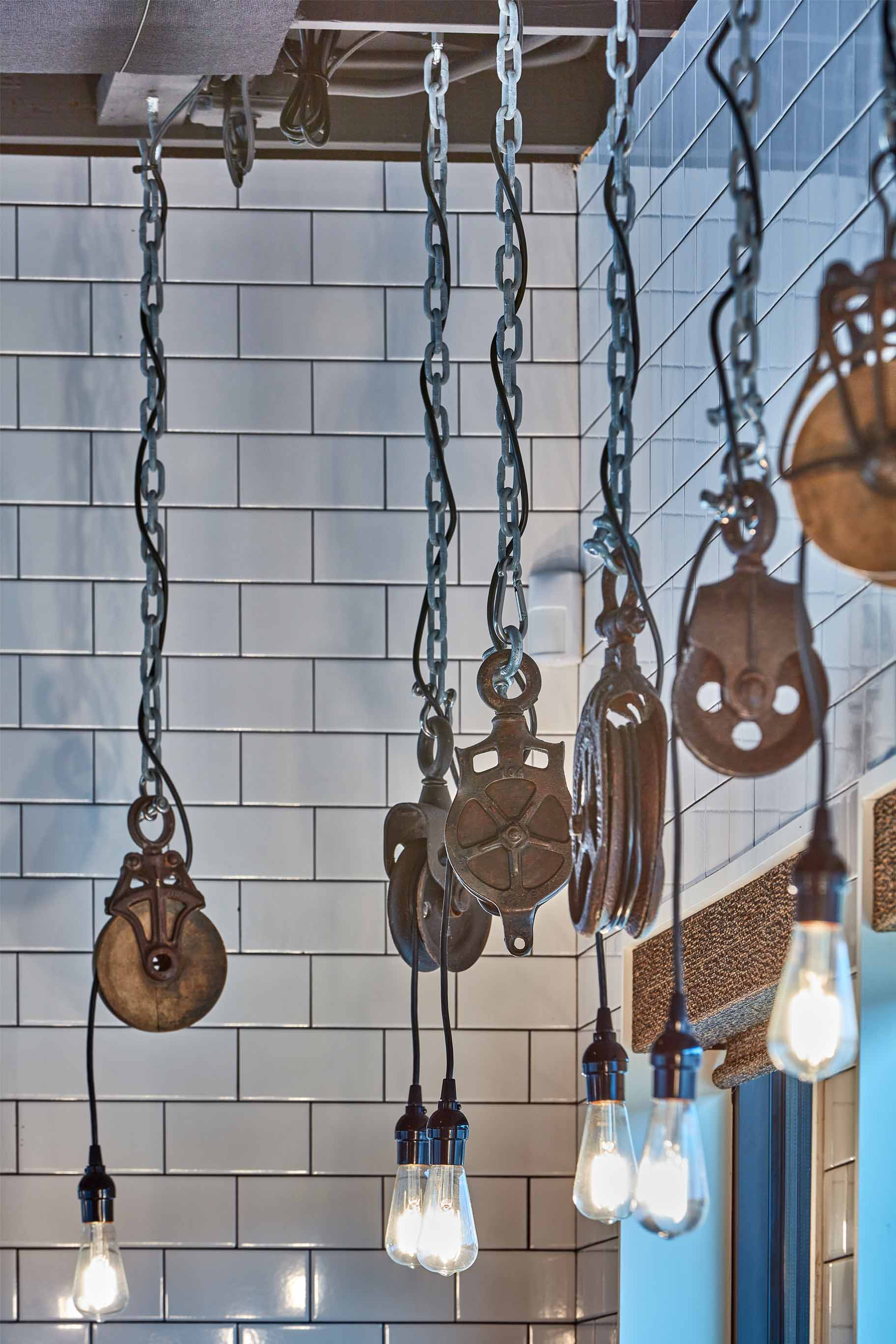
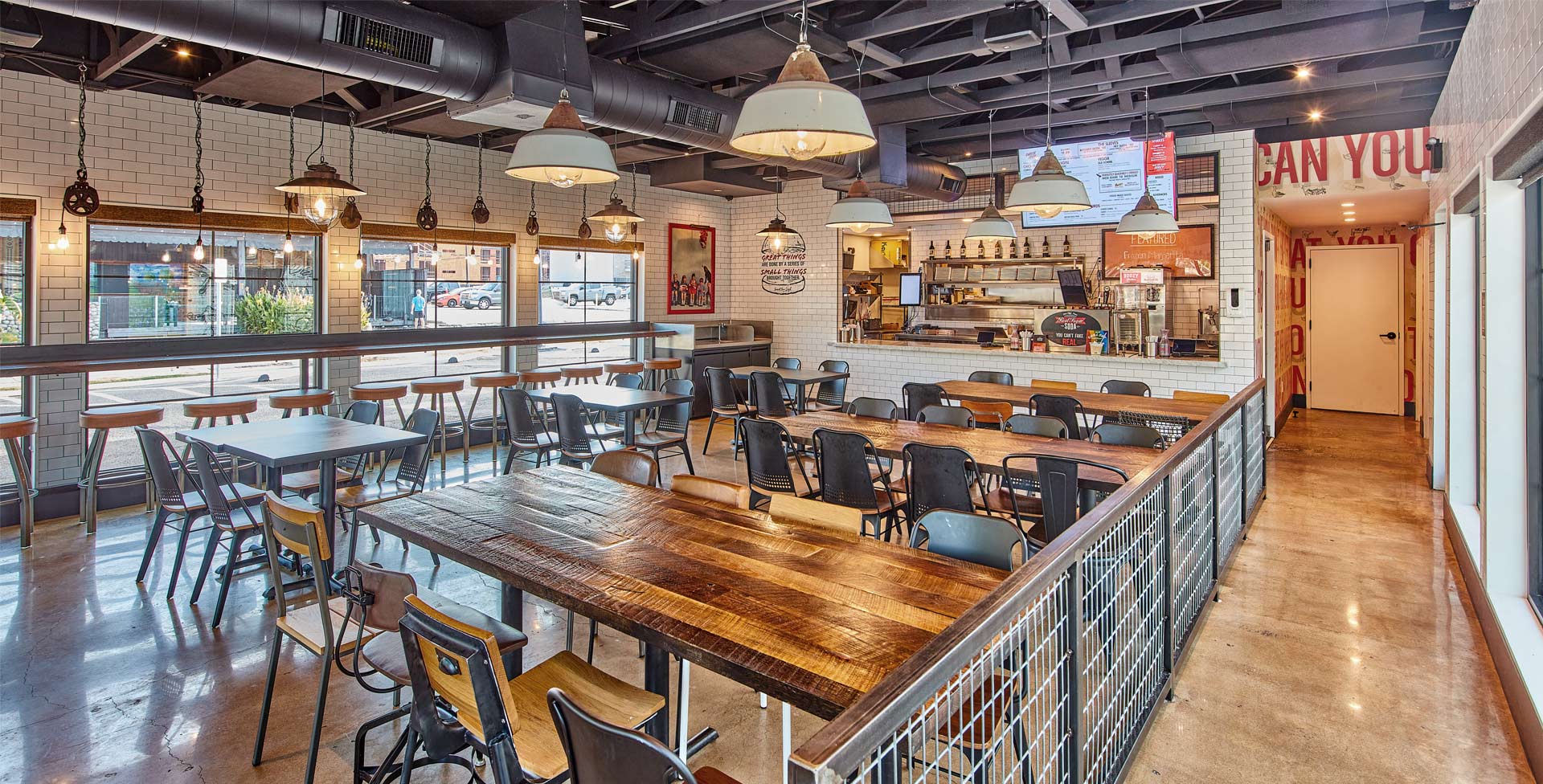
Reimagining the successful food hall kiosk, we developed a scalable model steeped in cheeky references, from Pink Floyd lyrics to the imagined persona of the butcher’s daughter. The result? A distinctive mix of restaurant environmental graphics and hospitality design that doesn’t take itself too seriously but still delivers seriously good design.
Quirky, retro, and rooted in American nostalgia, the exterior architecture retains its signature three peaks and familiar footprint while layering in surprising details that make every visit a little more memorable. From architectural moments to irreverent touchpoints, Son of a Butcher proves that attitude and approachability can coexist in one cohesive, crave-worthy concept.

Related projects
Let’s create something unforgettable
Fuelled by knowledge and imagination, we are driven by our ambition to evolve hospitality brands.
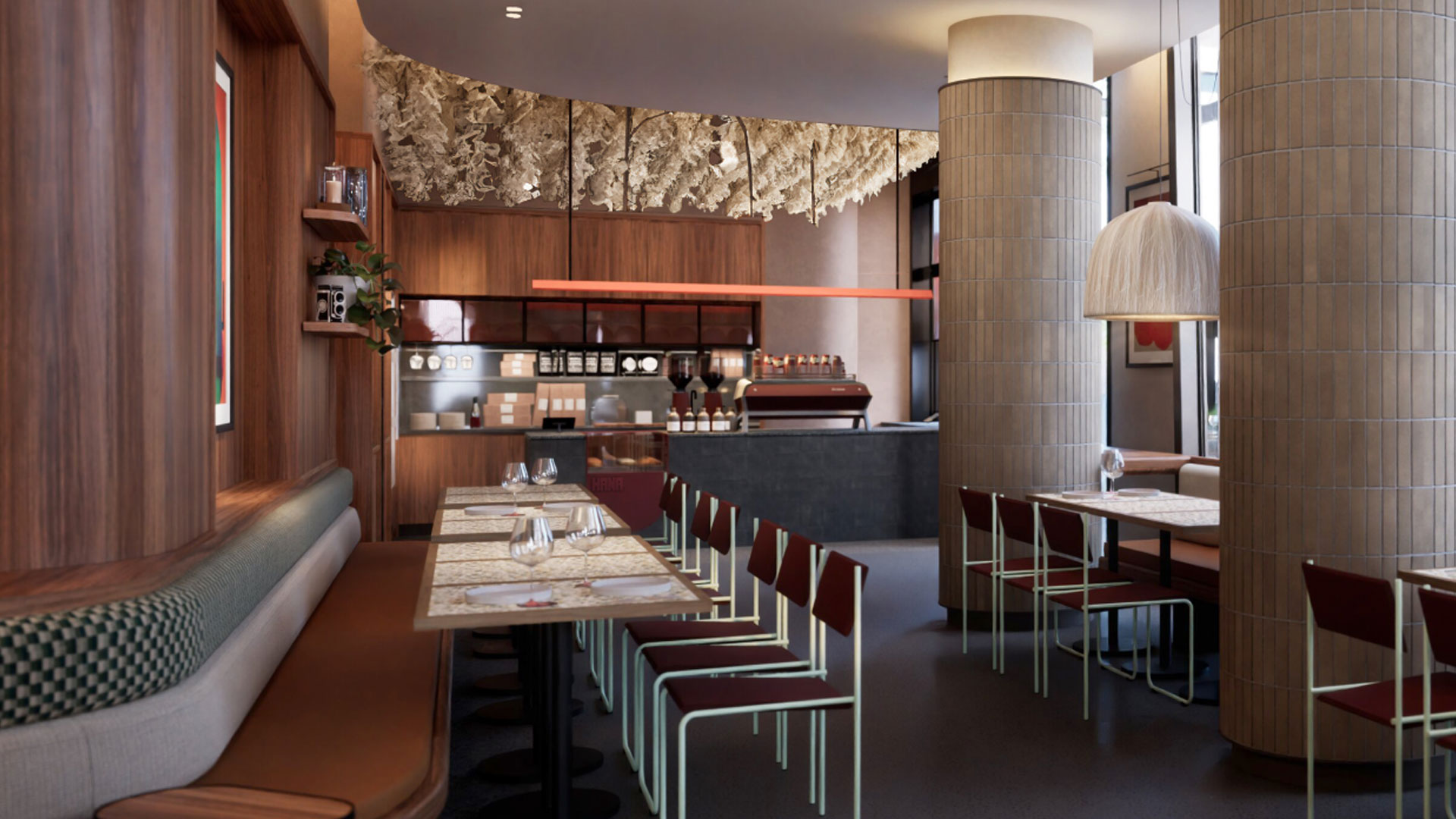
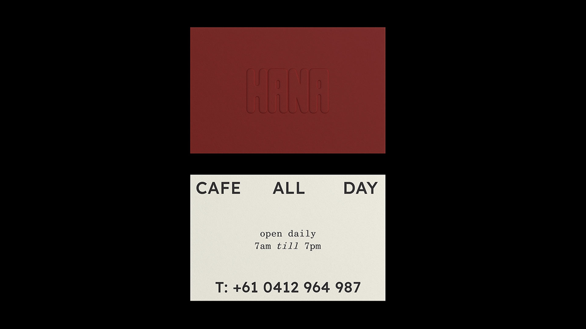
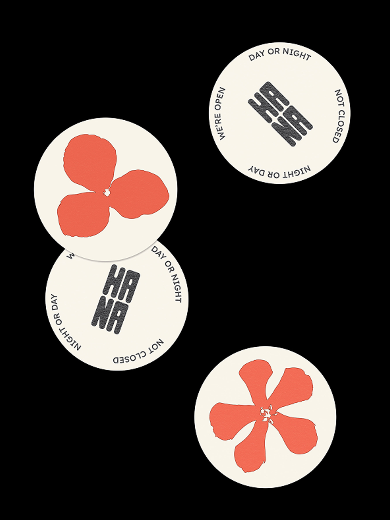
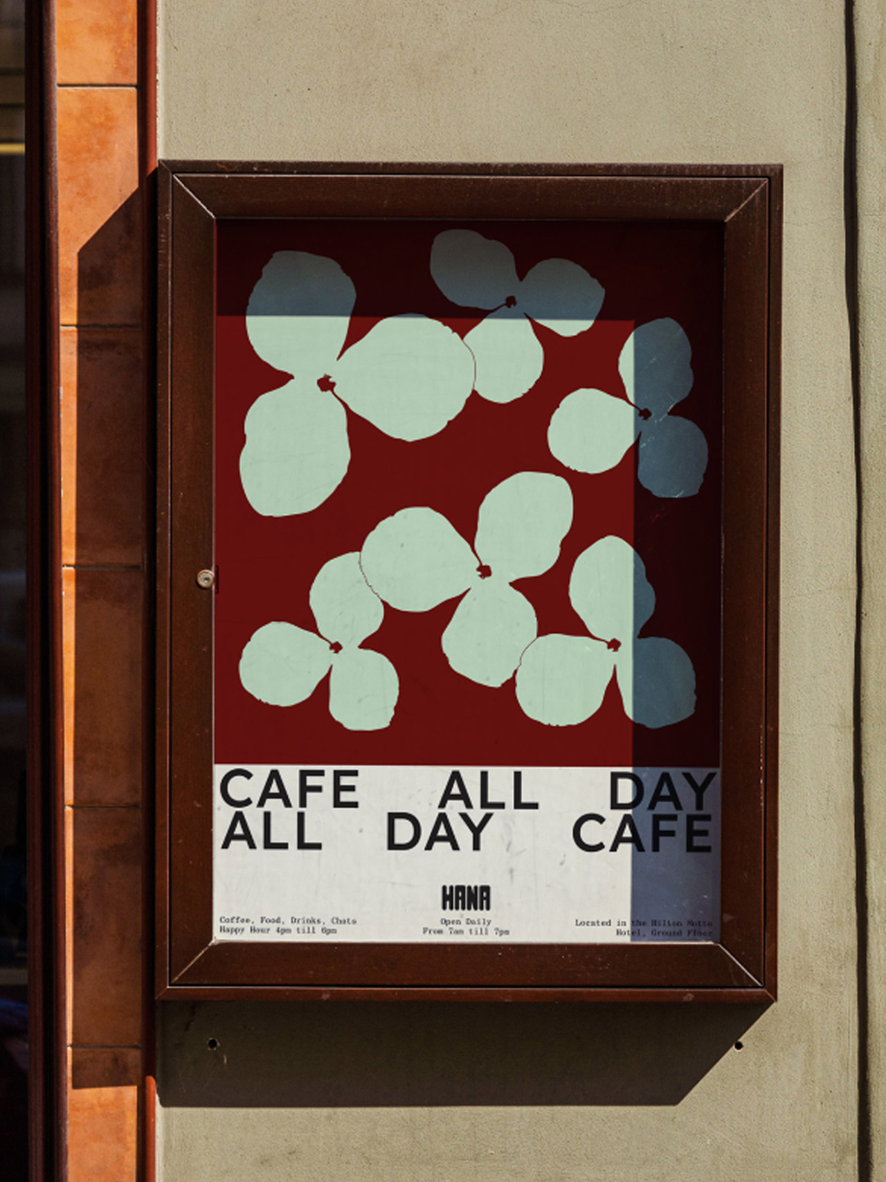
Inspired by native flora and Adelaide’s layered textures, Hana’s interior is an interplay of softness and structure, from custom lighting to material warmth.
Inspired by Adelaide’s native flora and relaxed rhythm, it offers an all-day welcome to both locals and travellers alike.
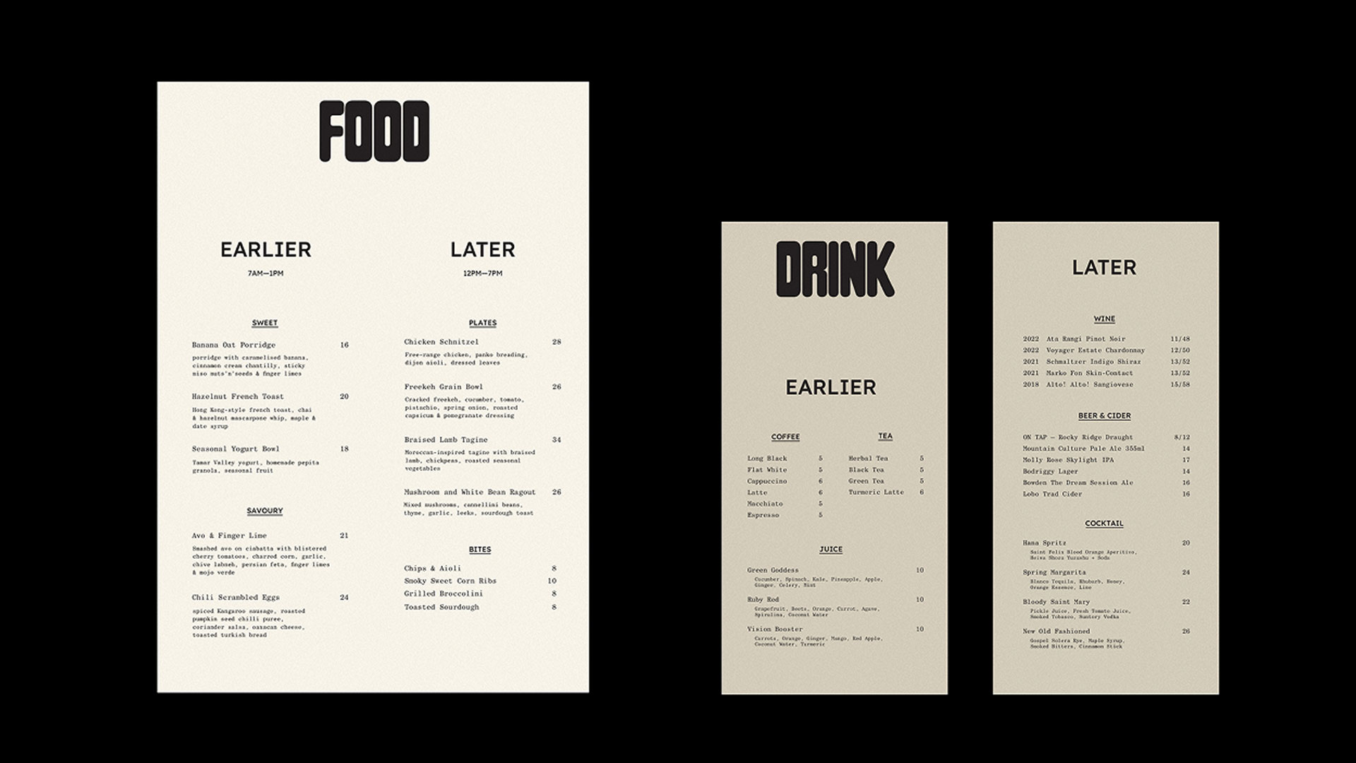
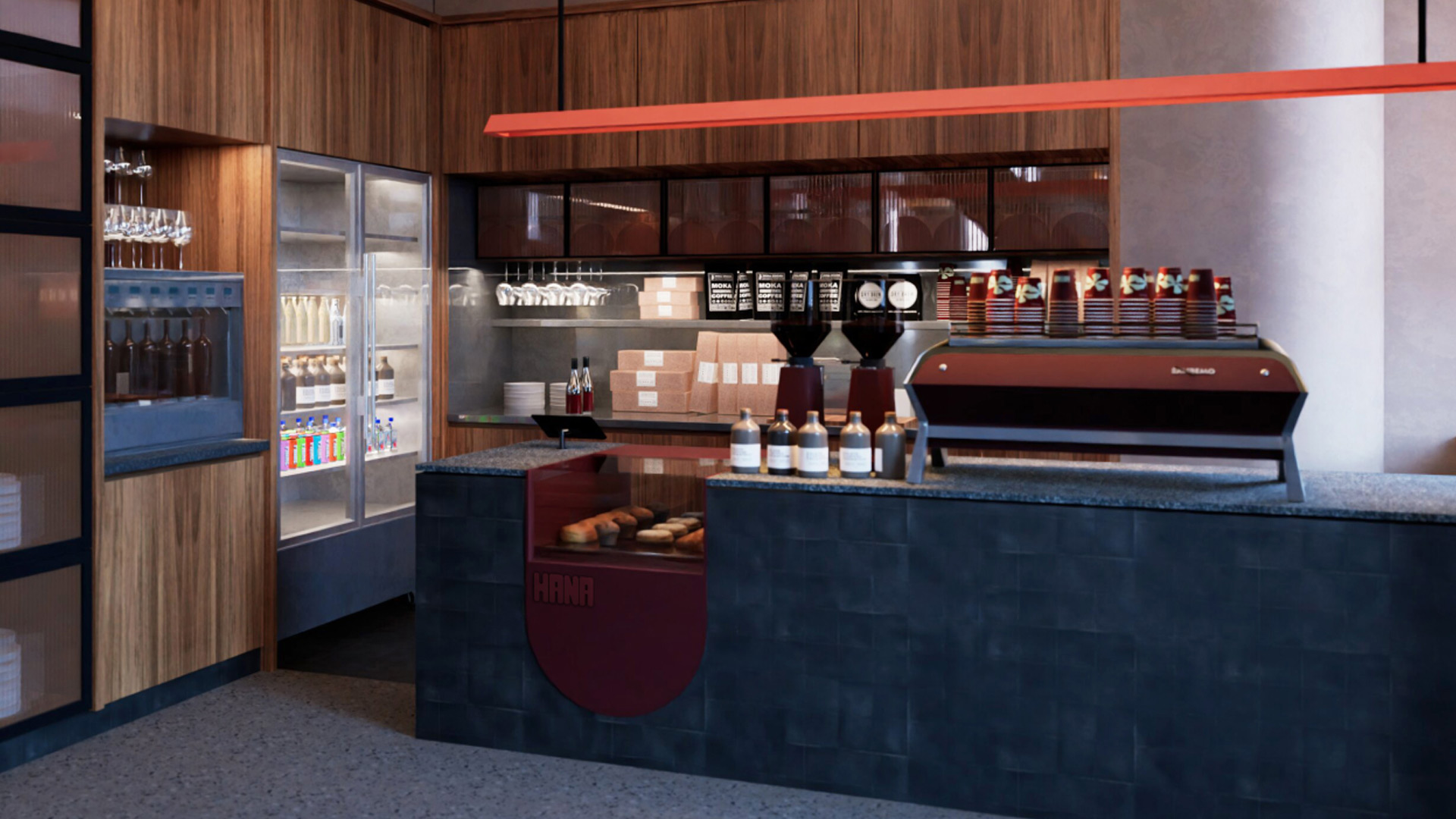
From the beginning, we saw Hana as more than a hotel café. It was an opportunity to create a neighbourhood hub. A space shaped by the surrounding landscape wrapped in warmth, and the energy of a city that’s coming into its own. Working in step with Motto’s values, we developed a brand identity that speaks to both community and character. The menu Strategy was developed to flex from causal small plates to lager lunch bites.
Bold floral motifs and a layered, natural palette give the café an easy elegance, while bespoke lighting and soft textures reflect the gentle beauty of native plants. The result is a space that feels alive rooted in the present, open to what’s next, and unmistakably Adelaide.
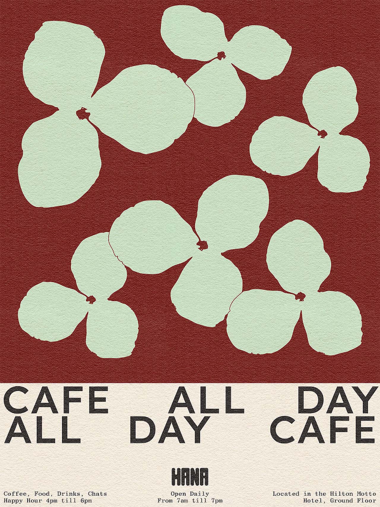

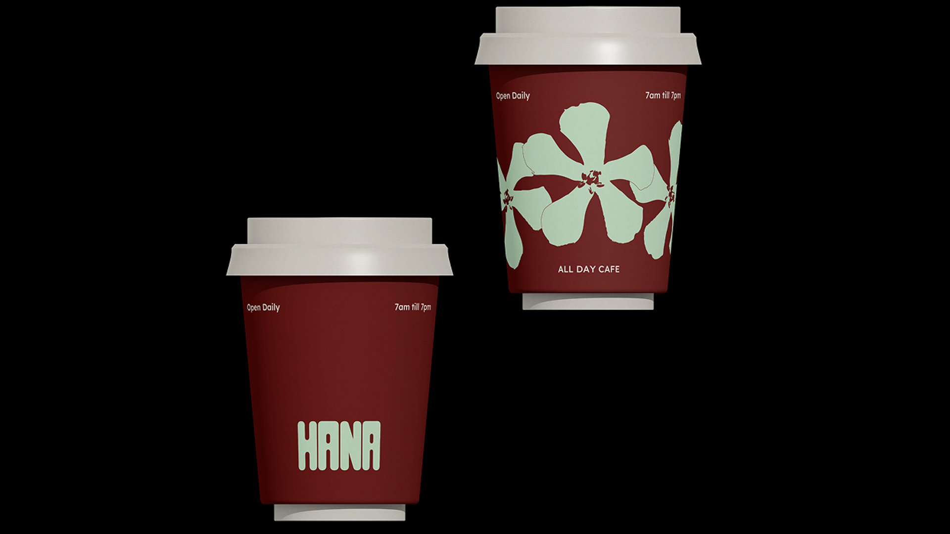
Hana invites guests in for good coffee and good company, all in a vibrant setting that feels unmistakably Adelaide.
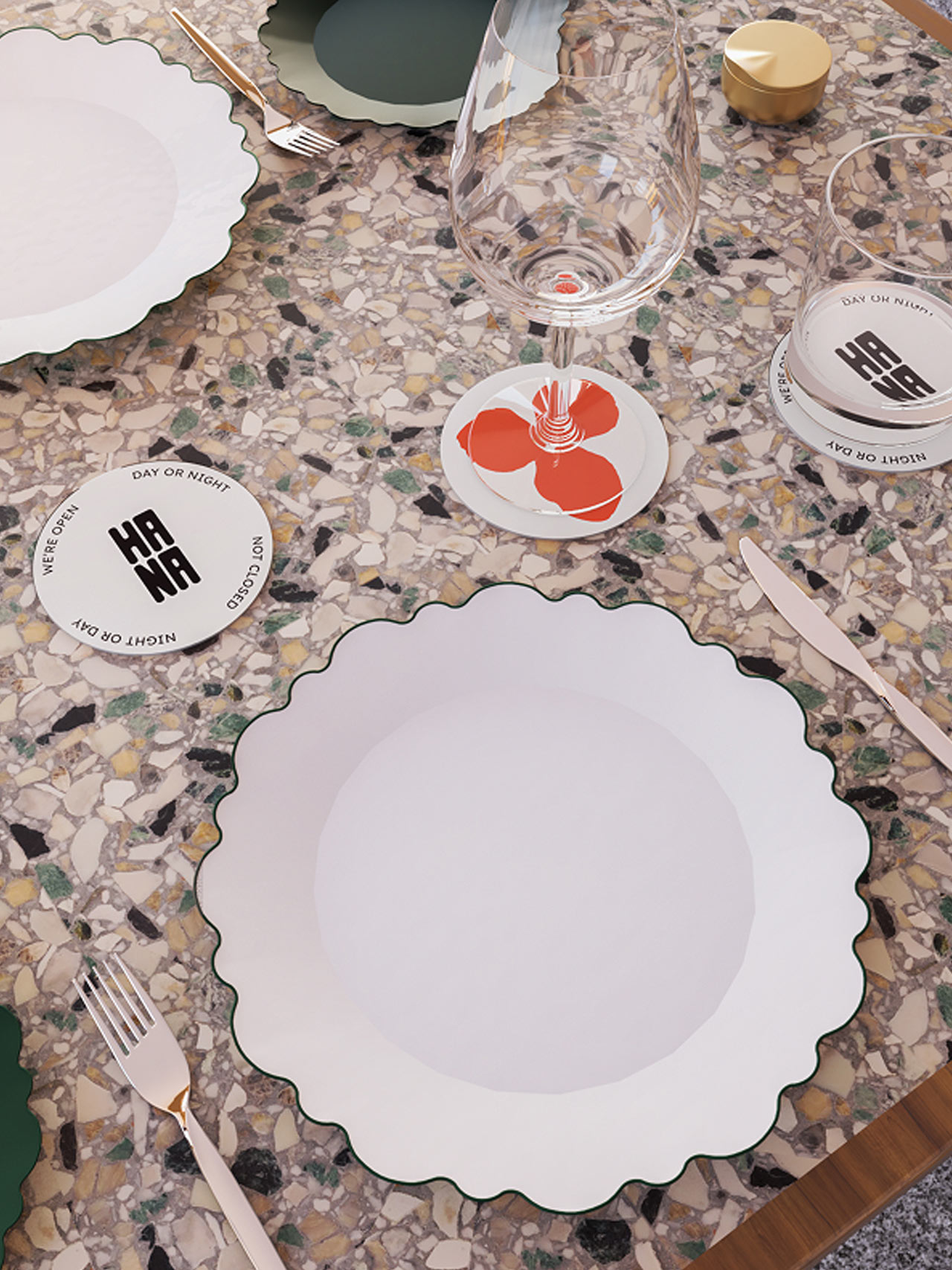
Every detail considered, scalloped plates, terrazzo textures, and playful coasters bring Hana’s table settings to life, creating moments that linger.
Related projects


Let’s create something unforgettable
Fuelled by knowledge and imagination, we are driven by our ambition to evolve hospitality brands.
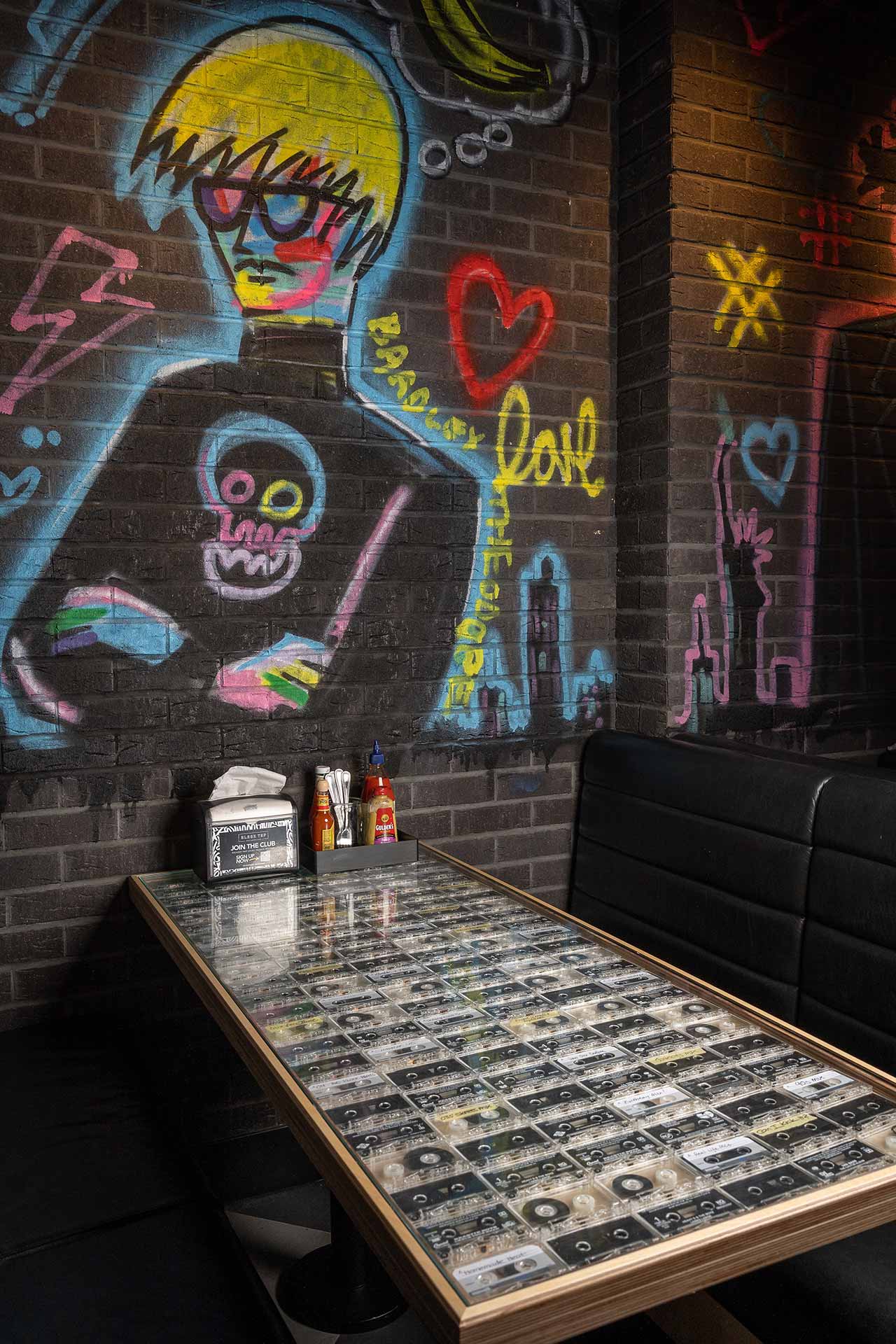
The walls showcase vibrant, striking murals by renowned NYC street artist Bradley Theodore, capturing the energy and spirit of New York while adding another layer of authenticity.
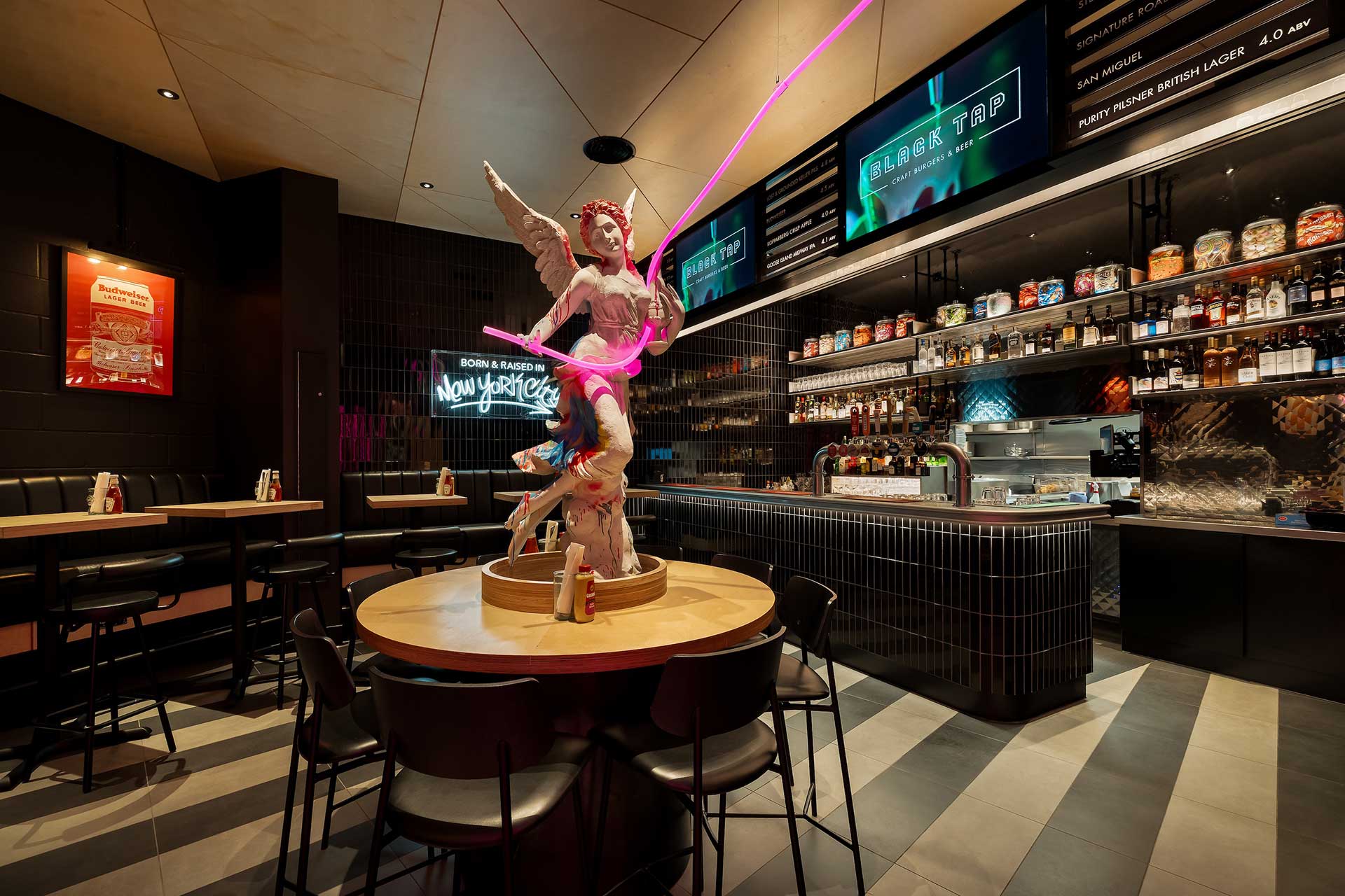
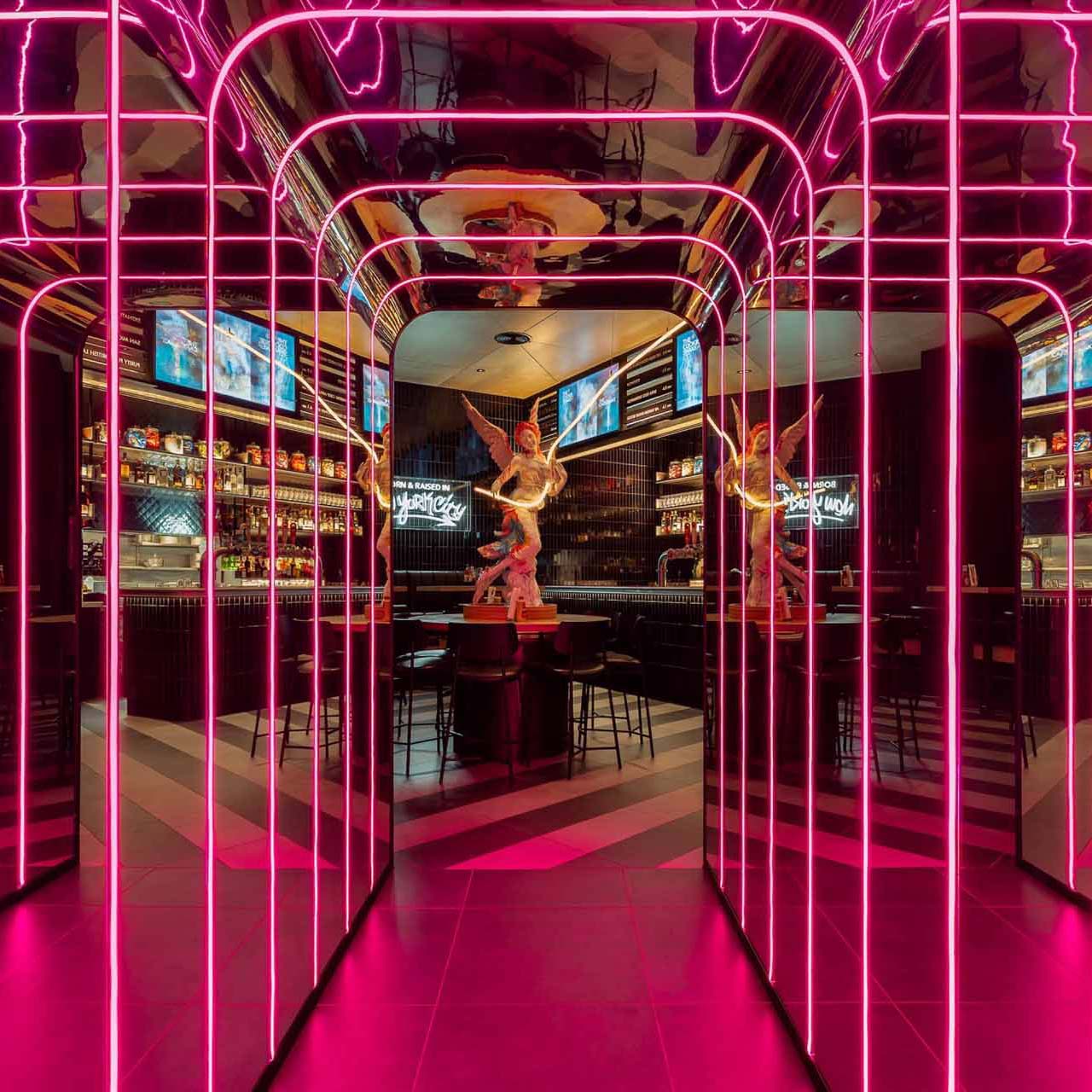
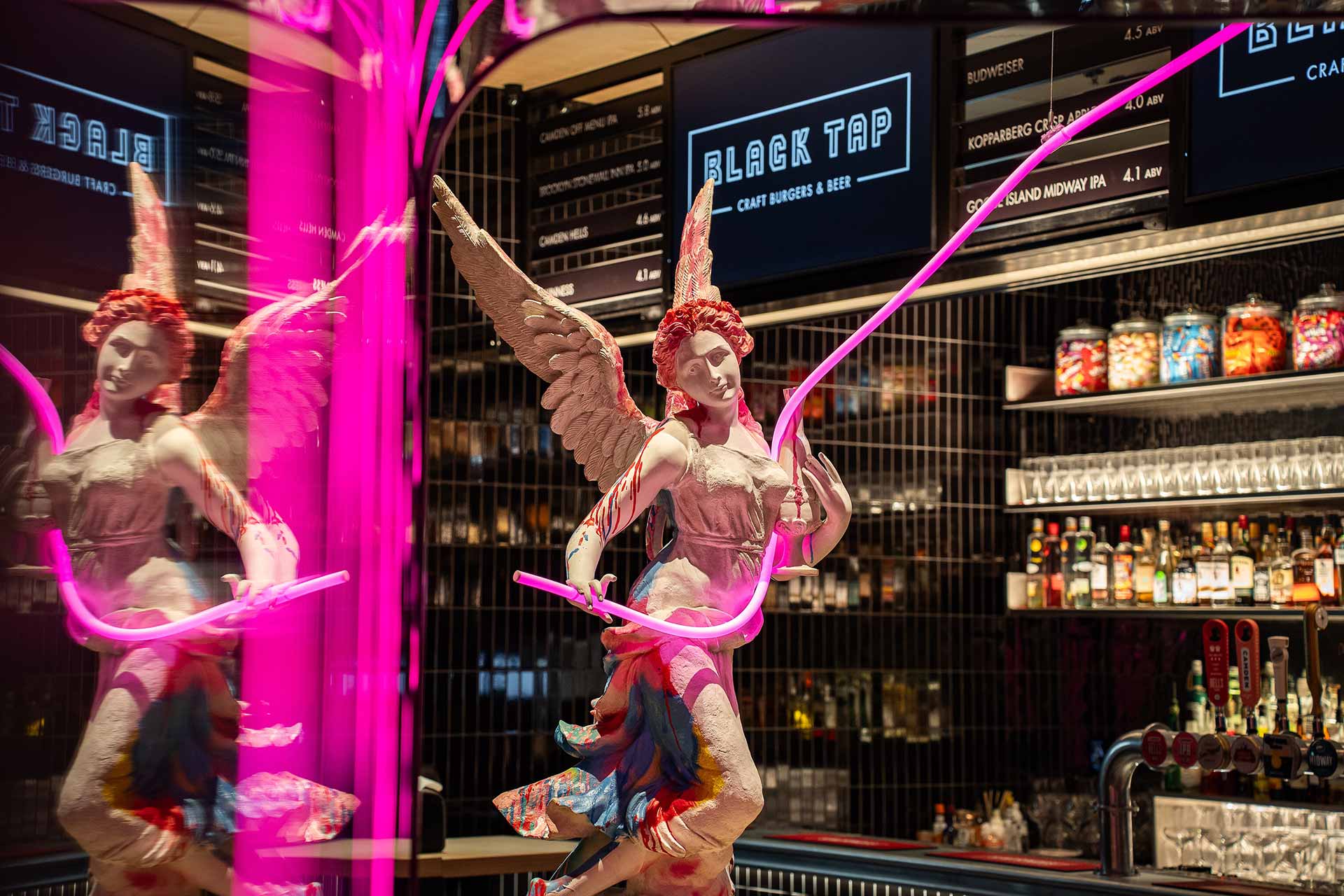
A striking angel statue positioned beyond the boombox corridor serves as a nod to the building’s heritage.
Soho to Soho – A Flagship Fusion of Heritage and Attitude
Inspired by Black Tap’s journey from Soho, New York to Soho, London, the interiors fuse NYC street culture with the elegance of a historic landmark London setting. It is a carefully orchestrated balance of preservation and provocation, demonstrating how thoughtful project management and creative interior design can translate a global brand with precision and intent.
Honouring History Through Dramatic Design
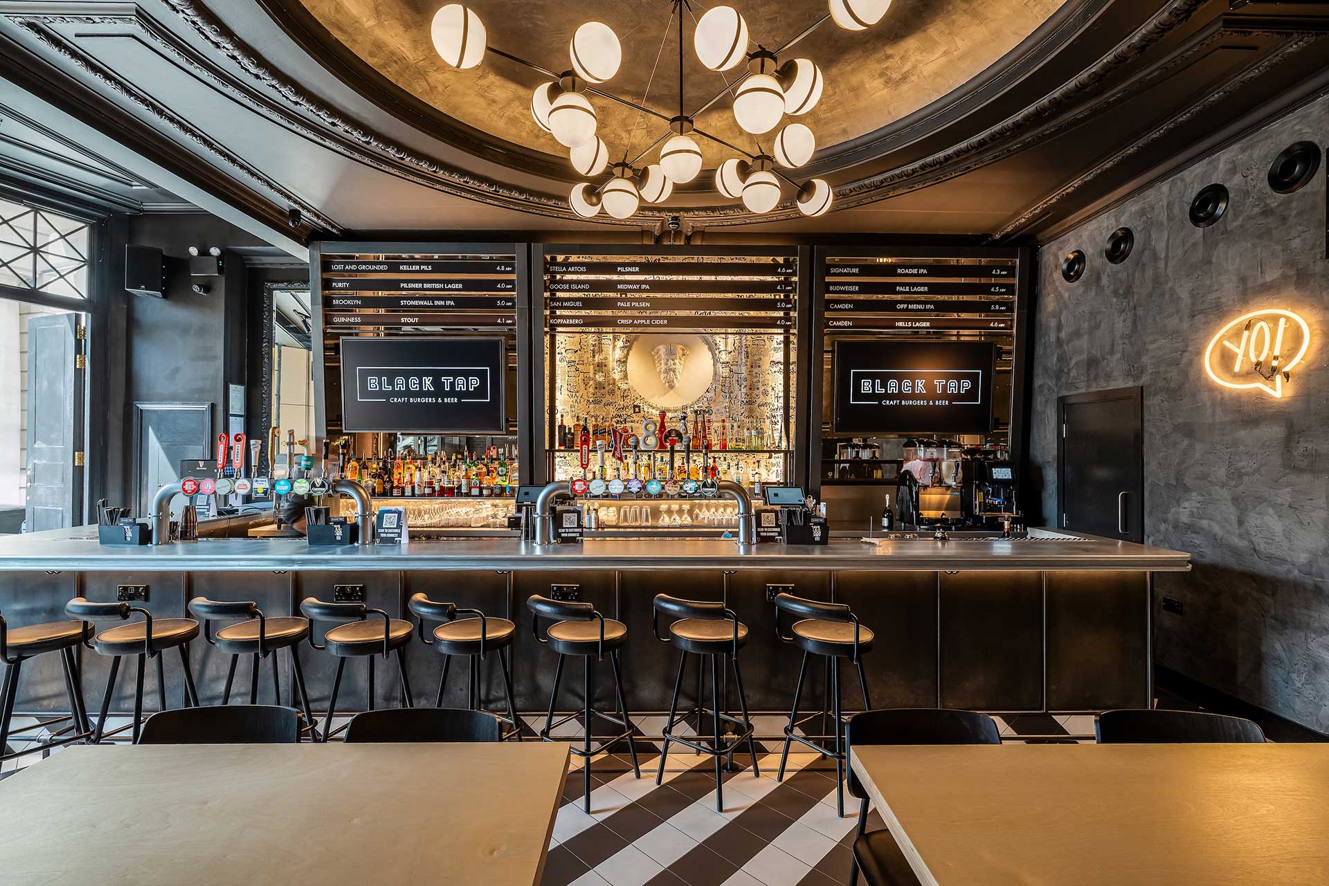
At ground level, a disciplined monochrome palette establishes a strong first impression. Geometric black-and-white tiles flow across the space and wrap a sculptural central bar, creating a graphic statement that feels modern and dynamic while remaining respectful of the building’s architectural integrity.
A Bold Journey Below Ground
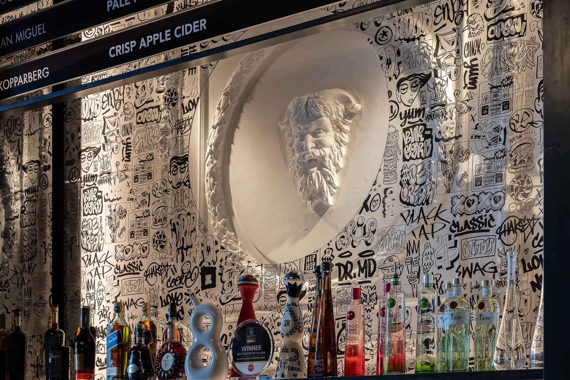
Descending to the basement, the atmosphere changes. The space becomes more immersive, playful, and expressive. A large-scale boombox installation anchors the room, while LED-lit corridors, fire-escape-inspired seating, and graffiti murals by New York street artist Bradley Theodore inject movement and character. The design captures the raw, creative spirit of the city it’s unapologetic, layered, and full of life.
Every element, from bespoke furniture to unexpected sculptural moments including a classical statue reimagined with a neon aux cord has been designed to surprise, delight, and tell a story through space. Carefully considered lighting and layered artwork heighten contrast throughout, allowing bold interventions to sit confidently within the historic fabric of the building.
A Confident Translation of Brand and Place
Black Tap London is more than a new restaurant. It is an exercise in global brand translation at its most considered where creative energy is channelled with discipline, and experience is shaped with purpose. The result is a dynamic, memorable destination that feels authentic to both its New York roots and its London setting. Hospitality design that is ambitious, contextual, and unmistakably Black Tap.
“Black Tap Piccadilly is all about energy, contrast and craft,” adds Sarah. “It was about creating a space that feels alive — where every corner sparks curiosity and every design detail plays its part in the story.”


The best Black Tap to date and it has raised the bar really high.
Related projects
Let’s create something unforgettable
Fuelled by knowledge and imagination, we are driven by our ambition to evolve hospitality brands.
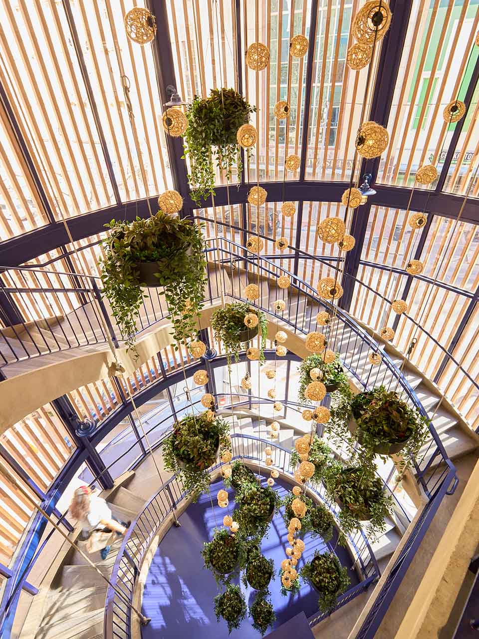
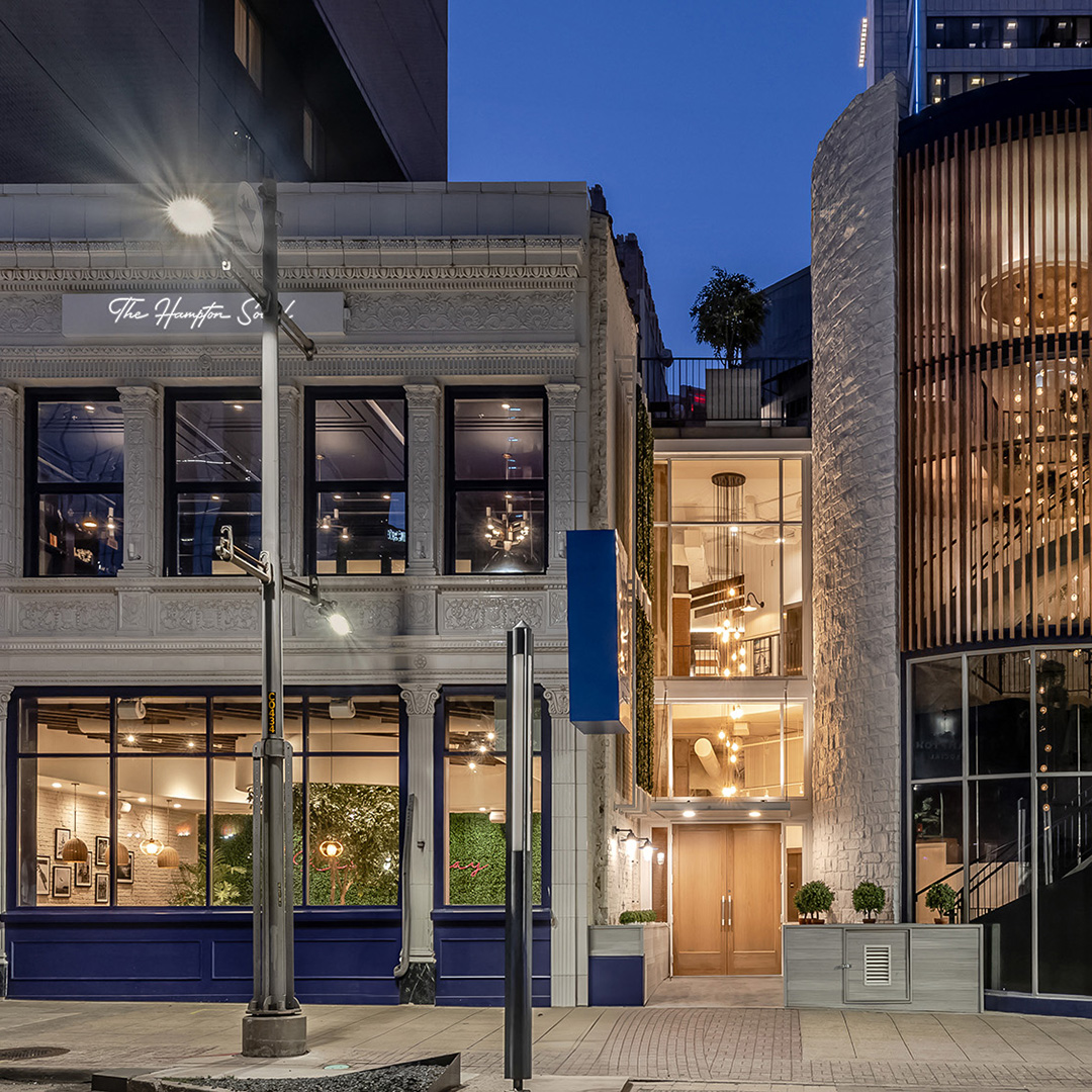
A once utilitarian stairwell becomes a signature moment of interior architecture, where greenery, sculptural lighting, and coastal hues express the brand identity across every level of the layered guest journey.
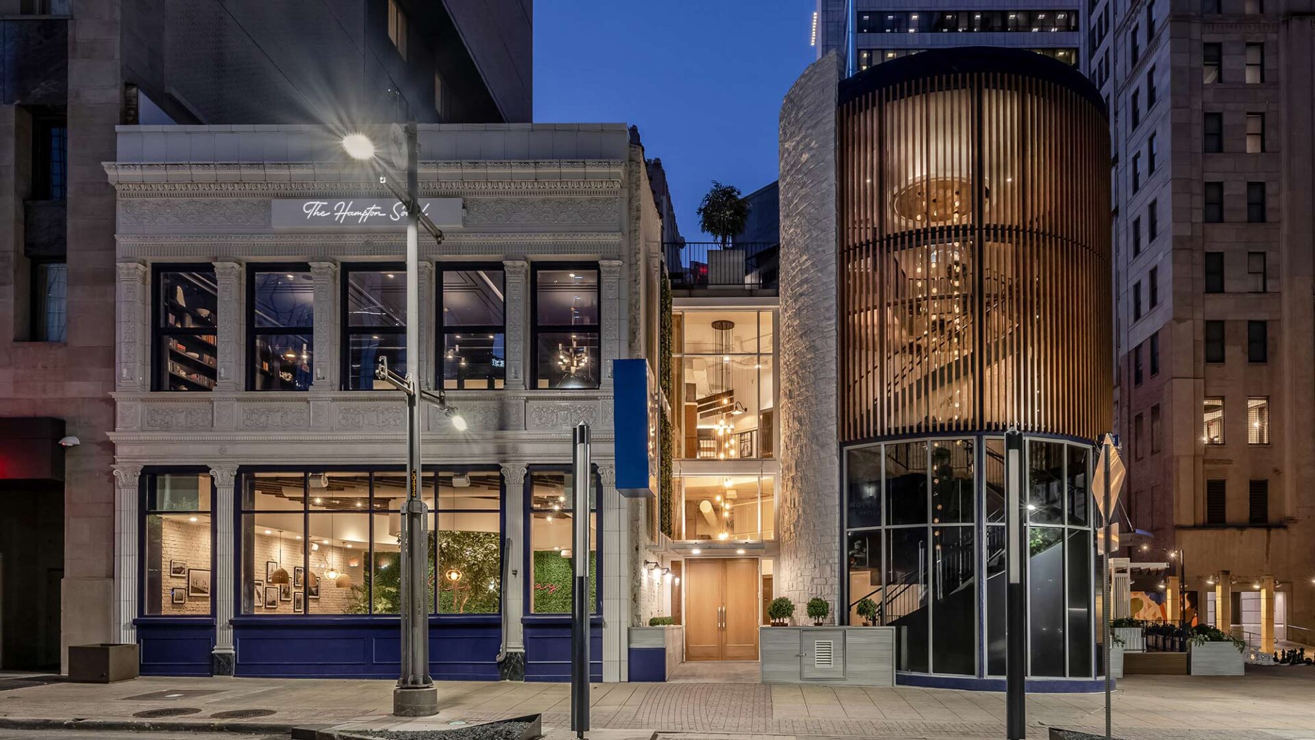
Historic ornamentation meets modern form as a 1915 façade sits comfortably alongside the contemporary spiral stairs in a brilliant balance of layered, hospitality architecture.
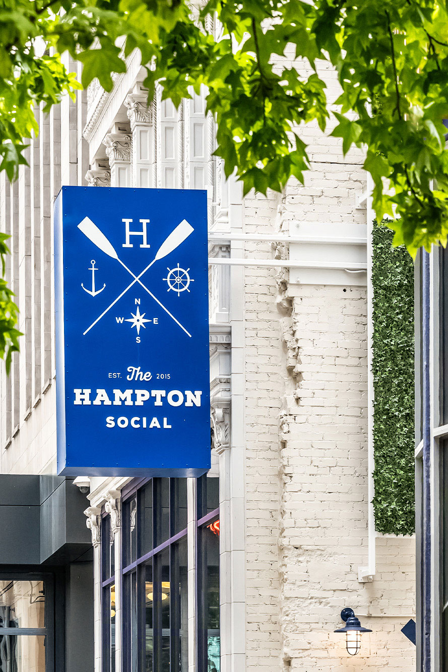
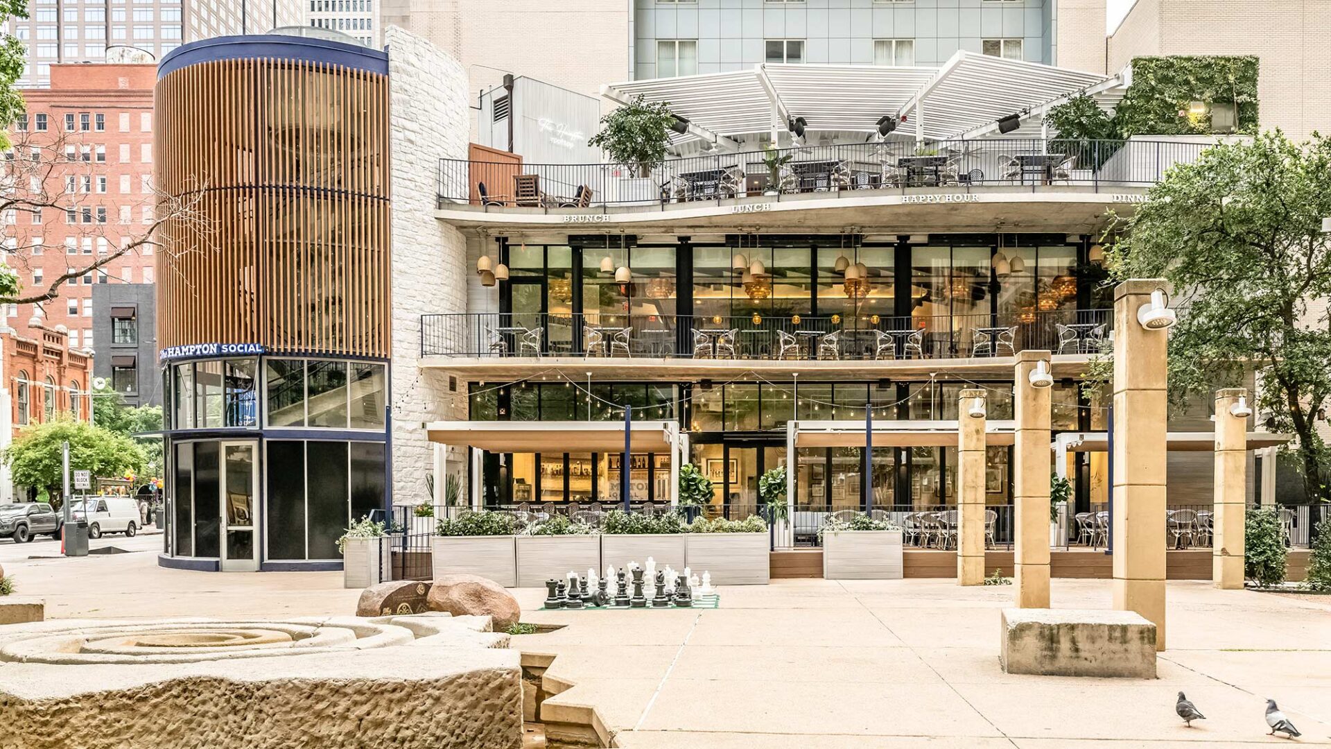
Designed by Harrison as both interior designer and architect of record, the 18,775-square-foot space transforms a once-vacant historic building into a dynamic showcase of restaurant design and interior architecture. From light-filled dining spaces to park-facing patios, every detail was crafted to create movement, mood, and magic. A spatial story designed for the way people want to gather in today’s fast-paced world.
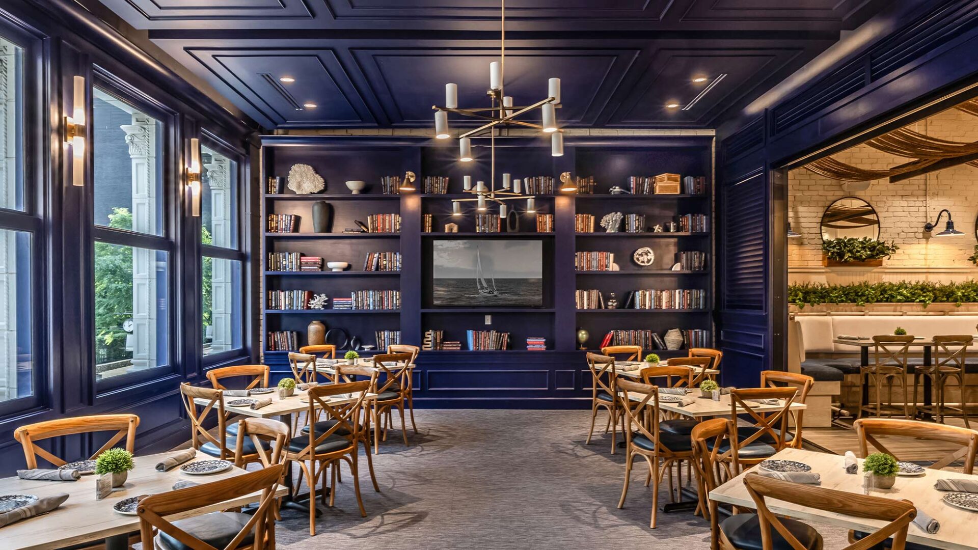
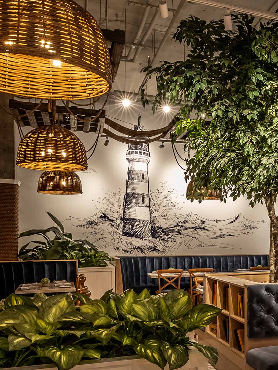
Inside, the interiors mix whitewashed woods, rope textures, and exposed brick to seamlessly marry coastal ease with urban edge. The beautifully detailed 1915 façade offers a grounded counterpoint to the airy experience within, a tribute to the building’s layered past and a symbol of renewal in the heart of the city.
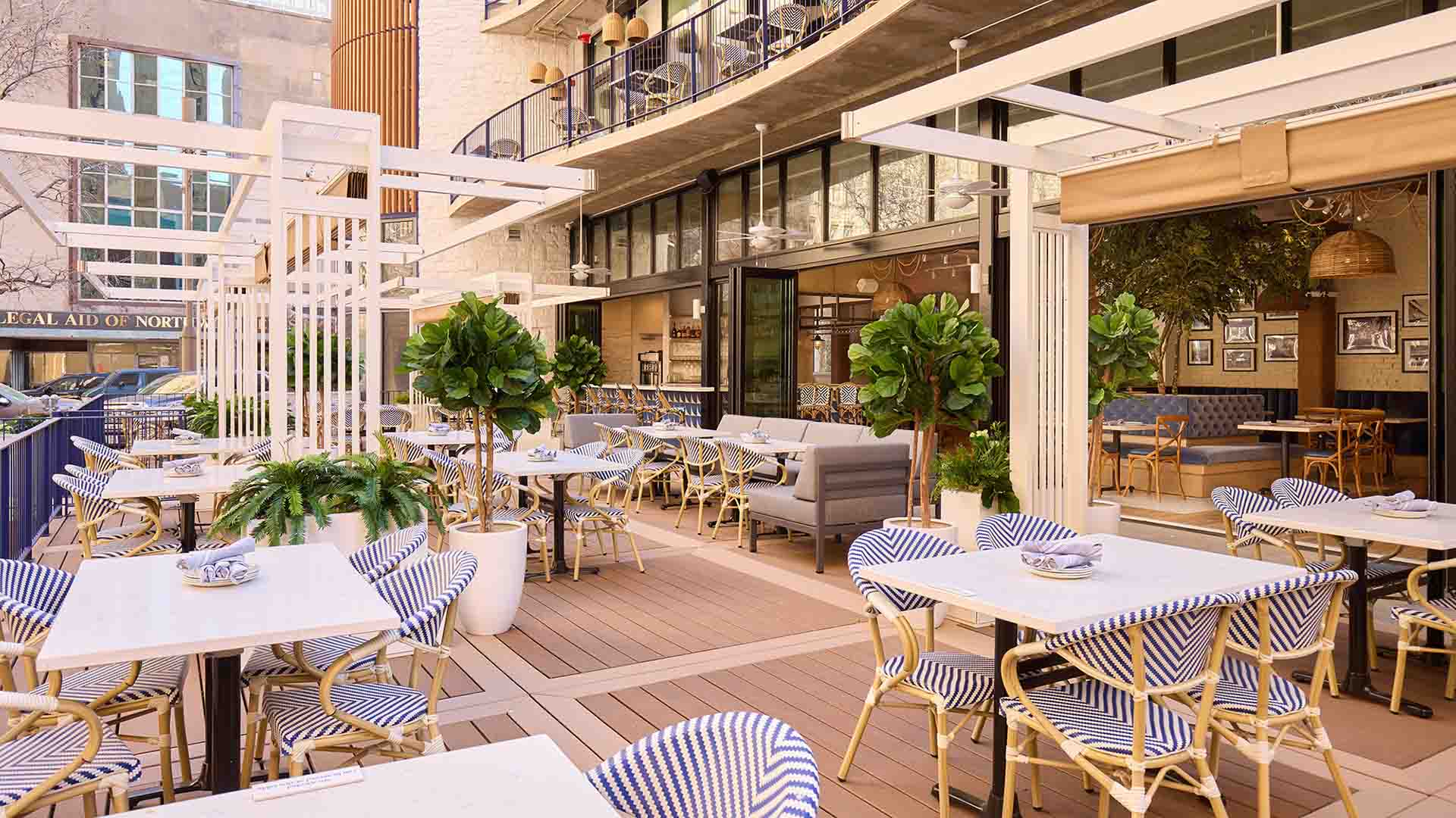
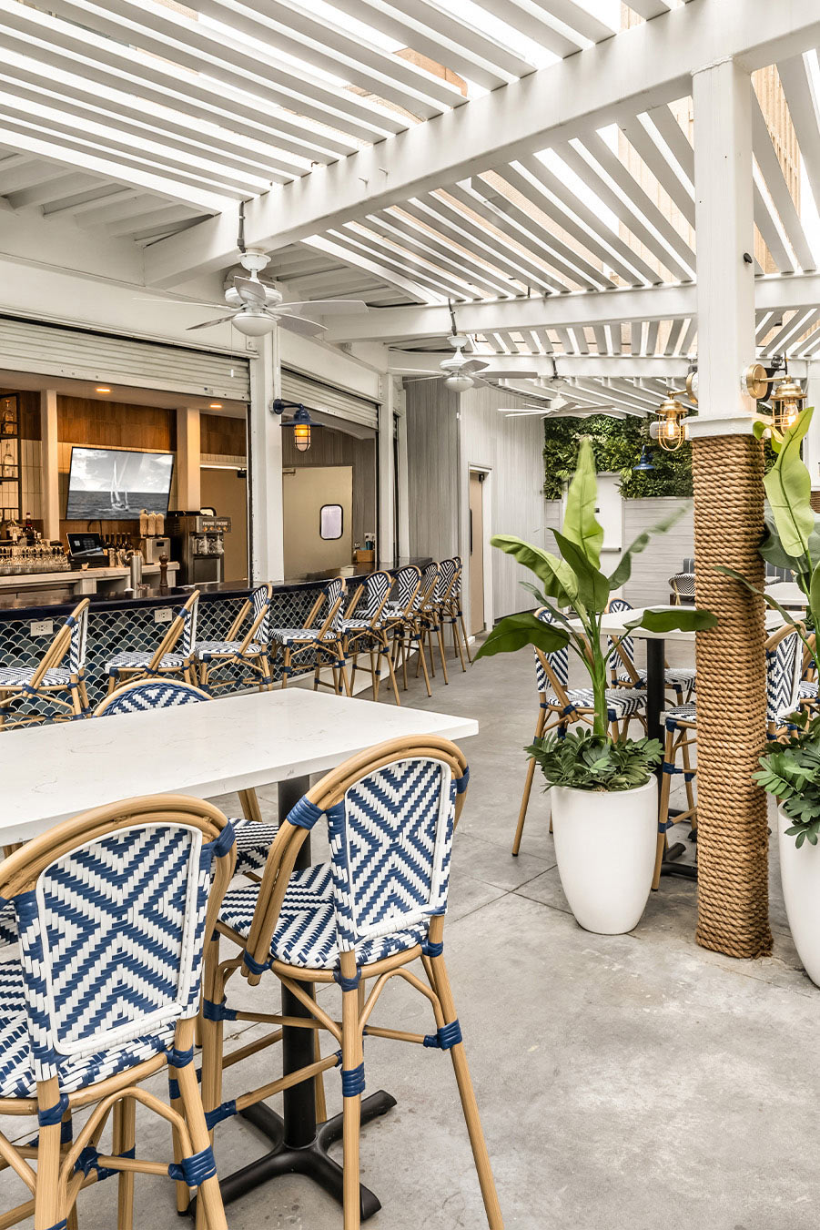
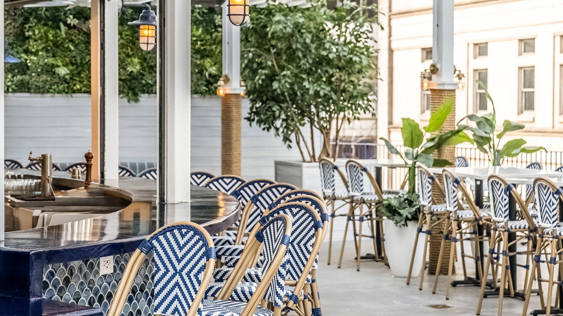
Designed as both destination and story element, the modular patio extends the brand storytelling outdoors as an advanced design concept crafted for flexibility, flow, and a golden-hour state of mind.
Each level brings a distinct rhythm: rooftop relaxation, bar-forward energy, and a private members club below. A bar on every floor ensures social fluidity, while a modular outdoor deck, designed in coordination with city regulations, extends the brand’s hallmark atmosphere into the surrounding Pegasus Plaza.
Our solutions spanned creativity and complexity. With structural inconsistencies and undocumented renovations throughout the shell, the design required fast thinking, adaptive strategy, and seamless integration of old and new. The result is a hospitality environment that honors heritage, amplifies brand, and invites guests to stay awhile.
This is more than a restaurant. It’s a reawakening. A coastal state of mind built in the heart of the city.
Hampton Social has always been rooted in a thoughtfully curated, welcoming atmosphere. With this location, our team had the opportunity to build on that strong foundation, preserving the brand’s signature beachfront-inspired aesthetic while refining the design with a mix of coastal and elevated materials, rich textures, zoned social seating, and carefully considered lighting, providing an approachable experience while maintaining the breezy, celebratory Hampton Social vibe.”
The Harrison team has been instrumental in bringing this vision to life, seamlessly capturing the essence of The Hampton Social while thoughtfully adapting it to this redevelopment. Their expertise in reimagining complex spaces has made them an invaluable partner in shaping this next chapter for the district.
Project snapshot
Related projects
Let’s create something unforgettable
Fuelled by knowledge and imagination, we are driven by our ambition to evolve hospitality brands.
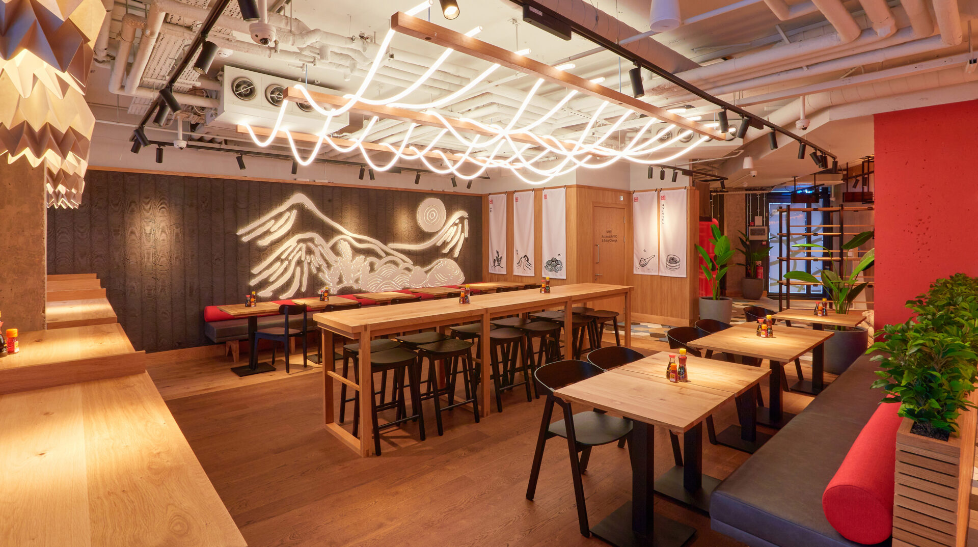
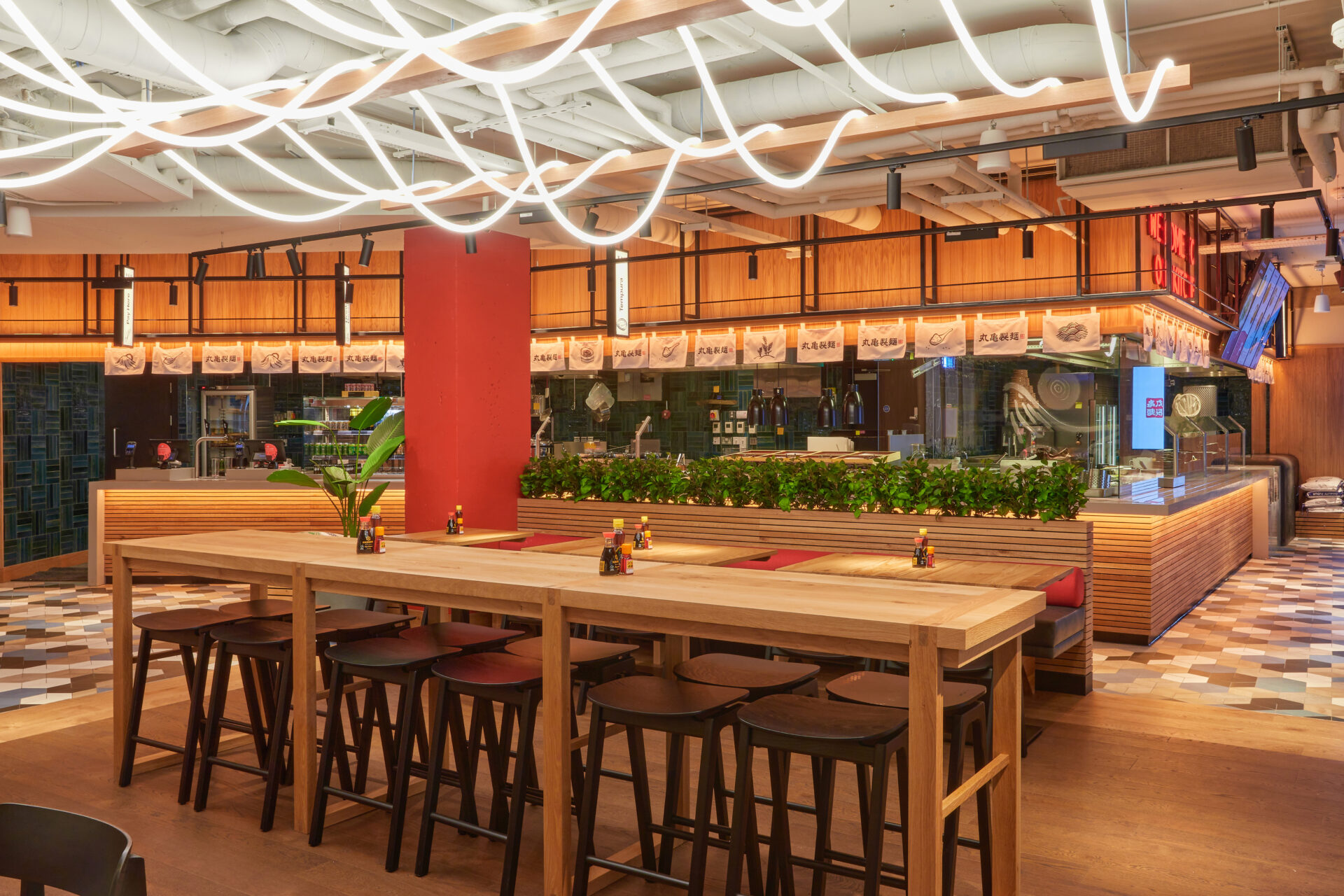
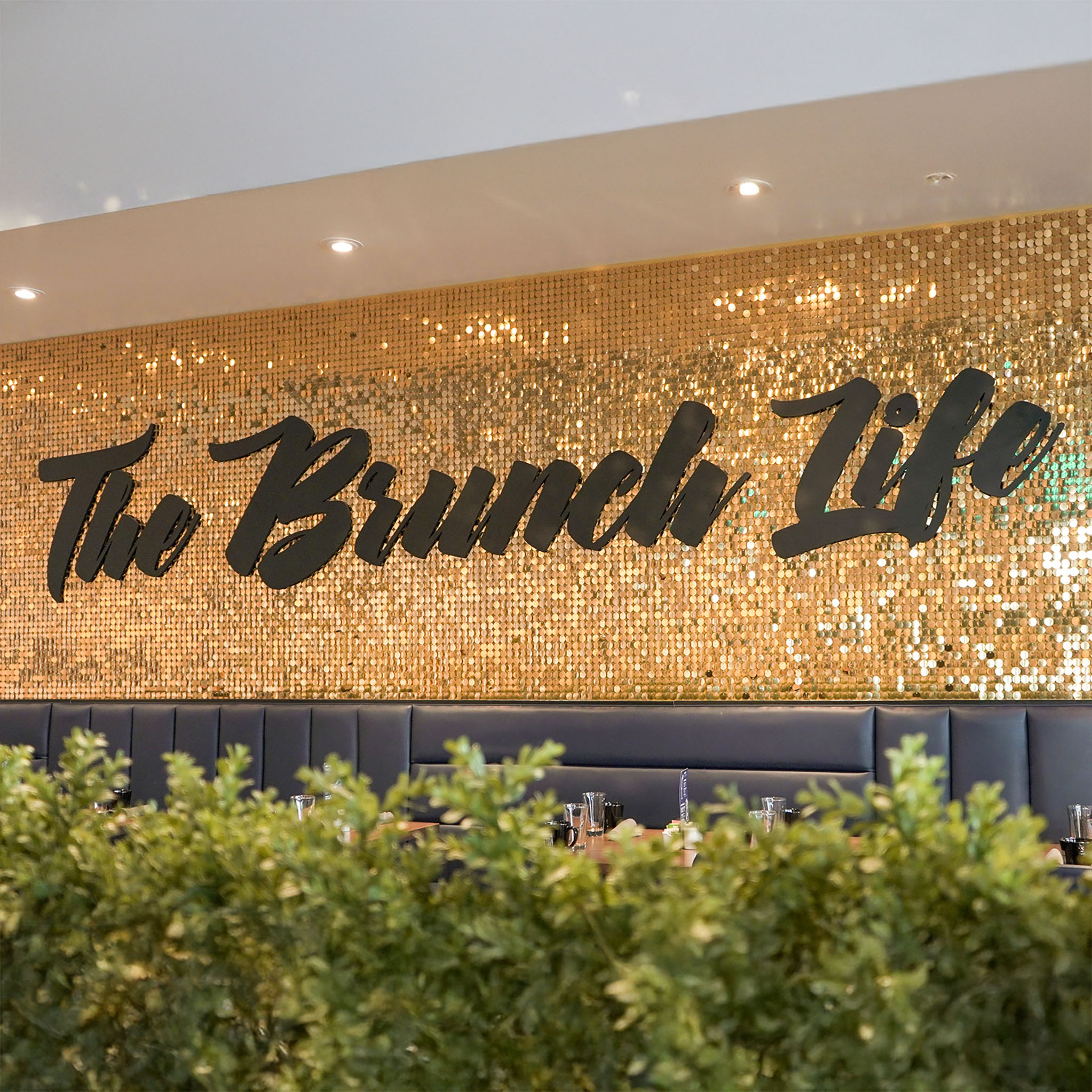
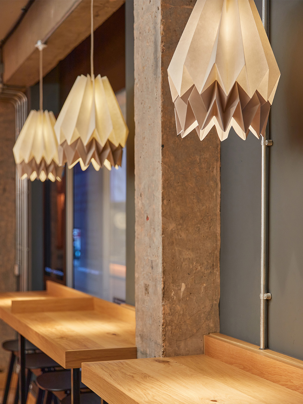
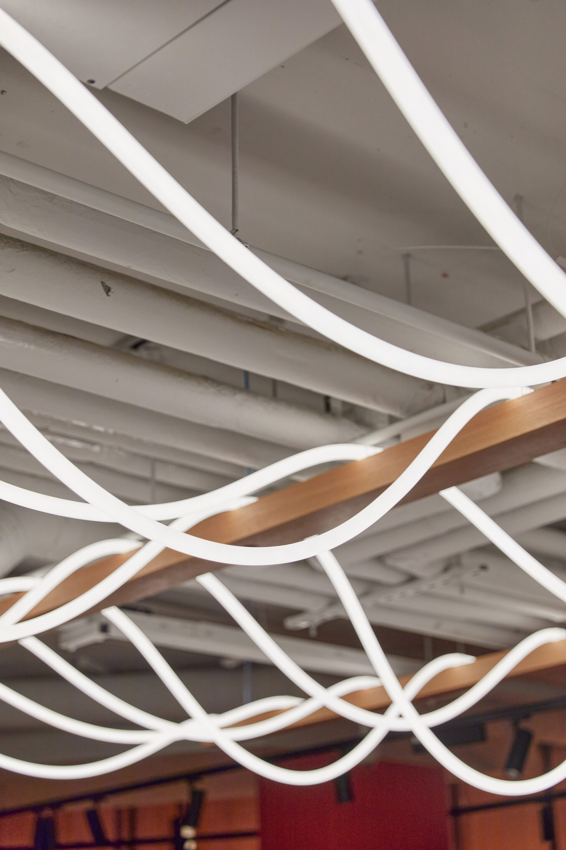
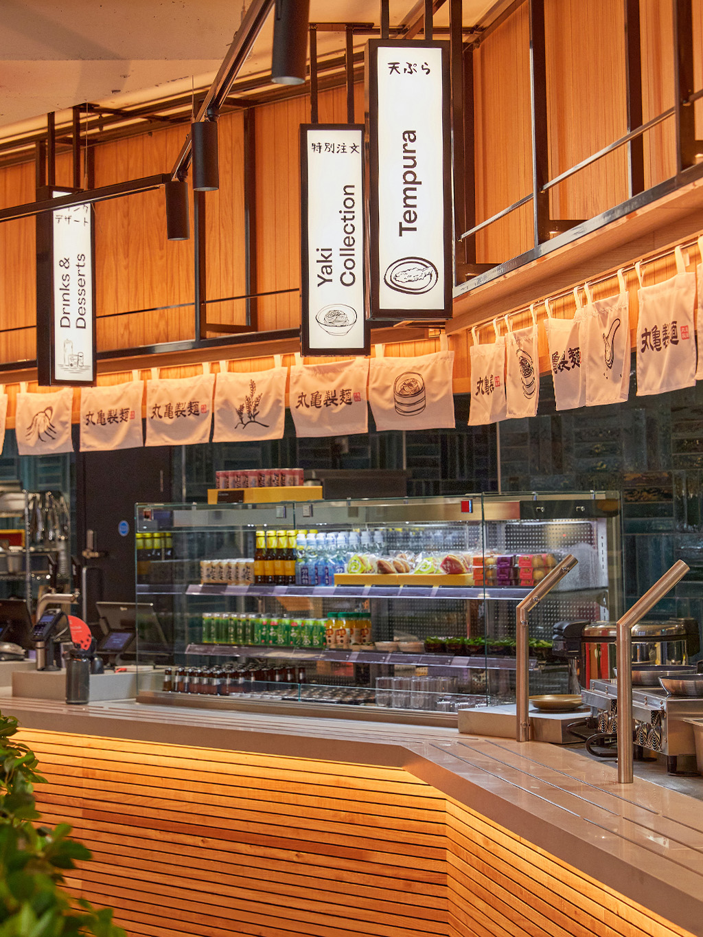
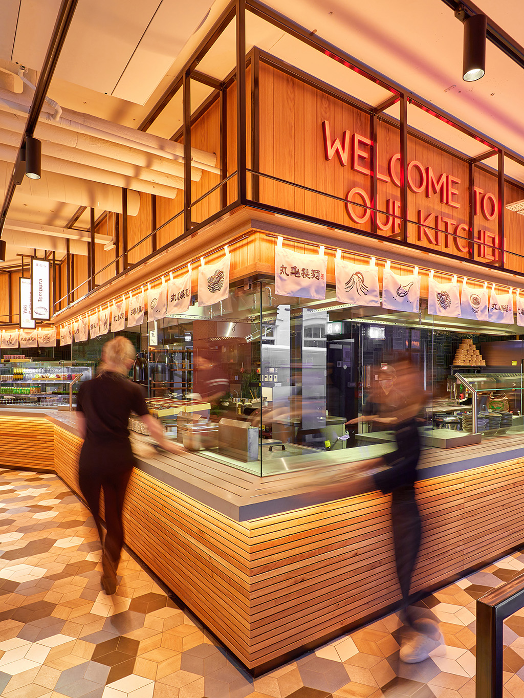
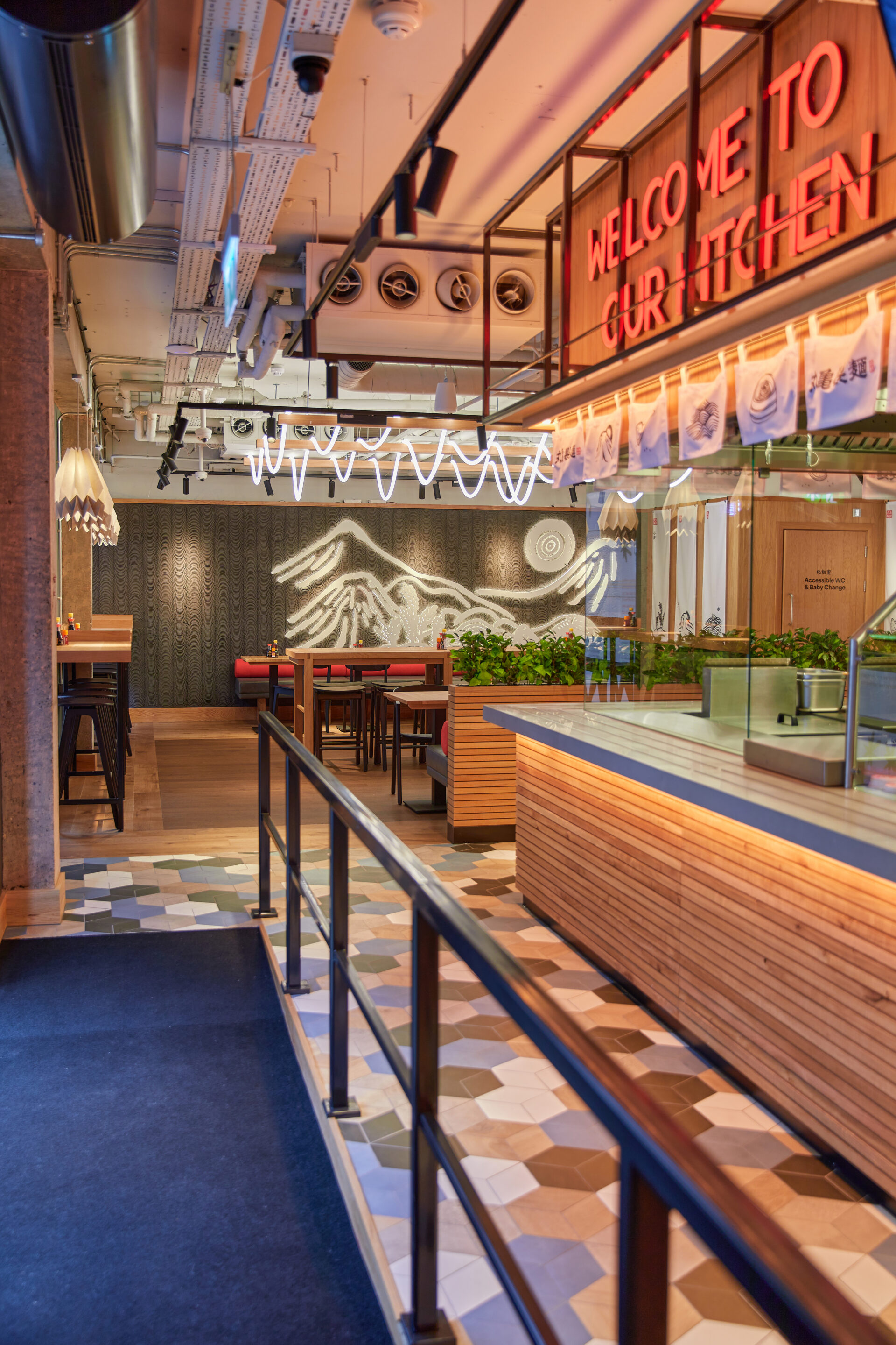
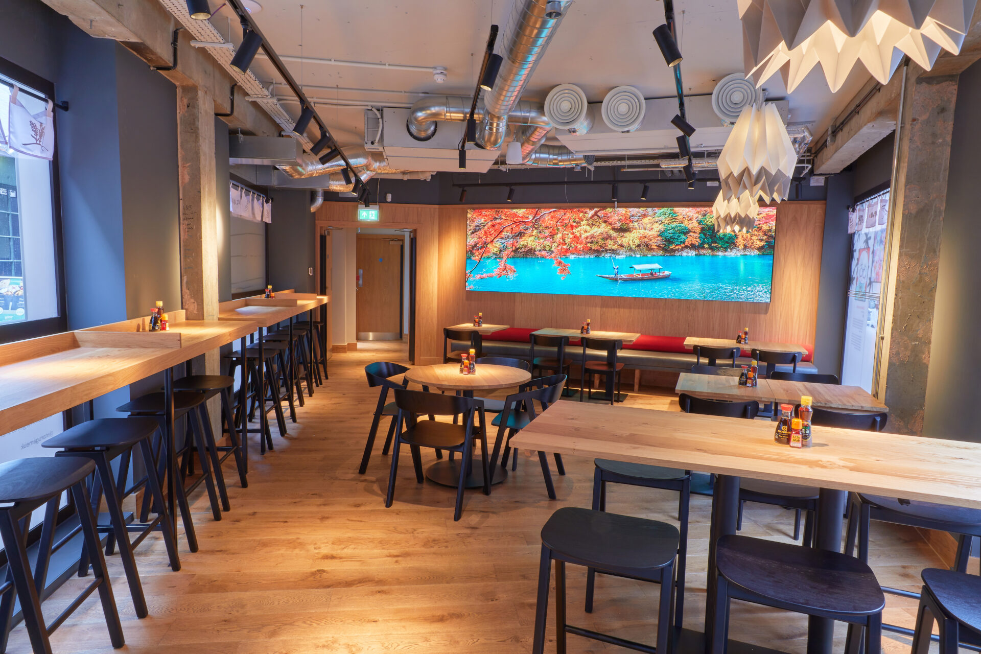
Quirky, dynamic feature lighting and a clear view into the ‘theatre’ kitchen became key design principles.
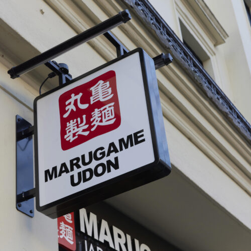
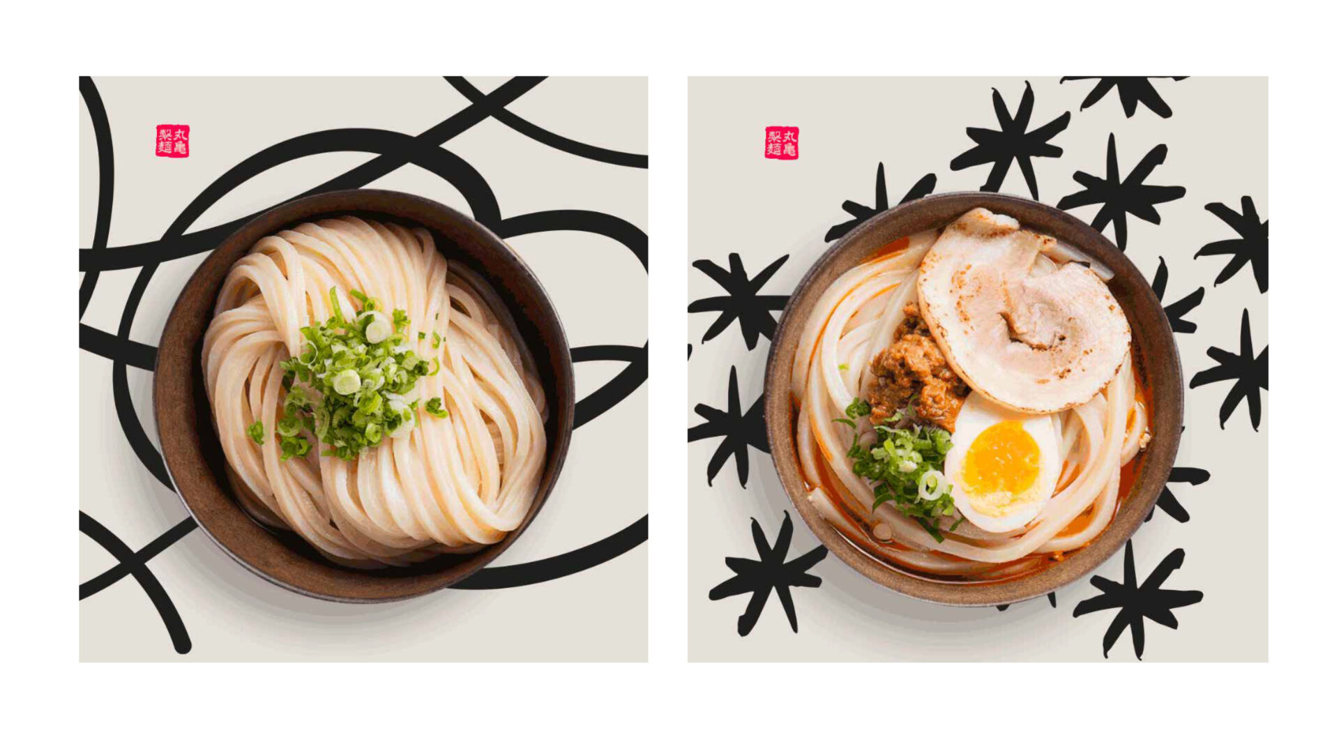
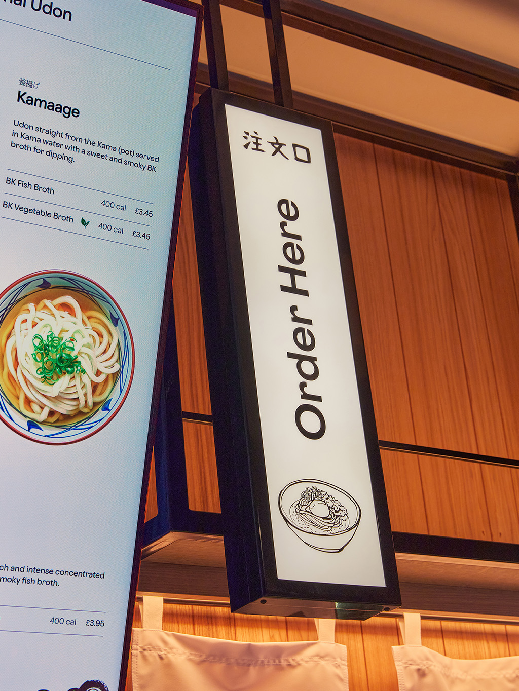
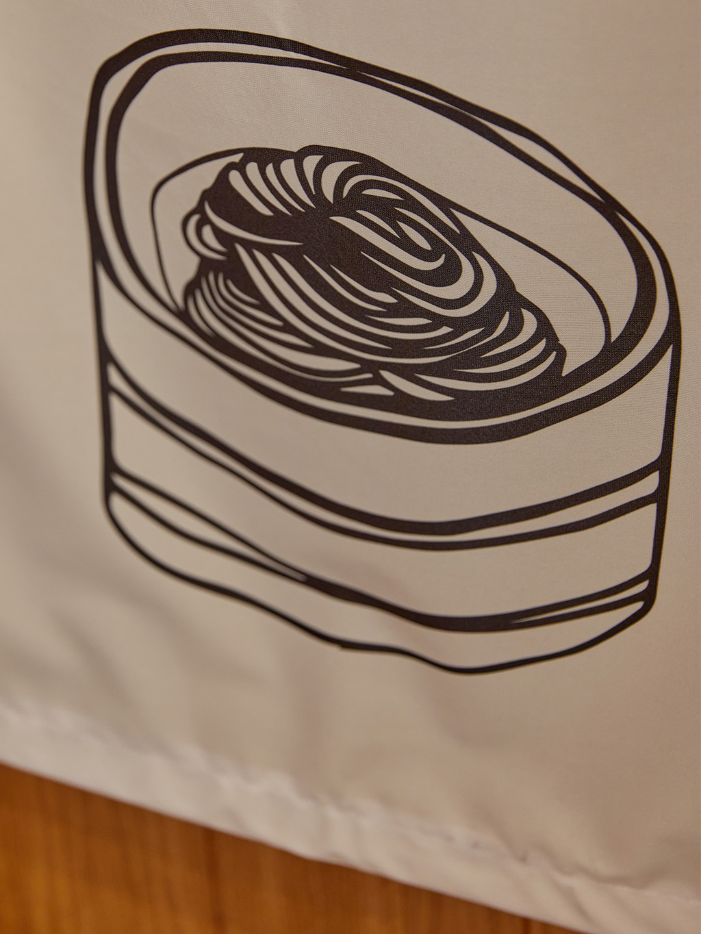
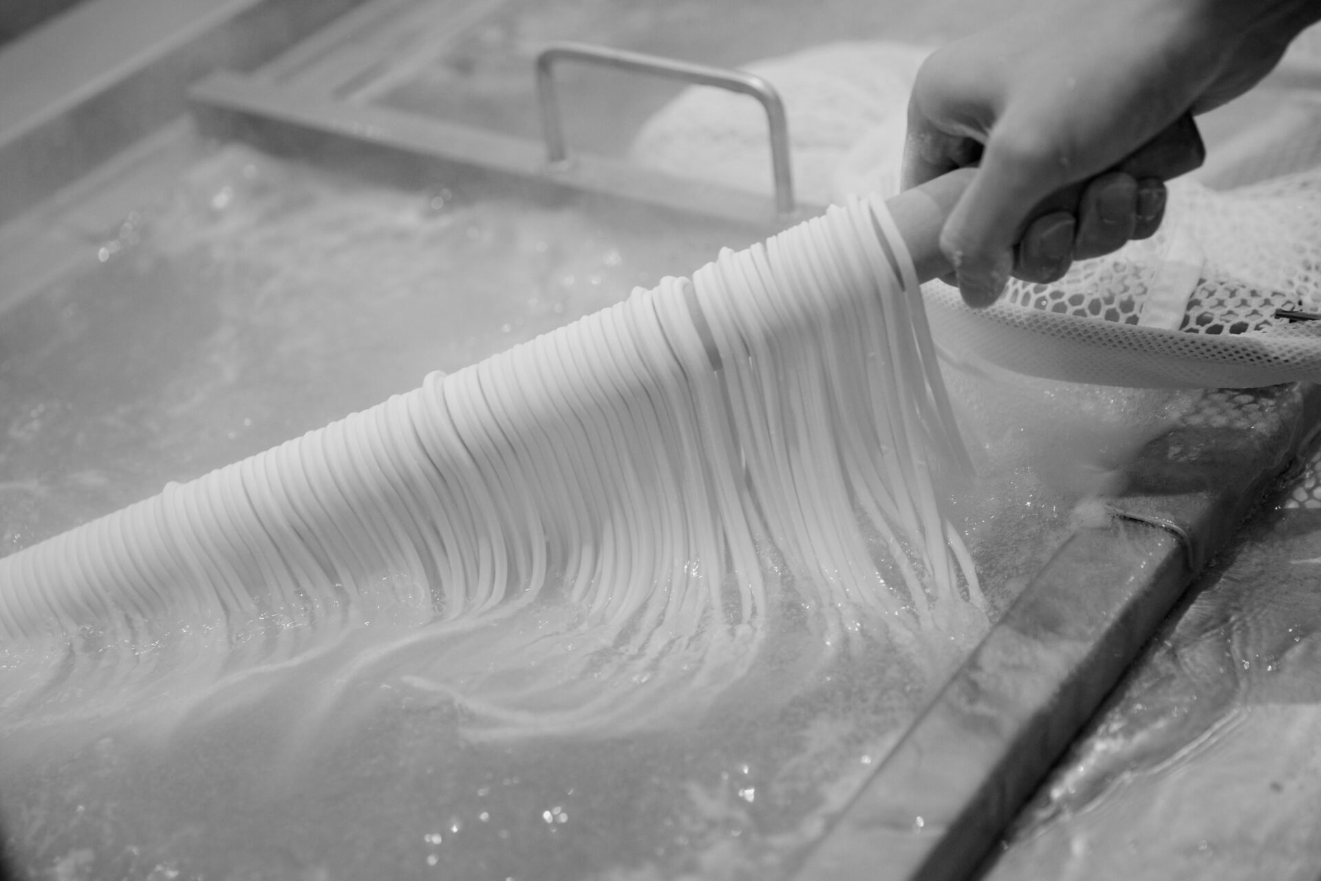
More than noodles
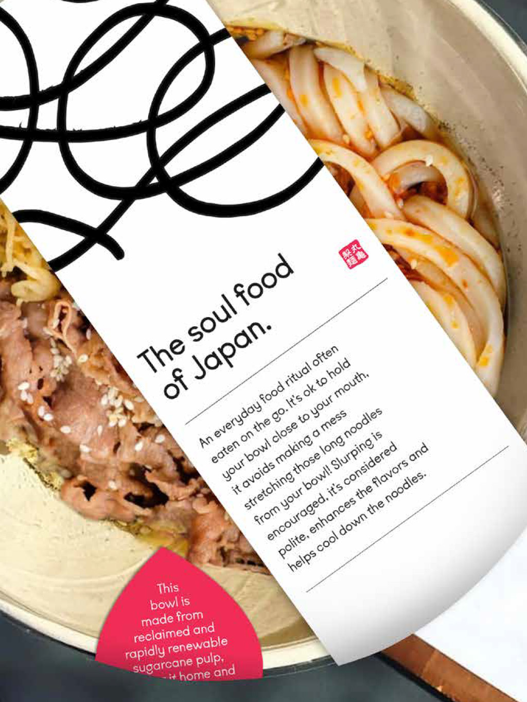
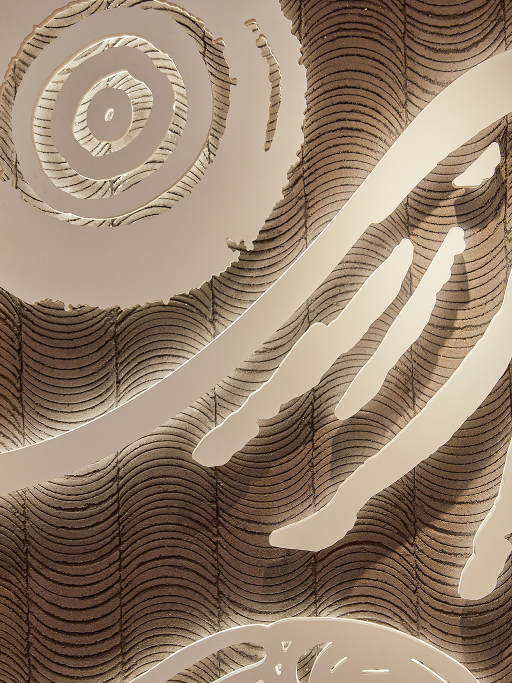
Japan’s much-loved Udon specialist, Marugame’s first UK restaurant at Liverpool Street, London had to do more than introduce a brand, it had to open a window into a culture. For many guests, this would be their first encounter with Sanuki Udon, made fresh in-house each day. The kitchen became the heart of the brand experience: open, energetic, and alive. Steam rises. Pots bubble. Skilled hands work in confident choreography. It’s purposeful, organised movement echoing the everyday kitchens of Kagawa, Udon’s spiritual home.
Strategic Brand Positioning
Alongside the physical experience sat a deeper strategic challenge. Working closely with Toridoll’s teams in Japan and the UK, we led a global brand review to ensure that Marugame’s brand essence could translate clearly, respectfully, and with meaning for a new European audience. The resulting brand strategy became the foundation for every creative decision, shaping a fully integrated guest experience.
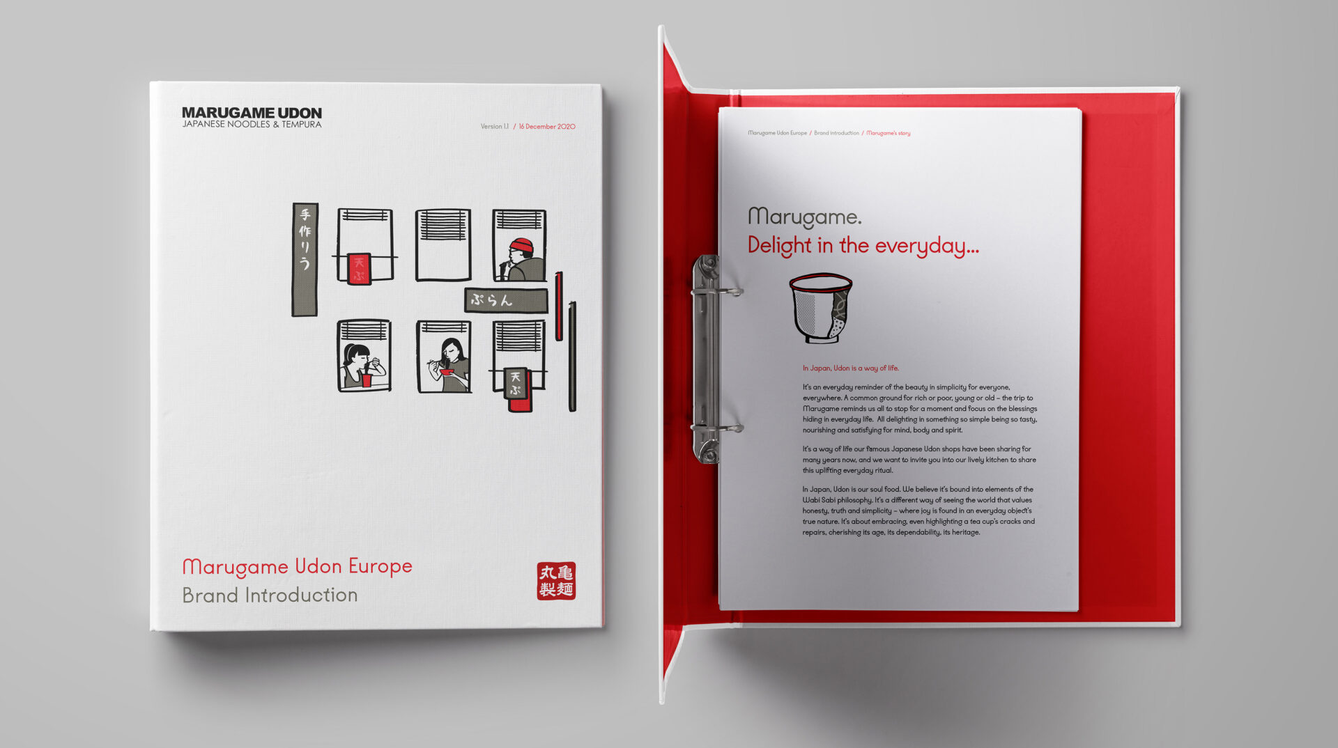
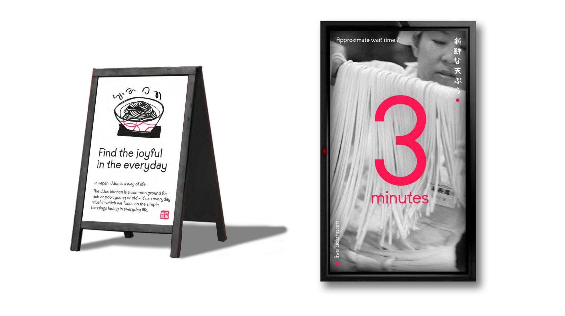
Why Delight in the everyday...?
At the core sits a simple idea: everyday nourishment. In Japan, Marugame is part of daily life a reliable ritual that feeds both body and spirit. We carried that ethos forward, creating an experience that feels accessible, uplifting, and quietly restorative. Affordable, inclusive, and unpretentious, a place where everyone is welcome, and nothing feels forced.
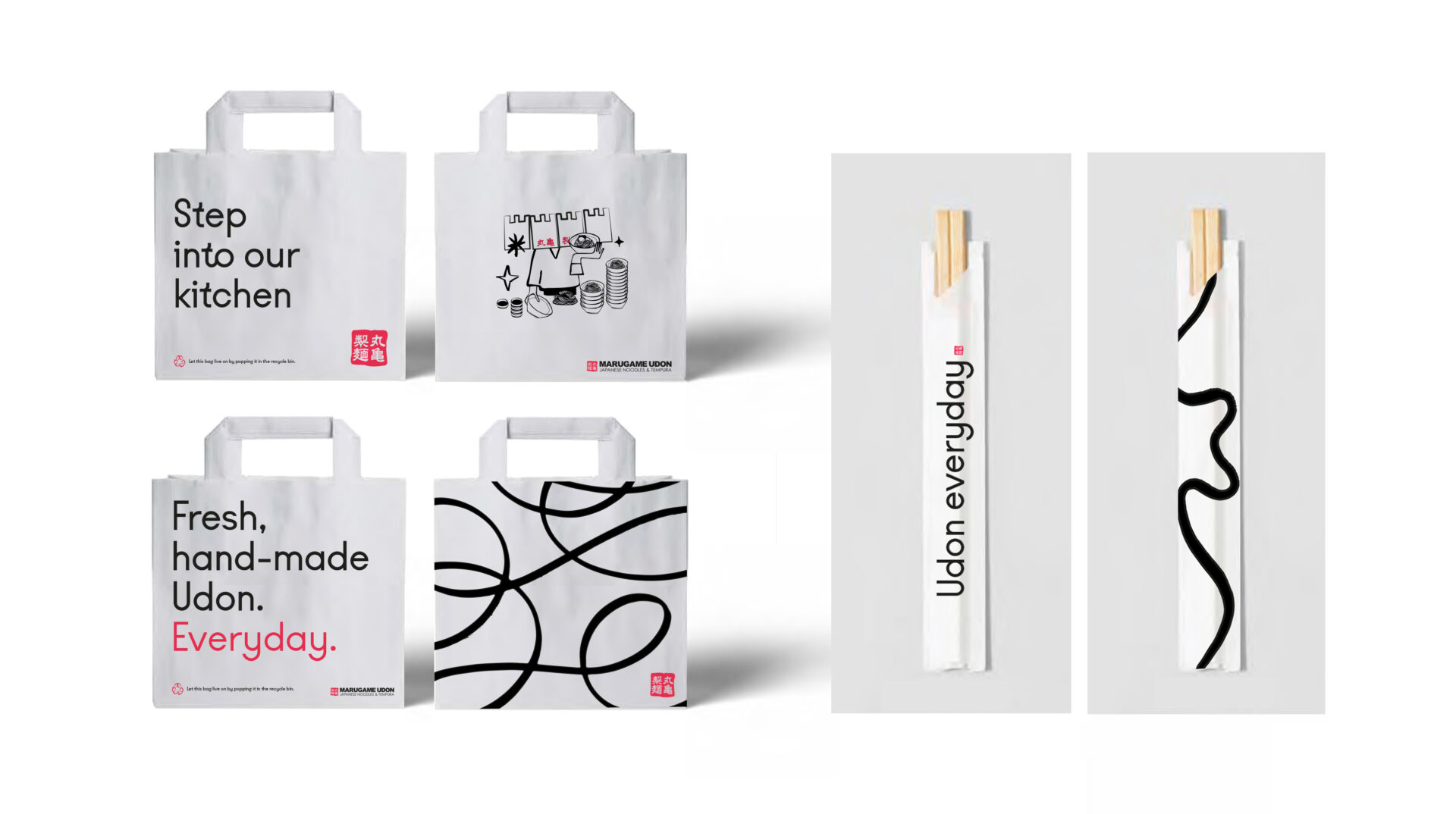
The Marugame Way…
Sharing the simple pleasure of eating this authentic everyday ritual outside Japan became our mission. Visiting udon kitchens is a way of life in Japan and we wanted to recreate the authentic sense of discovery of stumbling into a kitchen in Udon’s spiritual home of Kagawa, by inviting guests into the heart of Marugame’s lively kitchen to share this uplifting everyday ritual.
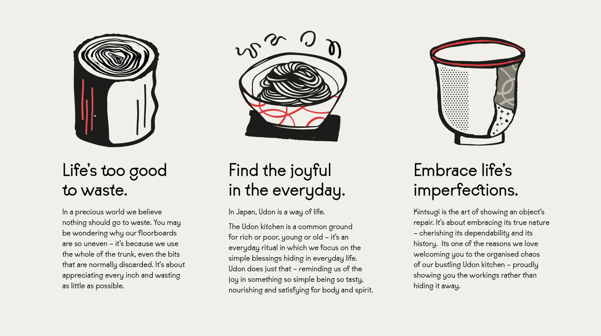
The affordable price point was a springboard to create a brand that was a great leveller, the experience in Japan is a common ground for rich or poor, young or old, the trip to Marugame reminding us all to stop for a moment and focus on the blessings hiding in everyday life.
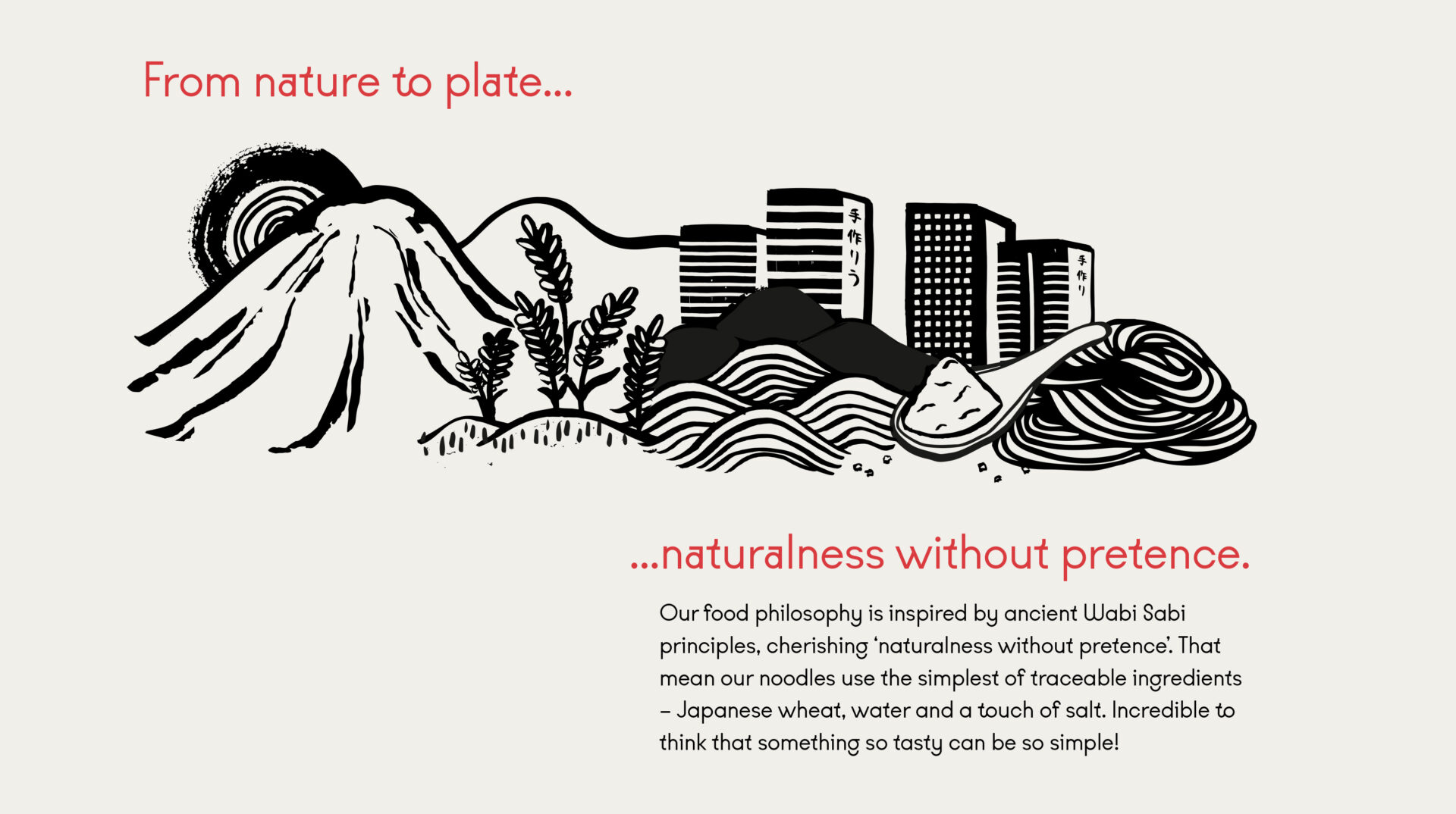
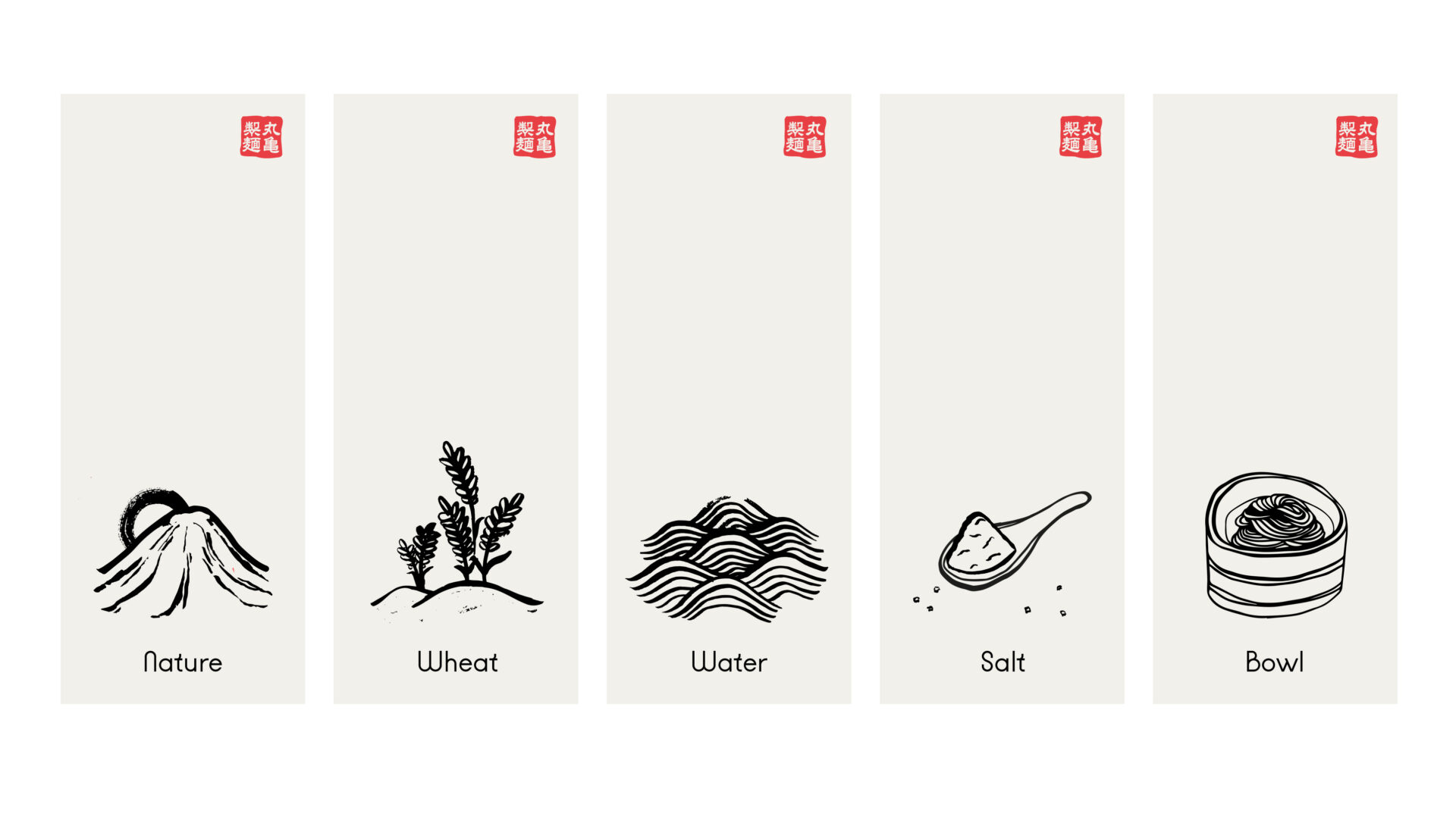
The menu is guided by finding delight in the everyday, a concept inspired by Shizen, an element of Wabi Sabi philosophy – meaning ‘naturalness without pretence’. It’s driven by a belief in keeping everything simple, honest and good for all. In other words that in life, the simple things can be the most rewarding. It’s a shared ritual. And a chance to rediscover the pleasures hidden in the everyday.
Working with an international brand where different cultural sensibilities are at play can be a real challenge. The whole Marugame team were incredibly impressed with the level of strategic depth that the Harrison team covered – which meant not only did they truly understood how best to bring the brand to life in Europe – but did so whilst staying true the company’s foundations and taking the founding stakeholders on the journey with them.''
Related projects

Let’s create something unforgettable
Fuelled by knowledge and imagination, we are driven by our ambition to evolve hospitality brands.