

A new landmark destination built to inspire, designed to evolve.
Glowing with refinement immersing you in time and space.
Clarity from complexity
With multiple stakeholders involved, our role was to guide, align, and simplify. Through collaborative workshops and structured project leadership, we unified ambition around a clear and singular brand vision. Creative imagination was balanced with commercial rigour. Every decision was intentional. Because great design doesn’t just look good, it works hard, connects emotionally, and endures.
Brand Strategy as the Foundation
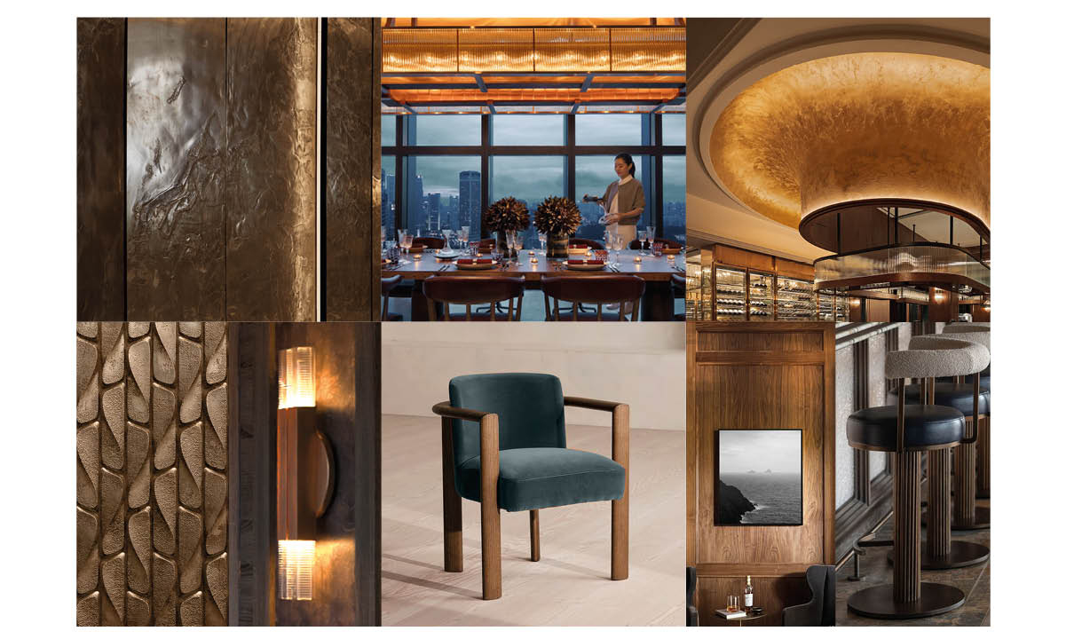
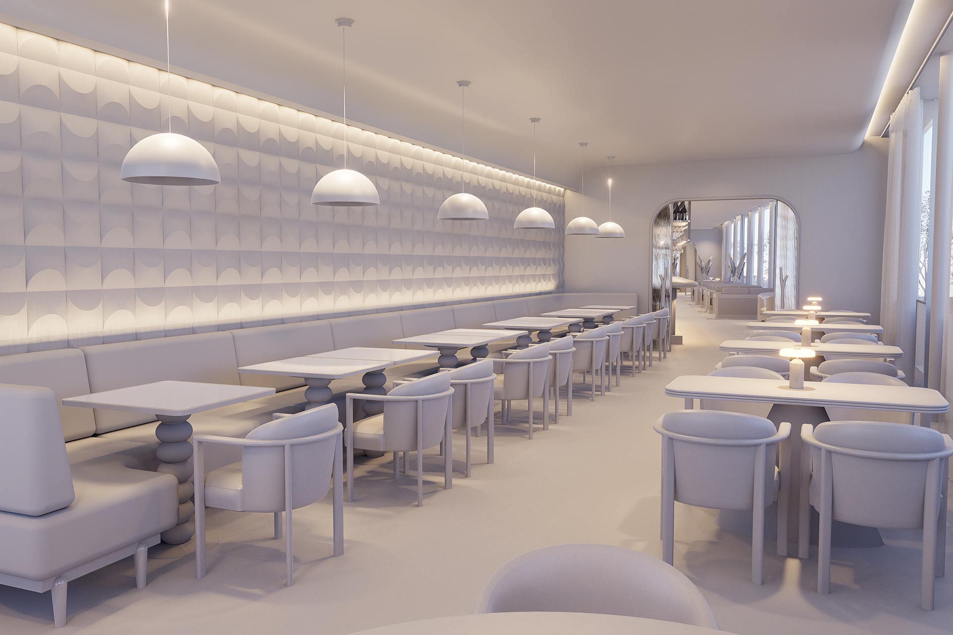
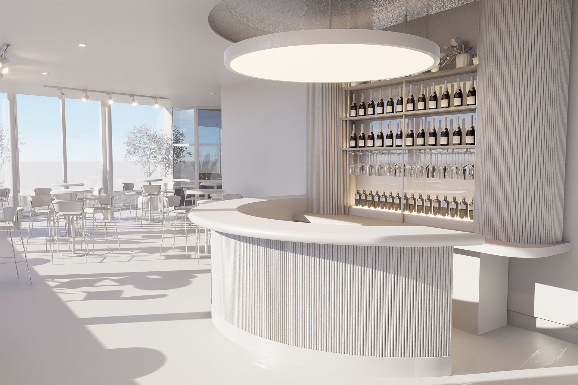
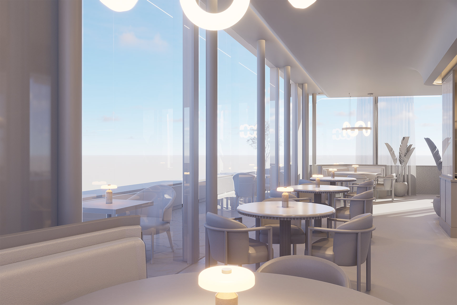
With the brand and offer clearly defined, storytelling became the driver. Each zone was planned with purpose and performance in mind. The design challenges convention, not for effect, but to create a hospitality experience that feels seamless, intuitive, and quietly extraordinary. Transformation came through clarity, not excess.

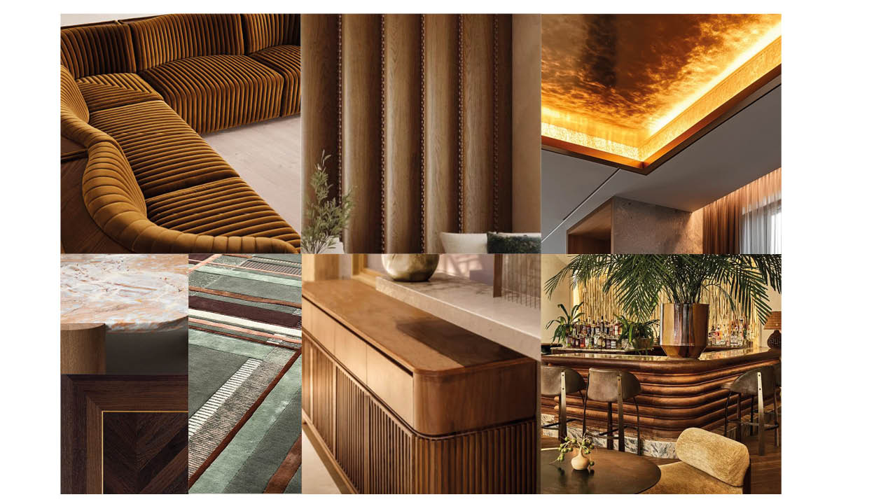
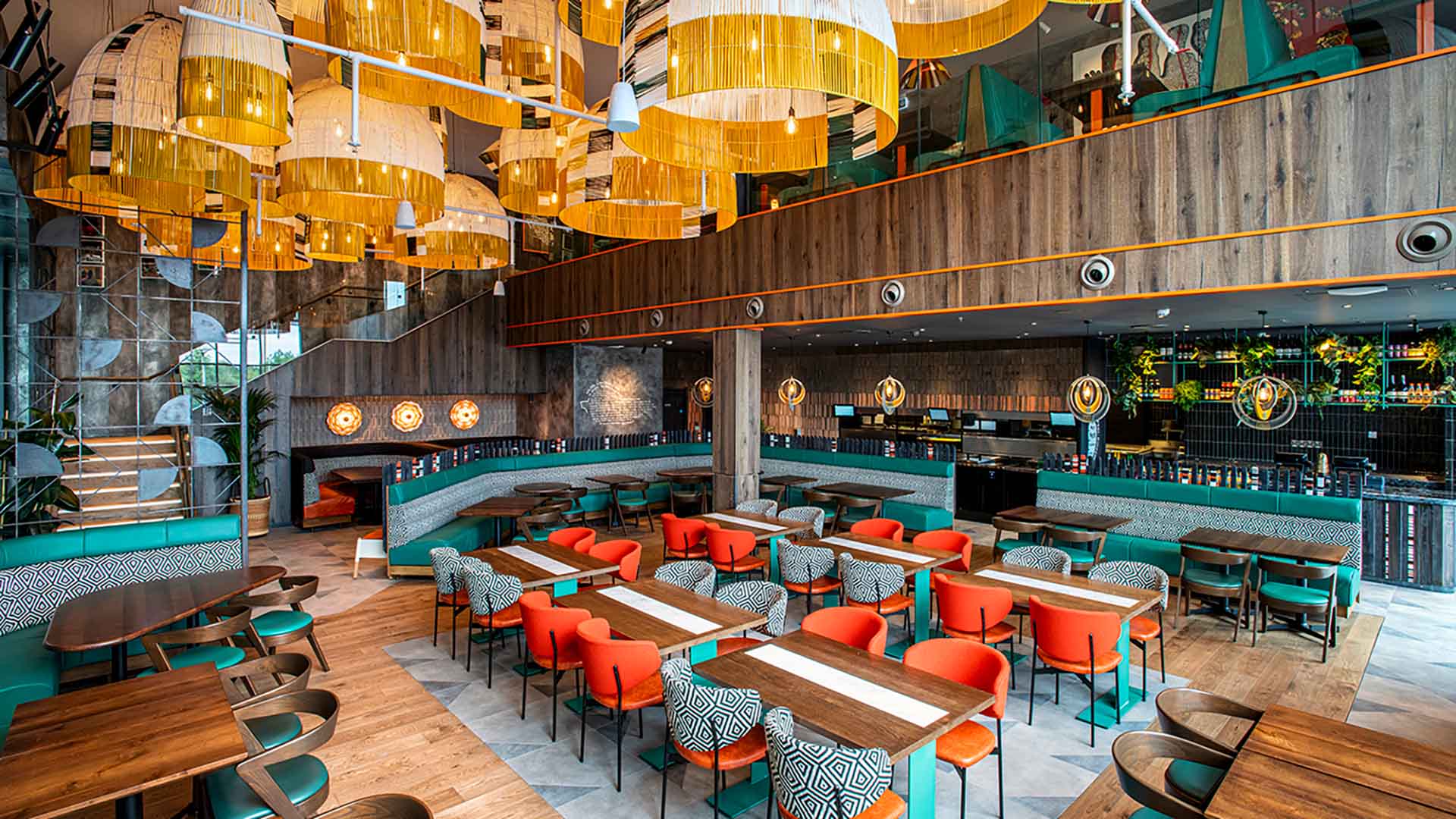
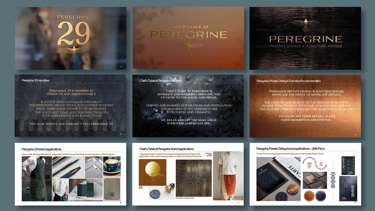
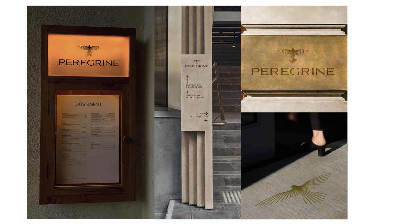
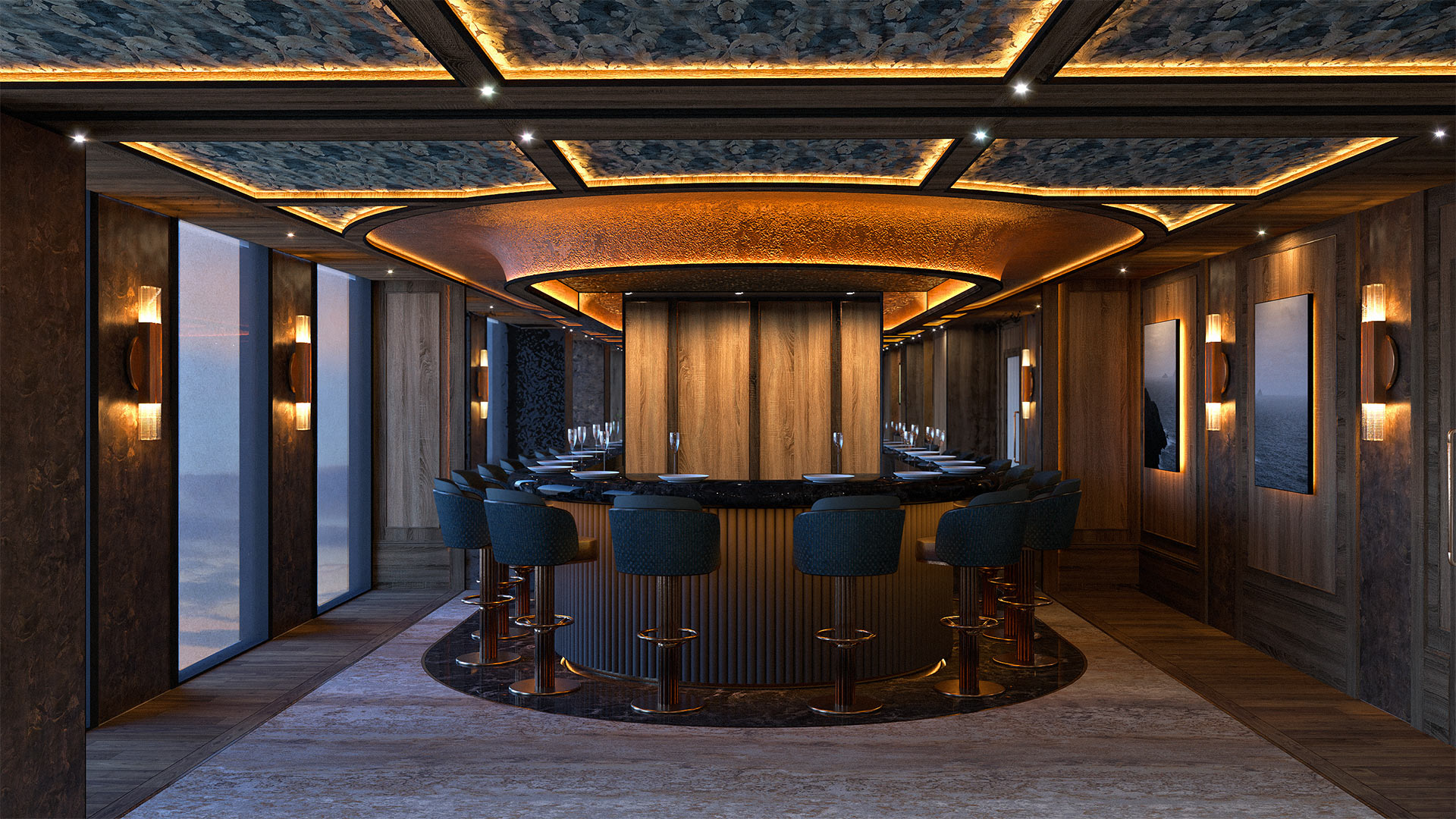
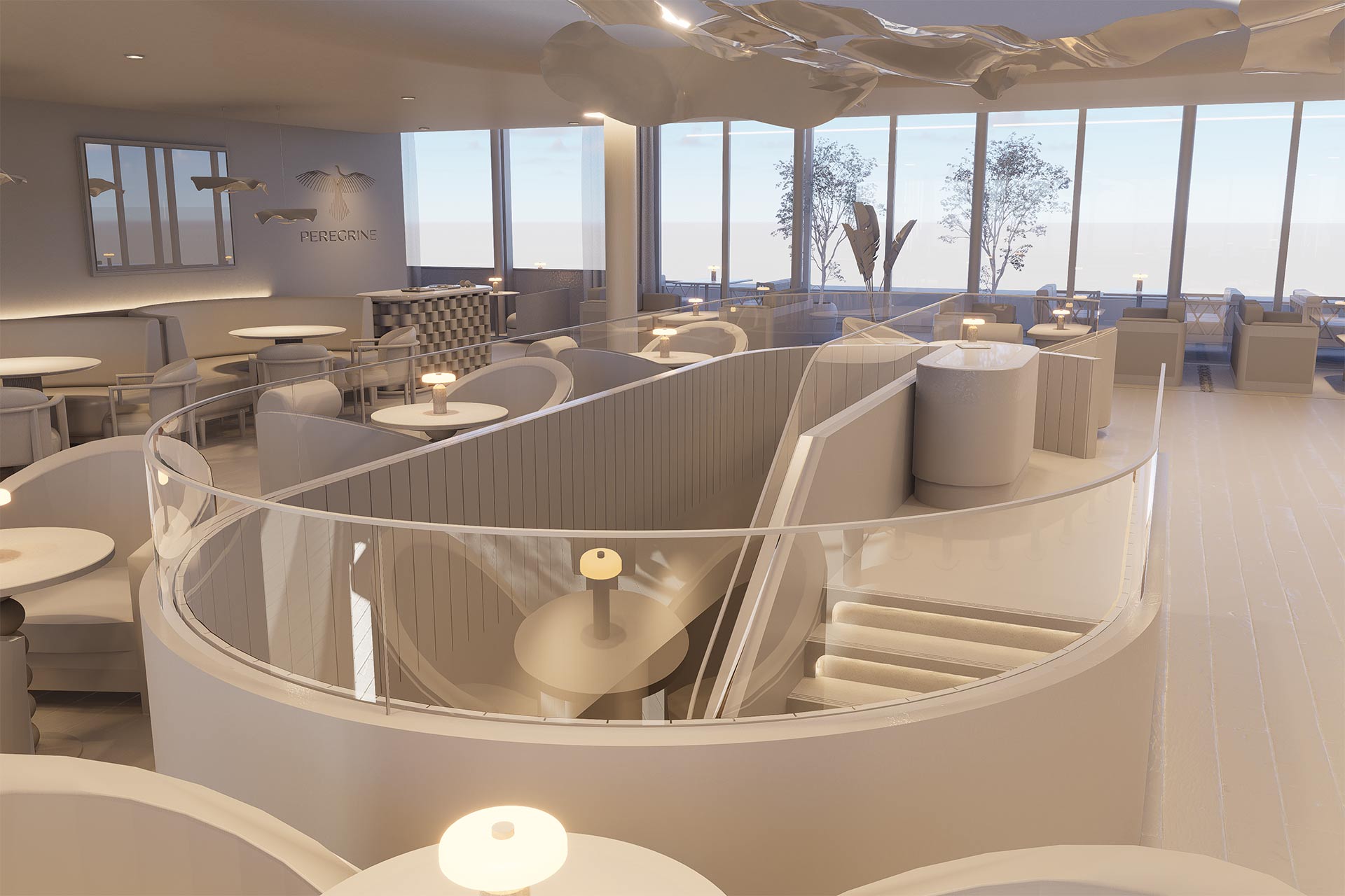
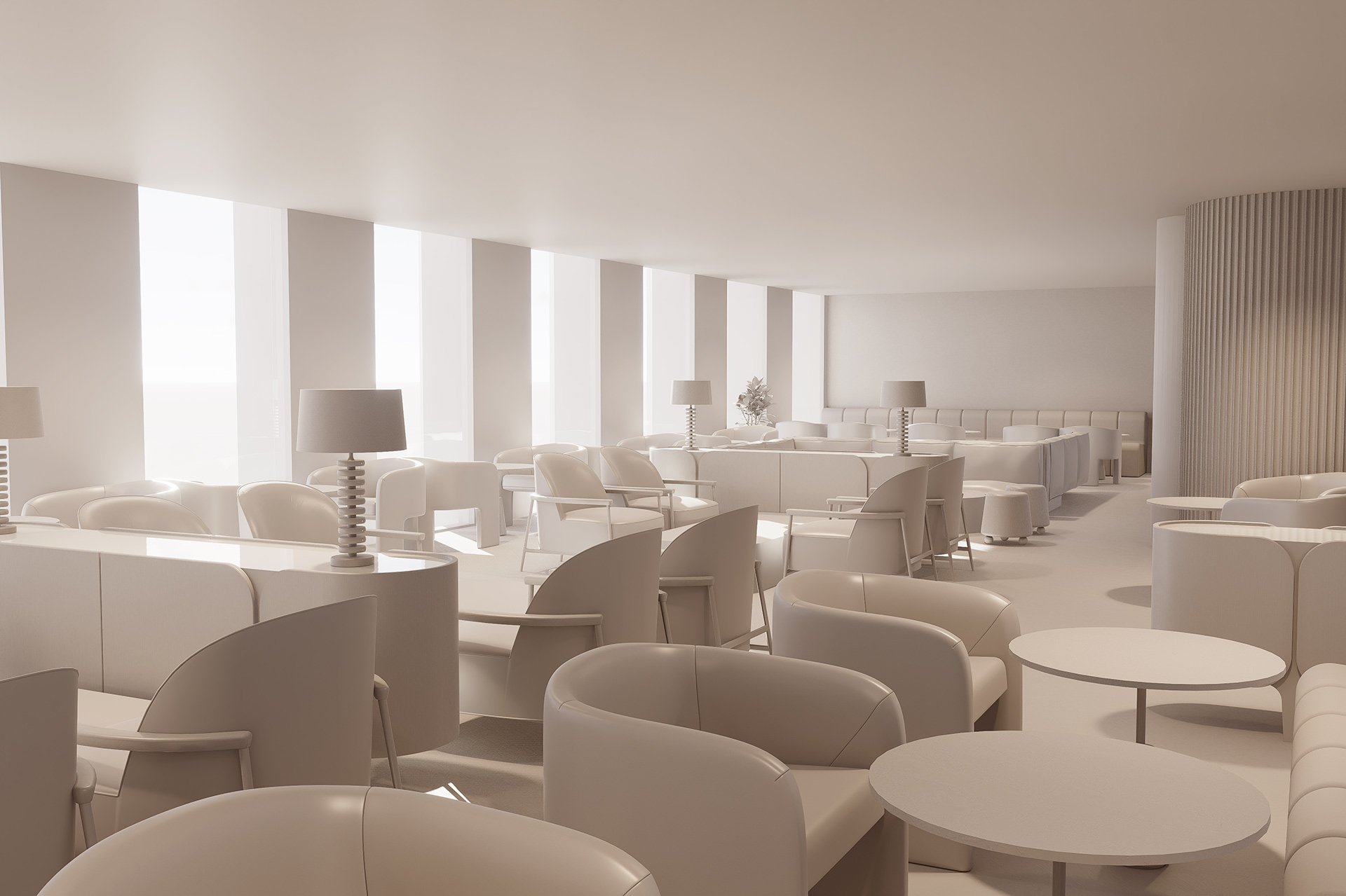
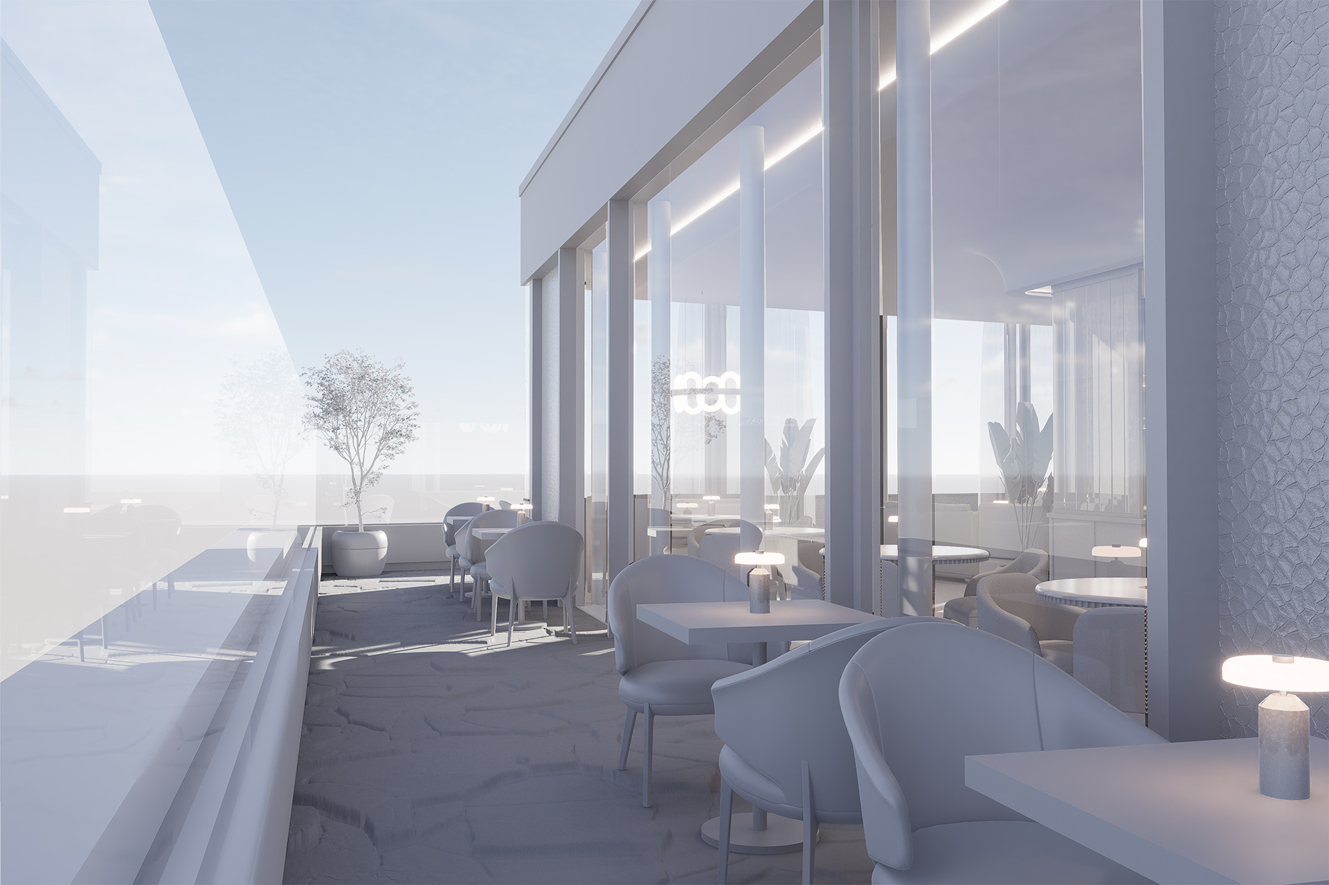
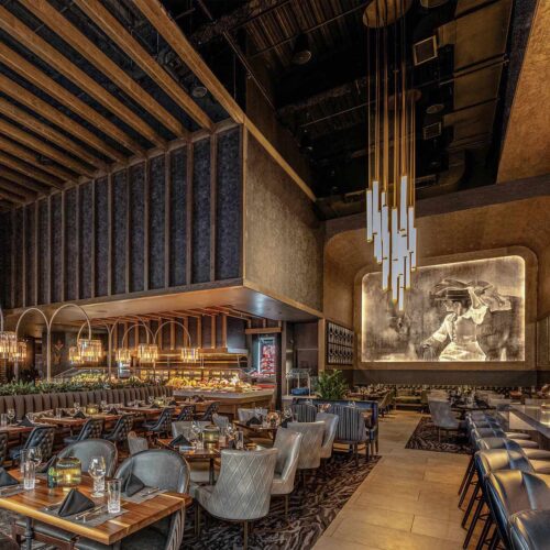
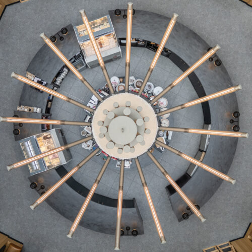
Peregrine takes flight
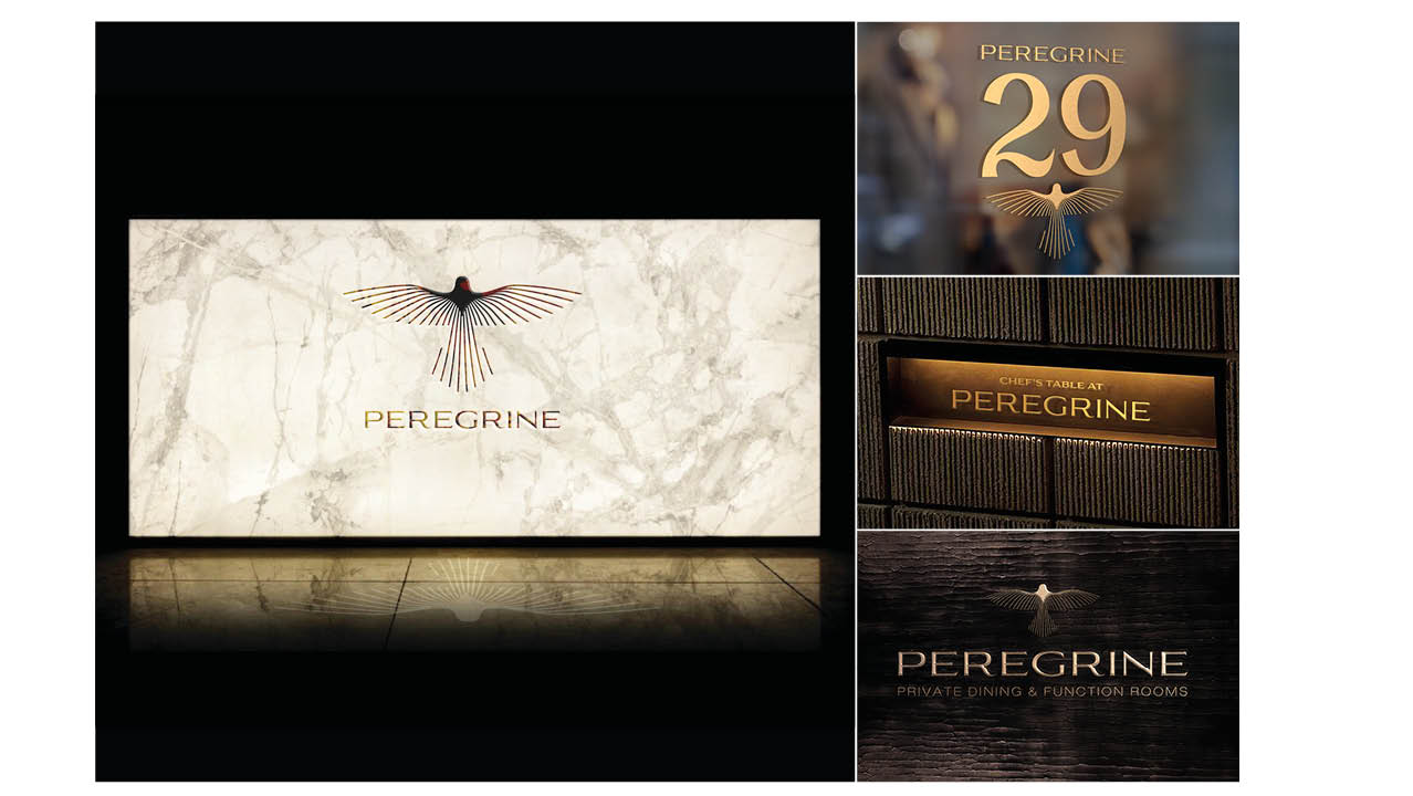
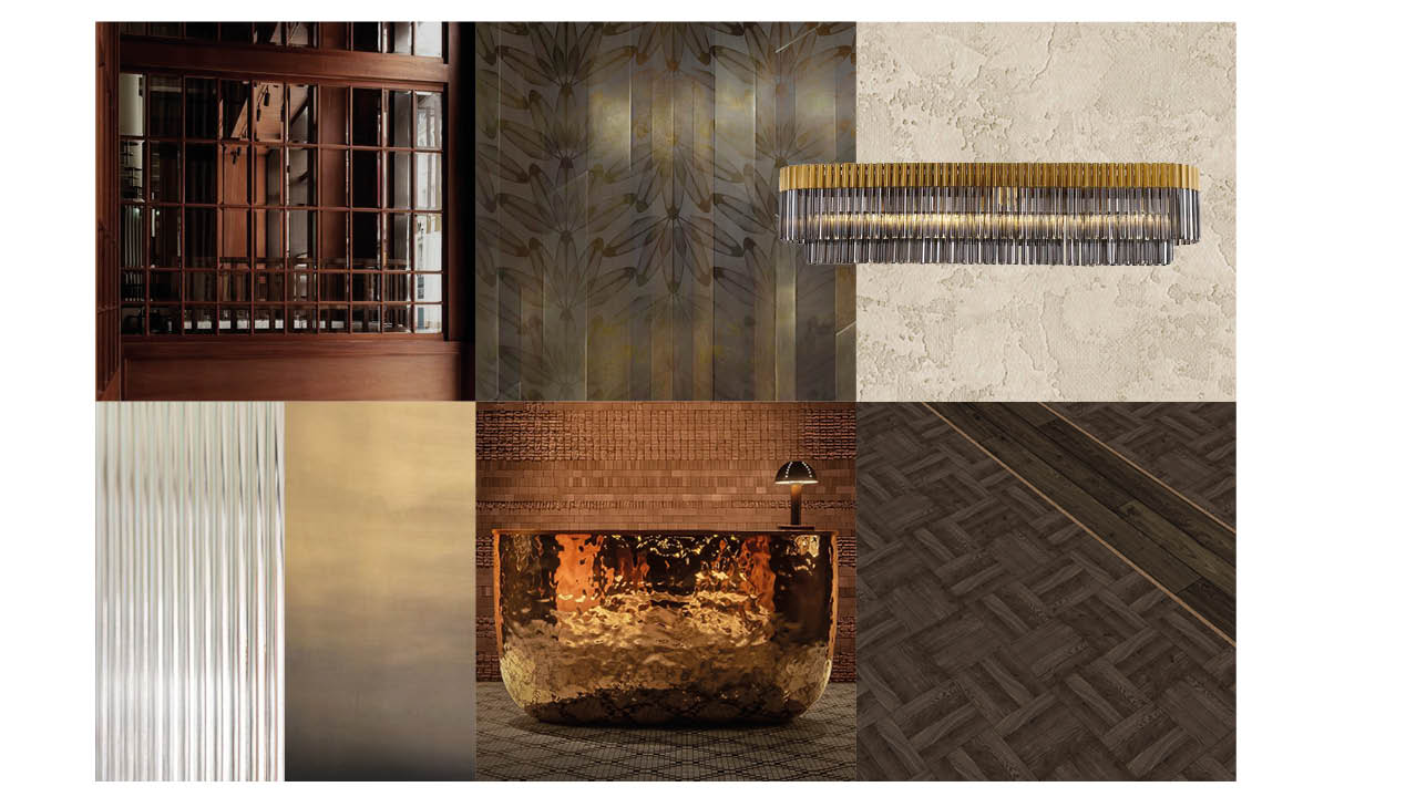
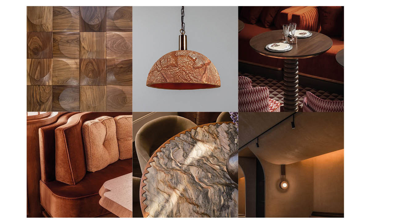
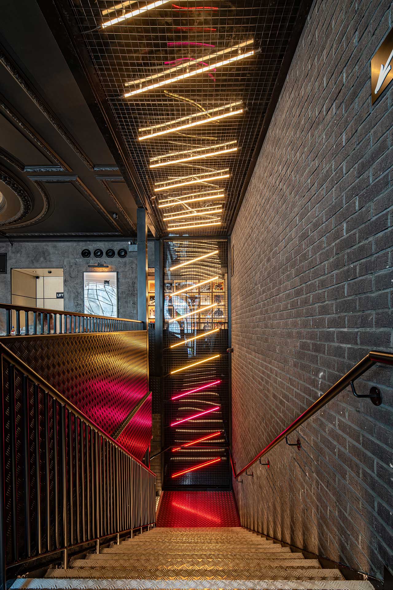
The brand name, Peregrine, draws inspiration from the world’s fastest bird, a symbol of power, precision, and elegance. This narrative informed every design decision. From expansive spatial gestures to refined material layers, the spirit of the Peregrine is embedded throughout. Architecture, Interiors, Wayfinding, and a unique atmosphere work together to create storytelling in motion.
A New Brand Brought to Life
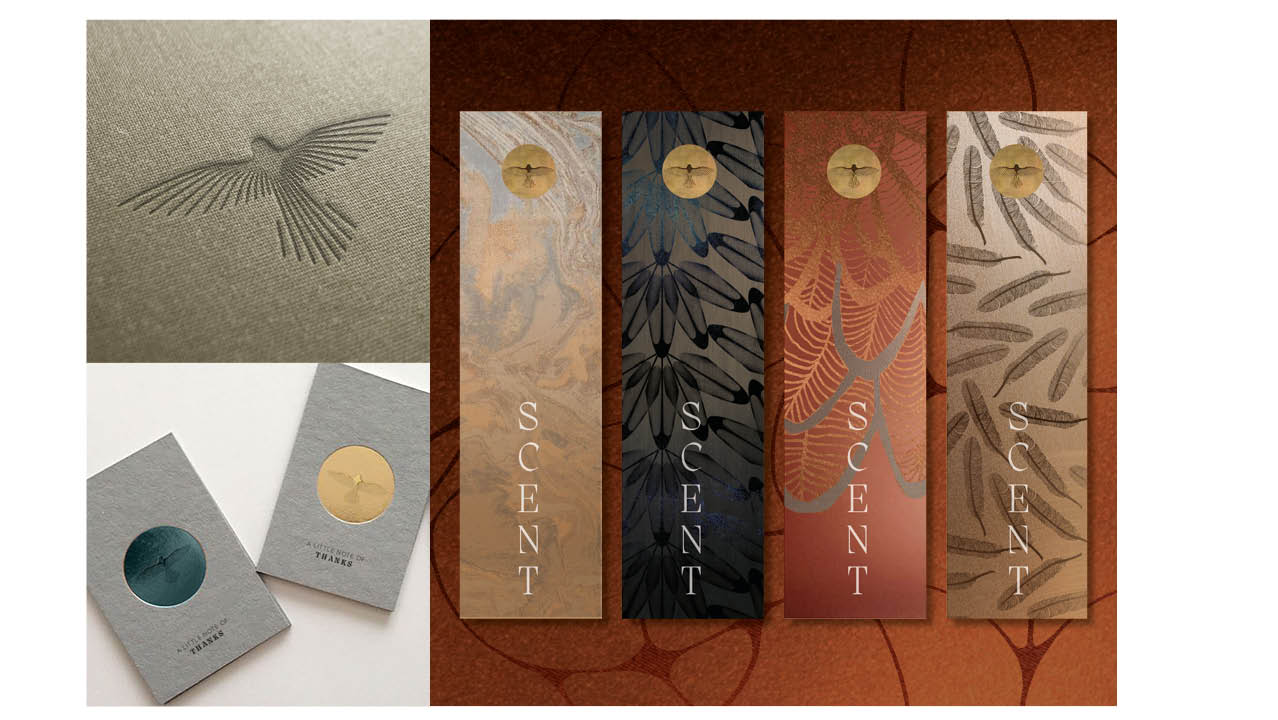
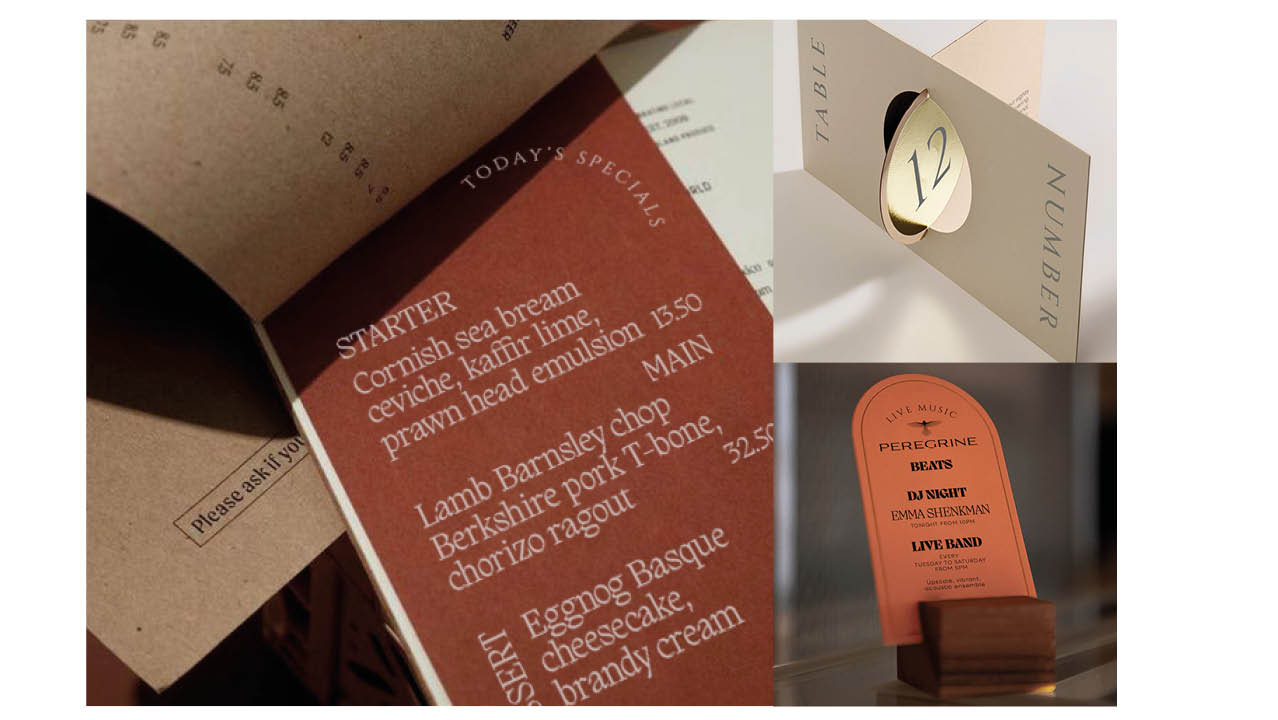
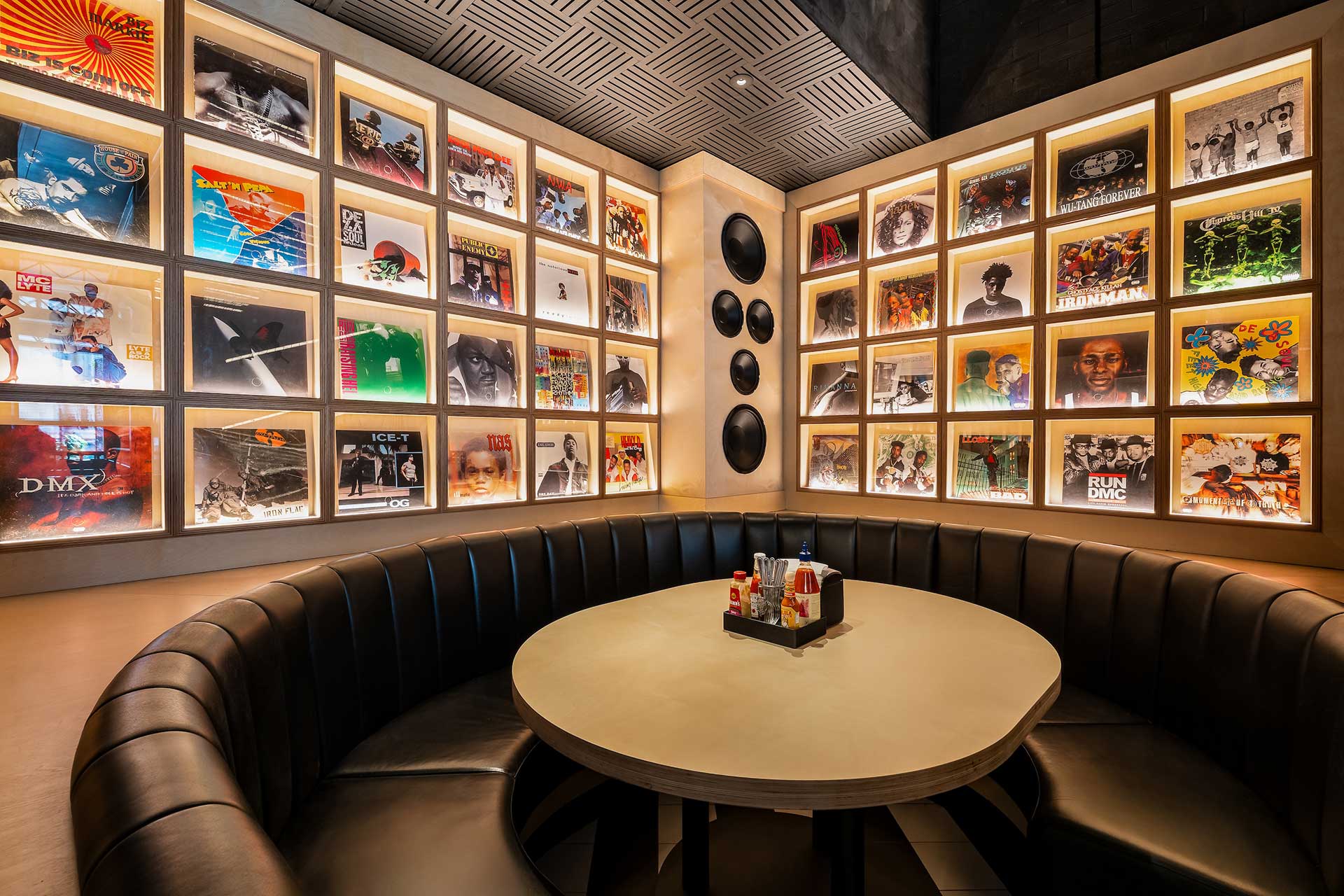
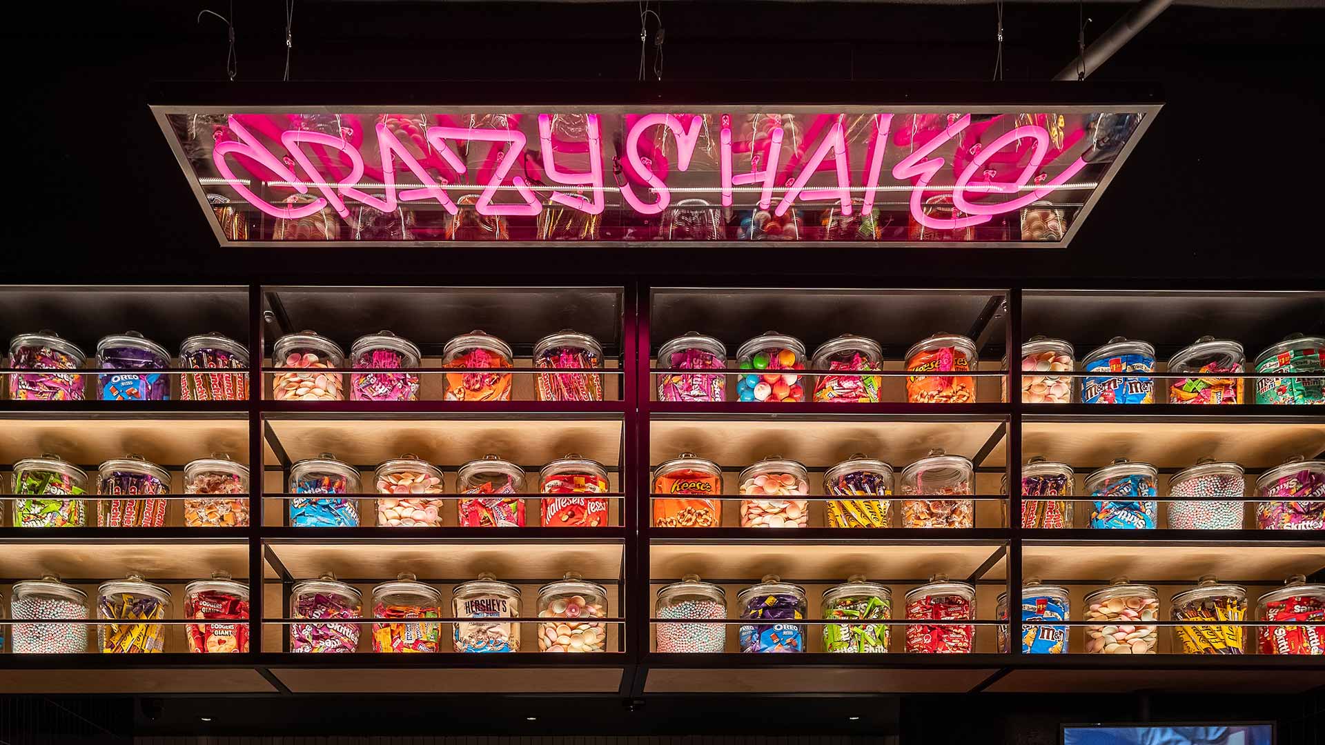
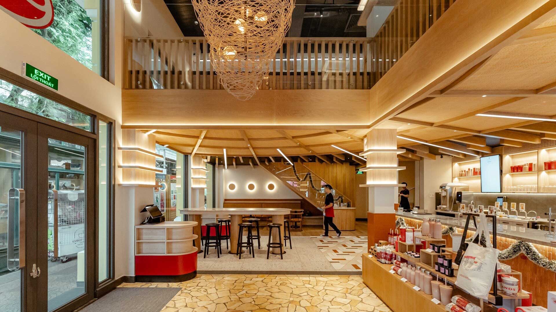
From external identity to internal wayfinding, Peregrine speaks with one clear voice. Uniforms reference movement. Signage reflects nesting and feather forms. Materials shift with light, echoing the bird’s grace in flight. At times bold, at times restrained, the design remains consistently intentional.
Here, the brand becomes the space. The space becomes the experience. And the guest, always at the centre feels it in every moment, whether pausing for reflection, sharing a meal, or gathering on the rooftop above the city
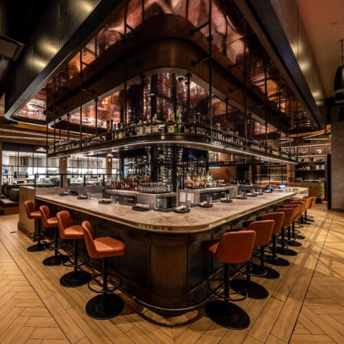
Shaping a new classic
From the ground-floor café to skyline dining, Peregrine is designed to perform at every level. For us, it represents hospitality strategy at its most considered, where narrative is woven into place, and place becomes memory. Creating a timeless experience, grounded in purpose and elevated by imagination..
With a project of this scale and so many stakeholders, we naturally embraced our role as creators, advisors, and designers. From the refined identity to the imaginative, detail-rich spaces, we’re incredibly proud of what we achieved with Peregrine. It’s a standout example of how Harrison blends strategic thinking with bold, empathetic hospitality design. The result is a layered, theatrical experience driven by passion, creativity, and purpose.
Iconic, timeless and memorable interior design at every turn.

Project snapshot
Related projects

Let’s create something unforgettable
Fuelled by knowledge and imagination, we are driven by our ambition to evolve hospitality brands.
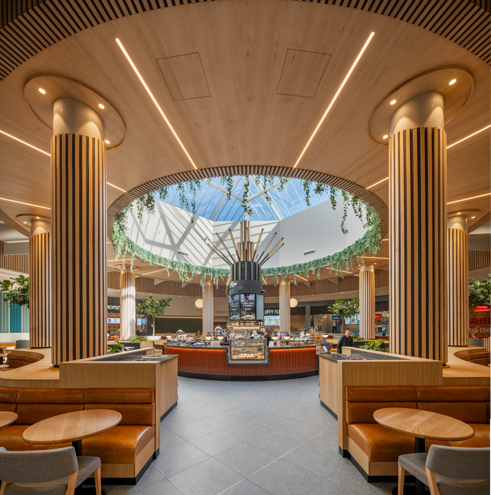
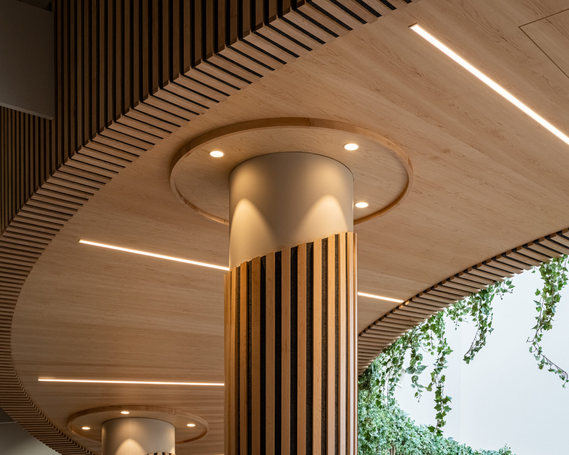
Reimagining What a Food Hall Can Be
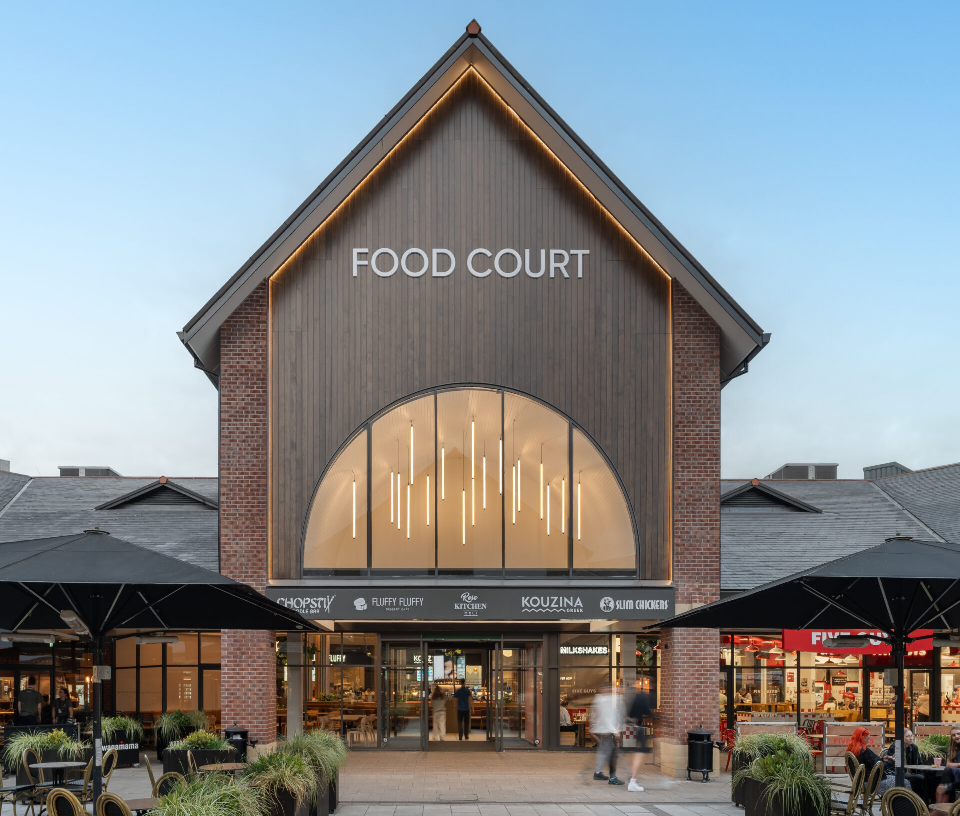
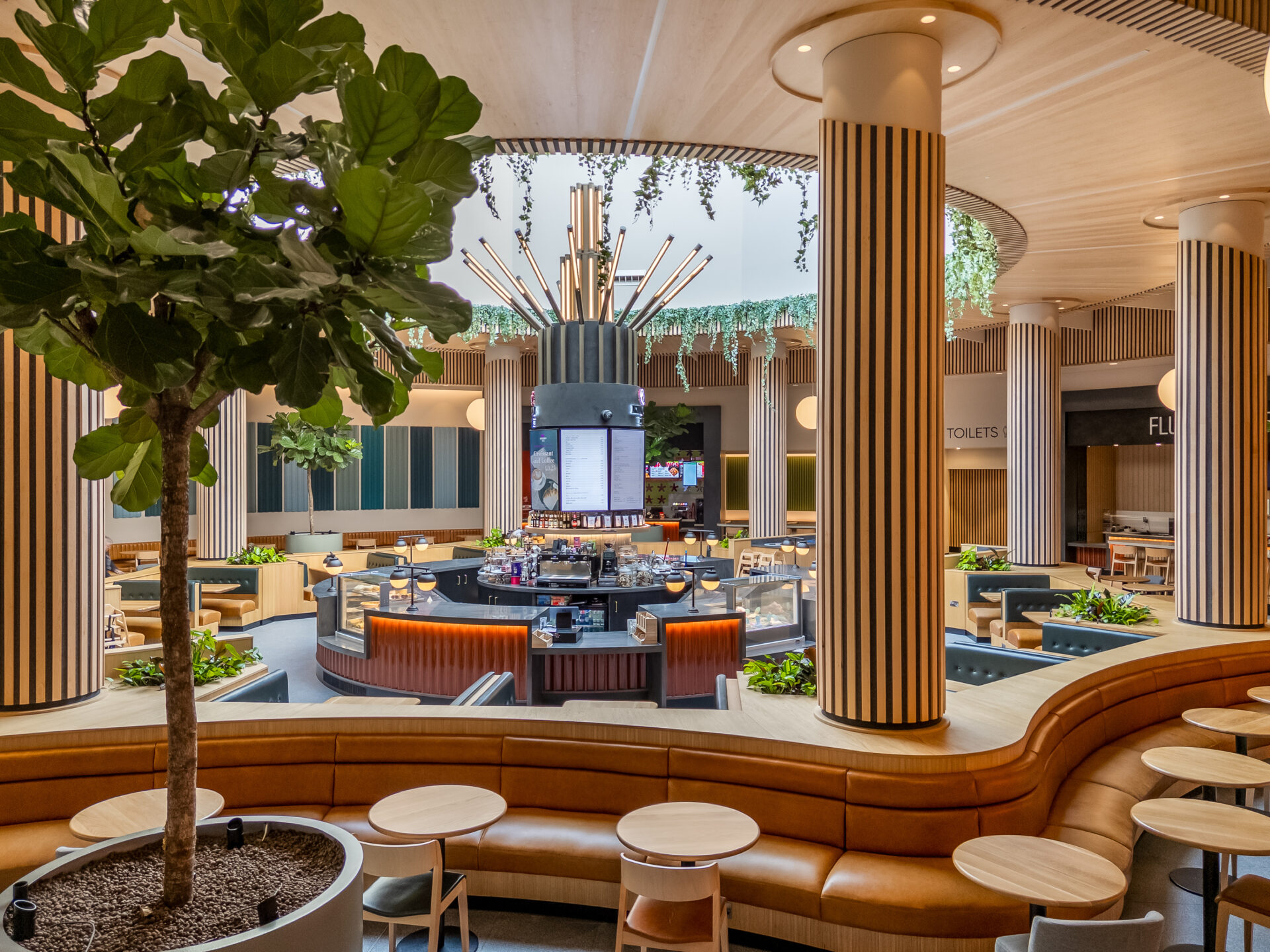
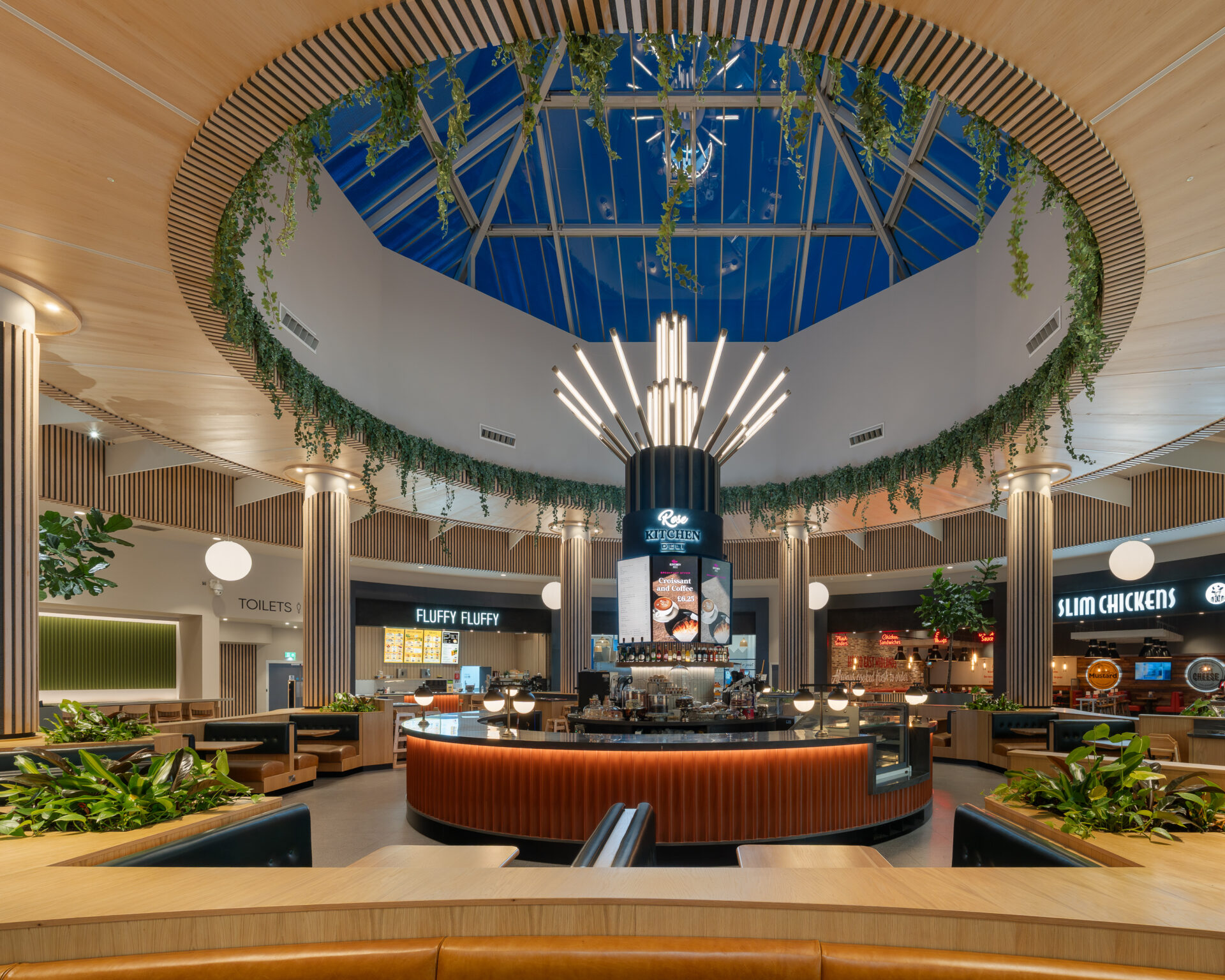
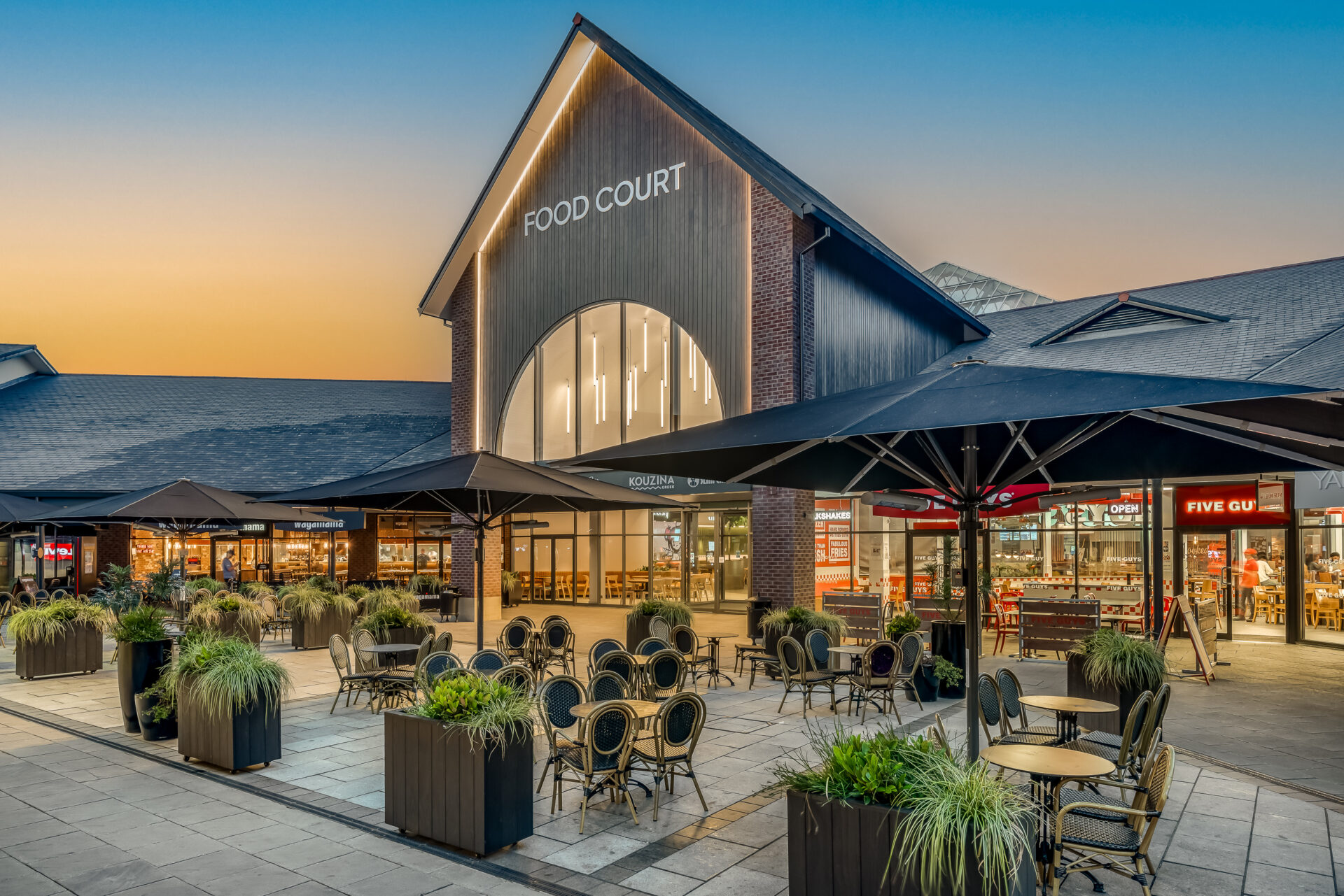
Working with Harrison on the transformation of our East Midlands Designer Outlet has been an exceptional, the team’s creativity, attention to detail, and deep understanding of our vision have completely redefined what our food and beverage offer can be.
Let’s create something unforgettable
Fuelled by knowledge and imagination, we are driven by our ambition to evolve hospitality brands.
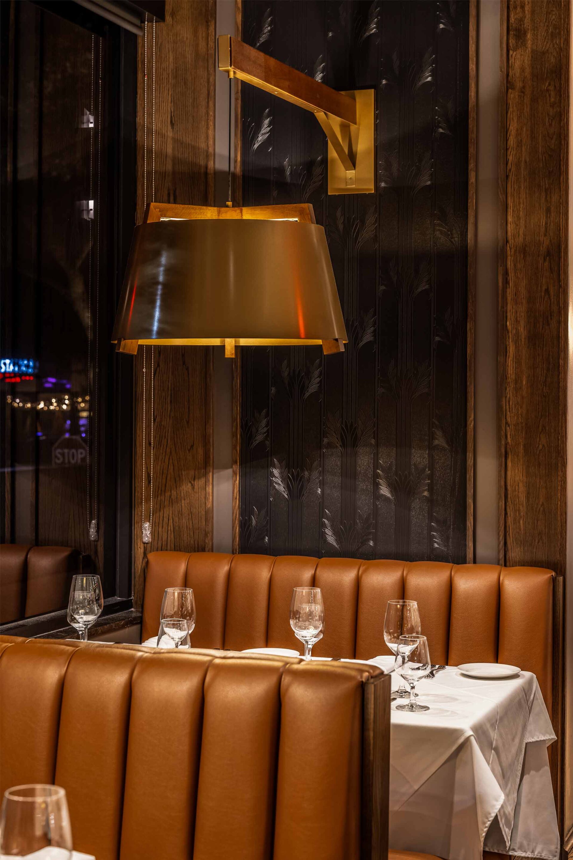
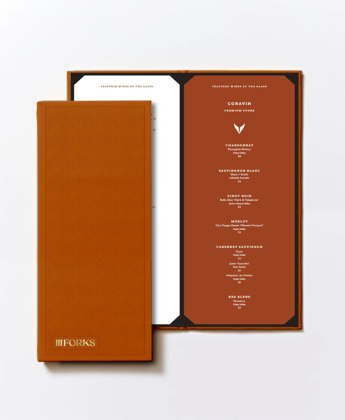
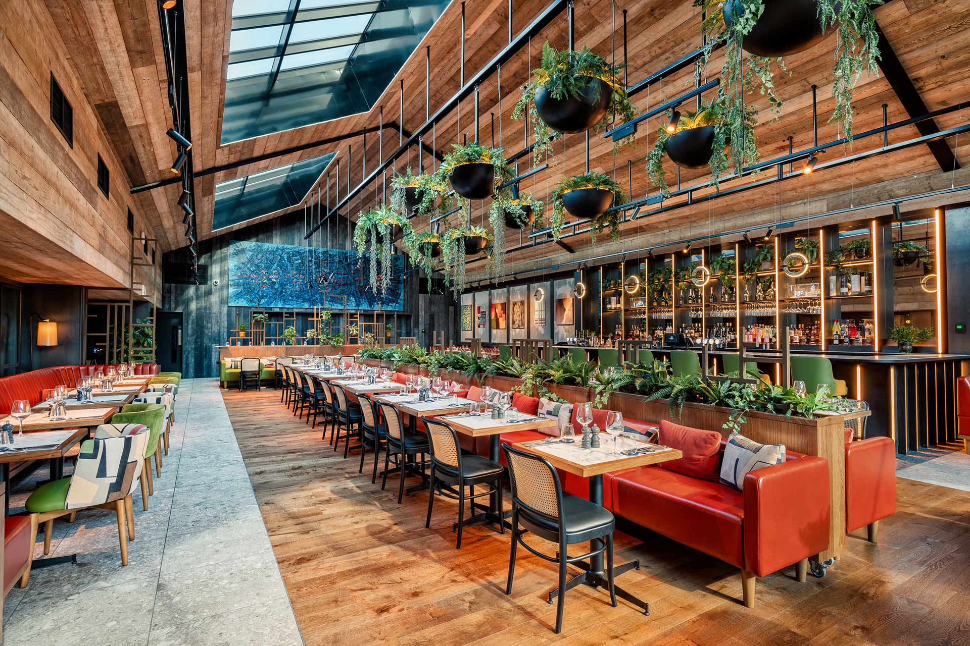
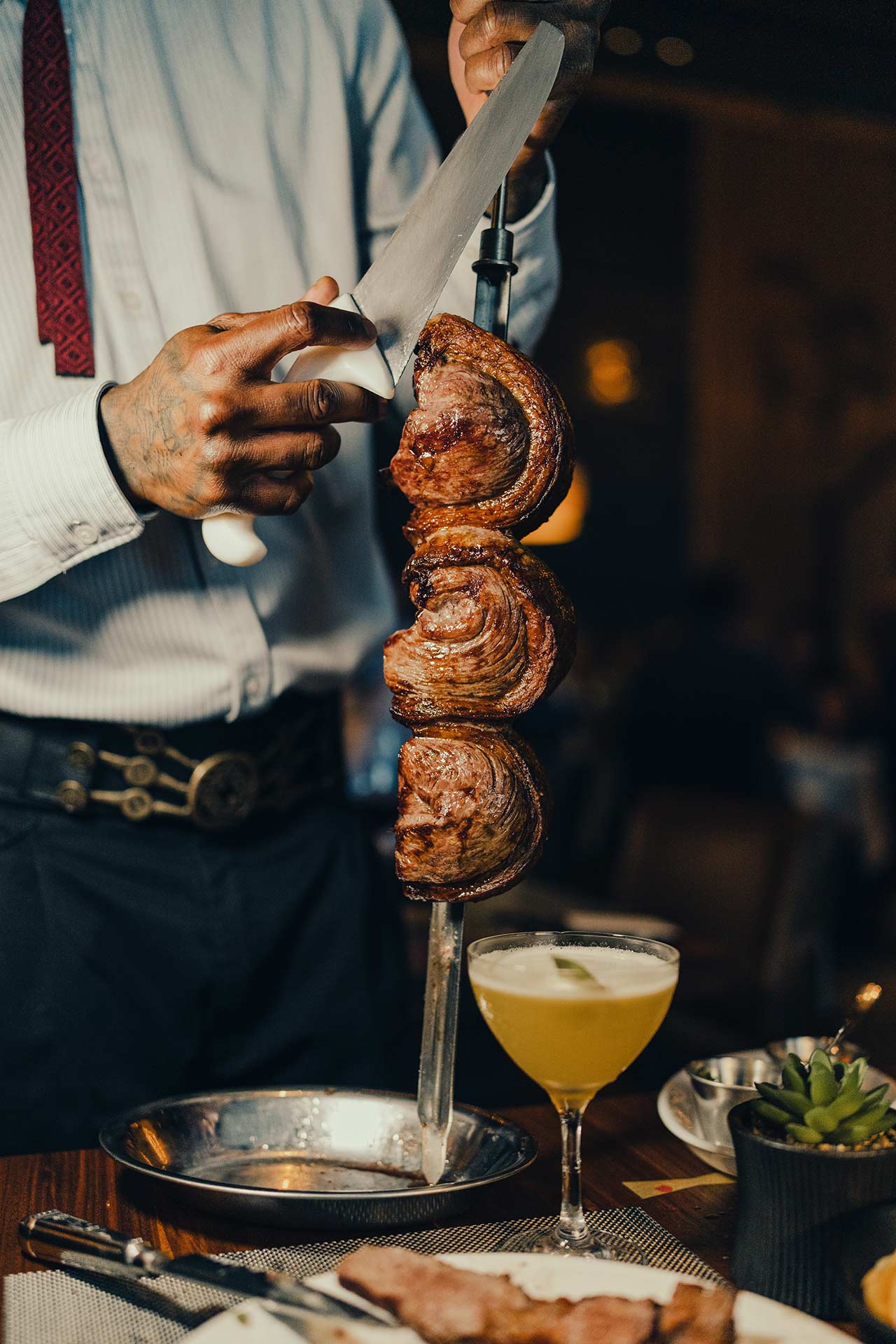
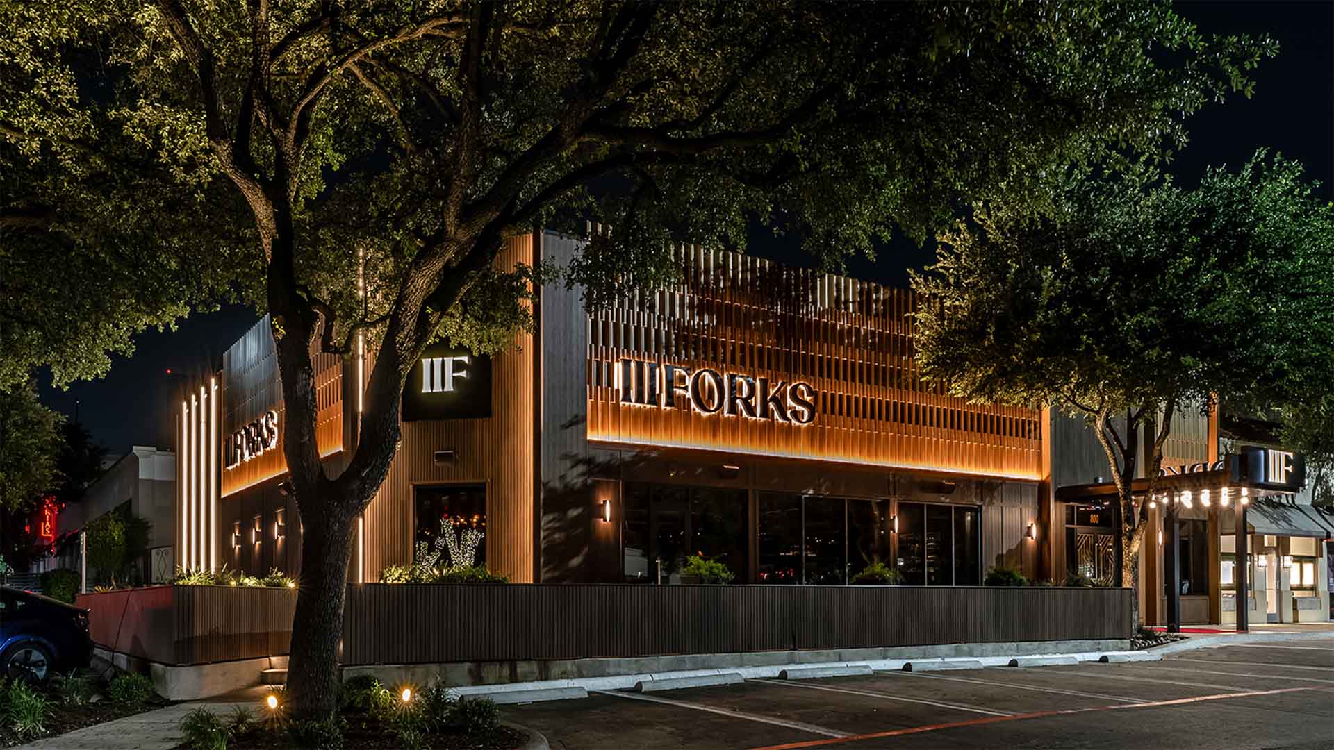
Inspired by the currents of the Trinity River, the refreshed concept channels a quiet kind of luxury; masculine yet refined, traditional with a modern twist. The new brand identity weaves together warmth, elegance, and celebration into a cohesive hospitality experience that feels both elevated and welcoming.
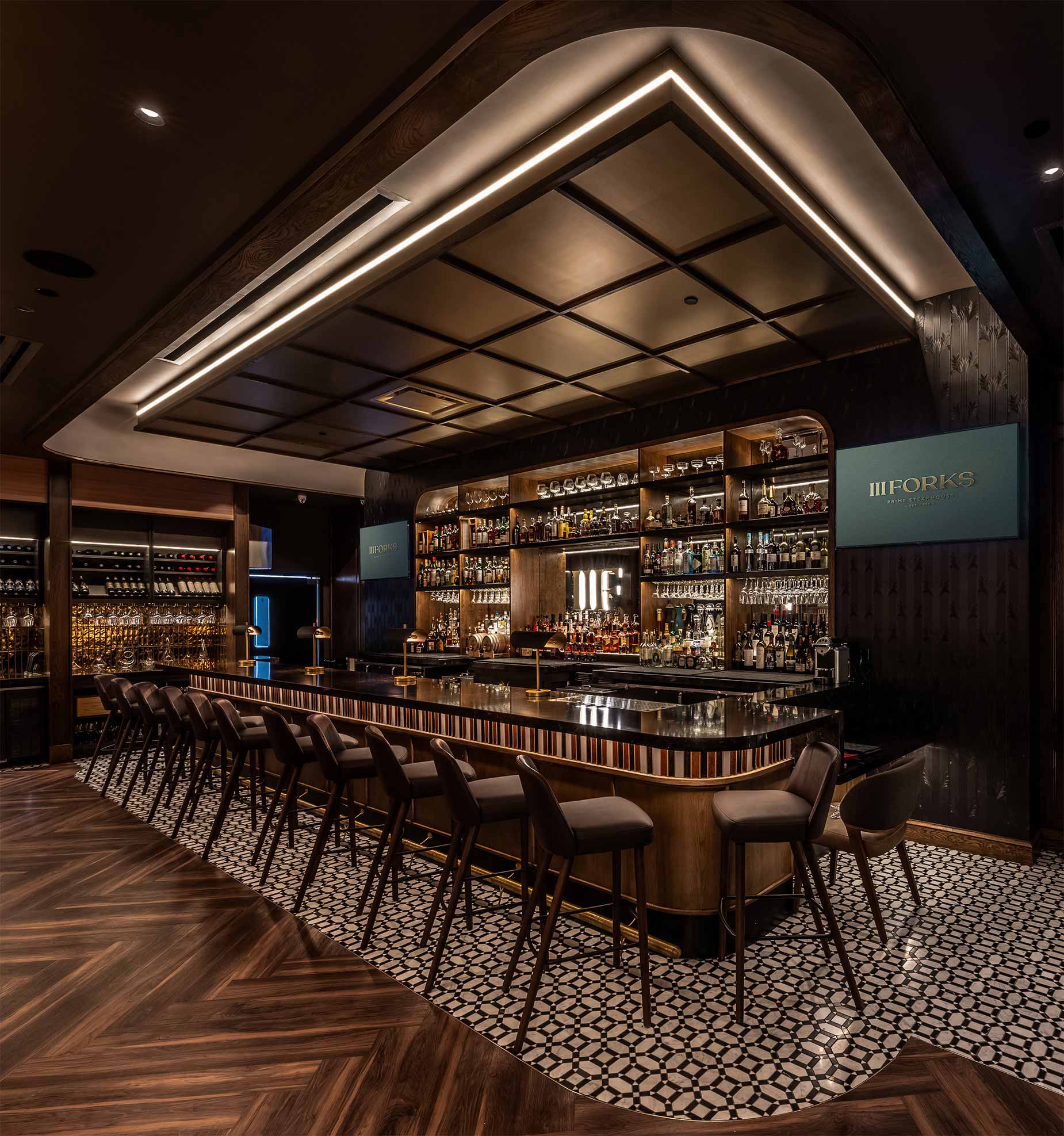
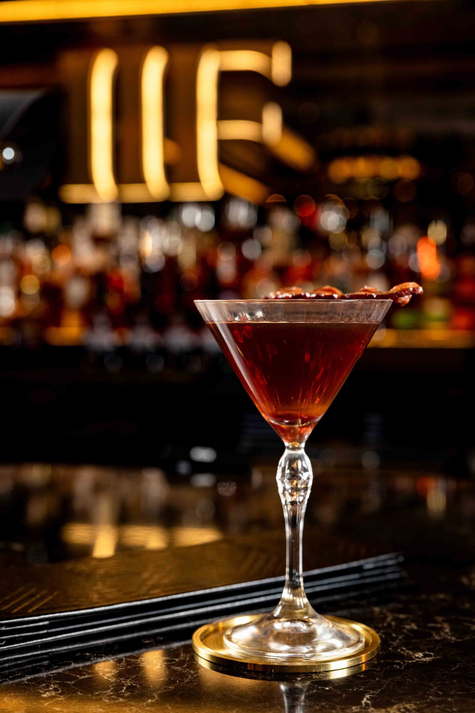
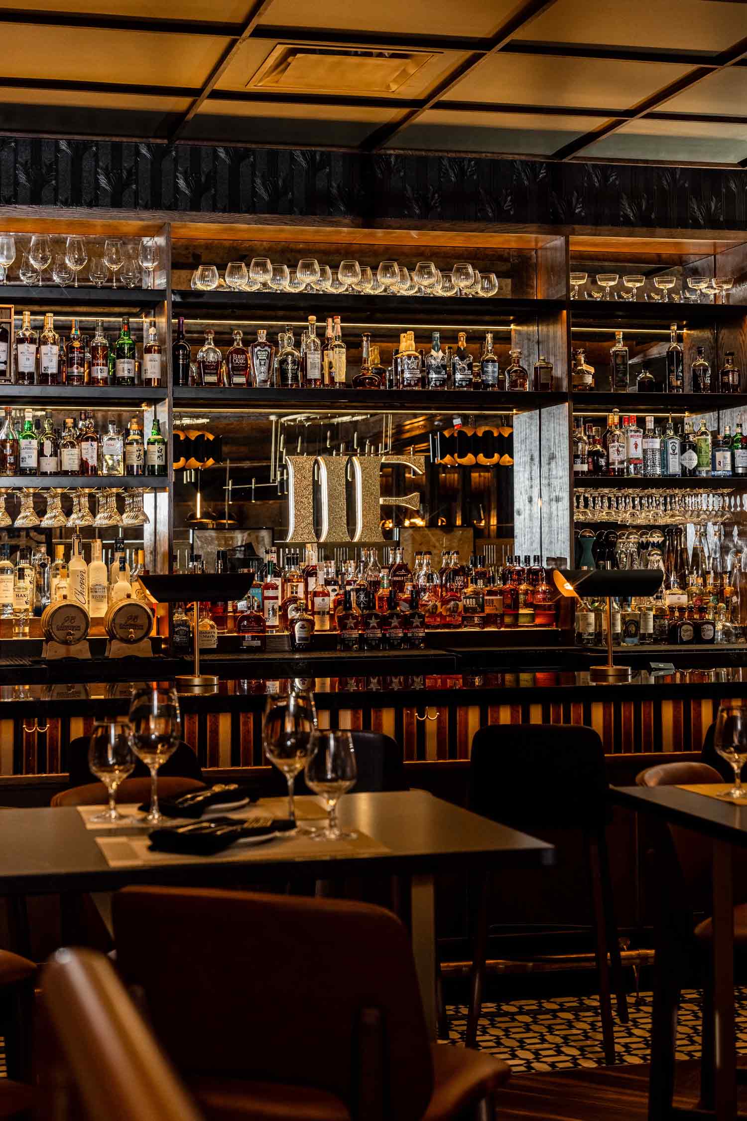
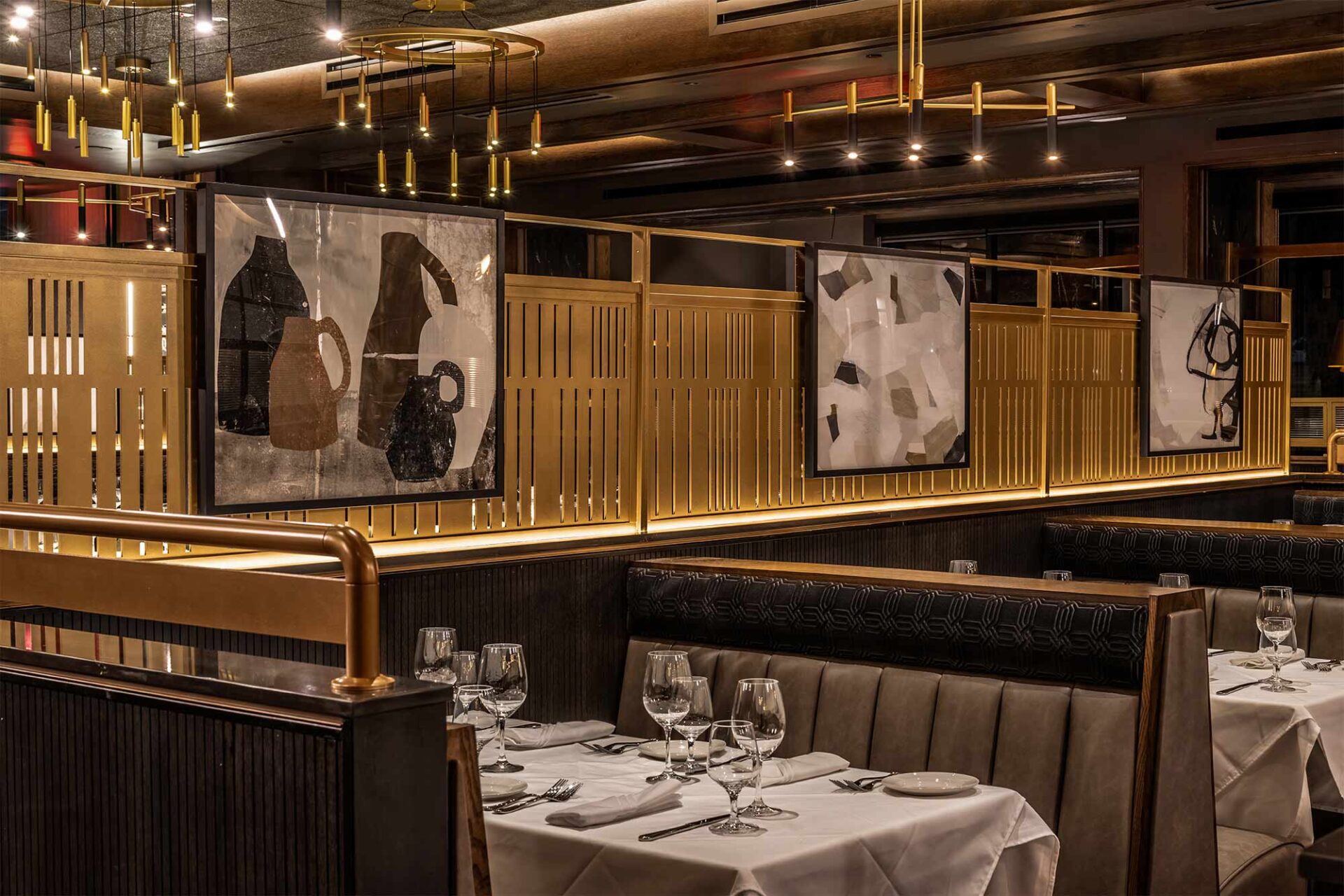
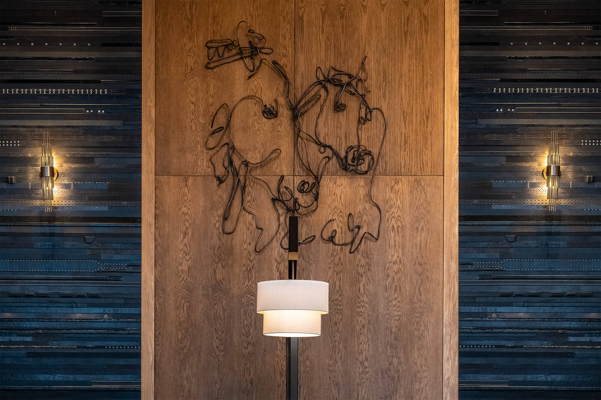
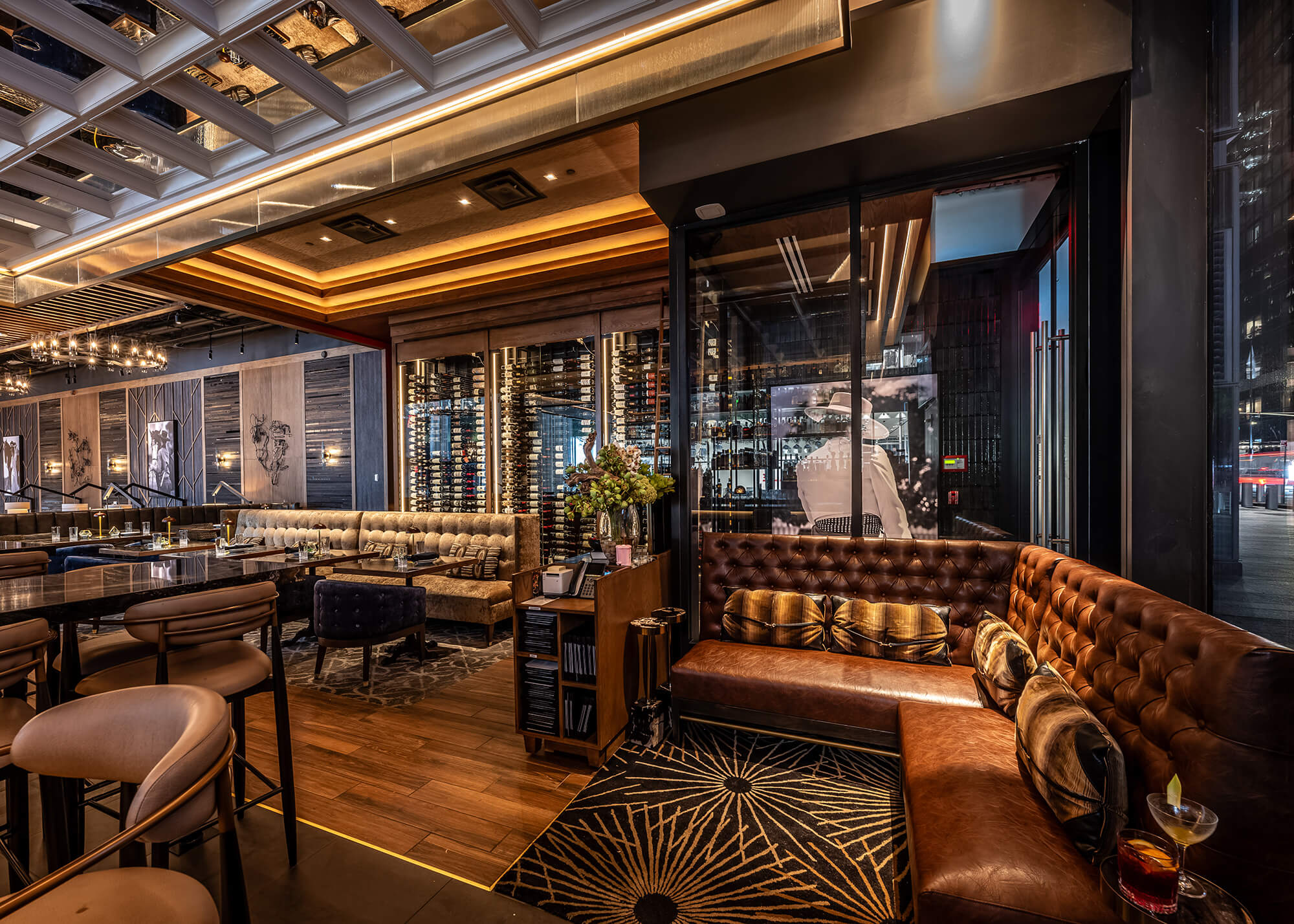
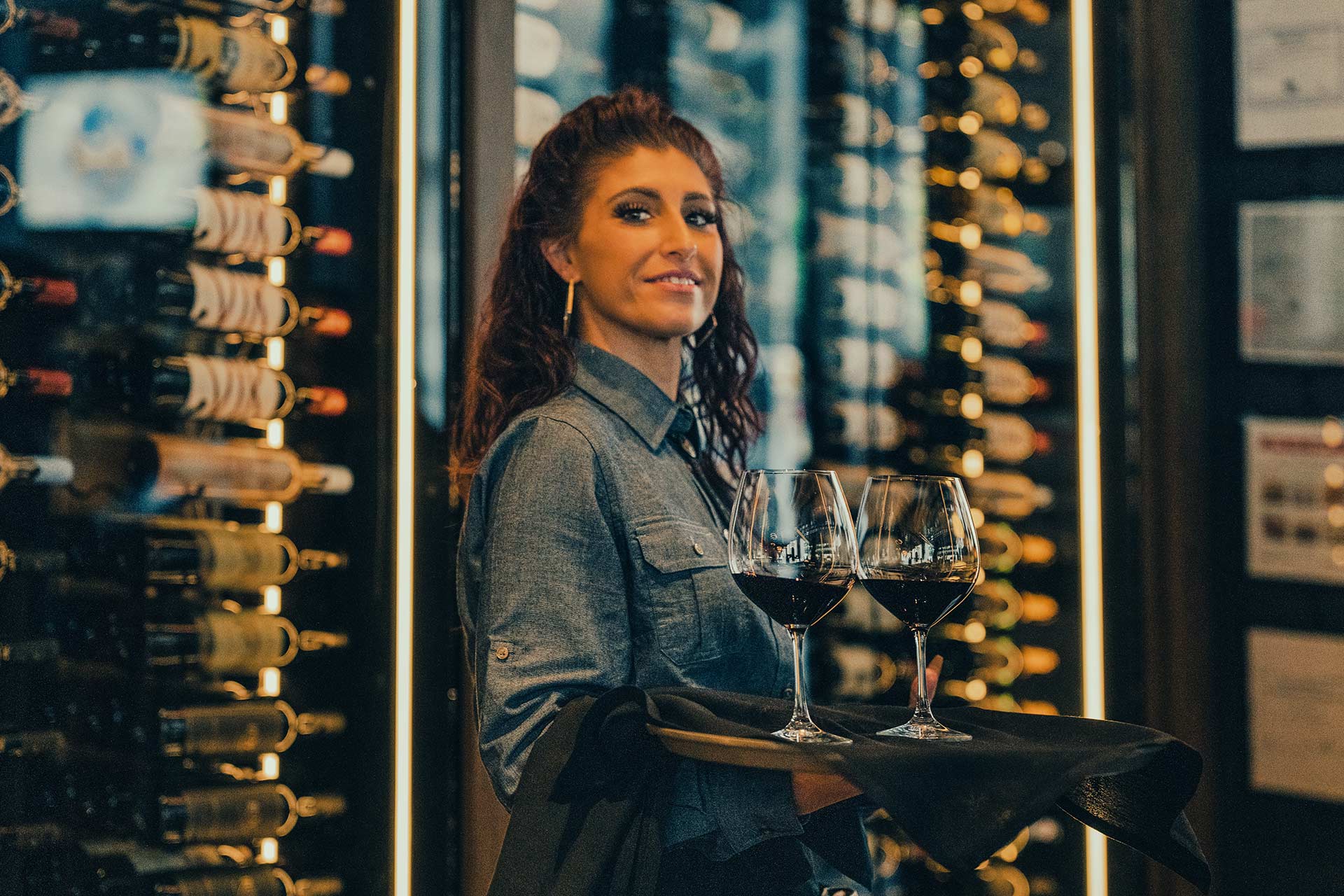
Design details throughout the restaurant interior were curated to spark emotion and encourage exploration. Signature moments, from a sculptural wine wall to a moody bar design to hidden private dining rooms, celebrate intimacy and indulgence. Textural layers, custom lighting, and a rich palette of Prosperity Green, dark wood, and metallics balance heritage with modern sophistication.
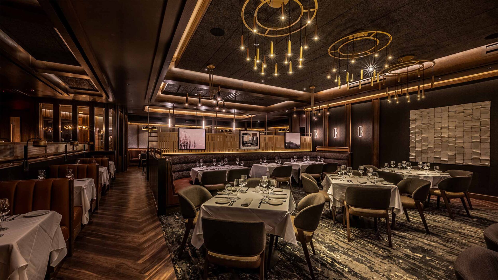
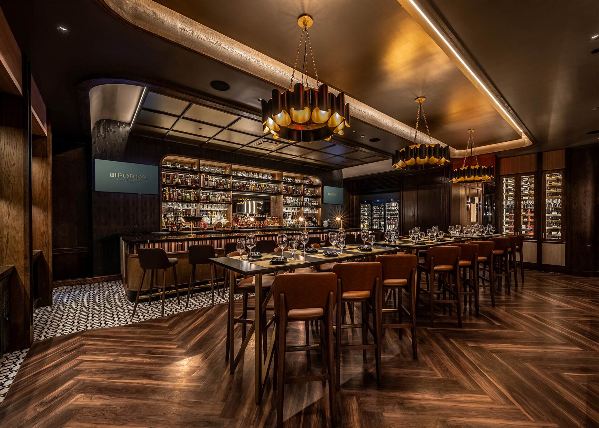
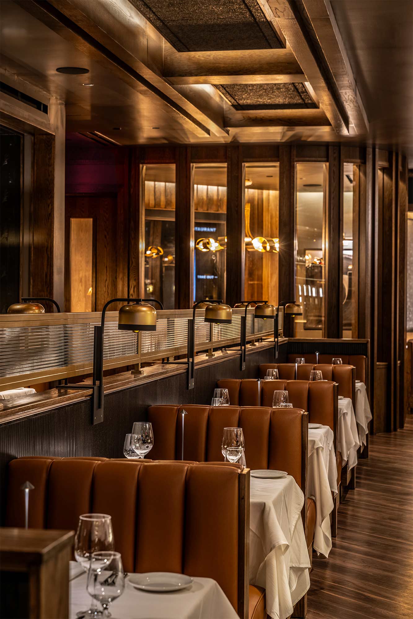
An inviting blend of freestanding tables, intimate booth seating, and warm ceiling coves sets the tone for a layered fine dining design, where custom finishes and textural contrast define the space.
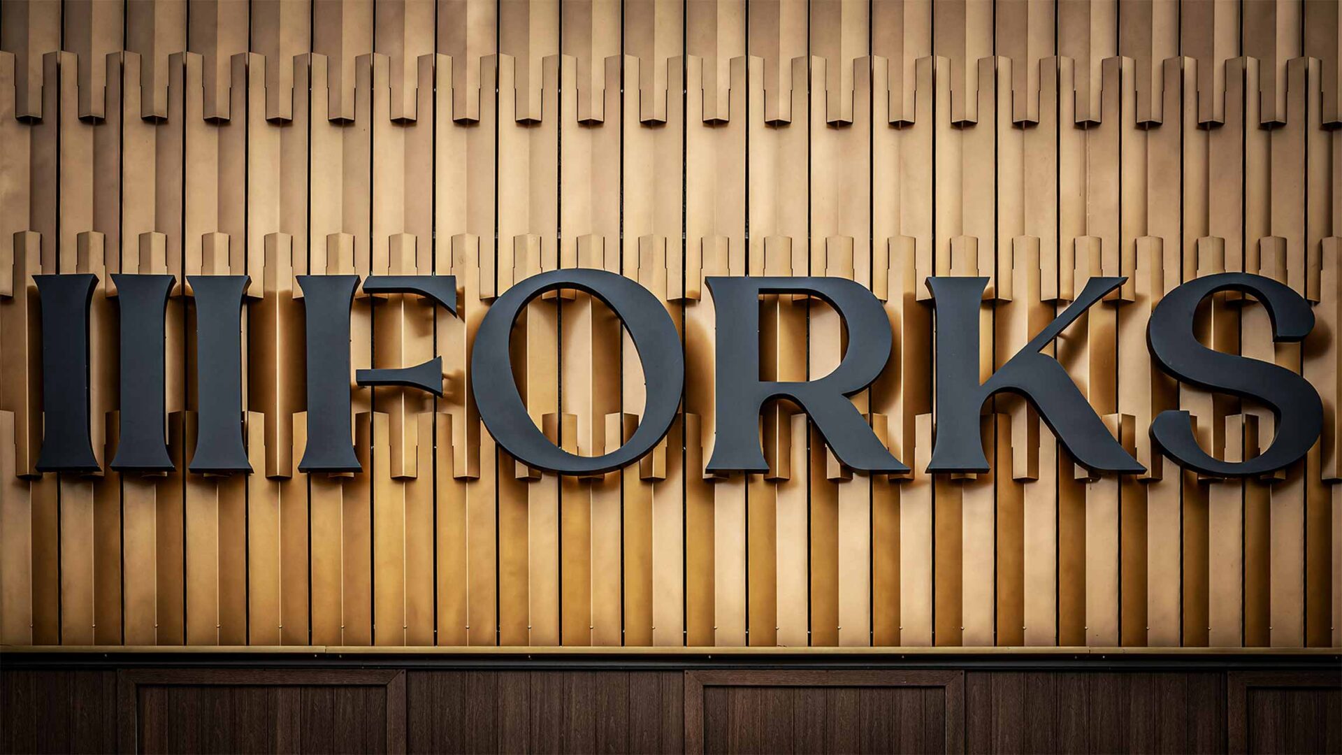
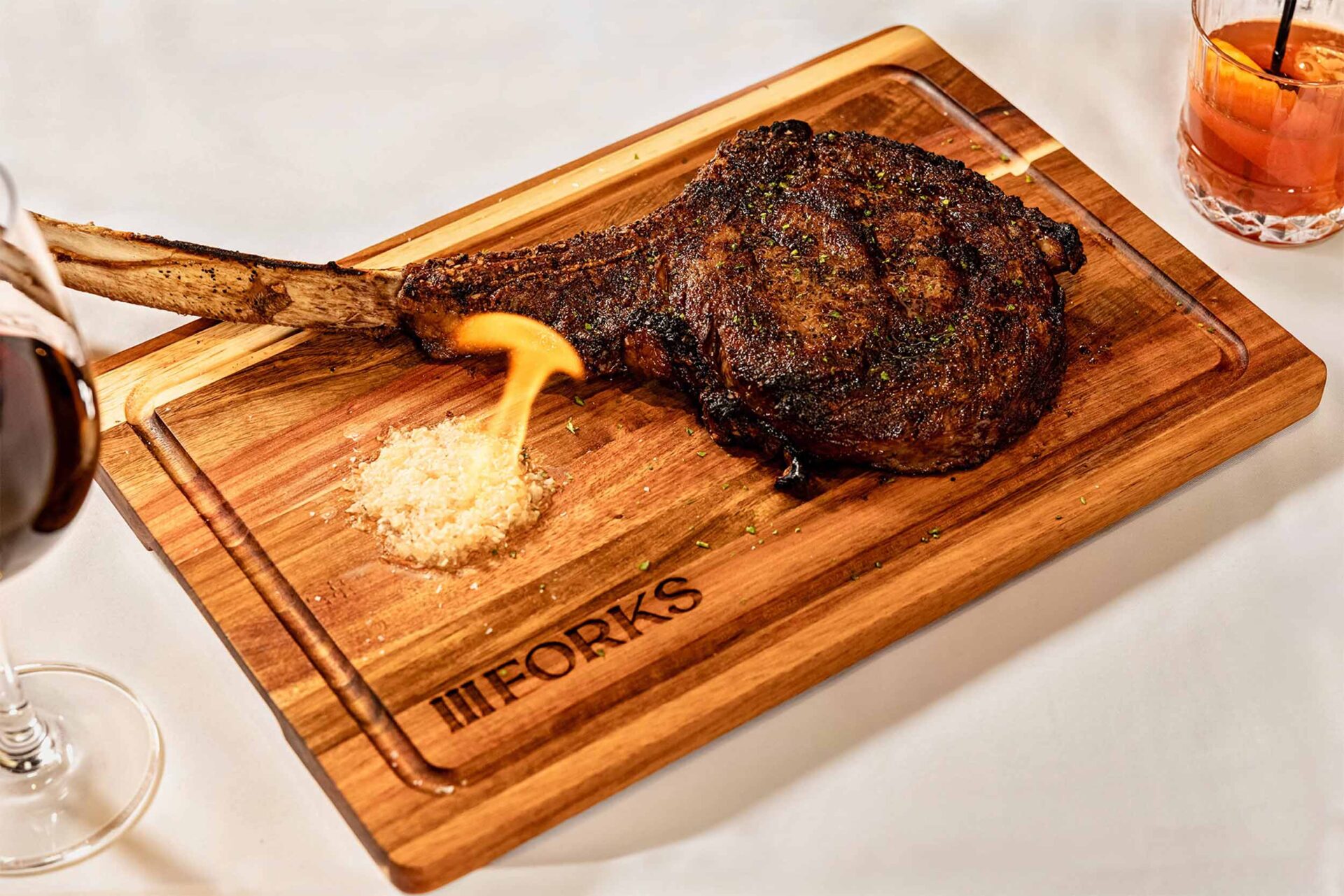
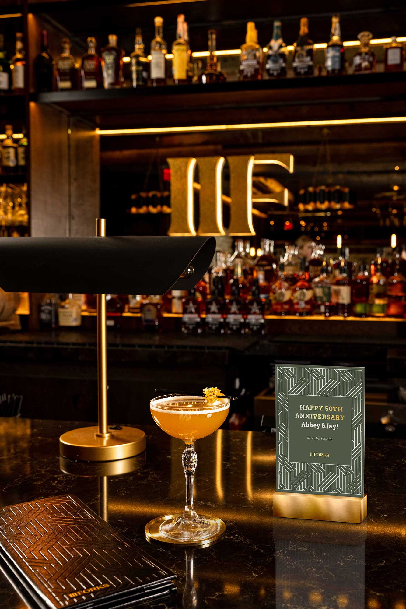
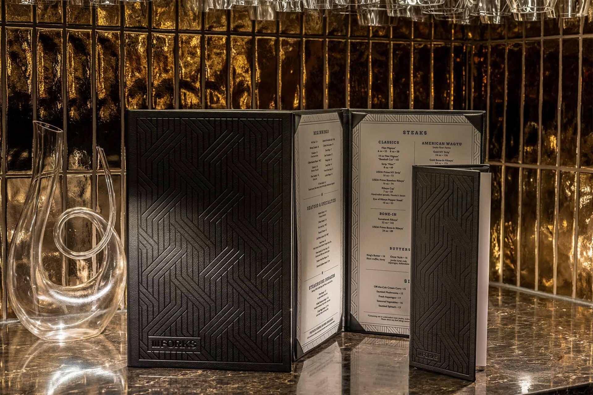
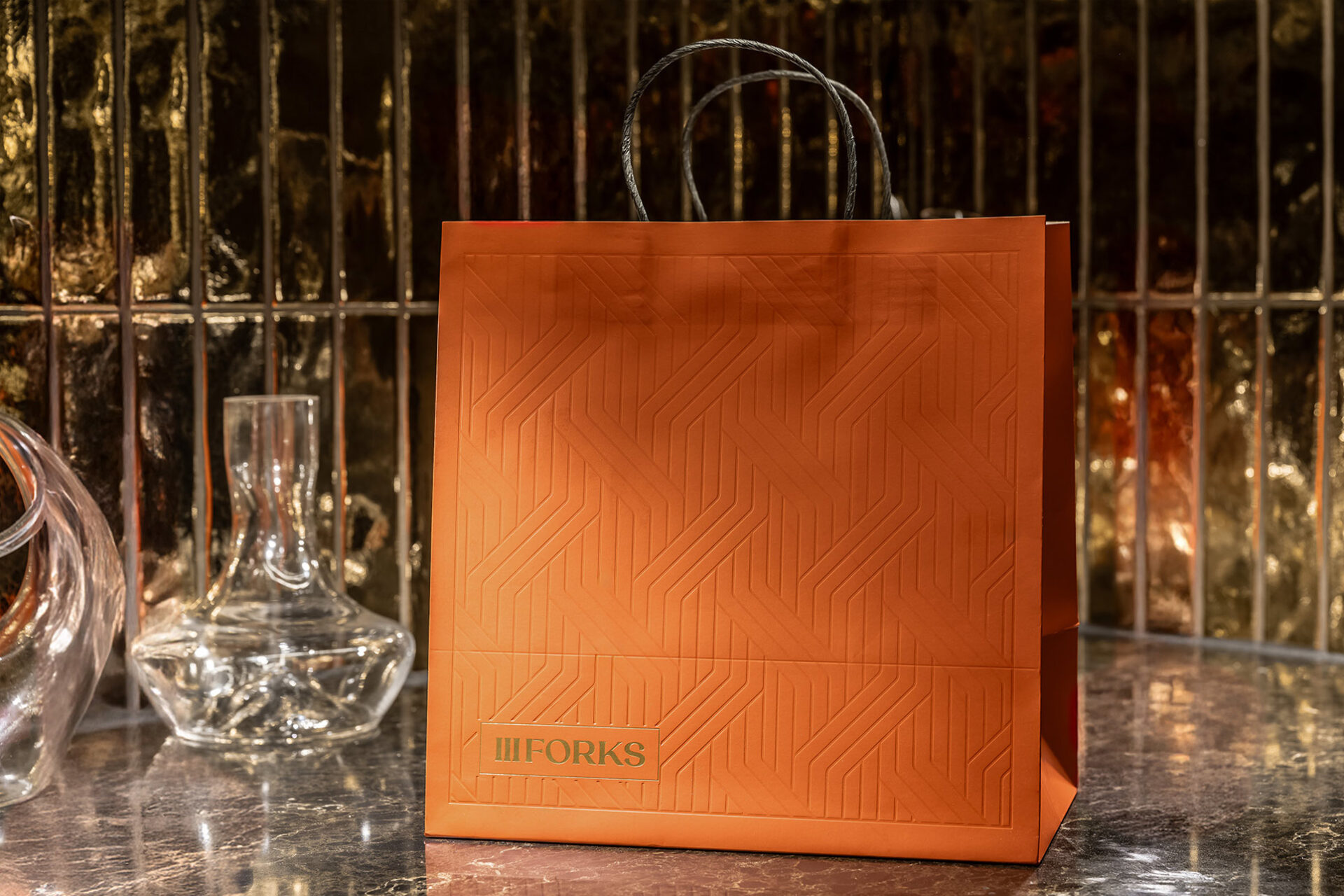
More than a visual refresh, the project was grounded in sound brand strategy. A responsive identity system, updated logo design, and thoughtful zoning support not just a beautiful restaurant design, but a commercially effective one. For III Forks, the result is a reimagined fine dining experience that resonates with today’s design-savvy diners and secures its place in the modern steakhouse landscape.
The team Harrison was amazing, guiding our team each step of the way. The end result is simply stunning!
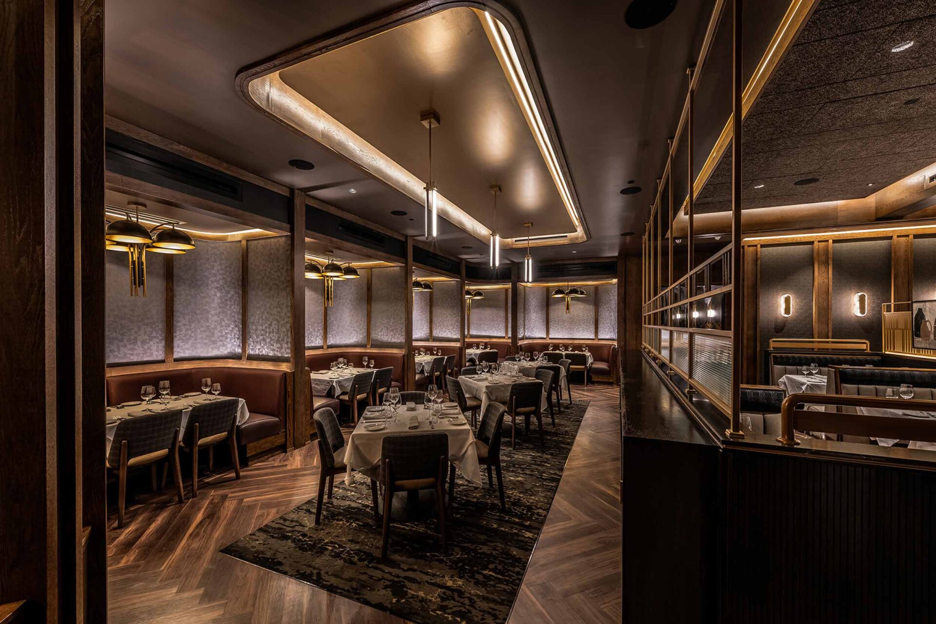
Defined by intimate zones, cohesive lighting design, and luxury restaurant finishes, this dining room composition balances privacy and openness—supporting both ambiance and operational flow.

Project snapshot
Related projects

Let’s create something unforgettable
Fuelled by knowledge and imagination, we are driven by our ambition to evolve hospitality brands.
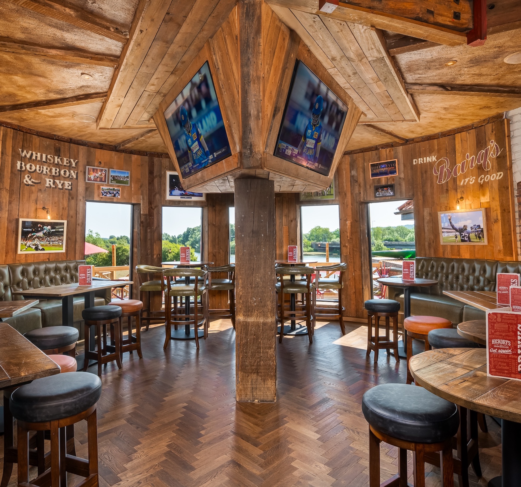
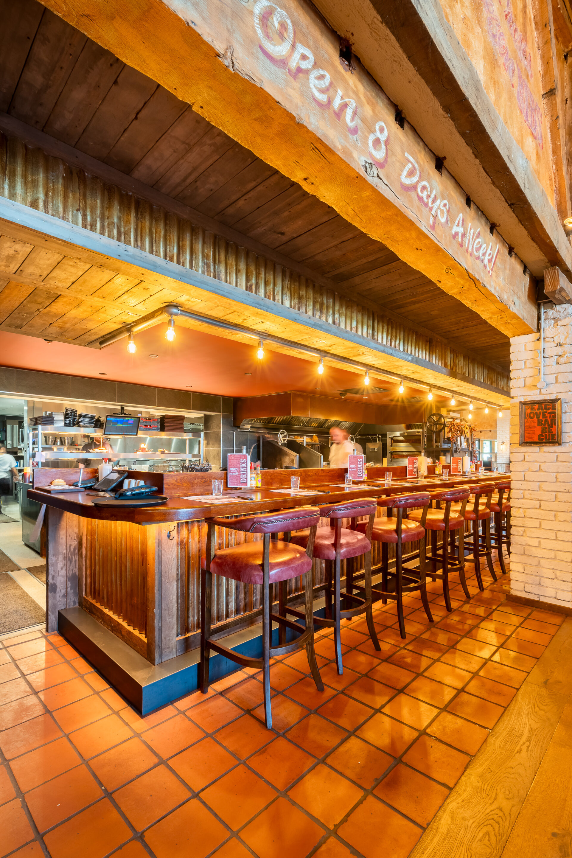
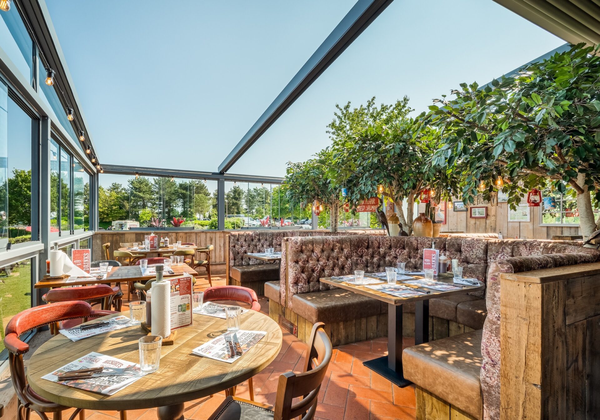
Design that translates US authenticity with British expectations of comfort and quality.
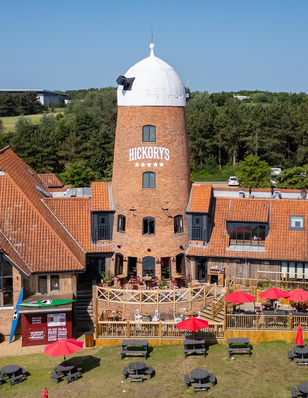
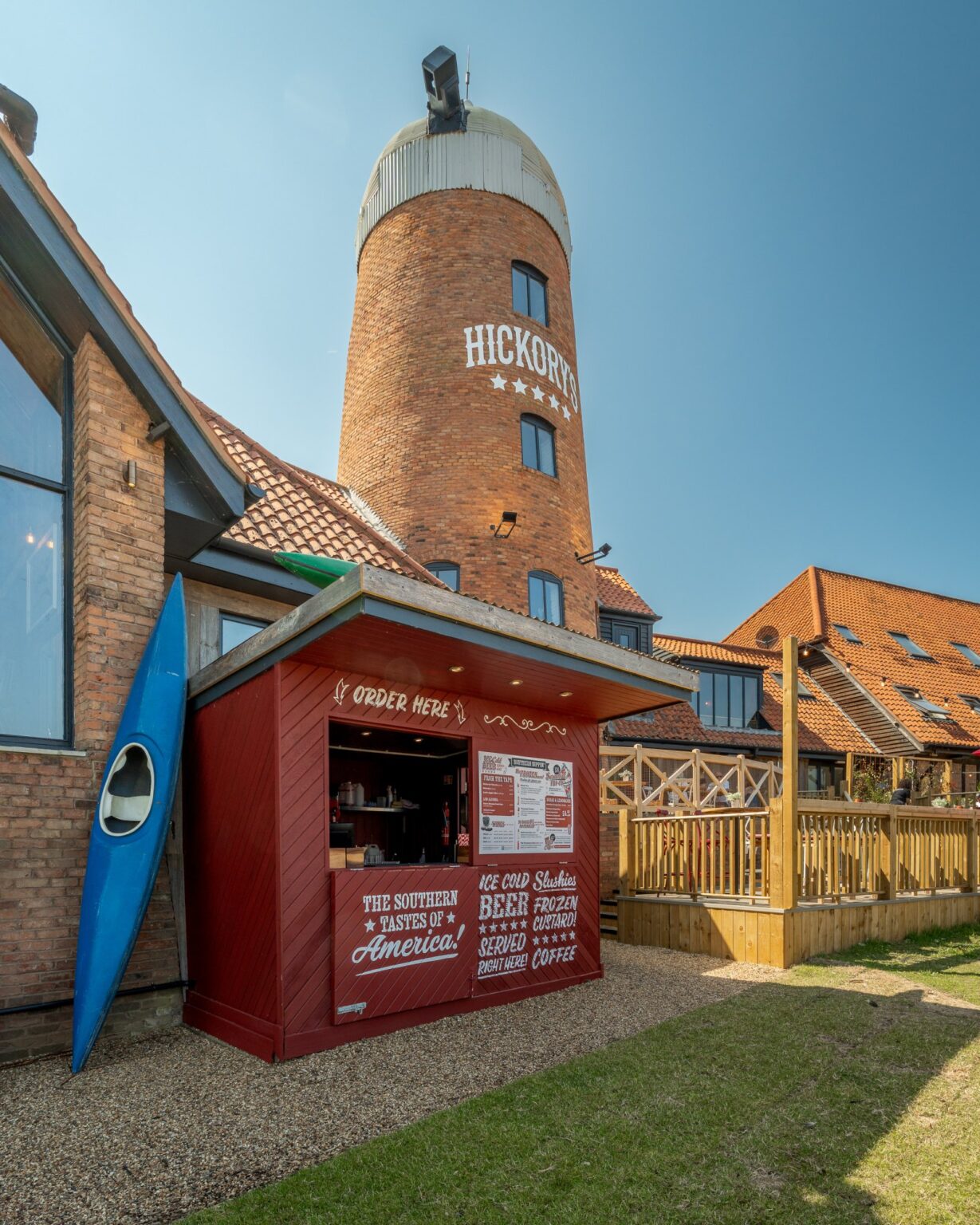
The landmark windmill structure anchors the Milton Keynes location
Bringing Authentic Hickory's Southern Hospitality to Milton Keynes
Inspired by Road Trips. Realised in Design
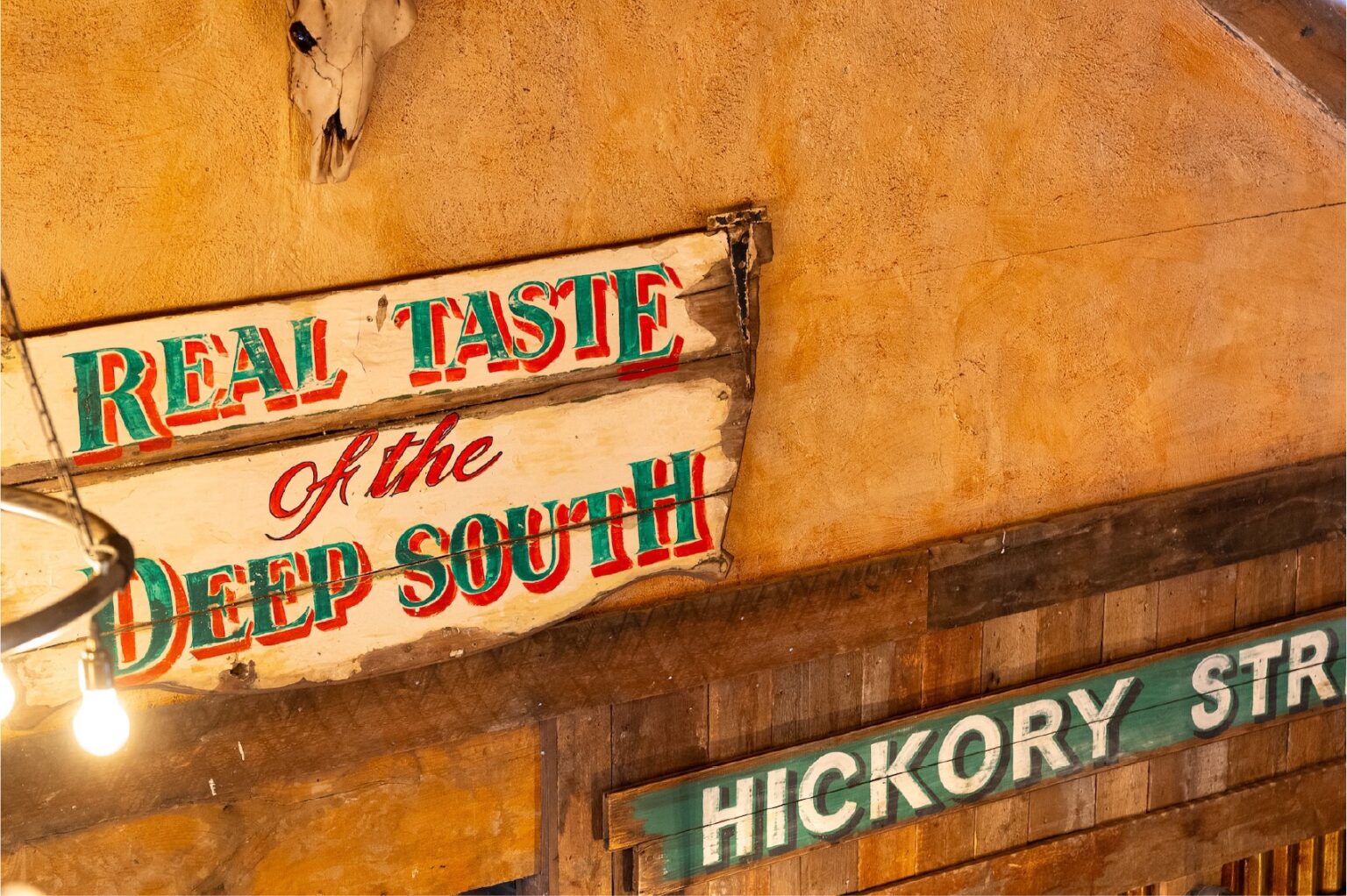
The origins of Hickory’s lie in curiosity and discovery. The concept was sparked when founder Neil McDonnell embarked on an unplanned journey through the southern states of America eating at roadside smokehouses, meeting pitmasters, and immersing himself in the region’s deep-rooted food culture. It was the South’s generosity of spirit that left a lasting impression and inspired Neil’s vision to share this across the UK.
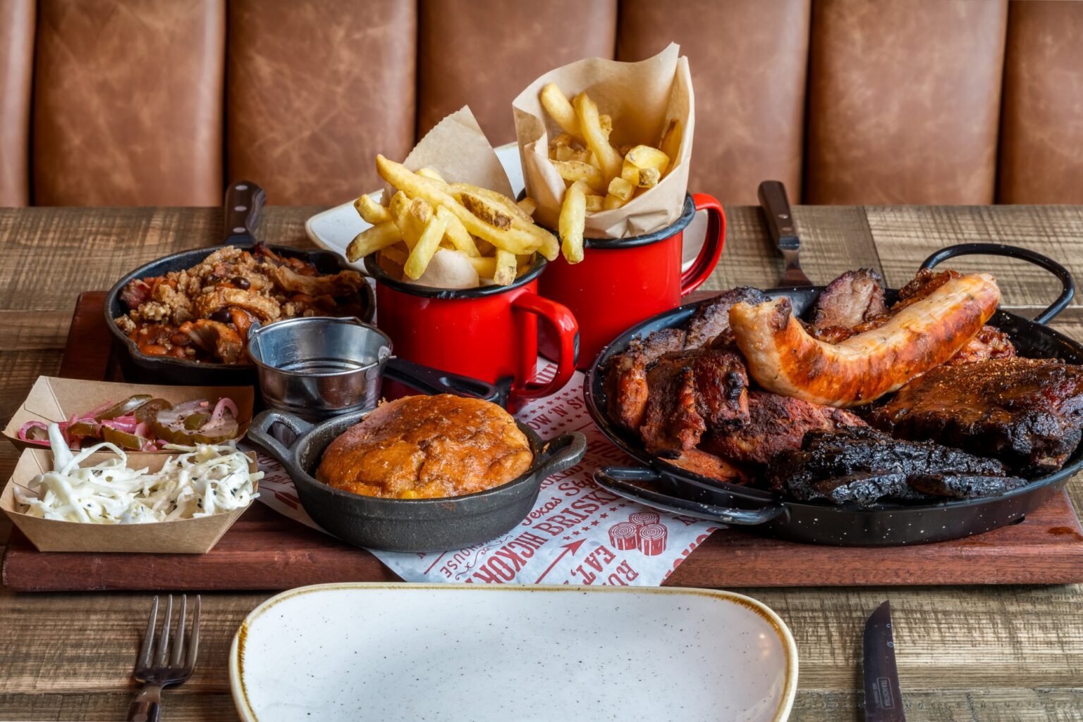
Crafted with Soul, Served with Heart.
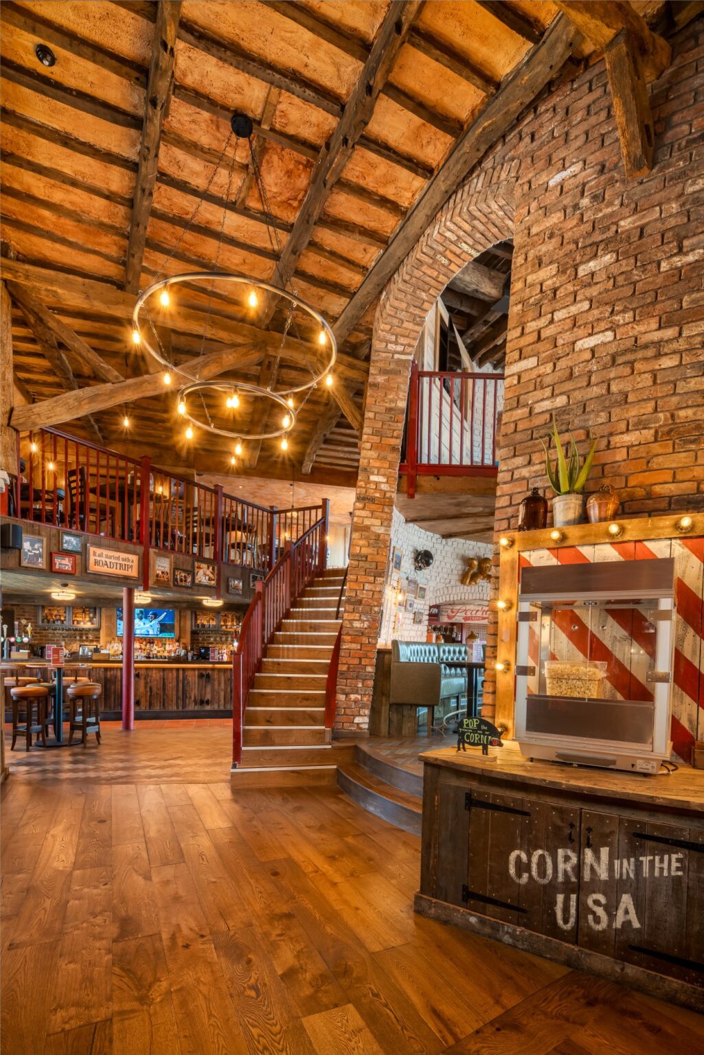
Anchored by the site’s landmark windmill, the Milton Keynes design blends Southern tradition with a distinctly UK sense of comfort. Drawing on first-hand research, the space feels collected rather than constructed layered with aged timber, reclaimed materials, rural Americana, and eclectic details that appear to have evolved over time.
Hickory's isn’t just a brand —it’s a way of life.
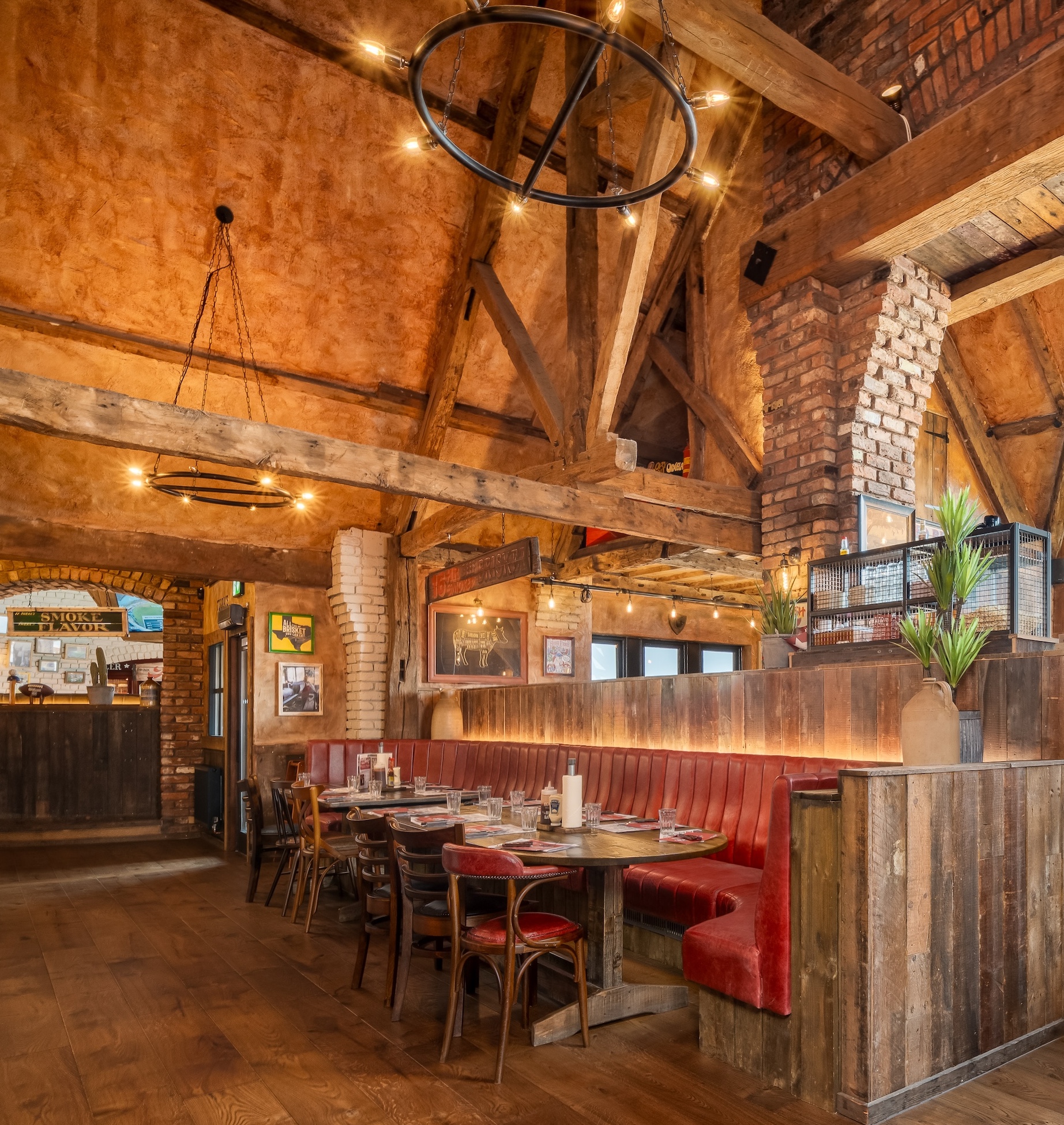
At its heart sits a bold, sociable bar, while vaulted mezzanines and barn-like dining spaces are shaped by oversized beams, textured finishes, and folk-inspired memorabilia. Throughout, raw authenticity is balanced with refinement, soft furnishings and considered lighting bringing warmth to the rugged smokehouse aesthetic.
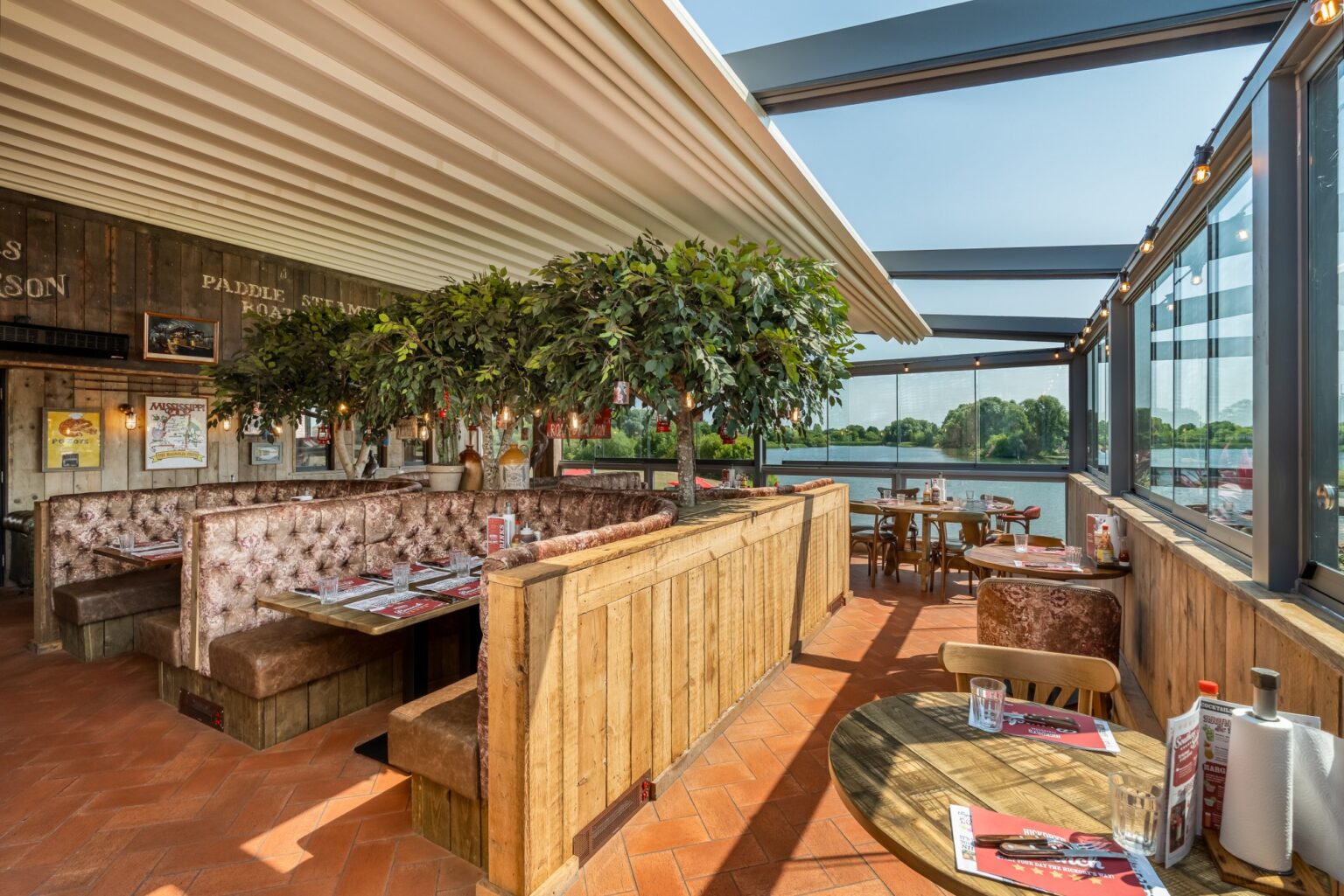
The result is an immersive escape. Hickory’s Milton Keynes isn’t just another location it’s a new chapter in a story still unfolding.

Let’s create something unforgettable
Fuelled by knowledge and imagination, we are driven by our ambition to evolve hospitality brands.
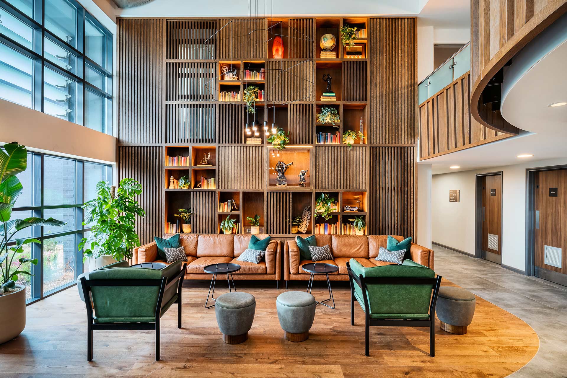
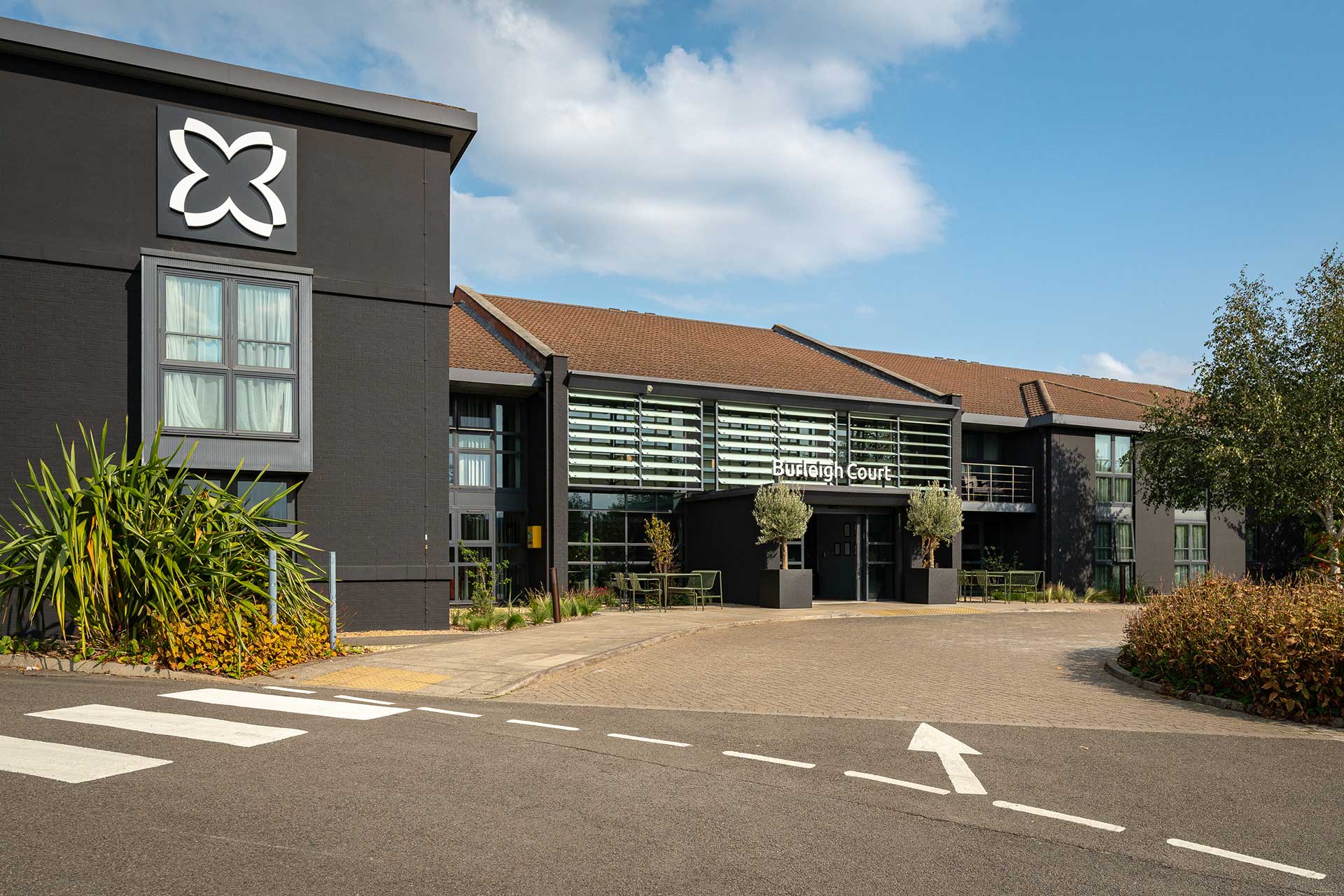
Transforming Loughborough’s Premier Hospitality Destination into a genuine centre of excellence
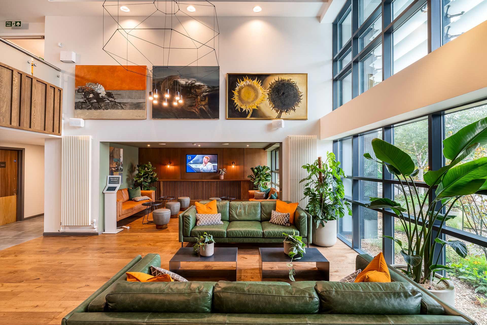
Working in close collaboration with Imago Venues, we completely reimagined Burleigh Court as a living expression of the university’s spirit rooted in heritage, shaped by innovation, and designed around experience. The ambition was simple but exacting: to transform into a guest journey that feels intuitive, engaging, and quietly memorable.
The reception feature wall tells the stories of and celebrates the different specialisms which can be studied at the university.
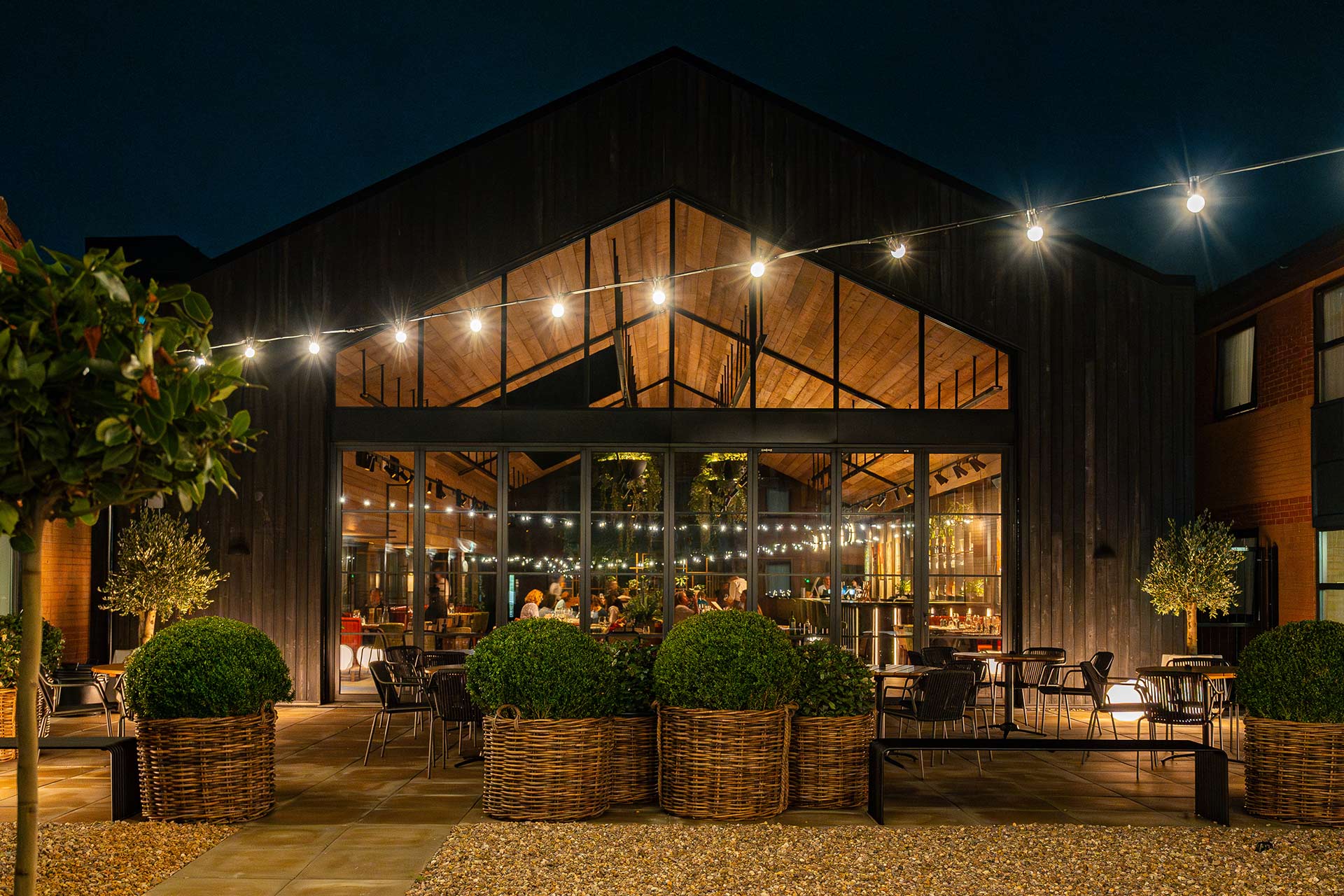
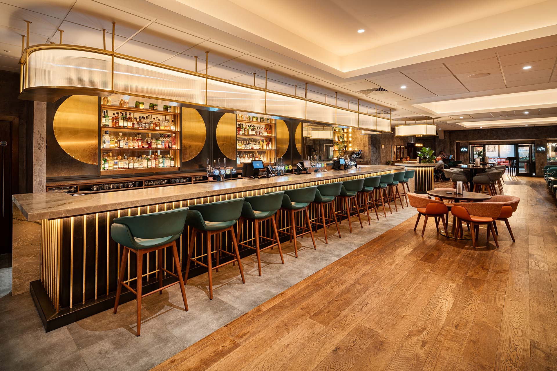
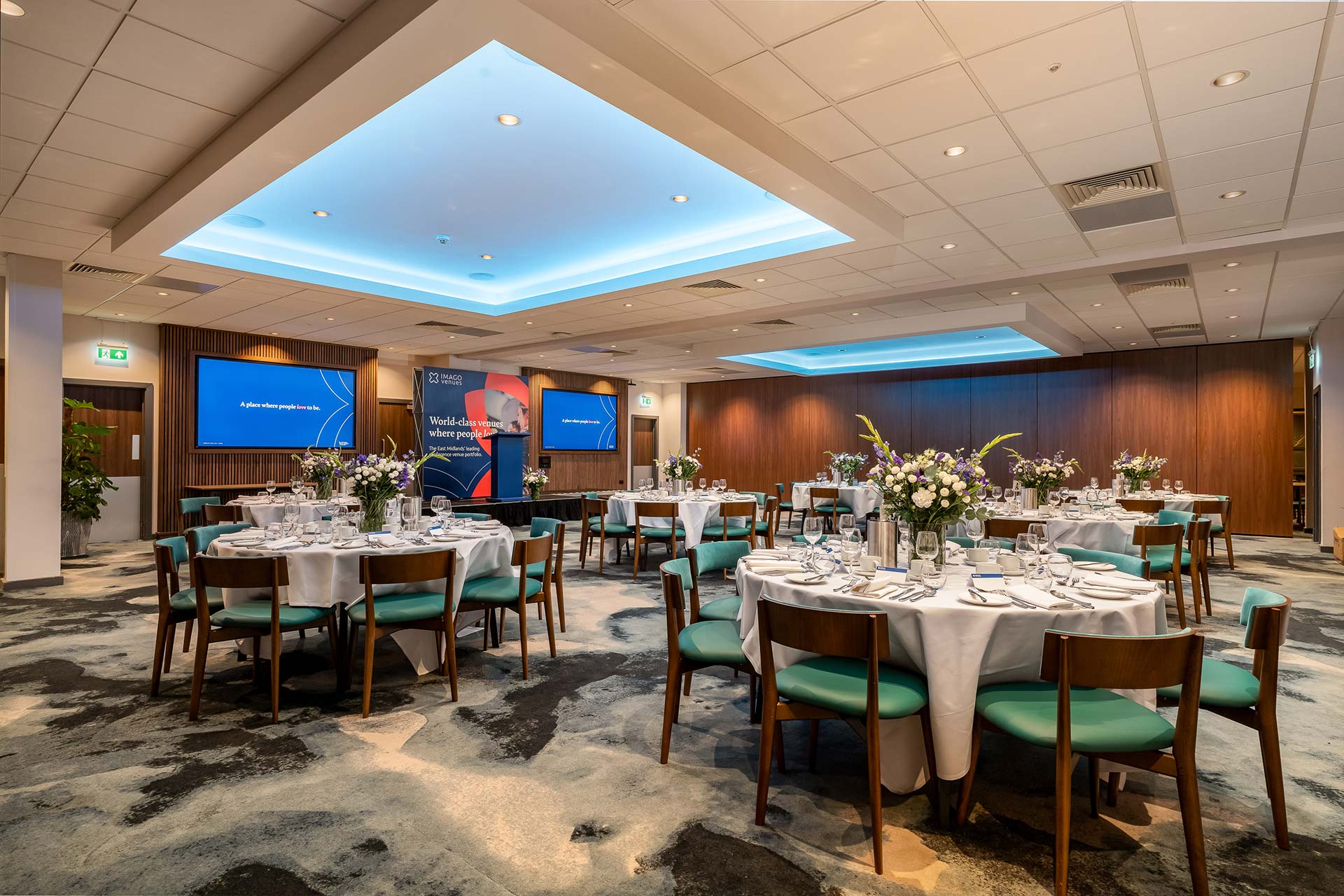
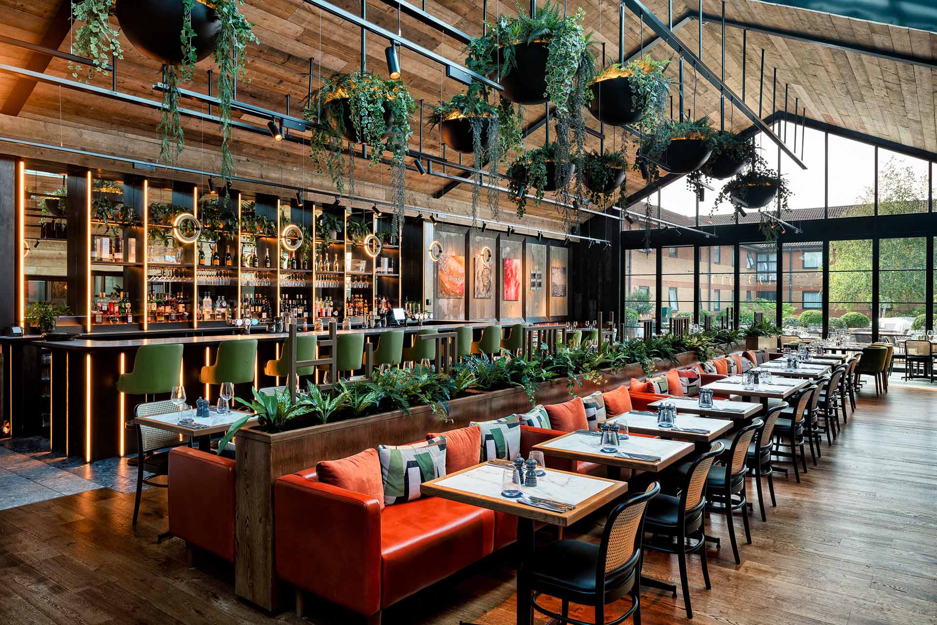
A spectacular new restaurant extension, Fifty The Street, has created a truly iconic destination that appeals throughout the whole day.
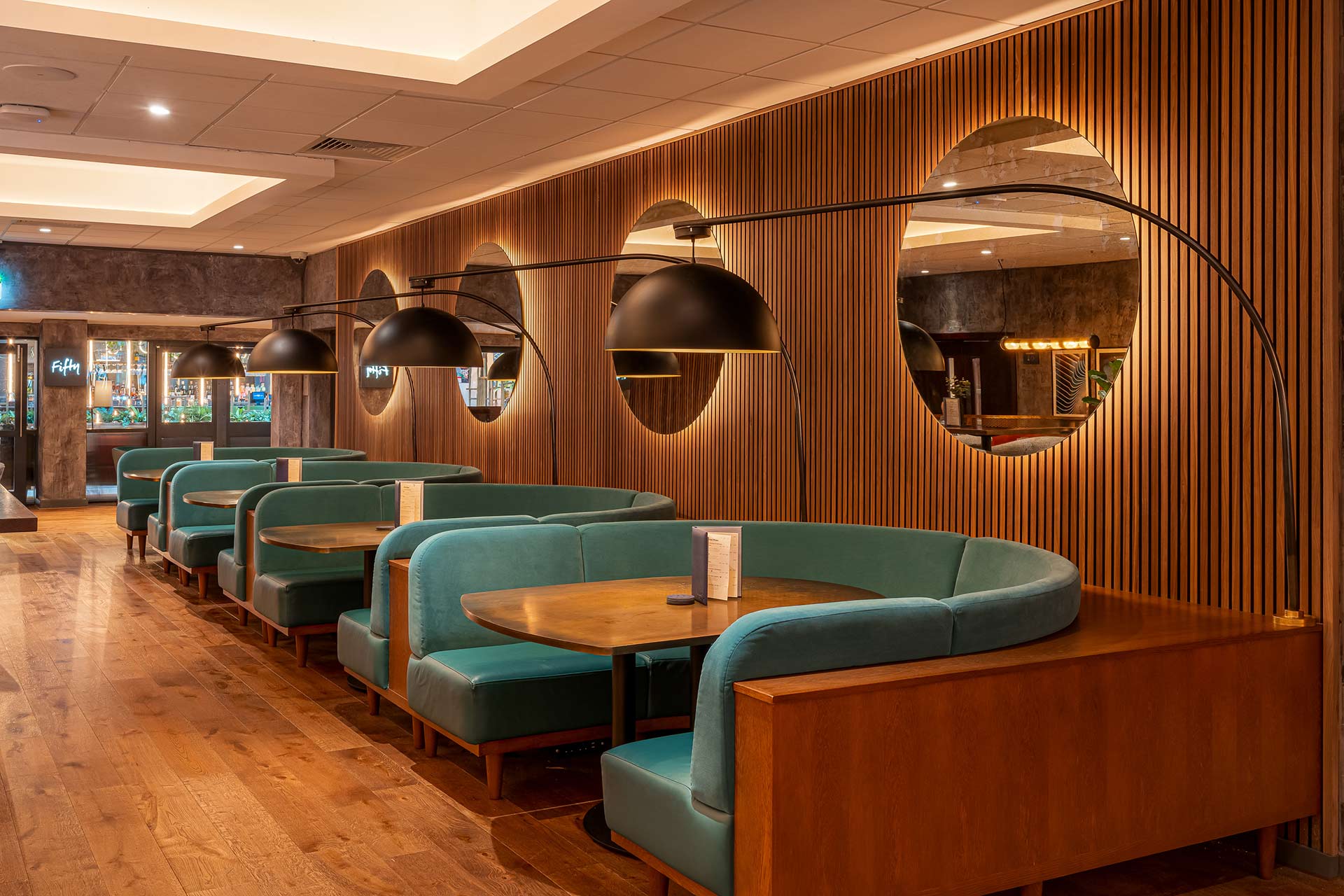
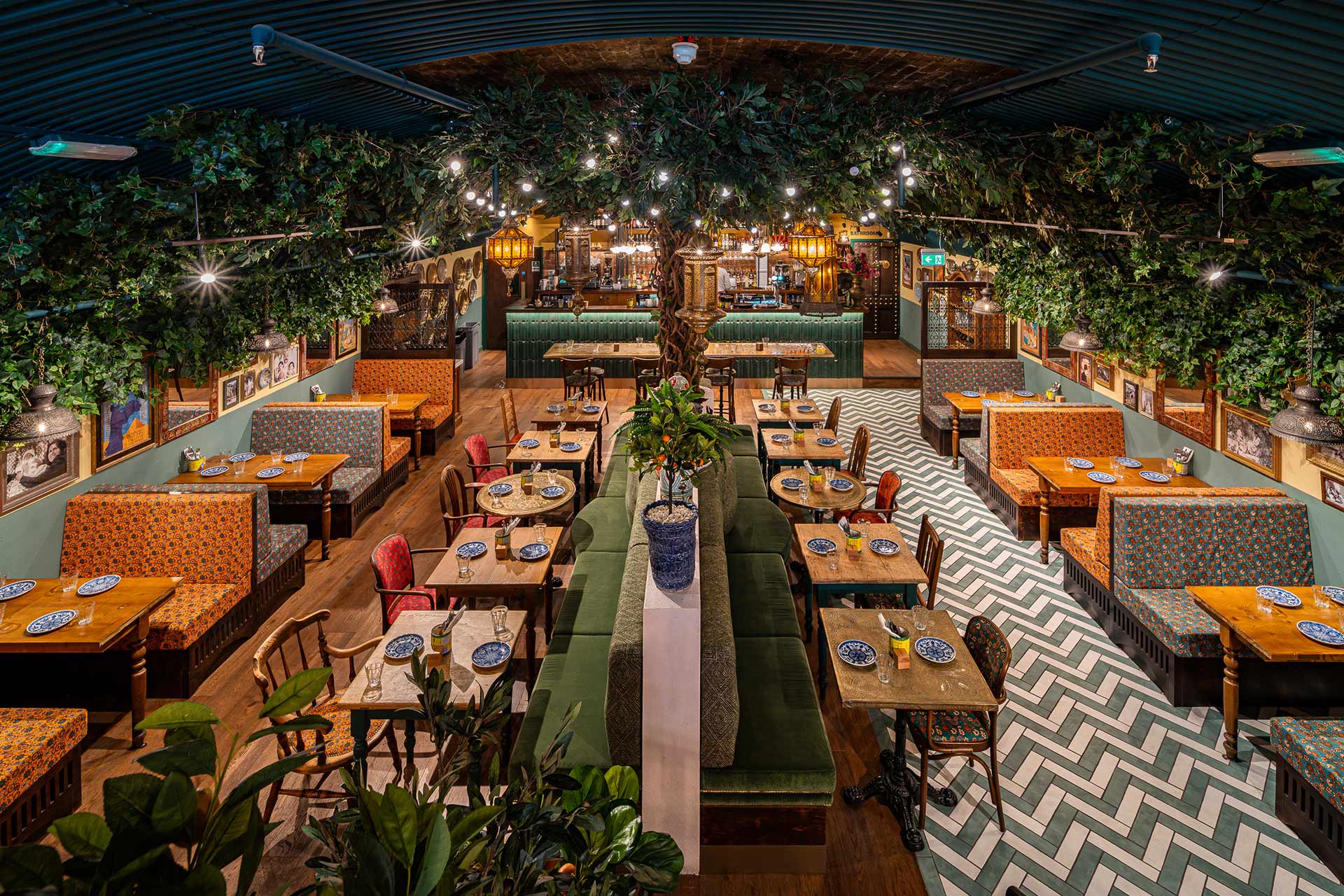
Five Distinct Spaces, One Cohesive Narrative
Inspired by Loughborough’s twin academic strengths of engineering and fine art the design unfolds across five distinct spaces, where each space builds a multilayered story. The newly created restaurant, Fifty the Street, sits at the centre. With a sustainable design ethos, it reflects a modern approach to guest dining that is thoughtful, progressive, and grounded in purpose
The Thingumajig Room
Intrigue and Curiosity also plays an important role. The Thingumajig Room, is home to a striking engineering artefact from the university, introduces elements of intrigue and play. It bridges past innovation with present day experience, giving guests something unexpected to discover and talk about.
We collaborated with 11 fine art students, curating original works that transform corridors, lounges, and shared spaces into evolving galleries. The result is a hotel that actively supports emerging talent while reinforcing its connection to the academic community it serves.
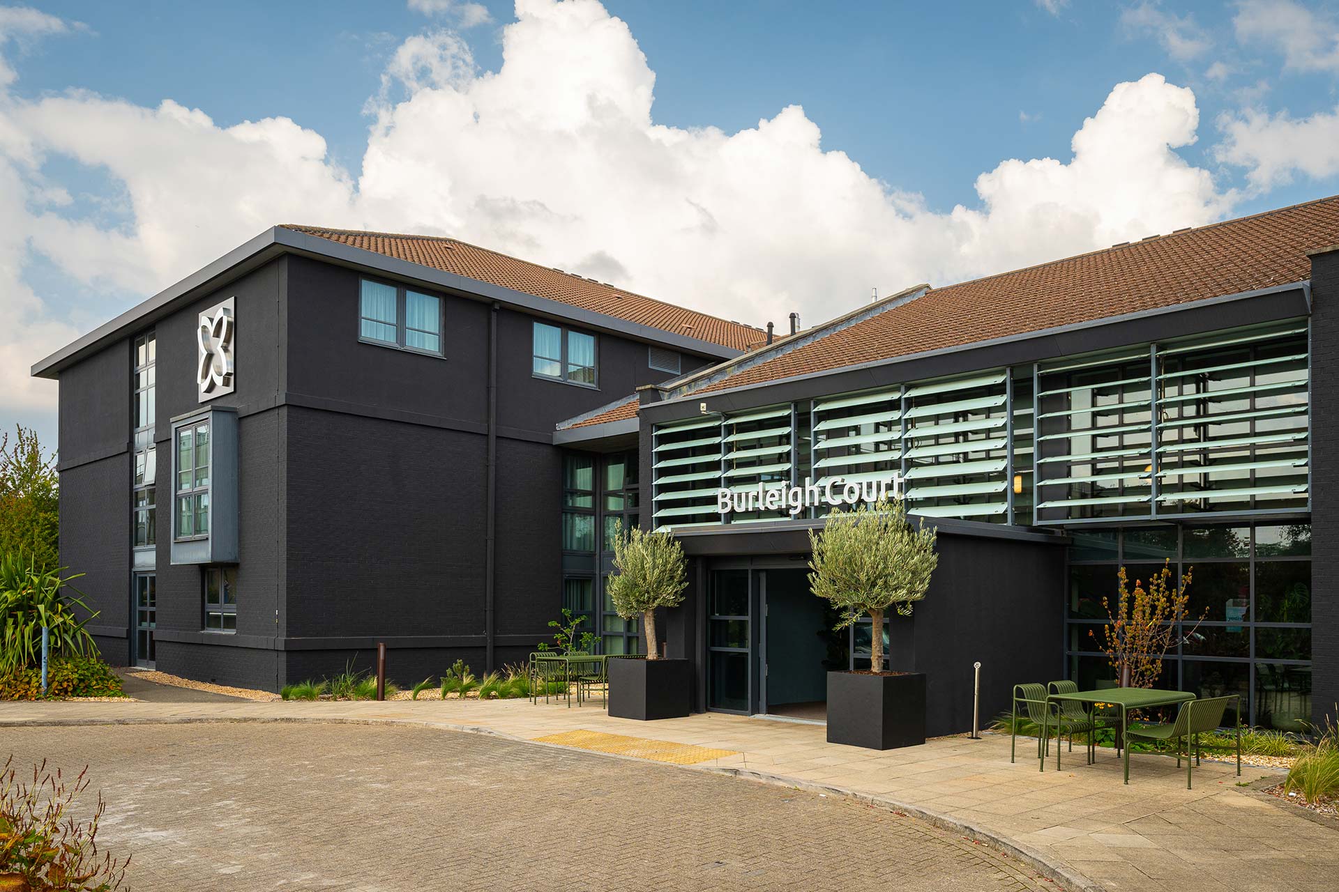
A sympathetic architectural evolution of the fascia and entrance has uplifted and heightened the sense of arrival.
Designed for Engagement and Ease
Functionality and a quality guest experience are carefully balanced. The reception has been completely redesigned to feel open and welcoming, with self-check-in technology seamlessly integrated into a warm, welcoming and homely space. Wayfinding, lighting, and signage work together to guide guests effortlessly, creating a journey that feels natural rather than directed.
A hotel transformation which goes beyond aesthetics
This project is a complete strategic brand and business repositioning that strengthens The Burleigh Court Hotel’s role within a competitive hospitality landscape. The refurbishment has already delivered double-digit like-for-like growth for Imago Venues proof that clarity of vision, when executed with care, delivers real impact.
Burleigh Court is not simply a place to stay. It is a place to relax and connect with ideas, with creativity, with the ongoing story of Loughborough University. Delivered with purpose and designed around the guests who pass through it.
When approaching the brief for Burleigh Court, we wanted to seamlessly blend together the academic heritage of the university and bring contemporary design to the forefront.
Harrison have truly been a great partner and I’m fortunate to have worked with them throughout the process. They have helped me and the business make the right decisions. This is entirely due to their professionalism, the people, and the quality of the job they delivered.
Related projects
Let’s create something unforgettable
Fuelled by knowledge and imagination, we are driven by our ambition to evolve hospitality brands.
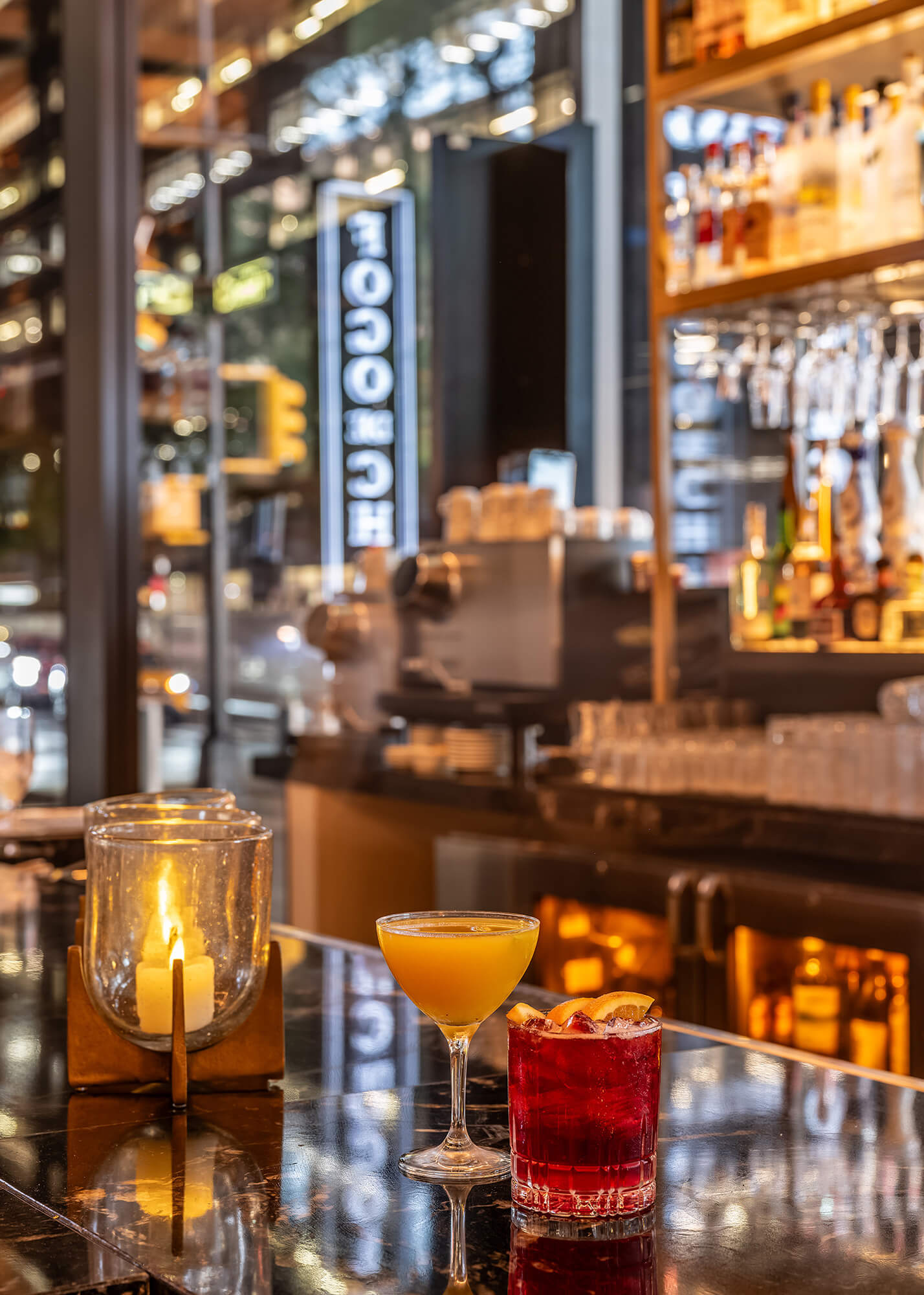
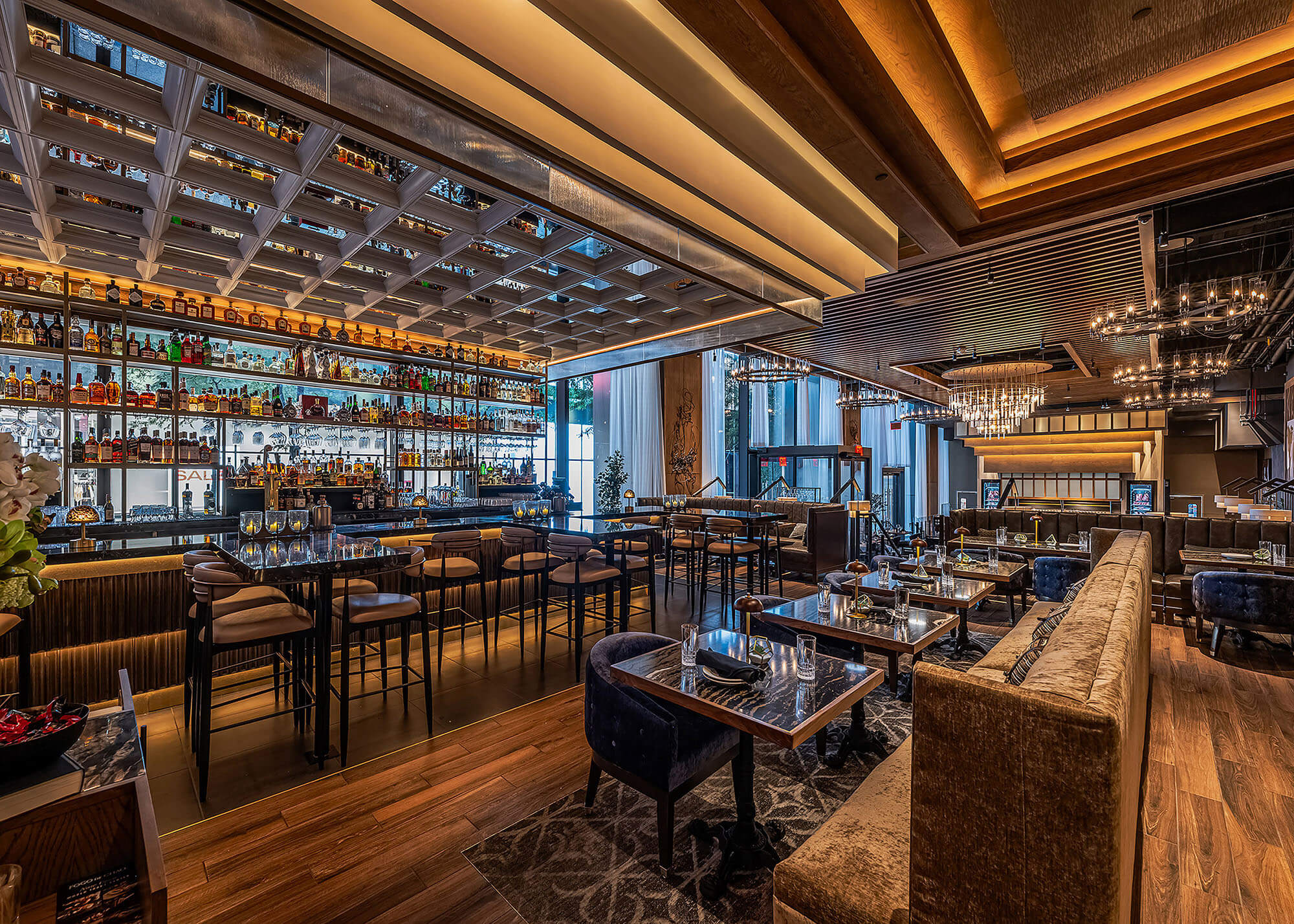
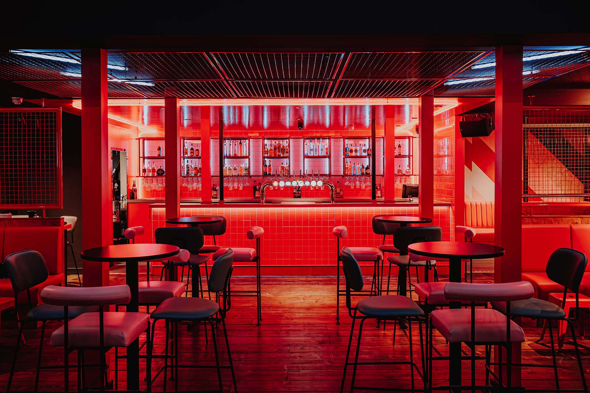
A modern bar design that blends ambiance with allure; where craft cocktails and warm hospitality take center stage in the heart of NYC.
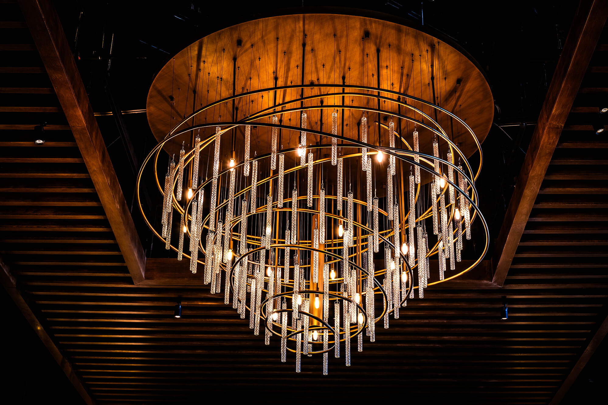
A modern centerpiece with old-world soul, this custom chandelier balances drama and restraint, elevating the guest experience through immersive restaurant lighting design.
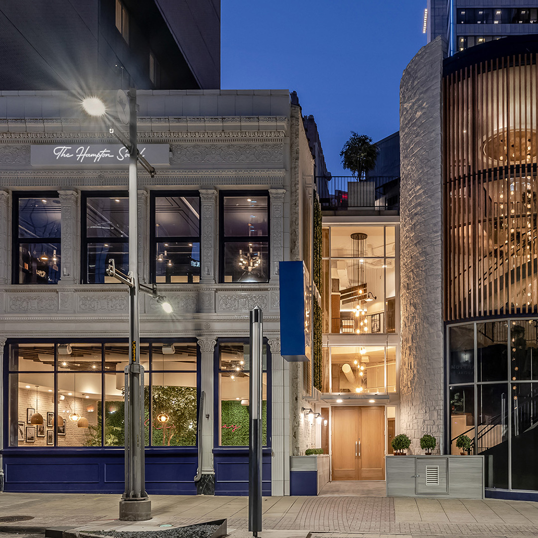
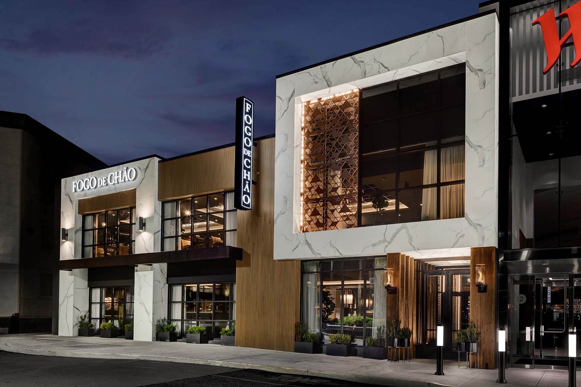
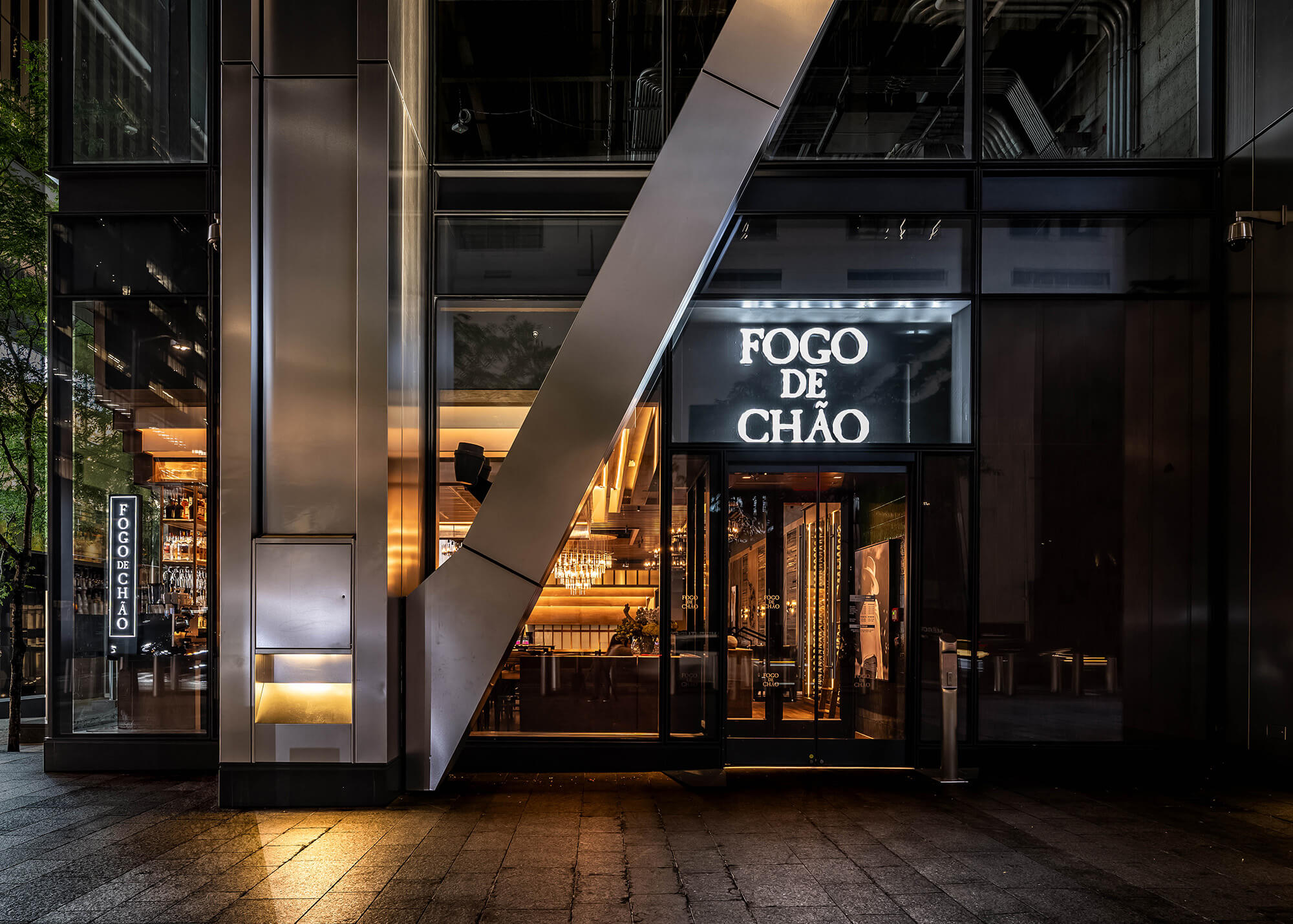
Set within the World Trade Center Oculus complex, this high-profile restaurant architecture project demanded both bold vision and precise execution. Our Dallas office served as Architect of Record and interior designer, overseeing the transformation of an open-volume shell into a refined yet inviting full-service dining experience.
The space planning required clever zoning and rigorous coordination with Port Authority and local officials. The team delivered a seamless restaurant design that respects the transparency of the space while introducing layered intimacy, inviting guests into a story that unfolds from street level to mezzanine.
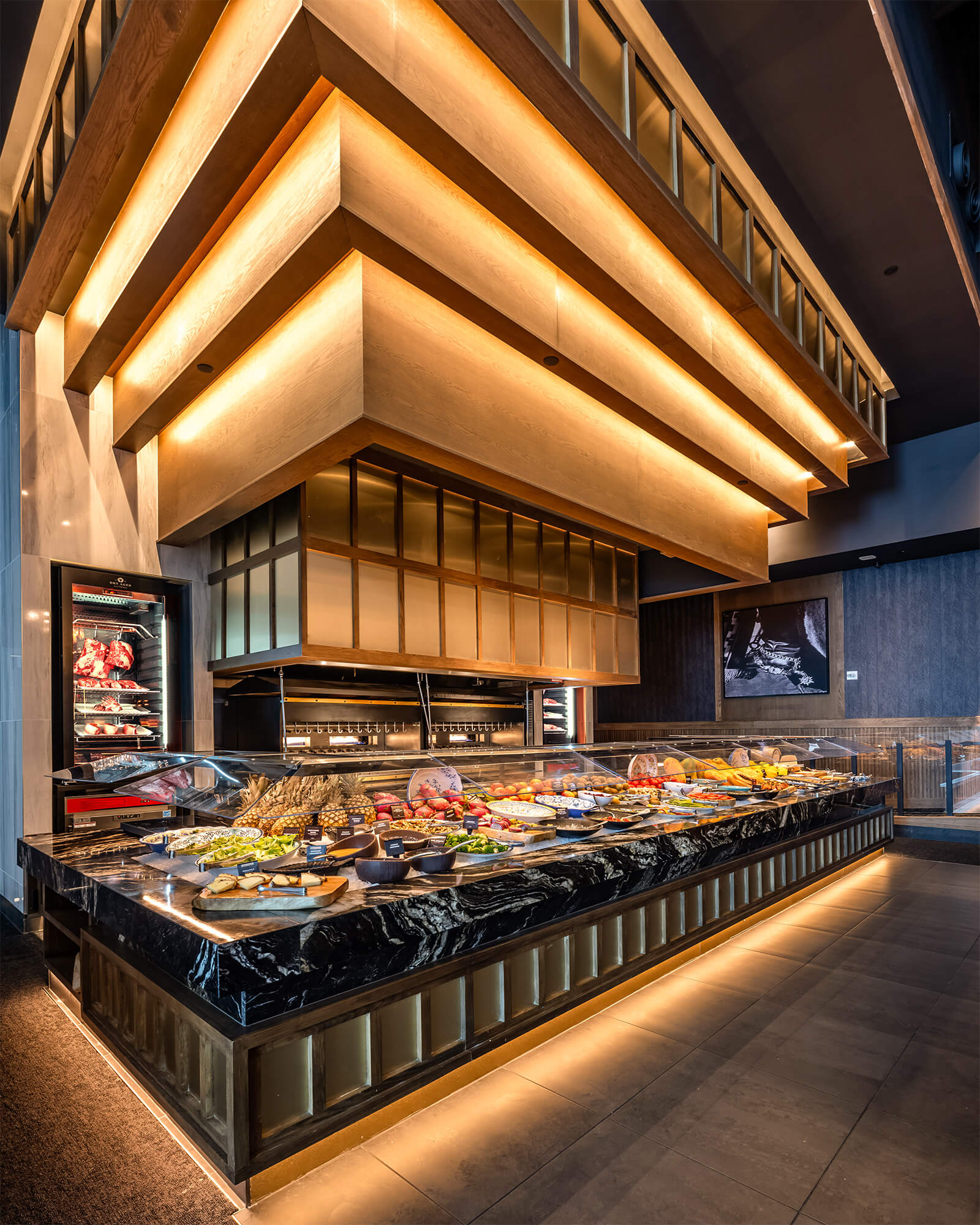
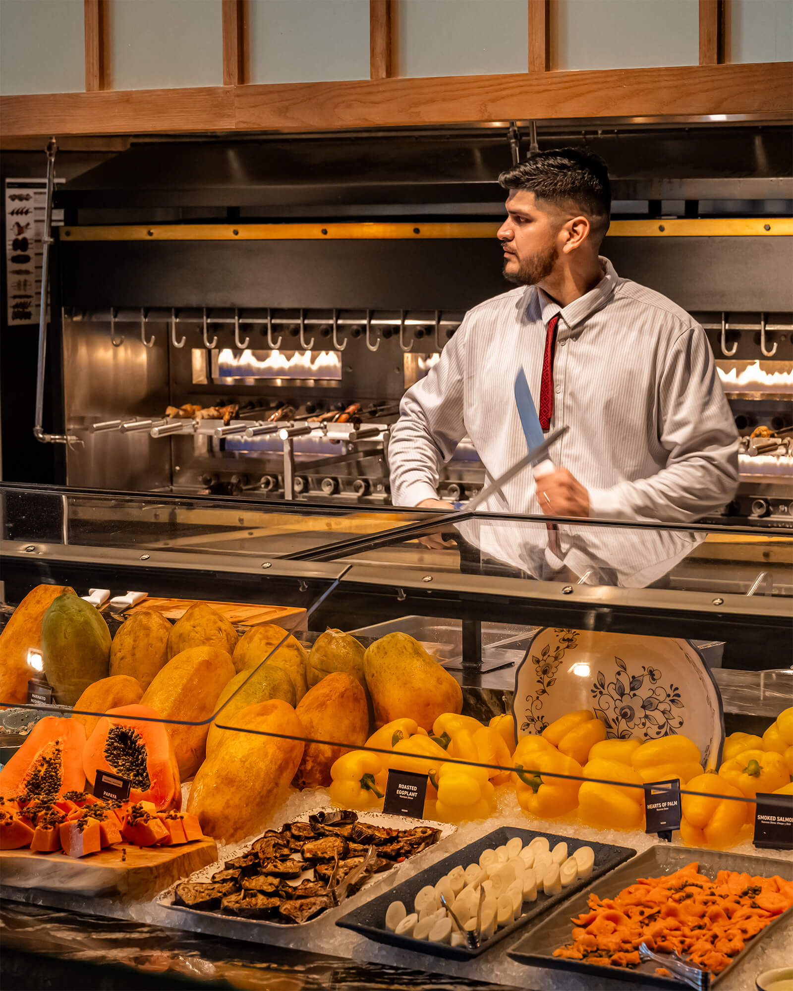
At the heart of the design is Fogo’s iconic Market Table, spotlighted as a visual anchor to reinforce the brand’s experiential dining roots. Above, sculptural lighting draws the eye upward, while sweeping views of the surrounding WTC campus connect guests to the city’s rhythm below.
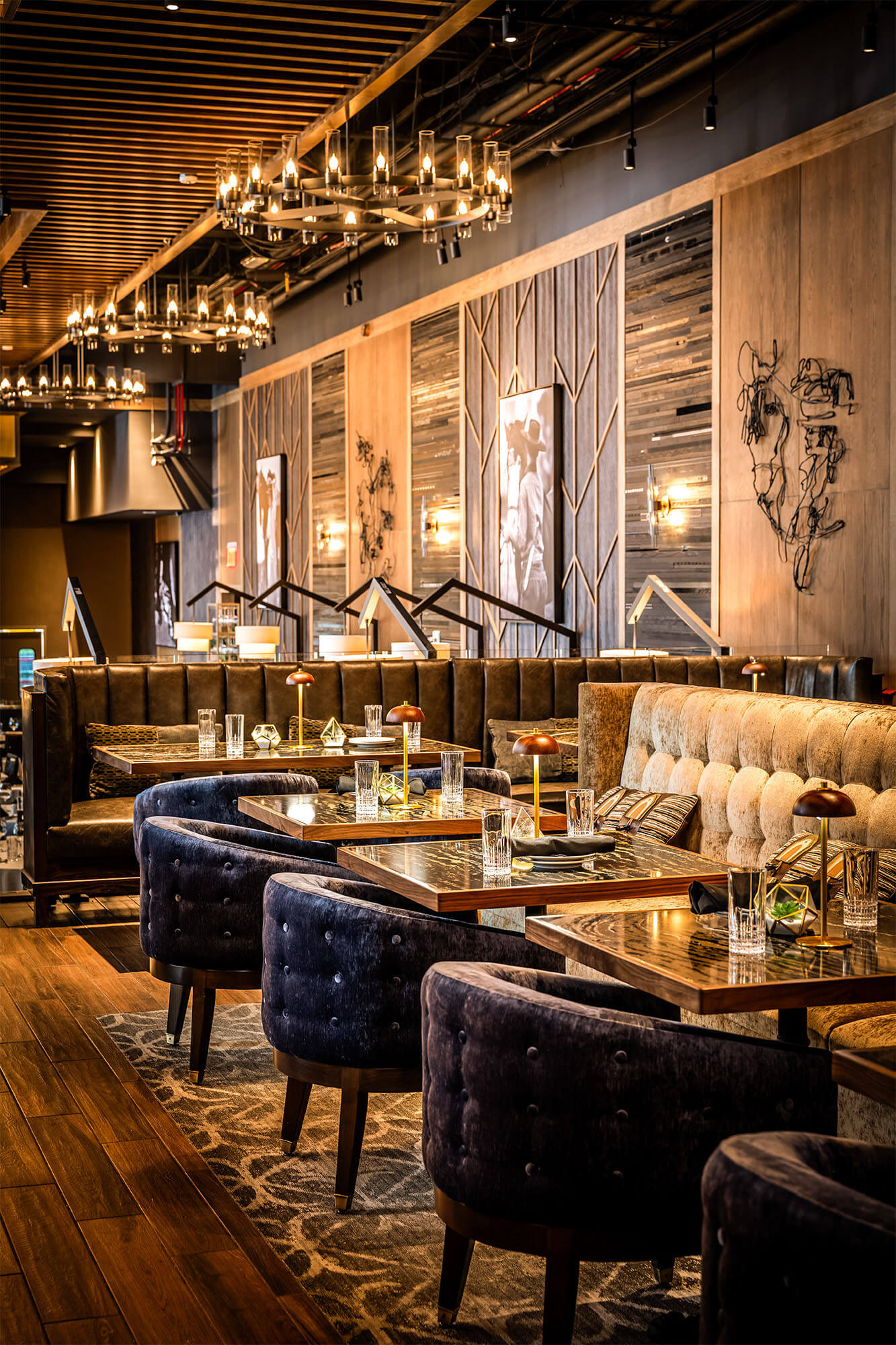
Natural materials, custom wine walls, and signature art moments ground the interior design in Brazilian heritage, while premium finishes and thoughtful acoustics elevate the urban dining experience. Designed to accommodate over 250 guests, the space includes a dynamic bar design, private dining, and lounge areas all optimized for flexibility and flow.
Whether serving tourists or local professionals, this restaurant design invites people to linger, connect, and experience the soul of Southern Brazilian hospitality brought to life through brand storytelling, structure, and the spirit of place.
There’s something deeply fulfilling about connecting history to spaces that people can truly experience. Seeing those ideas take shape in the real world brings a unique sense of joy and purpose. We are grateful to contribute to the community in this way creating places that not only meet our clients’ needs but also speak to the everyday person. It’s an honor to help bring stories to life through design.
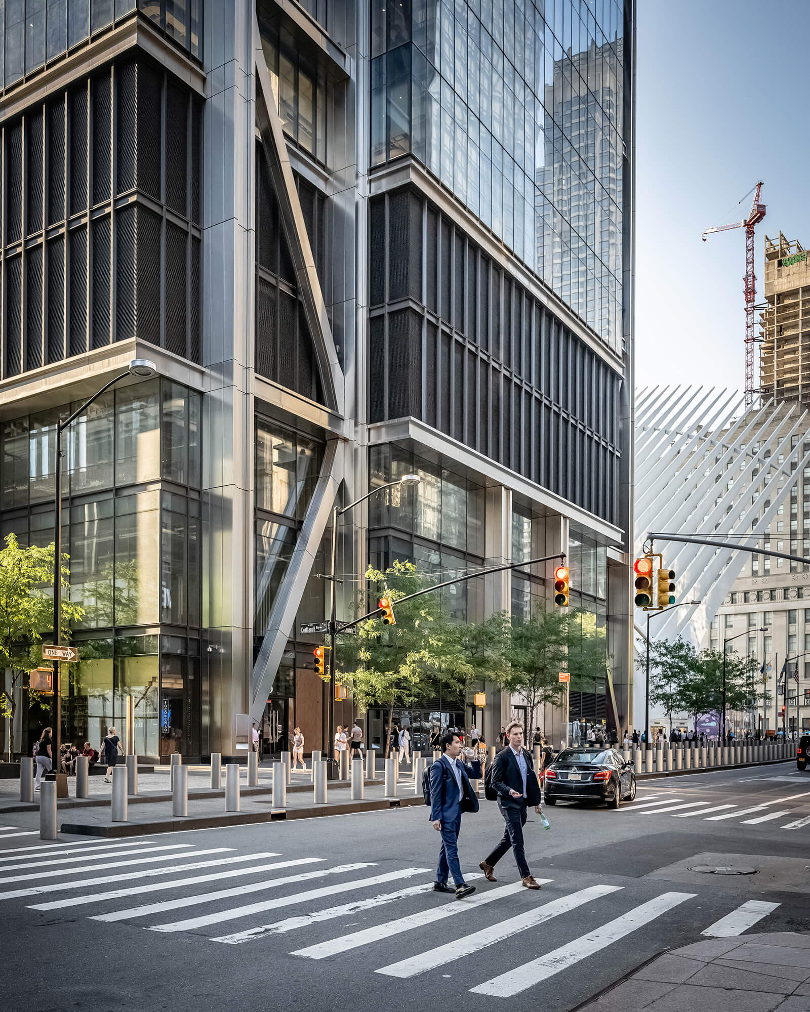
A bold first impression at the base of 3 World Trade invites guests into a refined space where tradition meets modern hospitality.
Project Snapshot
Related projects
Let’s create something unforgettable
Fuelled by knowledge and imagination, we are driven by our ambition to evolve hospitality brands.
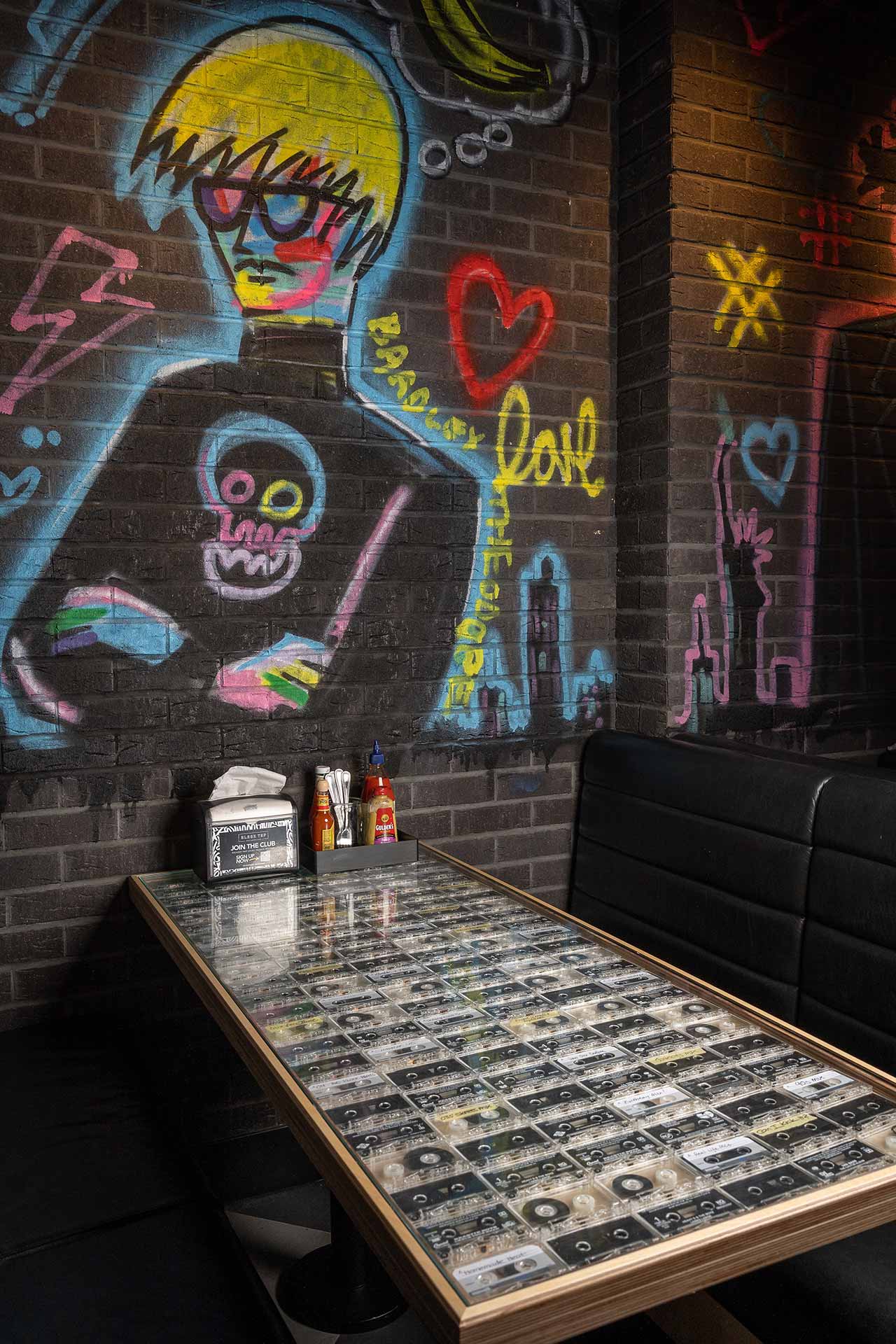
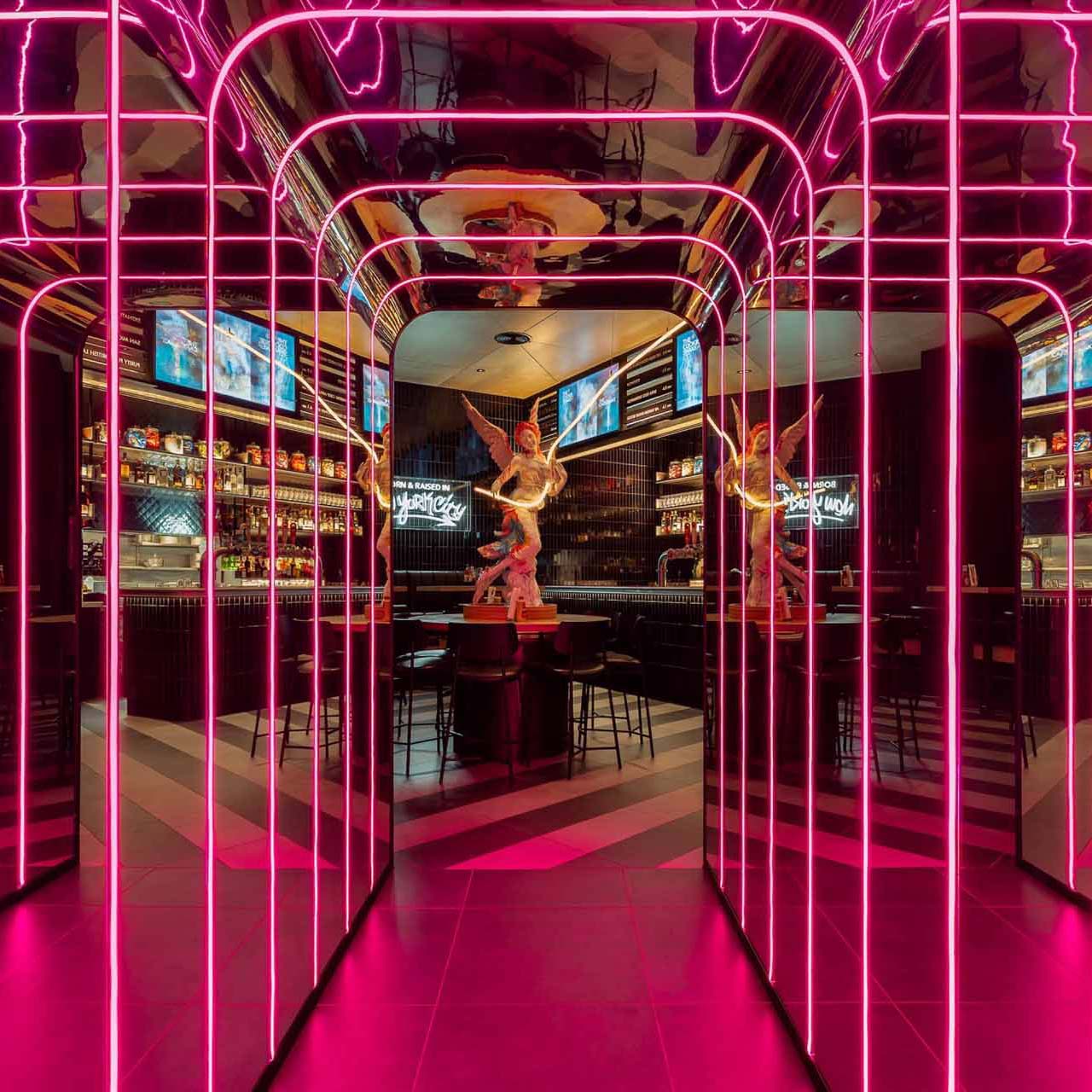
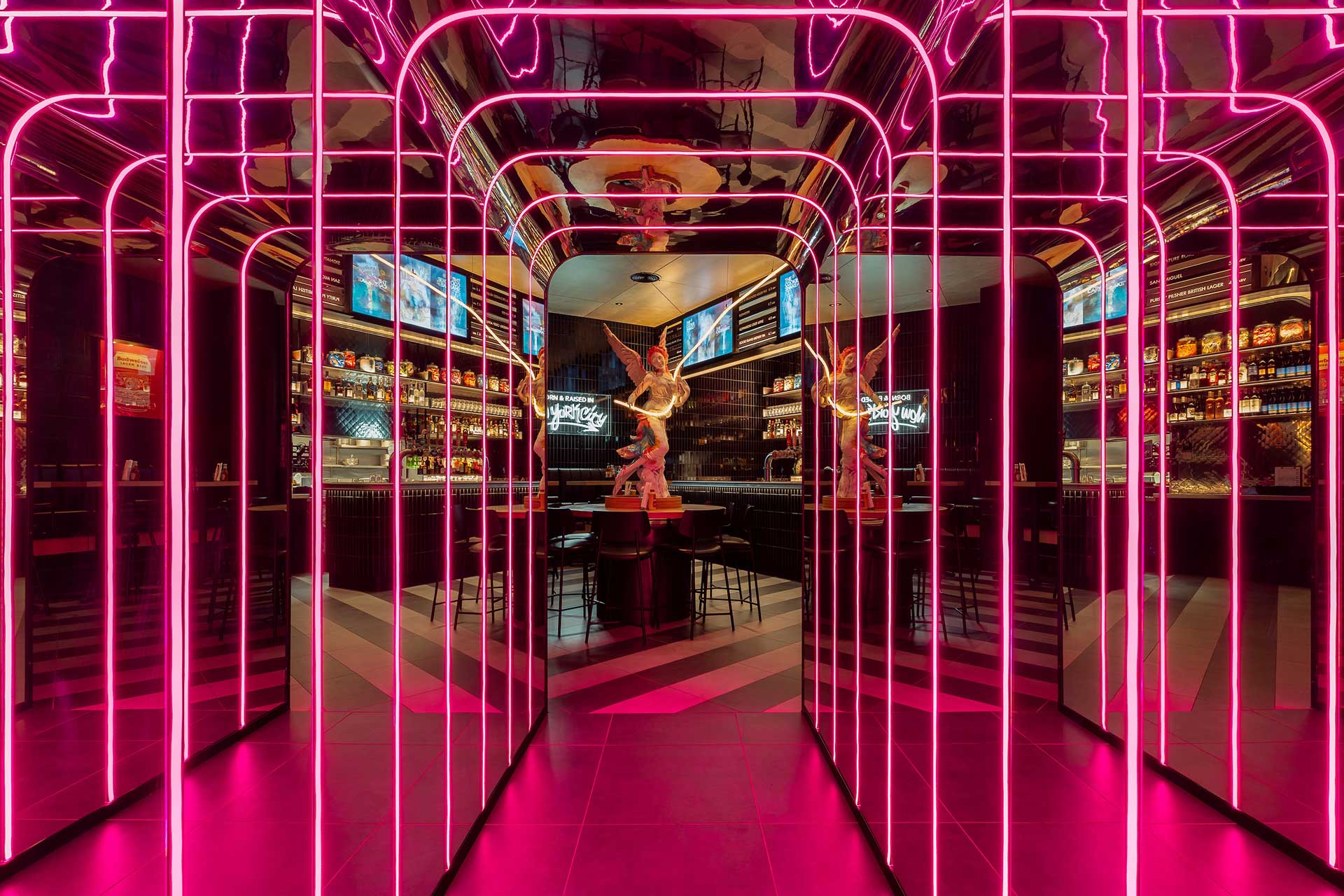
The walls showcase vibrant, striking murals by renowned NYC street artist Bradley Theodore, capturing the energy and spirit of New York while adding another layer of authenticity.
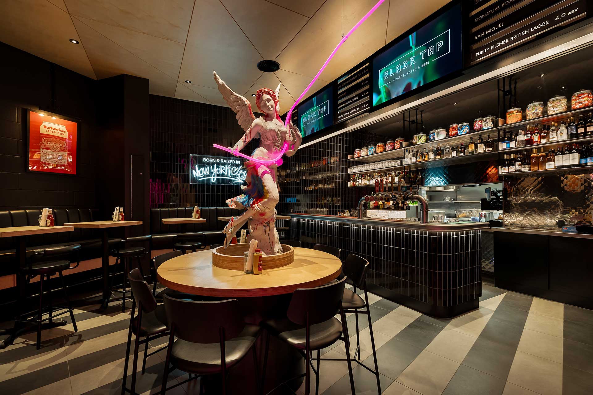
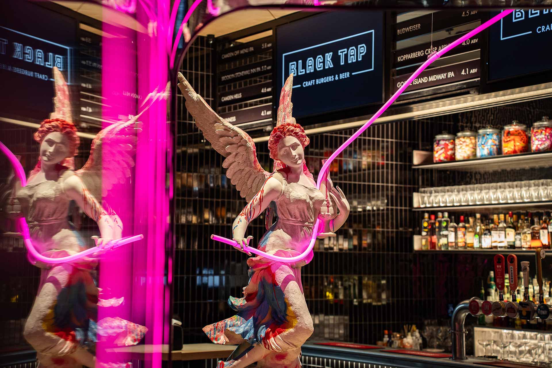
A striking angel statue positioned beyond the boombox corridor serves as a nod to the building’s heritage.
Soho to Soho – A Flagship Fusion of Heritage and Attitude
Inspired by Black Tap’s journey from Soho, New York to Soho, London, the interiors fuse NYC street culture with the elegance of a historic landmark London setting. It is a carefully orchestrated balance of preservation and provocation, demonstrating how thoughtful project management and creative interior design can translate a global brand with precision and intent.
Honouring History Through Dramatic Design
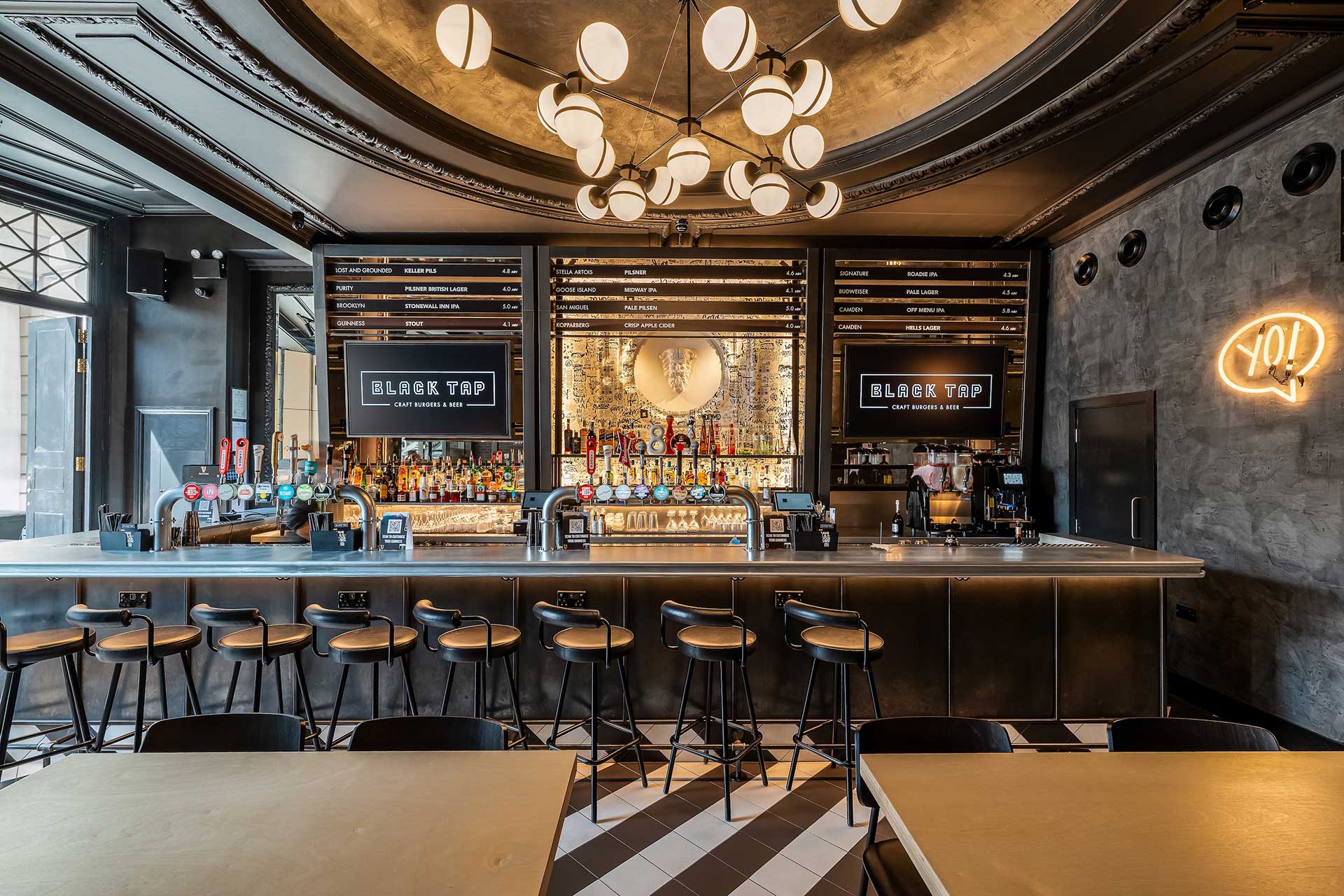
At ground level, a disciplined monochrome palette establishes a strong first impression. Geometric black-and-white tiles flow across the space and wrap a sculptural central bar, creating a graphic statement that feels modern and dynamic while remaining respectful of the building’s architectural integrity.
The Bold Journey Below Ground
Descending to the basement, the atmosphere changes. The space becomes more immersive, playful, and expressive. A large-scale boombox installation anchors the room, while LED-lit corridors, fire-escape-inspired seating, and graffiti murals by New York street artist Bradley Theodore inject movement and character. The design captures the raw, creative spirit of the city it’s unapologetic, layered, and full of life.
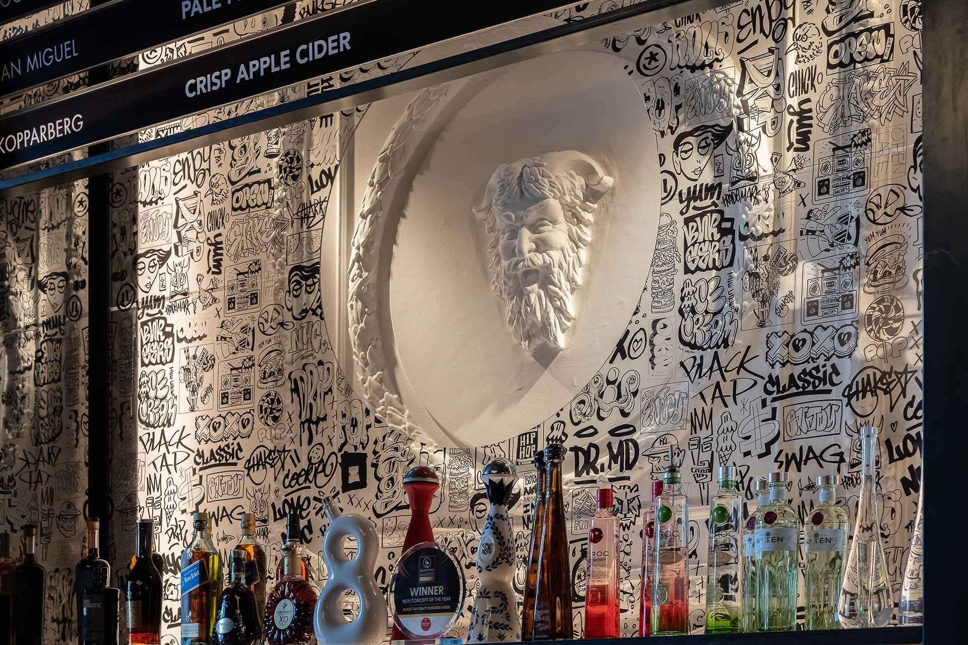
Every element, from bespoke furniture to unexpected sculptural moments including a classical statue reimagined with a neon aux cord has been designed to surprise, delight, and tell a story through space. Carefully considered lighting and layered artwork heighten contrast throughout, allowing bold interventions to sit confidently within the historic fabric of the building.
A Confident Translation of Brand and Place
Black Tap London is more than a new restaurant. It is an exercise in global brand translation at its most considered where creative energy is channelled with discipline, and experience is shaped with purpose. The result is a dynamic, memorable destination that feels authentic to both its New York roots and its London setting. Hospitality design that is ambitious, contextual, and unmistakably Black Tap.
“Black Tap Piccadilly is all about energy, contrast and craft,” adds Sarah. “It was about creating a space that feels alive — where every corner sparks curiosity and every design detail plays its part in the story.”


The best Black Tap to date and it has raised the bar really high.
Related projects
Let’s create something unforgettable
Fuelled by knowledge and imagination, we are driven by our ambition to evolve hospitality brands.
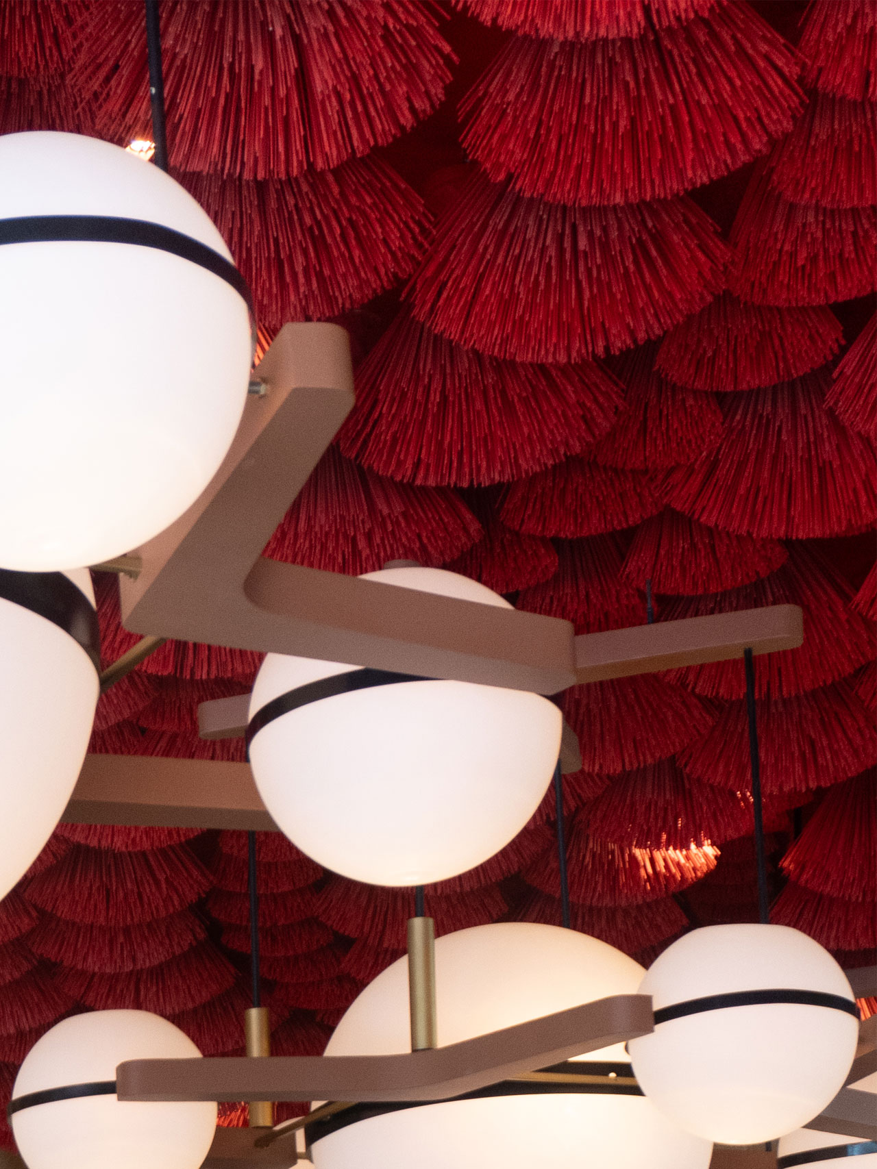
A dramatic pairing of material and light. The red brush ceiling and spherical pendants elevate the mood, making even everyday coffee moments feel cinematic.

A bold red canopy made from handcrafted ceiling elements brings energy and theatre to the lounge zone — a nod to Vietnam’s craft culture and Highlands’ evolving sense of hospitality drama.
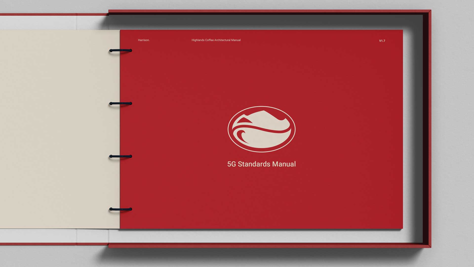
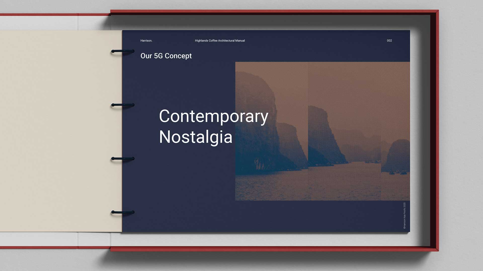
Our journey with Highlands Coffee started with a brief to develop the brand’s next-generation “5G” concept, a forward-thinking evolution of their store design and guest experience. But what began as a single project soon grew into something more lasting and collaborative.
As we filled gaps in design capability, we also built trust. By 2023, Harrison’s APAC team had become fully embedded within the VTI Group’s senior leadership, acting as Design Directors across the region. This closer partnership allowed us to work hand-in-hand with Marketing, Development, and Executive teams, shaping not just stores, but strategy.
Natural timber structures and soft ambient lighting shape a welcoming entry — balancing contemporary calm with quiet references to traditional Vietnamese craftsmanship.
Our role evolved from delivering individual design solutions to driving long-term brand growth. With more time to test, learn, and refine, we’ve been able to push the brand forward aligning creative, commercial, and operational goals into one cohesive direction.
Alongside this, we’ve launched a mentorship program to upskill the in-house design team ensuring Highlands Coffee can carry the vision forward independently, with confidence and clarity. Because strong design shouldn’t just deliver results, it should leave a legacy.
When you’re close to a brand’s growth, you see more than the milestones, you see the mindset shift. That’s what makes it exciting.


Related projects


Let’s create something unforgettable
Fuelled by knowledge and imagination, we are driven by our ambition to evolve hospitality brands.
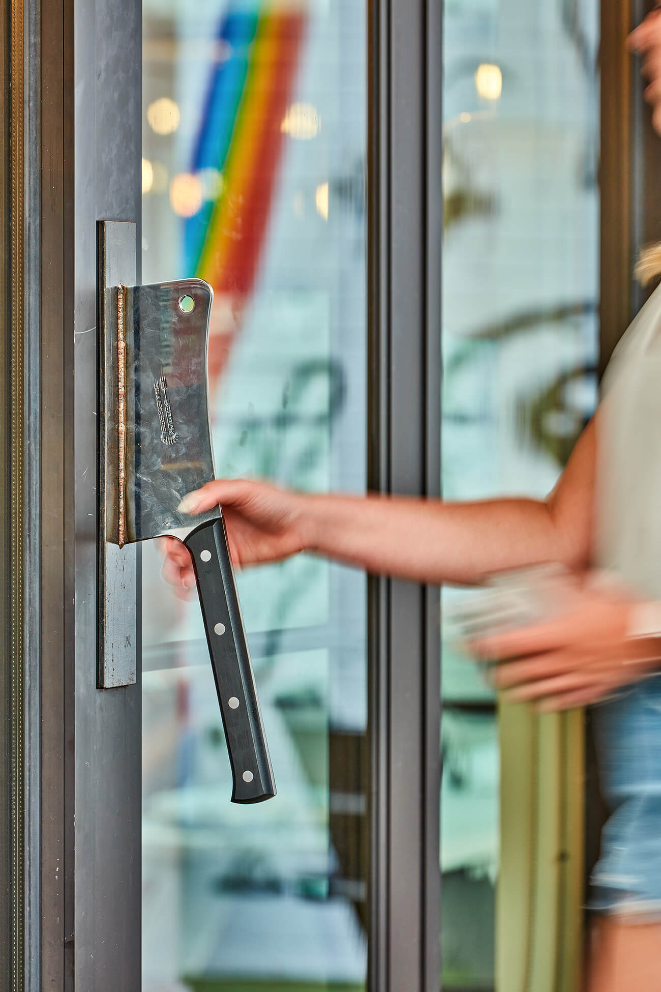
A clever branding moment in the customer journey, the custom door handle sets the tone before guests even step inside.
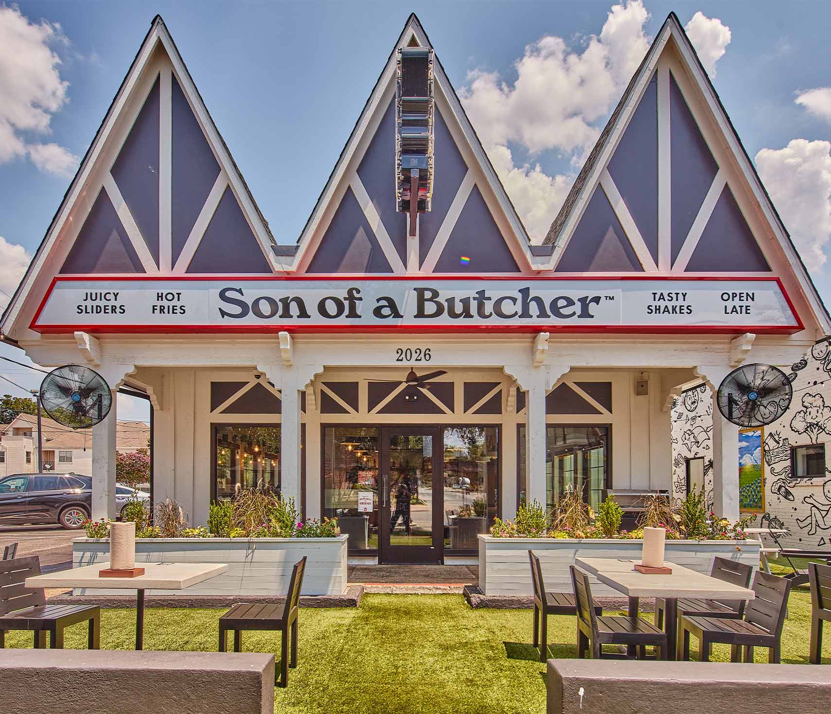
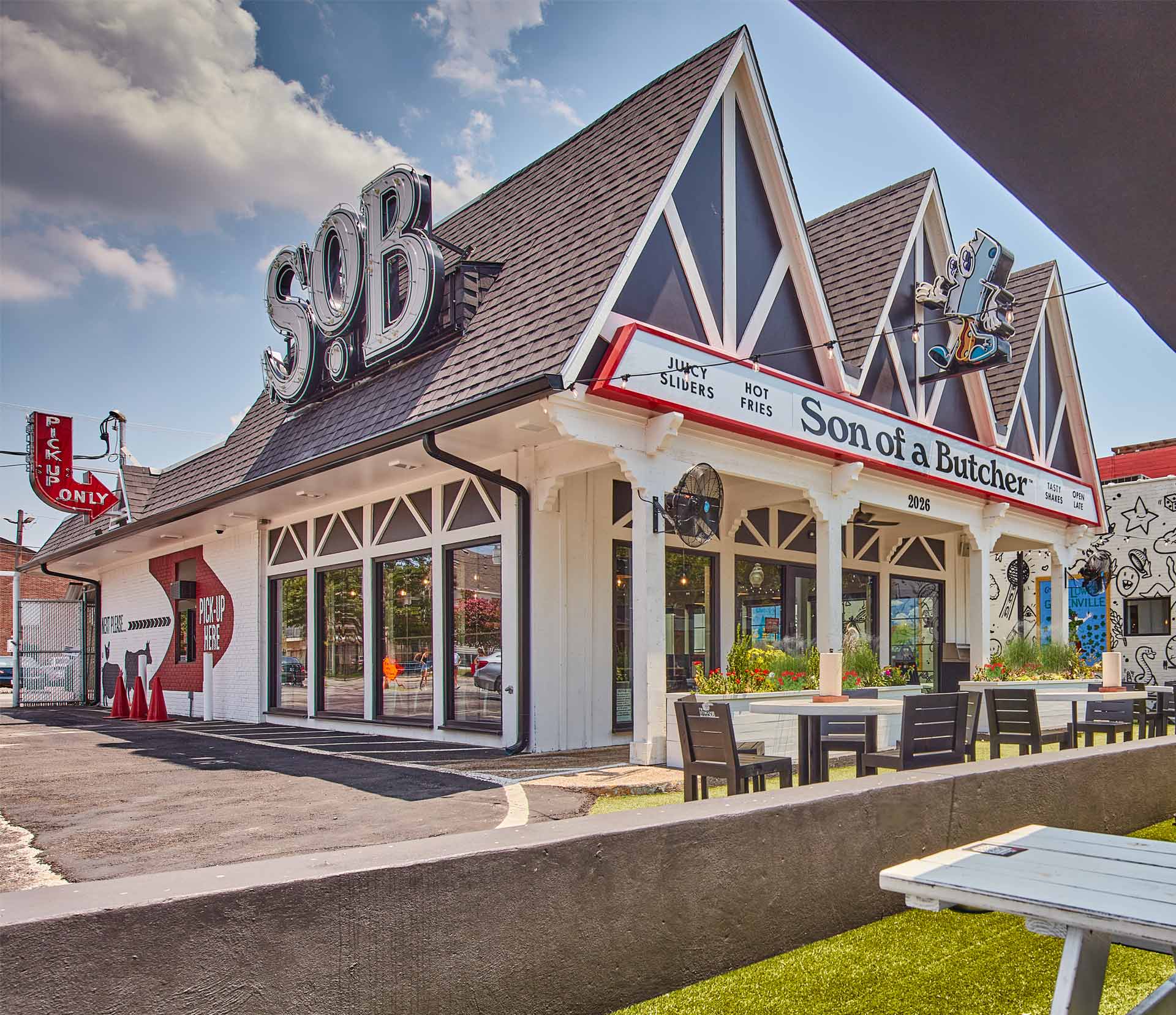
The iconic three-peak architectural design anchors the brand to a neighborhood icon.
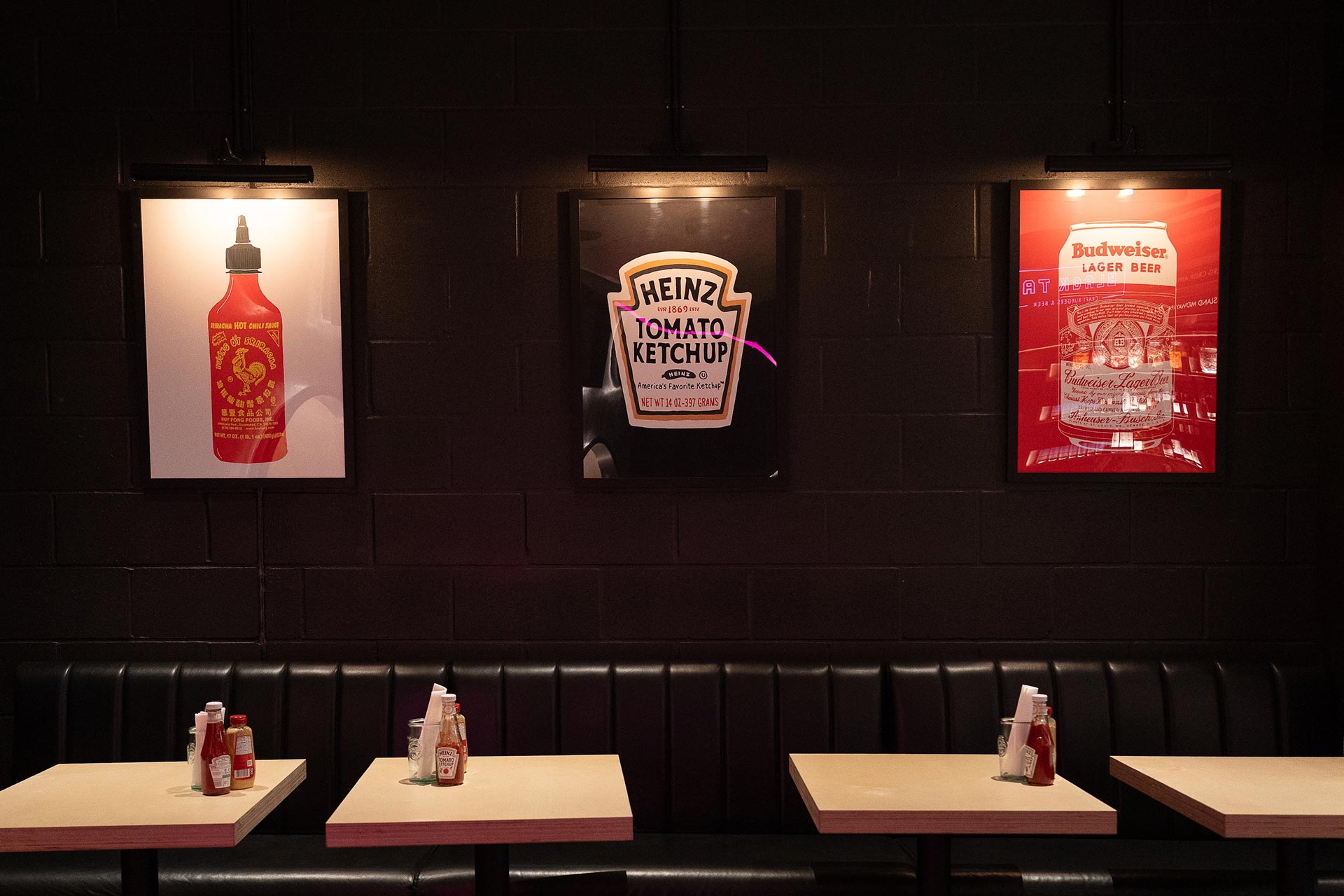
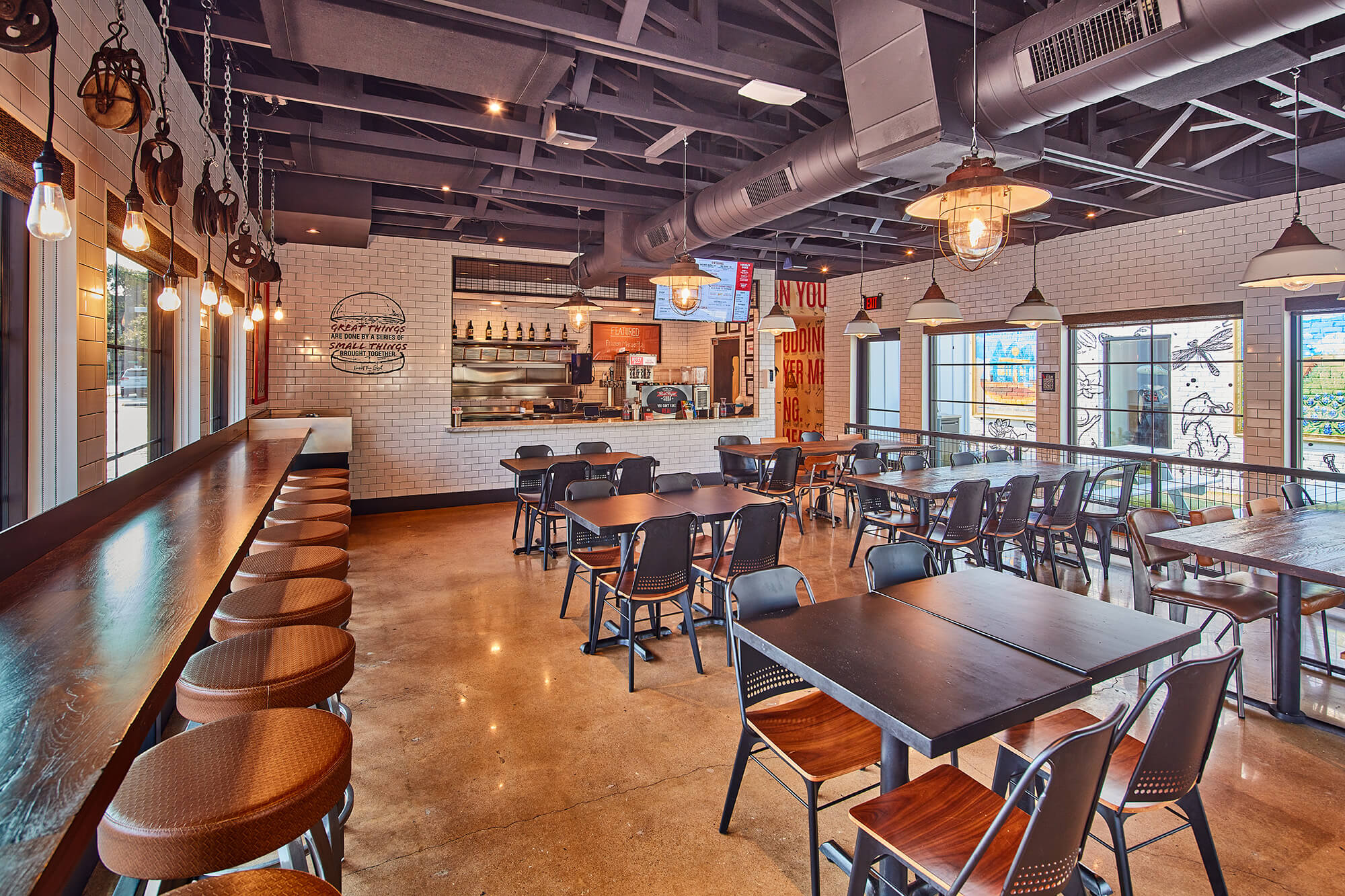
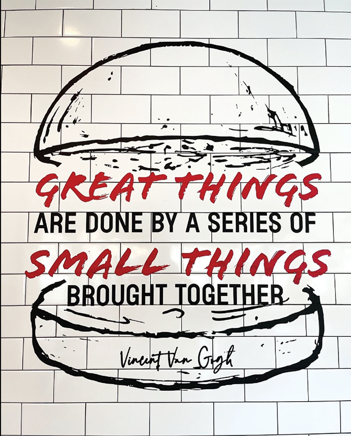
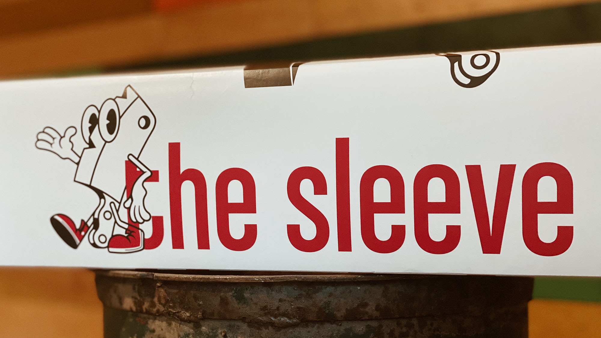
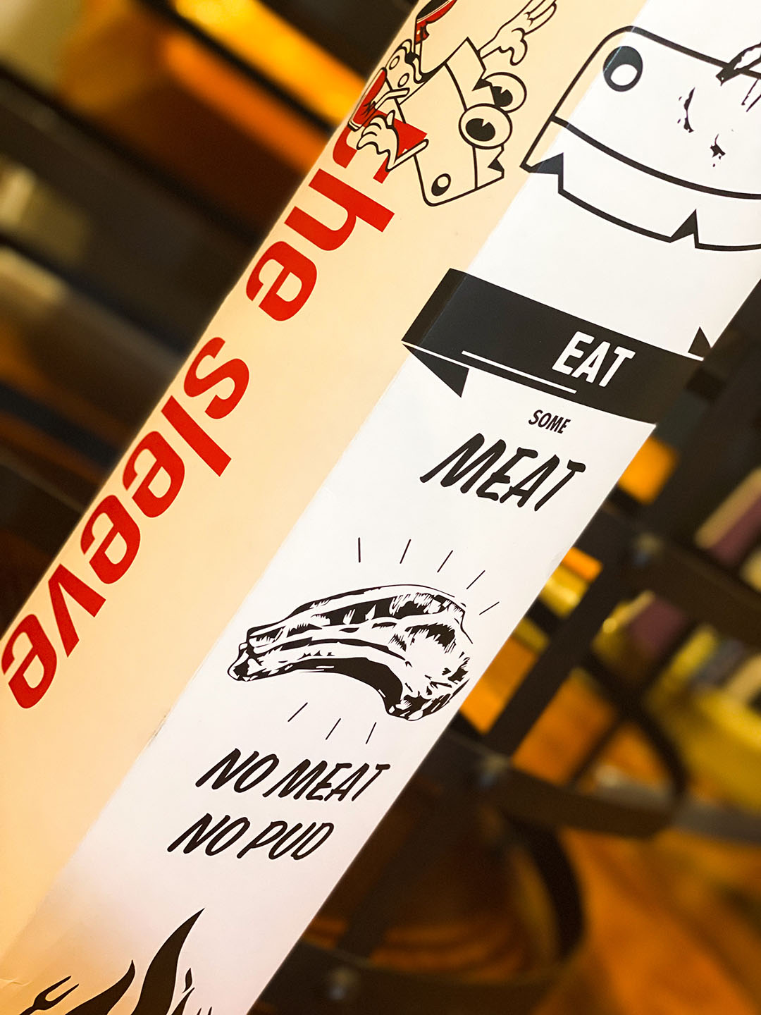
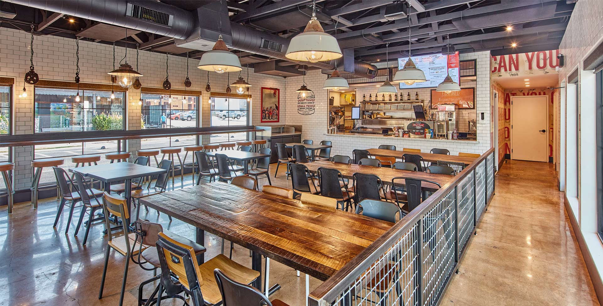
Reimagining the successful food hall kiosk, we developed a scalable model steeped in cheeky references, from Pink Floyd lyrics to the imagined persona of the butcher’s daughter. The result? A distinctive mix of restaurant environmental graphics and hospitality design that doesn’t take itself too seriously but still delivers seriously good design.
Quirky, retro, and rooted in American nostalgia, the exterior architecture retains its signature three peaks and familiar footprint while layering in surprising details that make every visit a little more memorable. From architectural moments to irreverent touchpoints, Son of a Butcher proves that attitude and approachability can coexist in one cohesive, crave-worthy concept.

Related projects
Let’s create something unforgettable
Fuelled by knowledge and imagination, we are driven by our ambition to evolve hospitality brands.
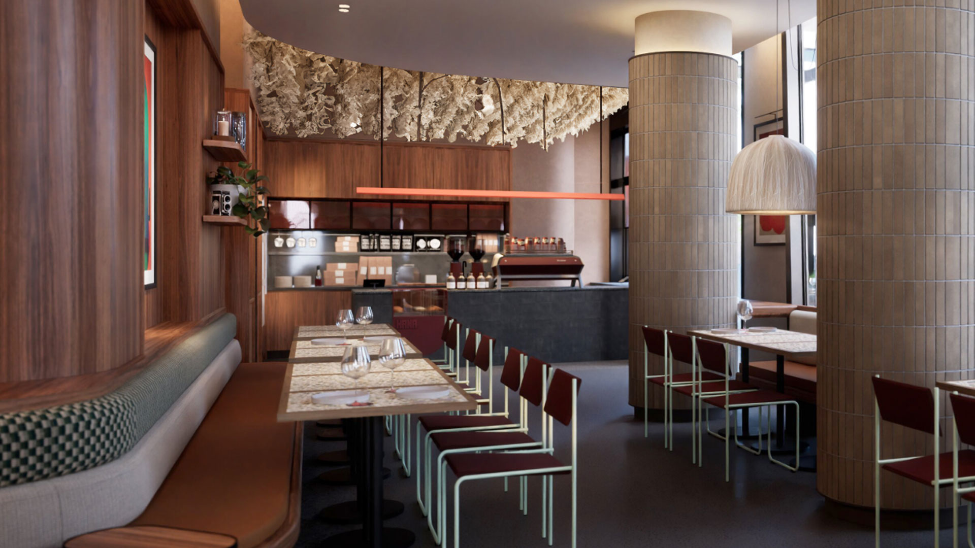
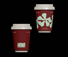
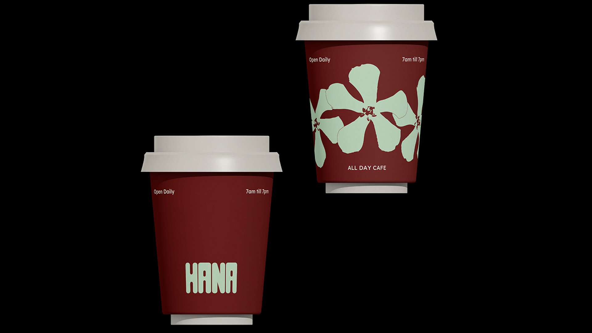
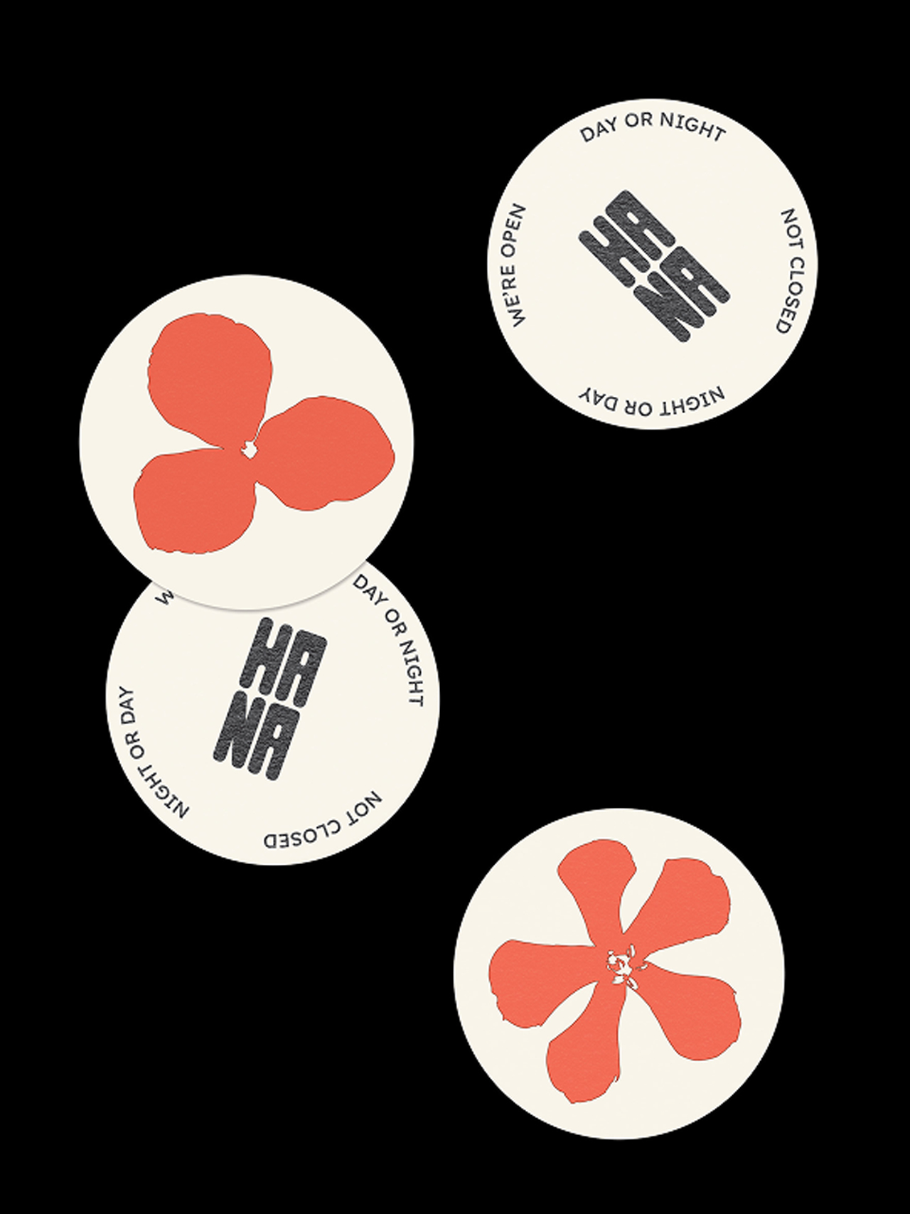
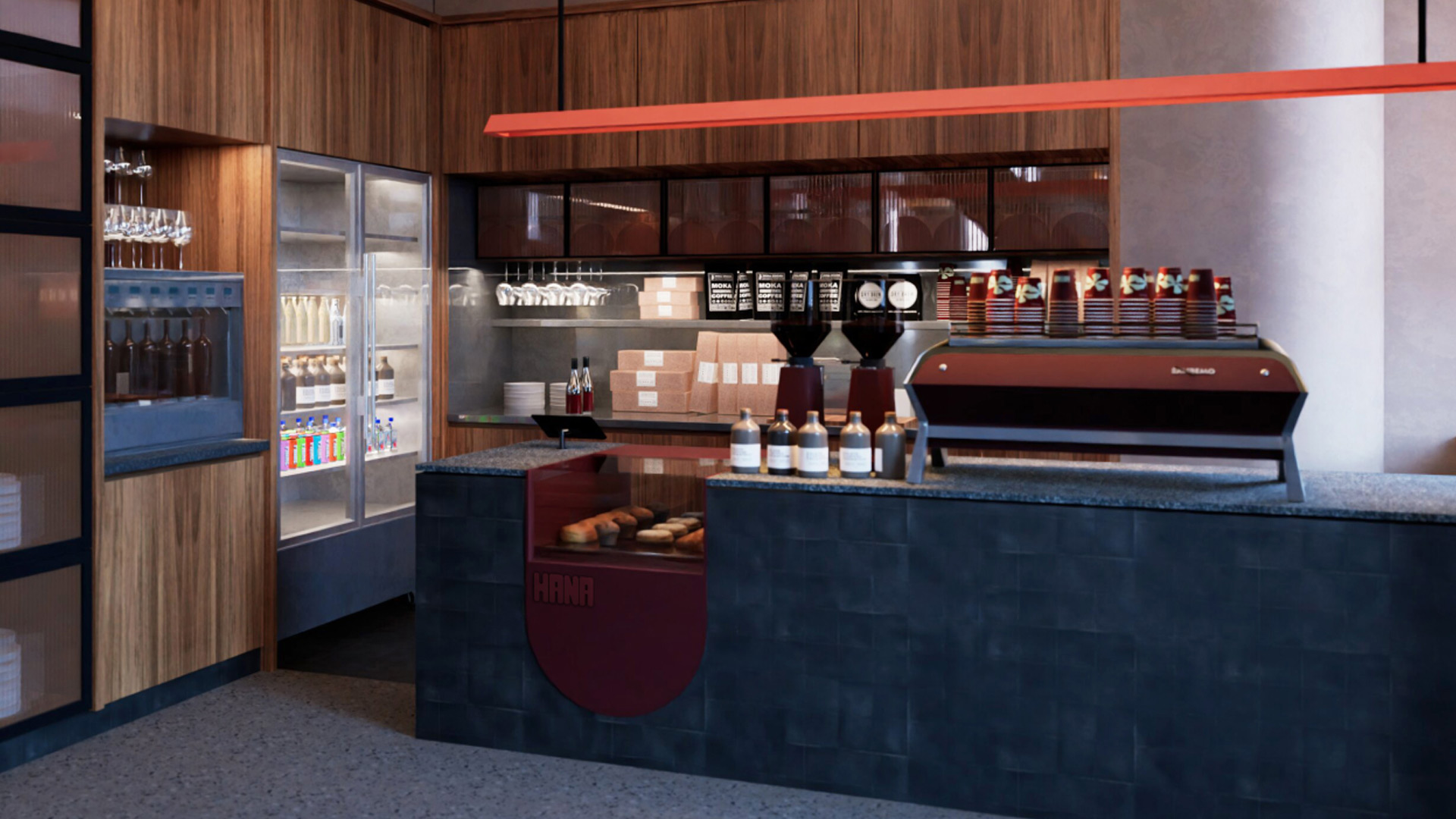
Inspired by native flora and Adelaide’s layered textures, Hana’s interior is an interplay of softness and structure, from custom lighting to material warmth.
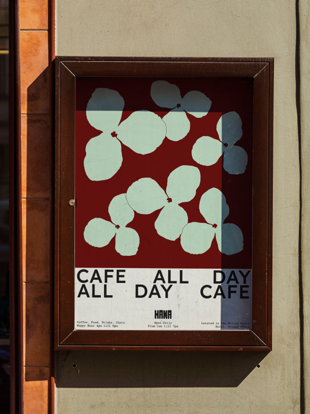
Inspired by Adelaide’s native flora and relaxed rhythm, it offers an all-day welcome to both locals and travellers alike.
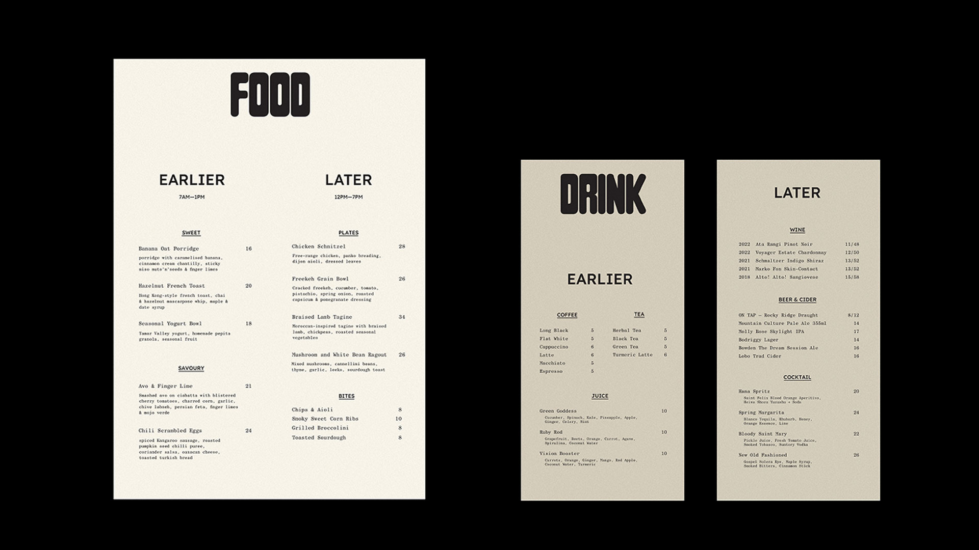
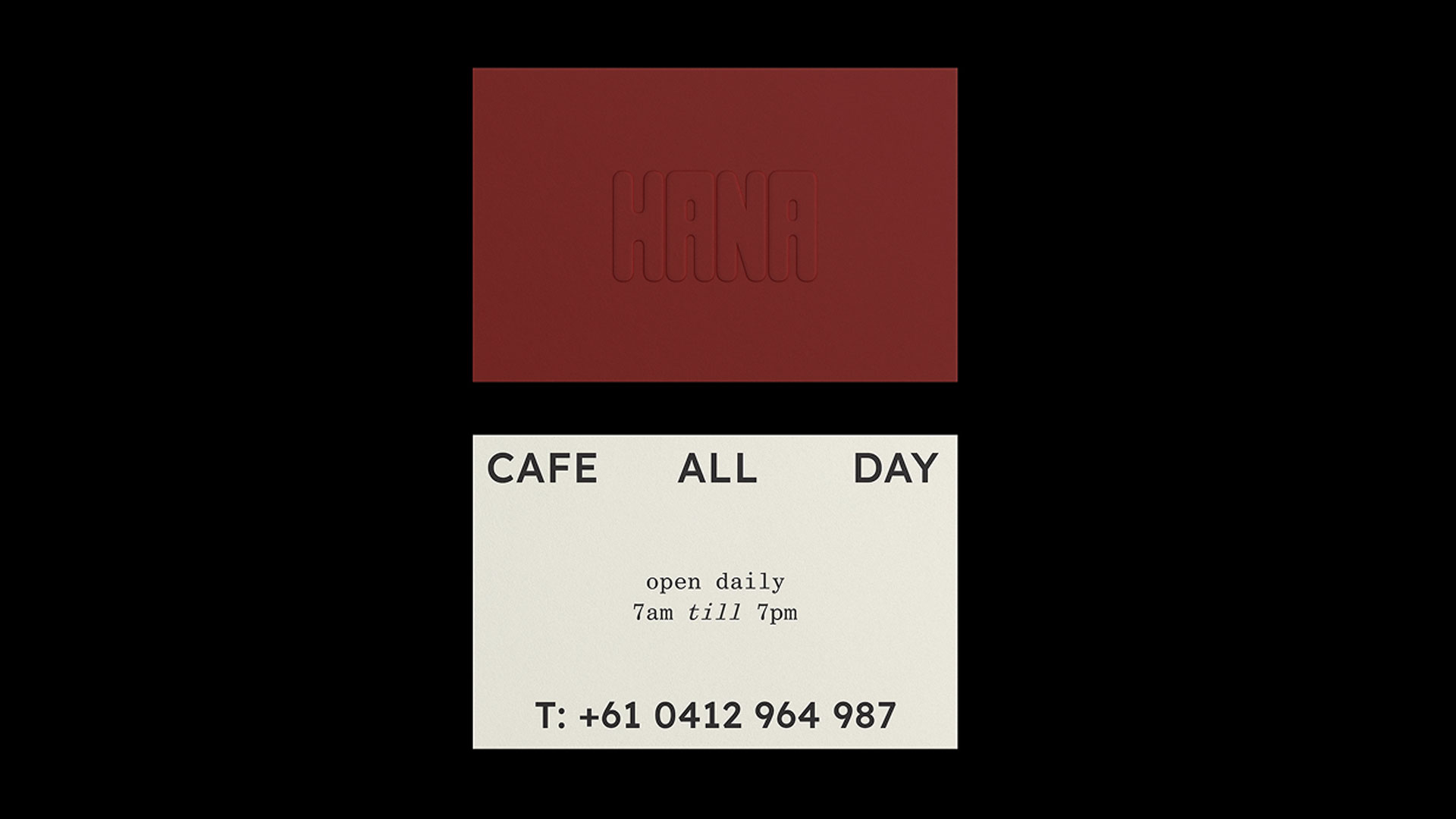
From the beginning, we saw Hana as more than a hotel café. It was an opportunity to create a neighbourhood hub. A space shaped by the surrounding landscape wrapped in warmth, and the energy of a city that’s coming into its own. Working in step with Motto’s values, we developed a brand identity that speaks to both community and character. The menu Strategy was developed to flex from causal small plates to lager lunch bites.
Bold floral motifs and a layered, natural palette give the café an easy elegance, while bespoke lighting and soft textures reflect the gentle beauty of native plants. The result is a space that feels alive rooted in the present, open to what’s next, and unmistakably Adelaide.
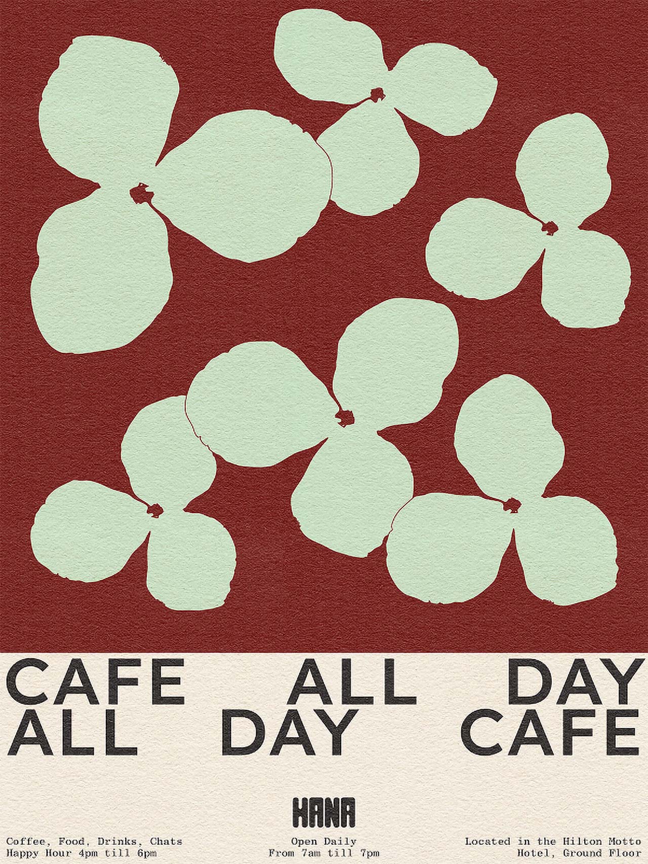

Hana invites guests in for good coffee and good company, all in a vibrant setting that feels unmistakably Adelaide.
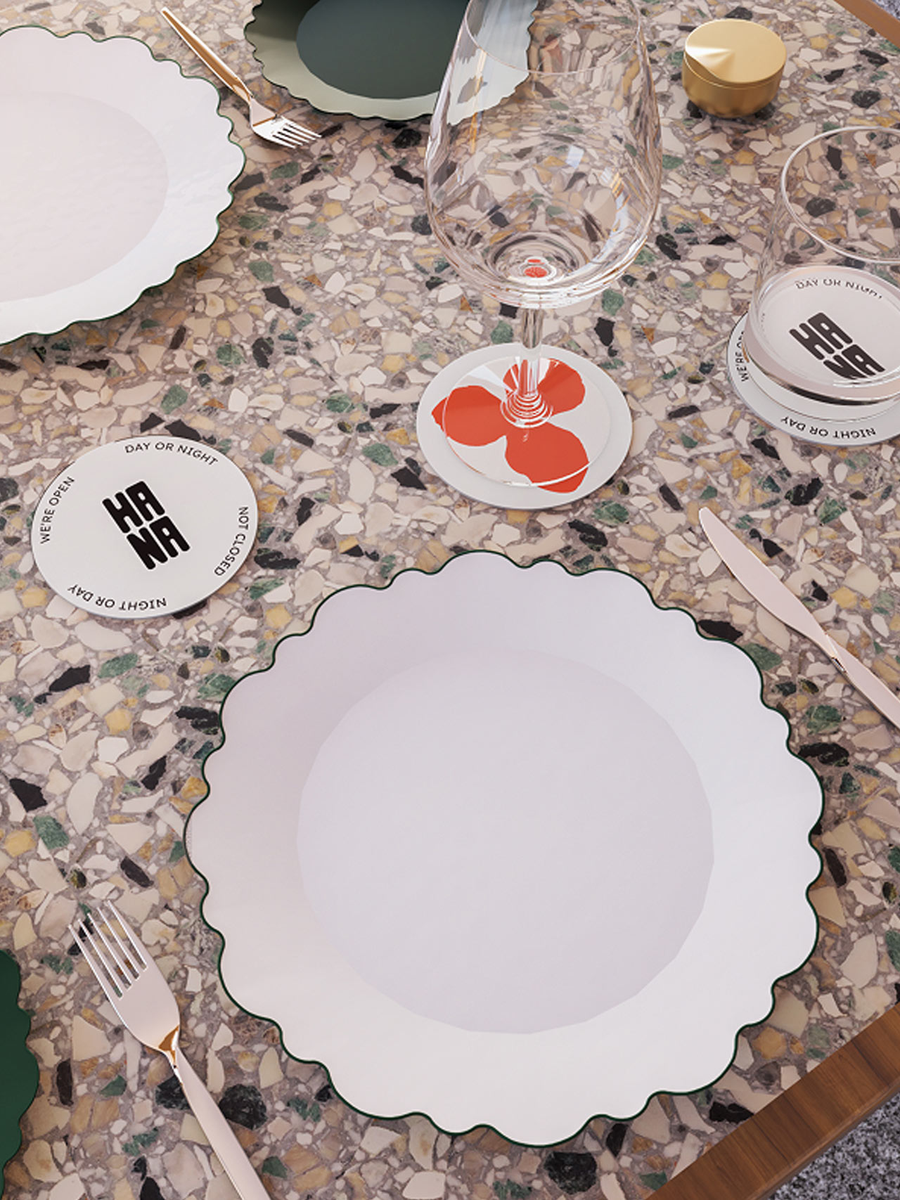
Every detail considered, scalloped plates, terrazzo textures, and playful coasters bring Hana’s table settings to life, creating moments that linger.
Related projects


Let’s create something unforgettable
Fuelled by knowledge and imagination, we are driven by our ambition to evolve hospitality brands.